- Home
- Getting started
-
Modules
- General info
- Accordion
- Blog card
- Box over image
- Button
- Column navigation
- Compact card
- Comparison table
- Contact box
- Content card
- Cover card
- Feature card
- Features showcase
- Form
- Gallery
- Go card
- Heading
- Hero slider
- Icon
- Image
- Image box
- Image plus text
- Language selector
- Listing
- Logos
- Mobile navigation
- Modal
- Multi address
- Navigation
- Numbers
- Pillar navigation
- Pricing
- Properties
- Quick action
- Quick features
- Quote
- Review
- Rich text
- Scroll to
- Section extra settings
- Section intro
- Sharing
- Shifter
- Side menu
- Site search
- Steps
- Tabs
- Team card
- Timeline
- Video
- Blog configuration
- Articles
- Changelog
-
- License
- Support policy
- Refund policy
Changelog
Version 43
Mar 4, 2026
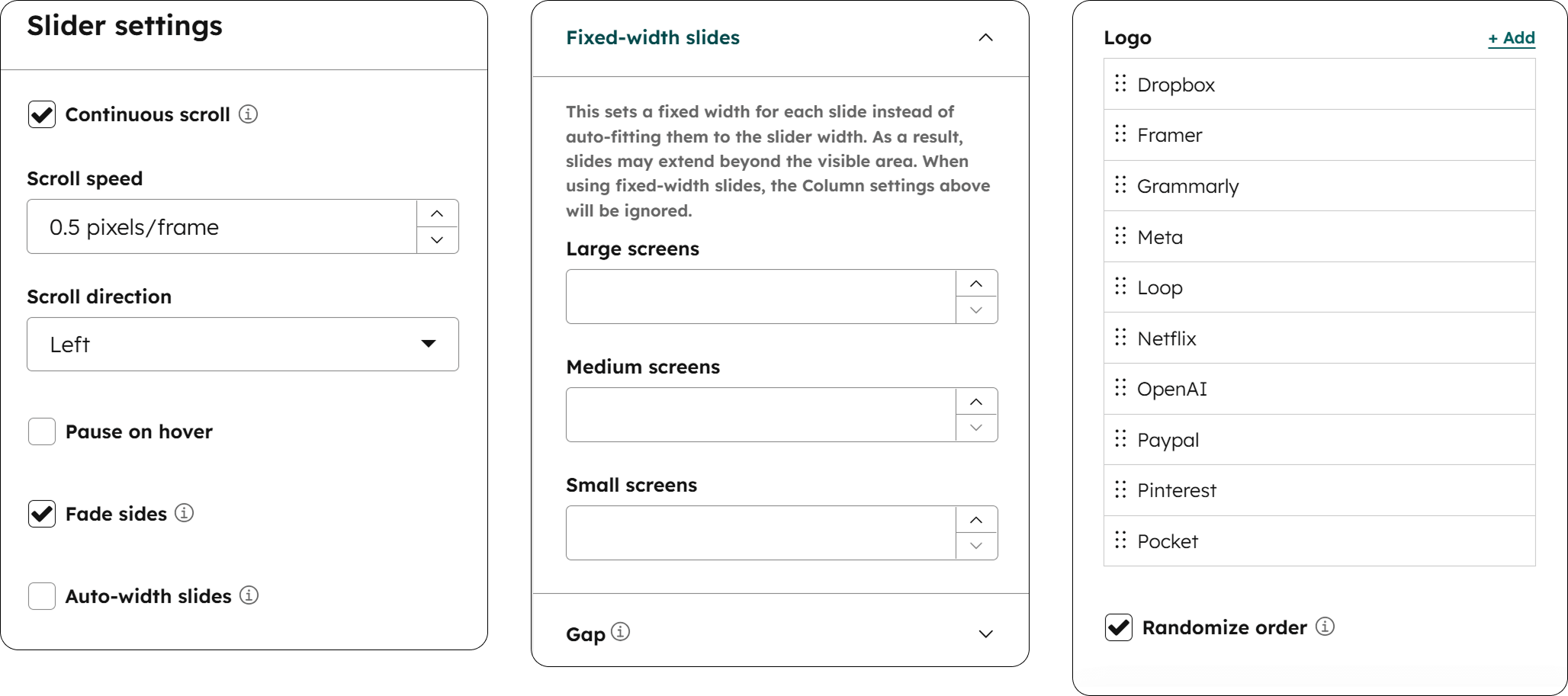
New Logos module options
Several new options in the Logos module: Continuous scroll for smooth, uninterrupted scrolling, Randomized order, Fade sides for improved visuals when using continuous scroll, Auto-width slides, Fixed-width slides, and a custom Gap control for adjusting the spacing between slides.
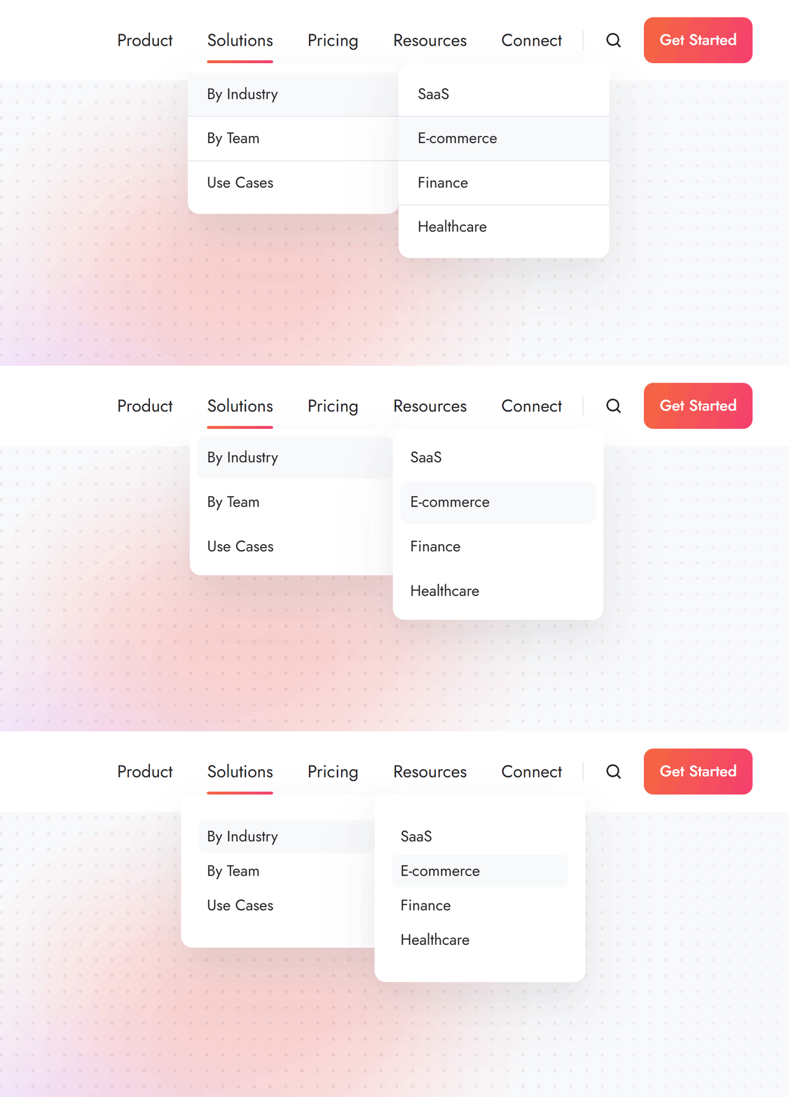
New flyout designs
Added new flyout designs to the Navigation module: Without borders, and Compact.
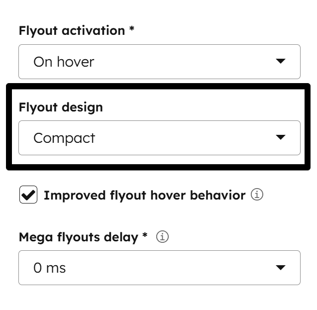
Improved flyout hover behavior
This new option allows more forgiving, directional mouse movement toward the flyout without closing it when the cursor is slightly off course, improving the overall user experience. You can enable it in your Navigation module.
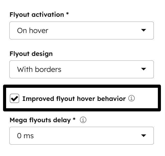
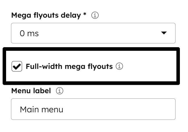
Full-width mega flyouts
Added an option in the Navigation module to make mega menu flyouts full-width. This doesn't apply to the header island design or flyouts with a custom width.
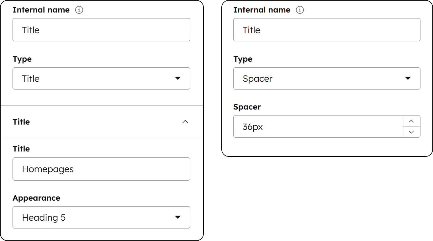
New mega menu content types
The mega menu 'Multiple items' content type now includes Title and Spacer options:
Improved Listing accessibility
Visitors can now navigate seamlessly with the keyboard.
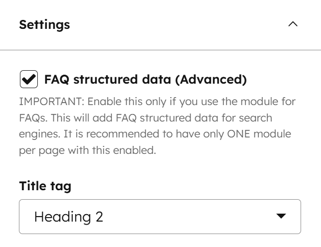
FAQ structured data
Added an option for FAQ structured data in the Accordion module. Enabling this helps your content appear as rich snippets on search engines. To ensure proper indexing, this should only be enabled for one Accordion module per page and used exclusively for actual FAQ content. While this improves your chances of standing out, keep in mind that search engines ultimately decide when and how these snippets are displayed in search results. More info here.
Upgraded to Splide 4.1.4 (latest version), which offers improved accessibility, support for extensions, and more advanced features to build on in future updates.
Upgraded to List.js 2.3.1 (latest version), with improved search and performance.
Improved 'On click' flyout tab navigation and perfectly aligned the flyout text with its top-level parent.
Replaced javascript:; links with buttons to prevent about:blank tabs in HubSpot device previews.
Improved keyboard navigation for Image box links.
Fixed an issue that slipped through the last update where active menu styles were incorrectly applied to legacy mega menus instead of only to the Multiple items type.
Fixed a glitch in the editor where, under certain conditions, selecting a column would affect the Section extra settings background.
'Caption' and 'Open other file' fields are now hidden when using the Thumbnails option in the Gallery module, as these options are not applicable to this layout.
Pagination dots are no longer available for the Thumbnails gallery. They are not supported in the latest version of Splide when one slider is synced to navigate another, as is the case with this gallery layout.
Fixed an issue in the Properties module where the last item would incorrectly display a right border under certain conditions.
Corrected a layout error in the Header LP 2 where longer buttons would overlap the logo on very small screens; these now shrink automatically if space is limited.
Files updated
- css\components\gallery.css
- css\components\image-box.css
- css\components\listing.css
- css\components\mobile-nav.css
- css\components\modal.css
- css\components\nav.css
- css\components\section-extra-settings.css
- css\components\site-search.css
- css\components\splide-sneakpeek.css
- css\components\splide.css
- css\components\tag-list.css
- css\main.css
- js\components\drop-down.js
- js\components\list.js
- js\components\listing.js
- js\components\modal.js
- js\components\nav.js
- js\components\splide.js
- js\main.js
- modules\accordion.module\fields.json
- modules\accordion.module\module.html
- modules\gallery.module\fields.json
- modules\gallery.module\module.html
- modules\image-box.module\module.html
- modules\lang-select.module\module.html
- modules\listing.module\module.html
- modules\logos.module\fields.json
- modules\logos.module\module.html
- modules\mobile-nav.module\module.html
- modules\modal.module\module.html
- modules\nav.module\fields.json
- modules\nav.module\module.html
- modules\properties.module\module.html
- modules\site-search.module\module.html
- partials\blog-listing-1.html
- partials\blog-listing-4.html
- partials\header-01.html
- partials\header-lp-02.html
- sections\full-screen-hero-slider.html
- templates\blog-listing.html
- templates\blog-post.html
- theme.json
Files added
- css\components\splide-core-4.1.4.css
- js\components\splide-4.1.4.js
- js\components\splide-extension-auto-scroll.js
Version 42
Dec 22, 2025
Summary of updates
This update brings exciting new features and improvements: custom heading styles, rotating text (typed or animated), header island, drag-and-drop footer, new forms editor, accessibility improvements, new background decorations and section extra settings, content cards slider, custom header and footer background colors and content widths, and more. Check the notes or watch the short YouTube videos we added below. Thanks for using Act3!
Rotating text + Heading custom styles
We’ve added rotating text options to the Heading module, including a Typed text effect and an Animated text option, with multiple settings to customize how it appears.
While it’s recommended to maintain consistent typography across your website, there are rare occasions when you want a heading to truly stand out. You can now do this in the Heading module with a variety of custom styles. Adjust font size, change color, set letter spacing, apply gradient text, highlight specific words beautifully, and much more. Please read the helpful notes we added in the module.
Header island
We’ve added an exciting new styling option for the header and sticky header. You can enable the header island independently for the normal header and the sticky header, so you can use it on one state, both, or neither—completely up to you. Customize the width, spacing, and corner radius independently for both header states.
Drag-and-drop footer
We’ve added a new footer you can select in the theme settings: Footer 13. This footer is fully drag-and-drop, so the theme settings options don’t apply. You can set background colors and other options directly in the global content editor, just like with regular drag-and-drop sections in the page editor.
New forms editor
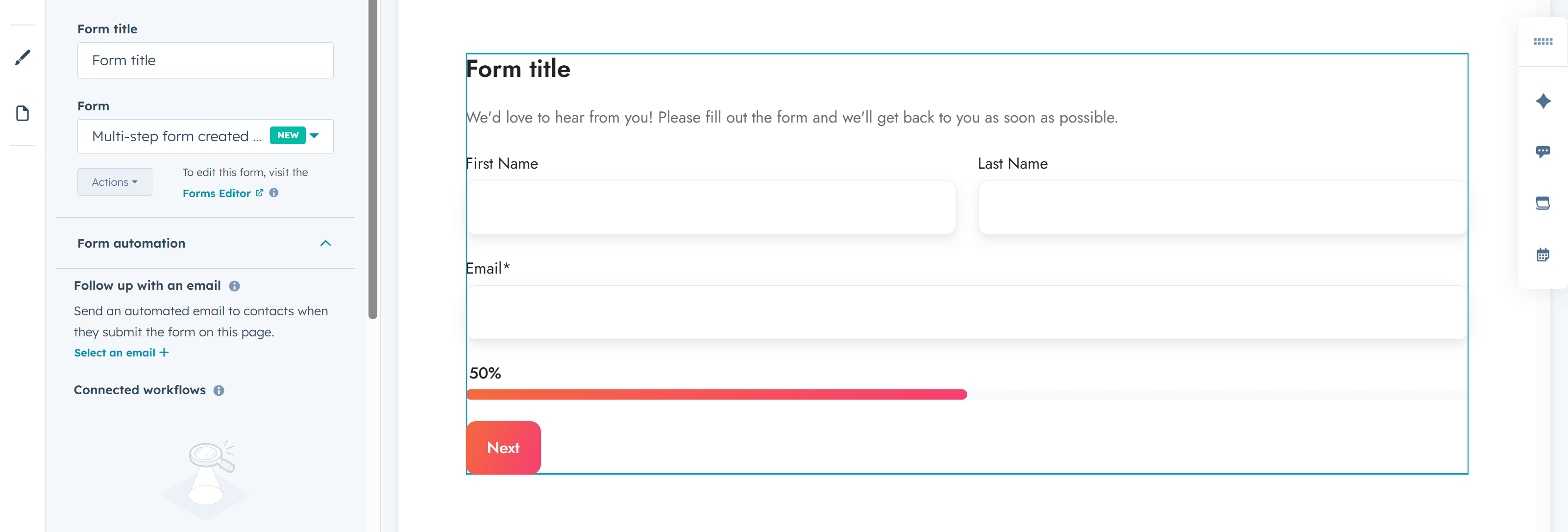
We’ve updated all form fields to support forms created with HubSpot’s new forms editor. You can apply theme styles to these forms for a consistent design, and there’s also an option to optimize CSS by disabling legacy form styles.
Accessibility improvements
We’ve added a Skip to content link option in Theme Settings > Miscellaneous. This link will appear when users navigate using the keyboard (by pressing Tab). If you use external widgets for accessibility that include a similar button, you can disable this feature in the Theme Settings.
We’ve also reviewed and improved keyboard navigation, ensuring that focus is clearly visible on most components (e.g., cards, sliders, etc.). The menu is now easier to navigate with the keyboard, and we’ve added the option to select a specific title tag along with the “looks like” option in multiple modules.

New options in the Section extra settings module
We added new options to the Section extra settings module, allowing you to set a Maximum width for your section and Side margin to create boxed-design sections. You can also set rounded Corners for sections, rows, and columns within that section, and use Clip overflowing content to prevent content from exceeding section boundaries. Browse the live preview to see what’s possible with these new options, and watch the YouTube video to see exactly how we achieved the boxed design on the Home 6 page:
New background decorations, including Custom SVG
We’ve added new background decorations to the Section extra settings module, including a Custom SVG option for advanced users, where you can use your own SVG. Check the notes in the module for specific details.
Live Previews: Peak, Triangle, Torn paper 1, Torn paper 2 and 3, Custom SVG example

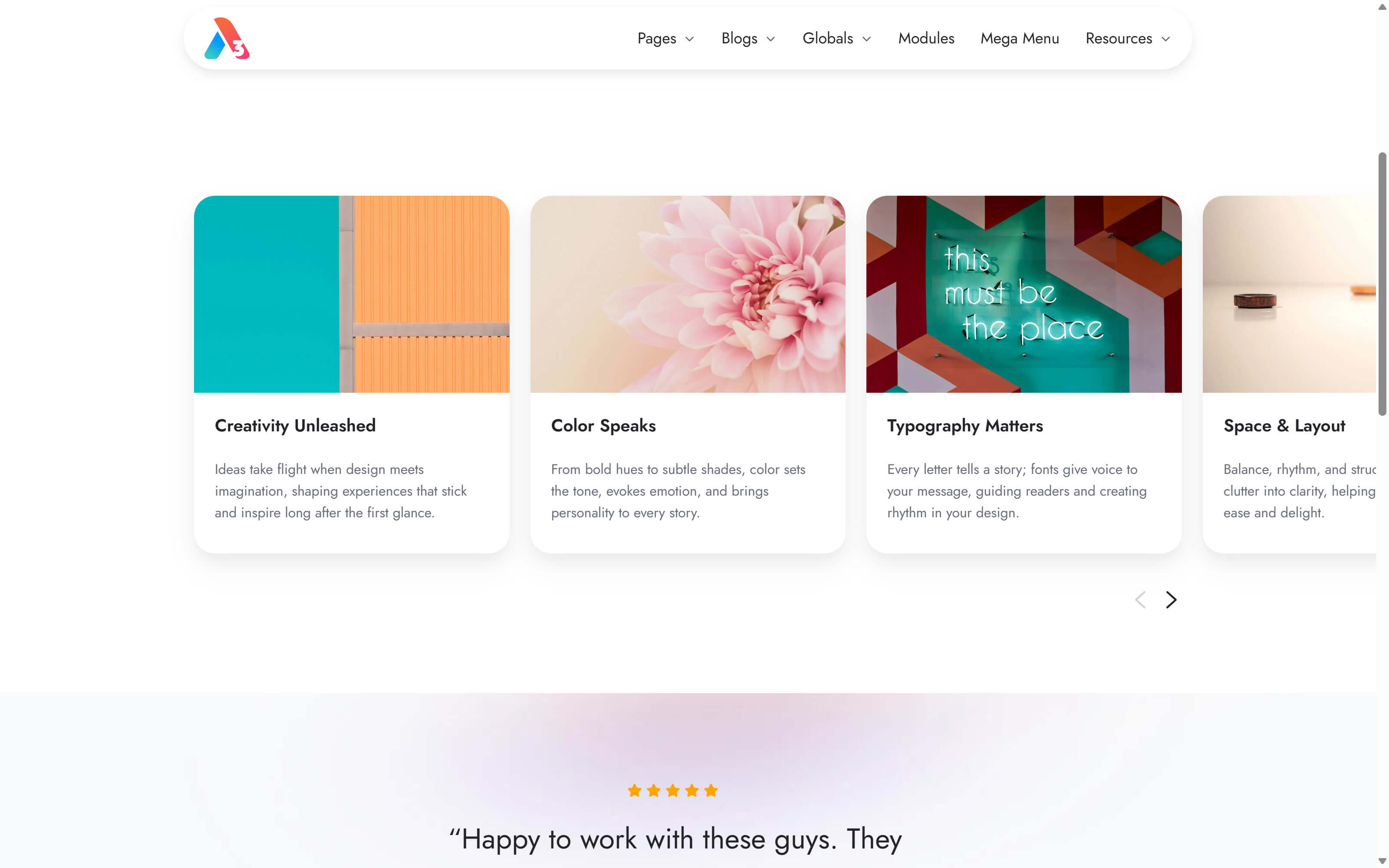
Content card slider
You can now enable a slider in your Content card module, specifically adapted for this type of content.
Remove the gap between columns
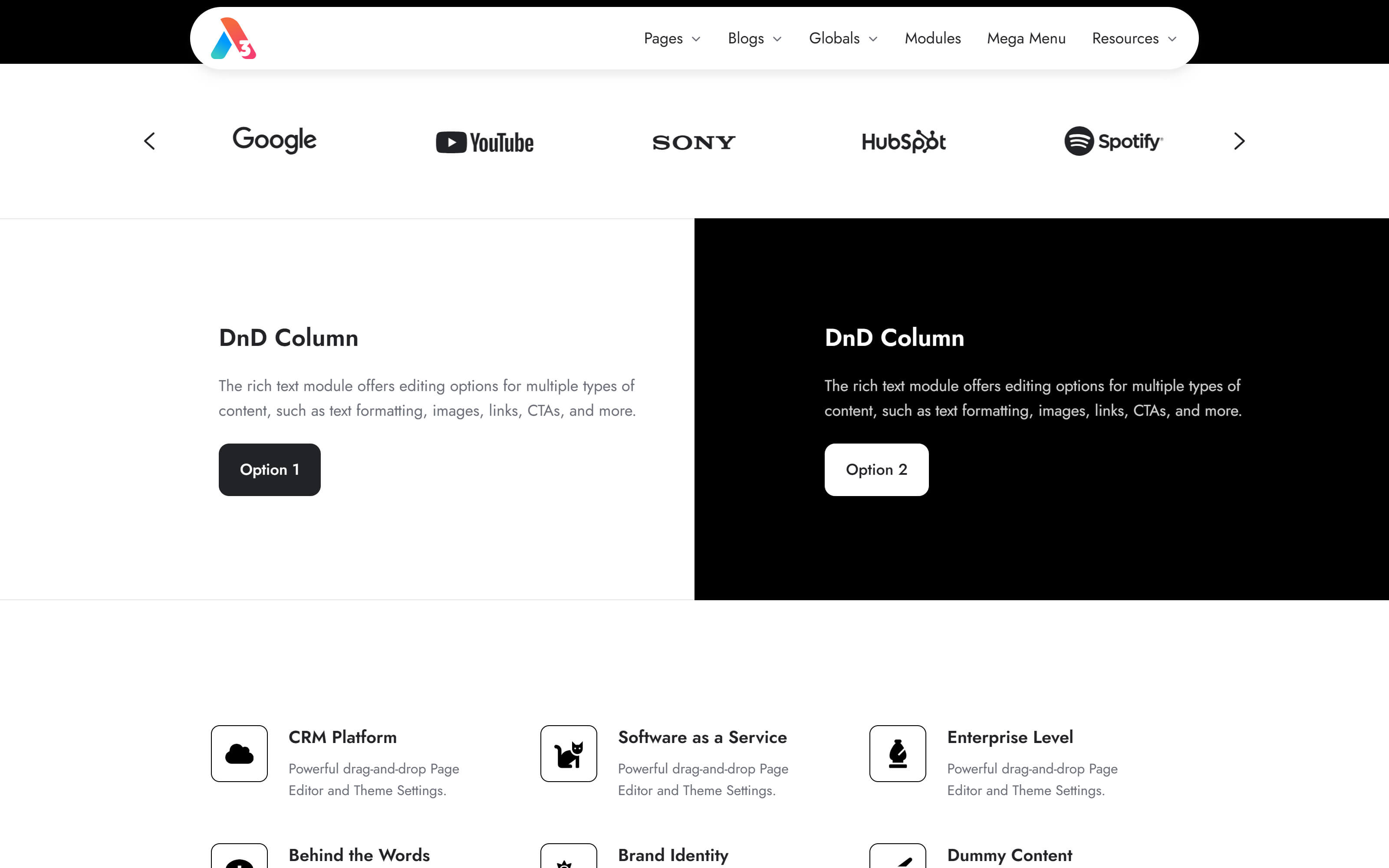
In the Section extra settings module, we added a Column gap option that lets you remove the default spacing between all columns in that section. See the live preview:
Header and footer custom background color
You can now choose a custom background color for your header and footer in the theme settings. This is especially useful with the Dark color scheme when you want a different background color than the default Dark gray.
Header and footer custom content width
You can now set a custom width for your header and footer content. If you don’t set a custom width, it will use the default Content width applied across all content sections, just like before.
`Below footer` drag-and-drop area
Added a `Below footer` drag-and-drop area to all footers, except Footer 13, which is already fully drag-and-drop. This can be handy for extra copyright notices or disclaimers.
Added a theme setting to Disable the sticky header on mobile devices.
You can now remove the Sticky header shadow.
Added a Vertically center icon and text option to the Quick features module.
Added the option to Disable active item styling for this column in the mega menu when the multi-items option is used.
Added a Custom class field to the Section extra settings module, which applies the class to the background element.
Fixed the jumpy header and extra spacing in previews and the editor when there was a hidden section included in the global header.
Fixed some validation errors in the page editor that were preventing content from being published, even though they were false positives.
Removed some no-longer-necessary prefixed CSS properties, as browser implementation has improved over time.
Correctly applied the color to the Horizontal Rule element as a border color instead of a background.
Added a few CSS variables for the layout elements, as part of an ongoing effort to prepare the theme for new options and future improvements.
Content card links now cover the icon area as well.
Removed the extra padding on the right side of the Review module.
The Drop-down component now correctly closes when the user clicks the drop-down again.
Refactored and improved the JS code that handles Content card 'collapse' and 'sync' functionalities.
Replaced the arrow links in the Features showcase module with actual button elements and added screen reader text options.
Included aria-label attributes for icons (buttons) in the Steps module.
Footer forms are no longer set to `Hide labels` by default, to avoid confusion and ensure they work perfectly with existing forms that don’t have placeholders. You can always enable the option later if your form needs to look that way.
Blog Listing 4 layout no longer renders image code in the editor before a featured image is selected.
Updated the Team member template to use the new X logo by default instead of the old Twitter icon.
Other minor improvements and fixes.
Files updated
- css\_base.css
- css\_button.css
- css\_form.css
- css\_layout.css
- css\components\accordion.css
- css\components\blog-card.css
- css\components\compact-card.css
- css\components\content-card.css
- css\components\cover-card.css
- css\components\feature-card.css
- css\components\features-showcase.css
- css\components\footer-01.css
- css\components\footer-02.css
- css\components\footer-03.css
- css\components\footer-04.css
- css\components\footer-05.css
- css\components\footer-06.css
- css\components\footer-07.css
- css\components\footer-08.css
- css\components\footer-09.css
- css\components\footer-10.css
- css\components\footer-11.css
- css\components\footer-12.css
- css\components\form-ghost.css
- css\components\go-card.css
- css\components\header-01.css
- css\components\header-02.css
- css\components\header-03.css
- css\components\header-04.css
- css\components\header-05.css
- css\components\header-06.css
- css\components\header-lp-01.css
- css\components\header-lp-02.css
- css\components\nav.css
- css\components\pricing.css
- css\components\quick-features.css
- css\components\review.css
- css\components\search-box.css
- css\components\section-extra-settings.css
- css\components\site-search.css
- css\components\splide-sneakpeek.css
- css\components\splide.css
- css\components\team-card.css
- css\main.css
- fields.json
- js\components\content-card.js
- js\components\drop-down.js
- js\components\nav.js
- js\components\splide.js
- js\main.js
- modules\accordion.module\fields.json
- modules\accordion.module\module.html
- modules\blog-card.module\fields.json
- modules\blog-card.module\module.html
- modules\column-navigation.module\fields.json
- modules\column-navigation.module\module.html
- modules\content-card.module\fields.json
- modules\content-card.module\module.html
- modules\feature-card.module\fields.json
- modules\feature-card.module\module.html
- modules\features-showcase.module\fields.json
- modules\features-showcase.module\module.html
- modules\form.module\fields.json
- modules\form.module\module.html
- modules\go-card.module\fields.json
- modules\go-card.module\module.html
- modules\heading.module\fields.json
- modules\heading.module\module.html
- modules\hero-slider.module\fields.json
- modules\hero-slider.module\module.html
- modules\icon.module\meta.json
- modules\image-box.module\module.html
- modules\lang-select.module\module.html
- modules\listing.module\fields.json
- modules\listing.module\module.html
- modules\mobile-nav.module\module.html
- modules\modal.module\fields.json
- modules\modal.module\module.html
- modules\multi-address.module\fields.json
- modules\nav.module\fields.json
- modules\nav.module\module.html
- modules\quick-features.module\fields.json
- modules\quick-features.module\module.html
- modules\quote.module\module.html
- modules\section-extra-settings.module\fields.json
- modules\section-extra-settings.module\module.html
- modules\section-intro.module\fields.json
- modules\section-intro.module\module.html
- modules\shifter.module\fields.json
- modules\shifter.module\module.html
- modules\site-search.module\module.html
- modules\steps.module\module.html
- partials\footer-01.html
- partials\footer-02.html
- partials\footer-03.html
- partials\footer-04.html
- partials\footer-05.html
- partials\footer-06.html
- partials\footer-07.html
- partials\footer-08.html
- partials\footer-09.html
- partials\footer-10.html
- partials\footer-11.html
- partials\footer-12.html
- partials\header-01.html
- partials\header-02.html
- partials\header-03.html
- partials\header-04.html
- partials\header-05.html
- partials\header-06.html
- partials\header-lp-01.html
- partials\header-lp-02.html
- sections\card-nav.html
- sections\cta.html
- sections\feature-cards.html
- sections\features-showcase-nav-left.html
- sections\features-showcase-nav-right.html
- sections\full-screen-hero-slider.html
- sections\image-left-text-right.html
- sections\image-right-text-left.html
- sections\proof-of-success.html
- templates\_base.html
- templates\about.html
- templates\blank.html
- templates\blog-post.html
- templates\case-study.html
- templates\contact-1.html
- templates\contact-2.html
- templates\contact-3.html
- templates\customers.html
- templates\email-subscription-confirmation.html
- templates\email-subscription-preferences.html
- templates\email-subscription-unsubscribe-backup.html
- templates\faqs.html
- templates\gallery.html
- templates\home-1.html
- templates\home-2.html
- templates\home-3.html
- templates\home-4.html
- templates\home-5.html
- templates\home-6.html
- templates\lp-download.html
- templates\lp-get-a-quote.html
- templates\lp-register.html
- templates\lp-thank-you.html
- templates\membership-access-denied.html
- templates\membership-create-new-password.html
- templates\membership-registration.html
- templates\membership-request-password-reset.html
- templates\membership-sign-in.html
- templates\membership-sign-out.html
- templates\partners.html
- templates\pillar.html
- templates\portfolio.html
- templates\pricing.html
- templates\product.html
- templates\quick-promo.html
- templates\resources.html
- templates\services.html
- templates\success-stories.html
- templates\system-404-error.html
- templates\system-500-error.html
- templates\system-password-prompt.html
- templates\system-search-results.html
- templates\team-member.html
- theme.json
Files added
- css\_css-var.css
- css\components\form-v4-dark.css
- css\components\form-v4-ghost.css
- css\components\form-v4.css
- css\components\one-field-form-v4.css
- images\module-icons\general.svg
- js\components\typed.js
- partials\footer-13.html
- partials\skip-to-content.html
Version 41
Jun 12, 2025
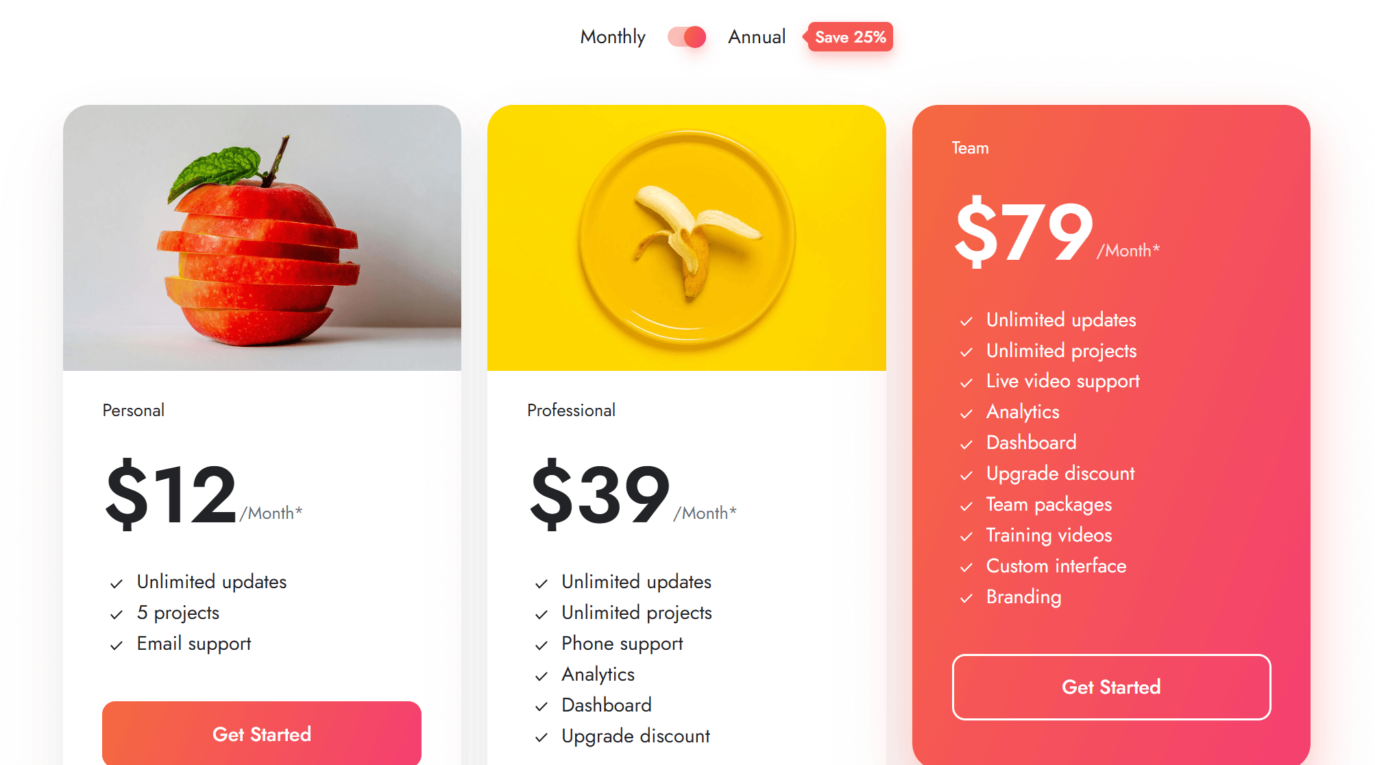
You can now add an image to your Pricing plan:
Added new options to the Site search module to display featured images and show short descriptions (based on the meta description) in your search results:
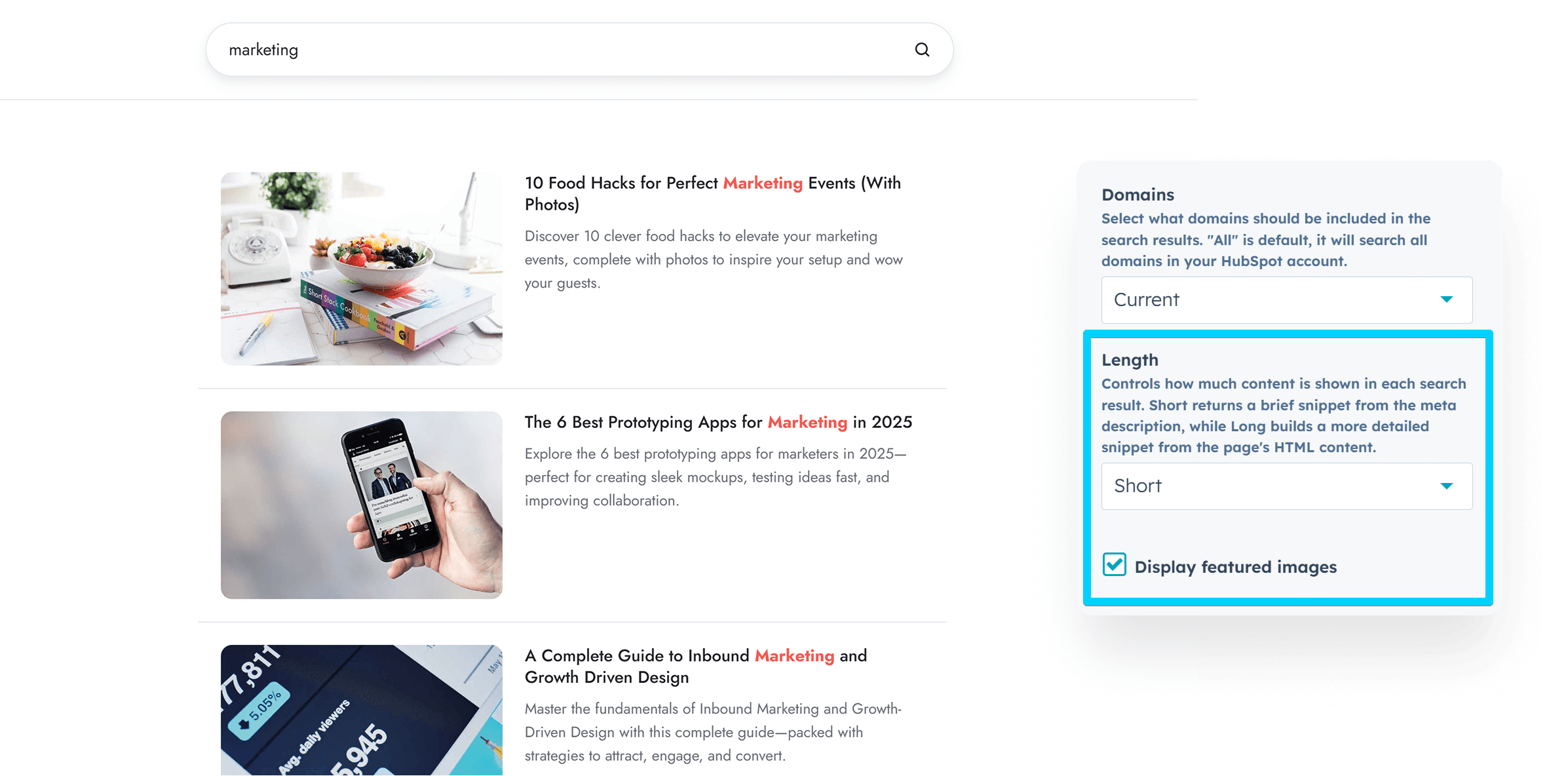
We also removed the extra space on the right side of the search result and lifted the maximum title width to better accommodate titles of any length. This change was also applied to the blog search.
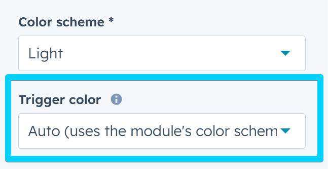
You can now choose a different color scheme for the trigger icon in the header that opens the Site search and Mobile navigation. This is useful if you want the icon to match your header's color scheme, while the window it opens uses a different one. For example, you might want the mobile menu icon to stay light, but have the actual mobile menu appear in a dark color scheme.
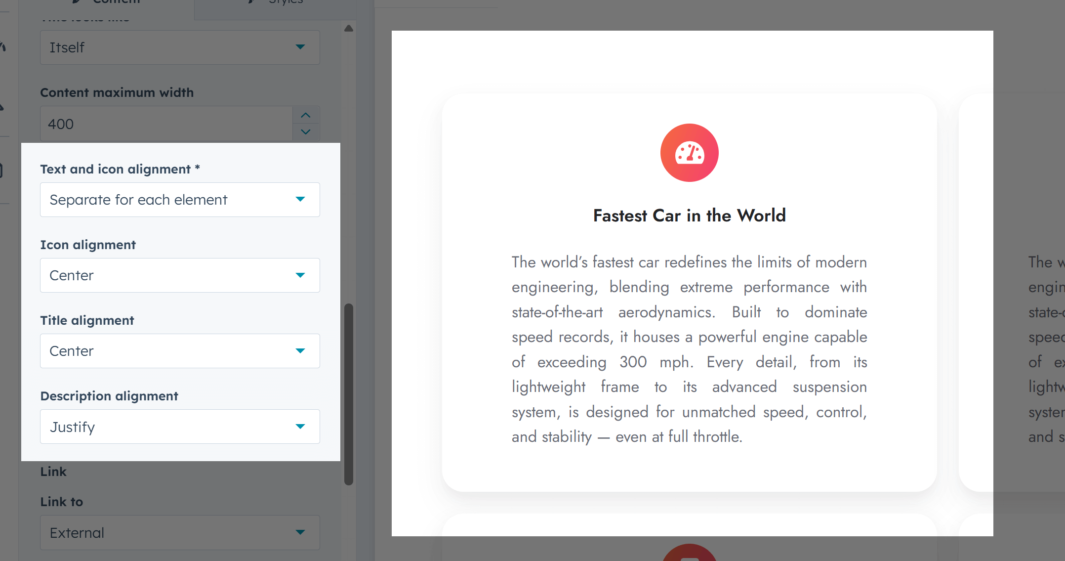
Added a new option to the Feature card module, allowing you to align the icon, title, and description separately:
Added a few new options to the mega menu: the ability to Remove column spacing (at the top/bottom of each column; useful for single-row layouts where you want to eliminate extra space at the bottom of the mega menu), set Custom padding for the mega flyout, and adjust the Separator spacing:

Added the Variable height slider option to the Quote and Review modules. It lets the slider adjust its height based on the current slide's content. Works only with 1-column sliders when Autoplay is off, as height changes during transitions are bad for user experience. Ignored when Sneak peek is on.

Added the Center content vertically option to the Review module.
Fixed an issue where background images failed to load if the file name contained parentheses.
Encoded Sharing titles to prevent broken links on X when special characters (such as |) are used in the page title.
Files updated
- css\components\blog-search.css
- css\components\mobile-nav.css
- css\components\nav.css
- css\components\pricing.css
- css\components\review.css
- css\components\site-search.css
- css\components\splide.css
- js\components\site-search.js
- modules\cover-card.module\module.html
- modules\feature-card.module\fields.json
- modules\feature-card.module\module.html
- modules\hero-slider.module\module.html
- modules\listing.module\module.html
- modules\mobile-nav.module\fields.json
- modules\mobile-nav.module\module.html
- modules\nav.module\fields.json
- modules\nav.module\module.html
- modules\pricing.module\fields.json
- modules\pricing.module\module.html
- modules\quote.module\fields.json
- modules\quote.module\module.html
- modules\review.module\fields.json
- modules\review.module\module.html
- modules\section-extra-settings.module\module.html
- modules\sharing.module\module.html
- modules\site-search.module\fields.json
- modules\site-search.module\module.html
- templates\blog-listing.html
- templates\blog-post.html
Version 40
May 13, 2025
Added checkboxes to toggle the X, Facebook, and LinkedIn icons in the Blog configuration module › Social sharing, when Act3's Default sharing widget option is selected.
![]()
Resolved some text color issues when using the Dark color scheme for the Mobile navigation module.
Fixed a problem with the new double-field phone number input with a country code dropdown, where the hs-input class is applied to a div element, causing it to inherit input-specific styling (e.g., box-shadow).
Addressed a Safari bug where form fields and 'Feature card' icons with 'ghost' styling appeared plain white when placed in a box that also used the 'ghost' styling. We disabled the backdrop-filter for these elements in Safari.
Corrected a couple of minor errors in Footer 9 that caused a title not to switch automatically to the dark color scheme when configuring the theme for the first time, as well as an issue with the font size of the copyright and links.
Files updated
- css\_form.css
- css\components\contact-box.css
- css\components\feature-card.css
- css\components\form-ghost.css
- css\components\form.css
- js\main.js
- modules\blog-config.module\fields.json
- modules\mobile-nav.module\module.html
- partials\footer-09.html
- templates\blog-post.html
Version 39
May 7, 2025
Quick update to change the template type for the Membership access denied and Membership sign out templates to reflect a recent change in HubSpot where these are no longer available under the Private Content settings.
Intentional or not on HubSpot's side, these templates are now selectable only if set as regular website page templates. Because of that, unfortunately, they will also appear as options when creating new pages. These templates are not meant for that, so please avoid using them to build new pages.
We hope HubSpot acknowledges this issue and deploys a fix so we can adjust them back for a proper user experience.
Files updated
- templates\membership-access-denied.html
- templates\membership-sign-out.html
Version 38
Apr 15, 2025
Updated the regex validation for custom class fields in all modules to prevent issues when using some special characters.
Fixed word-breaking issues with certain languages in the Language selector module.
Added a two-column layout option for small screens in the Content card module.
Files updated
- css\components\lang-select.css
- modules\accordion.module\fields.json
- modules\blog-card.module\fields.json
- modules\box-over-image.module\fields.json
- modules\button.module\fields.json
- modules\column-navigation.module\fields.json
- modules\compact-card.module\fields.json
- modules\comparison-table.module\fields.json
- modules\contact-box.module\fields.json
- modules\content-card.module\fields.json
- modules\content-card.module\module.html
- modules\cover-card.module\fields.json
- modules\feature-card.module\fields.json
- modules\features-showcase.module\fields.json
- modules\form.module\fields.json
- modules\gallery.module\fields.json
- modules\go-card.module\fields.json
- modules\heading.module\fields.json
- modules\hero-slider.module\fields.json
- modules\icon.module\fields.json
- modules\image-box.module\fields.json
- modules\image-plus-text.module\fields.json
- modules\image.module\fields.json
- modules\lang-select.module\fields.json
- modules\listing.module\fields.json
- modules\logos.module\fields.json
- modules\mobile-nav.module\fields.json
- modules\modal.module\fields.json
- modules\multi-address.module\fields.json
- modules\nav.module\fields.json
- modules\numbers.module\fields.json
- modules\pricing.module\fields.json
- modules\properties.module\fields.json
- modules\quick-action.module\fields.json
- modules\quick-features.module\fields.json
- modules\quote.module\fields.json
- modules\review.module\fields.json
- modules\rich-text.module\fields.json
- modules\scroll-to.module\fields.json
- modules\section-intro.module\fields.json
- modules\sharing.module\fields.json
- modules\shifter.module\fields.json
- modules\side-menu.module\fields.json
- modules\site-search.module\fields.json
- modules\steps.module\fields.json
- modules\tabs.module\fields.json
- modules\team-card.module\fields.json
- modules\timeline.module\fields.json
- modules\video.module\fields.json
Version 37
Mar 27, 2025
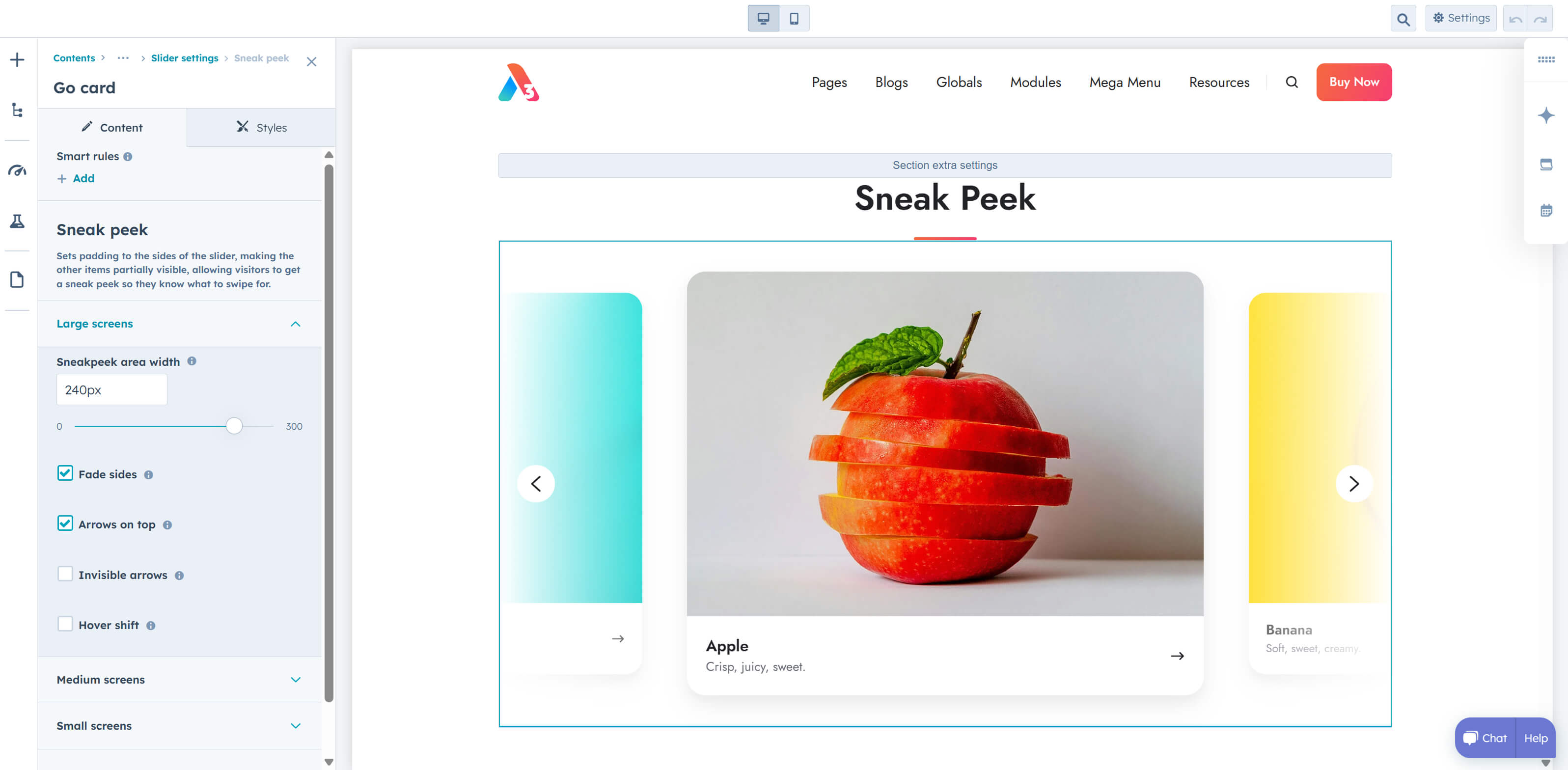
Added Sneak peek options to the Go card, Hero slider, Compact card, Quote, Image box, Review, and Team card modules. The Hero slider needs to have Animation set to Slide mode for the sneak peek feature to be available. Live preview
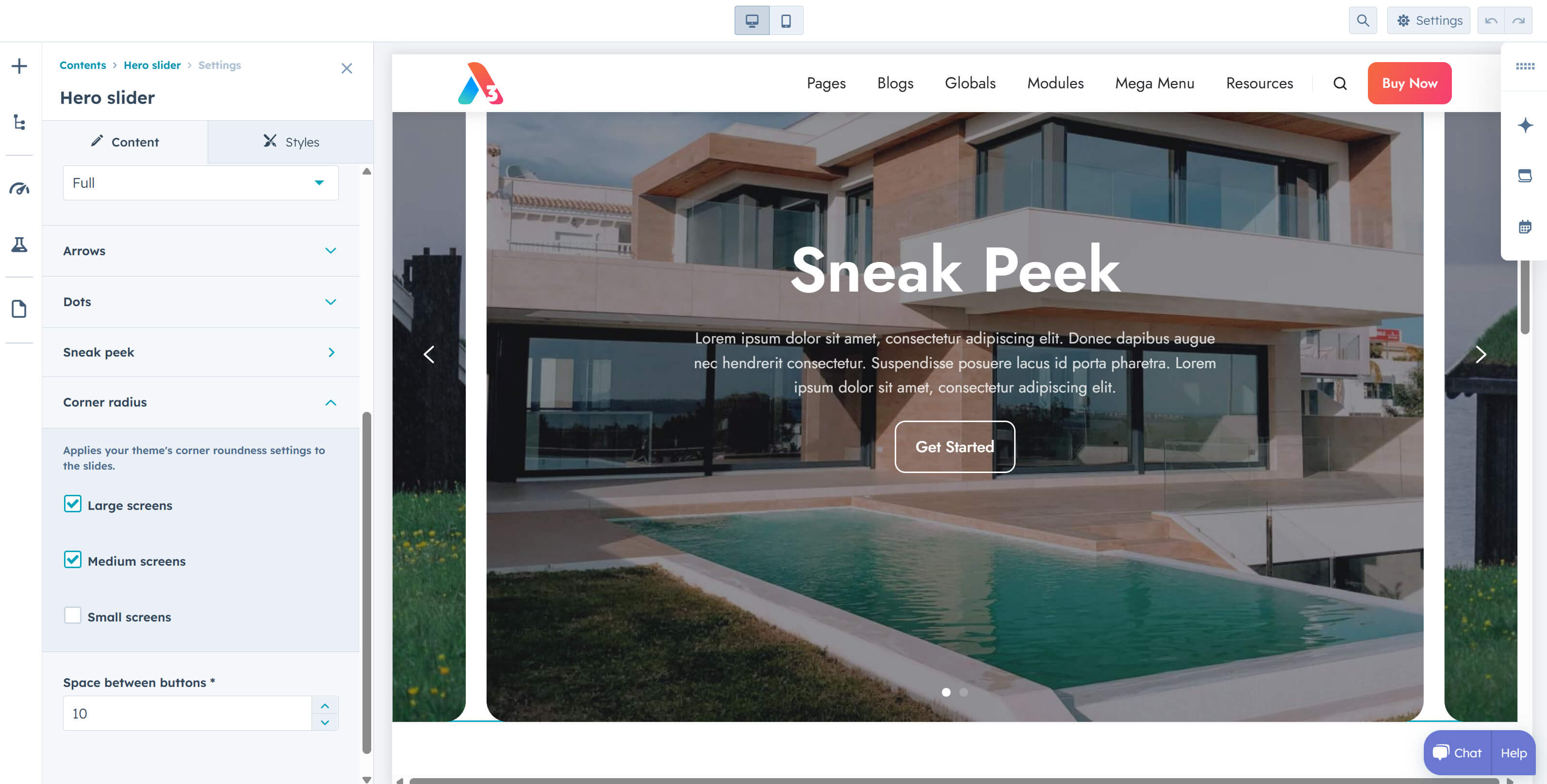
The Hero slider also includes a Gutter option with the sneak peek and now supports Corner radius options, which apply your theme's corner roundness settings to the slides. It is recommended to enable this on your Hero slider only if both the Sneak peek and Gutter options are enabled. Live preview
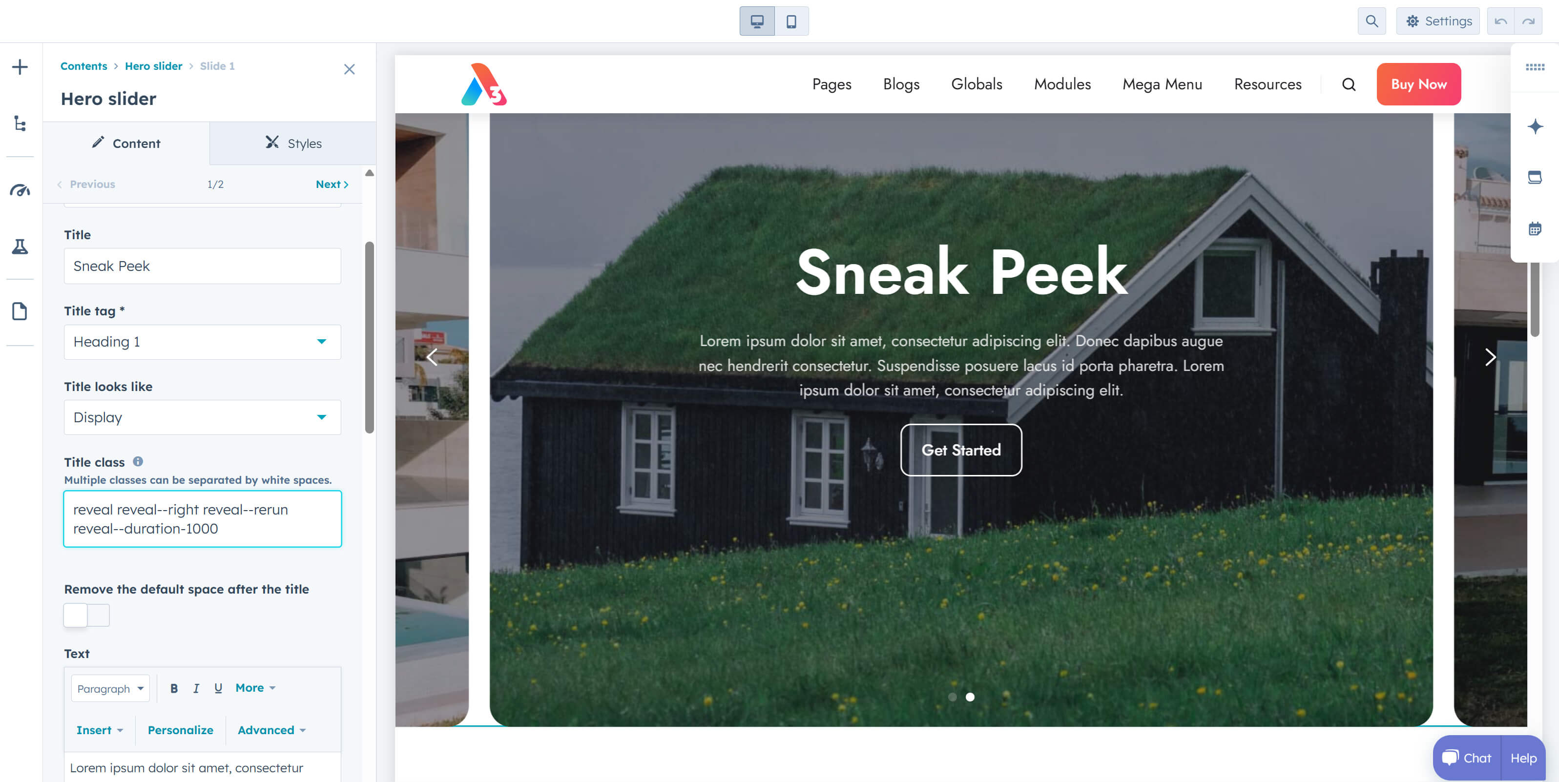
The Hero slider now supports adding classes to slide titles and text, allowing you to use Reveal classes to animate this content. Live preview
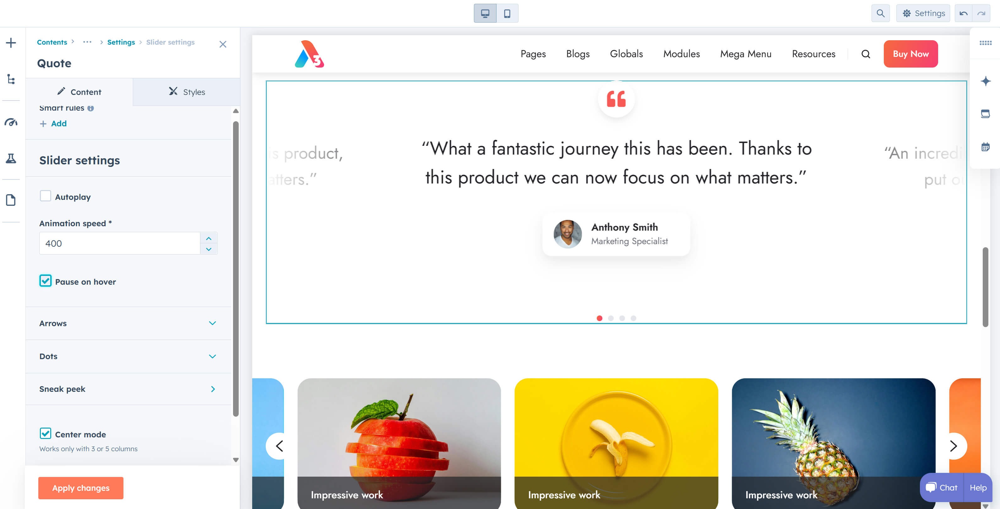
Pause on hover is now optional on all sliders.
You can now display the Meta description as the post summary on your blog or in the Blog card module.
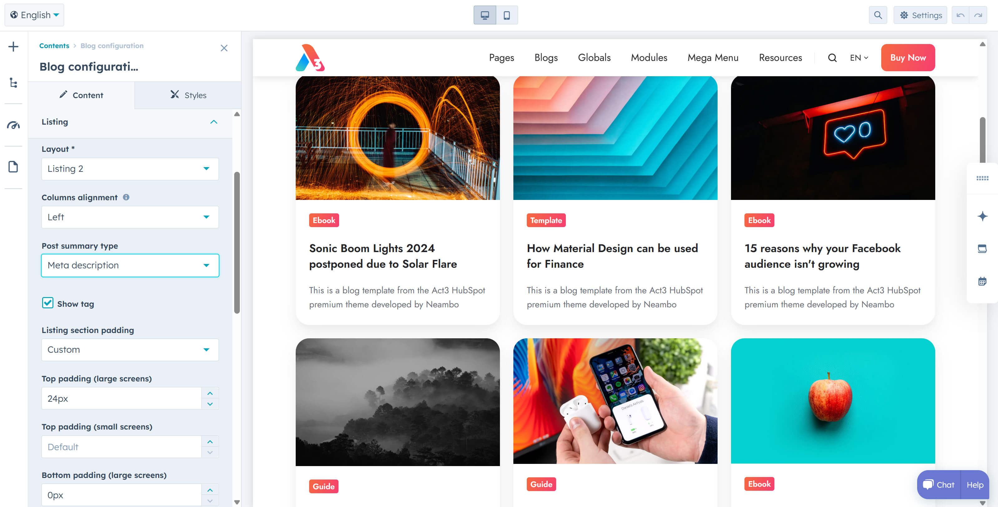
Author, Read time, Date, and Tags can now be visually removed from your blog. HubSpot still generates this data and pages, so be sure to use your robots.txt file to prevent author and tag pages from appearing in search results if that's what you want. This gives you the flexibility to transform a HubSpot blog into something beyond a traditional blog—whether it's a resource hub, a case studies library, or any other content-driven section where blog-specific details aren't needed. Or, if you prefer a cleaner, distraction-free blog. Here is an example.
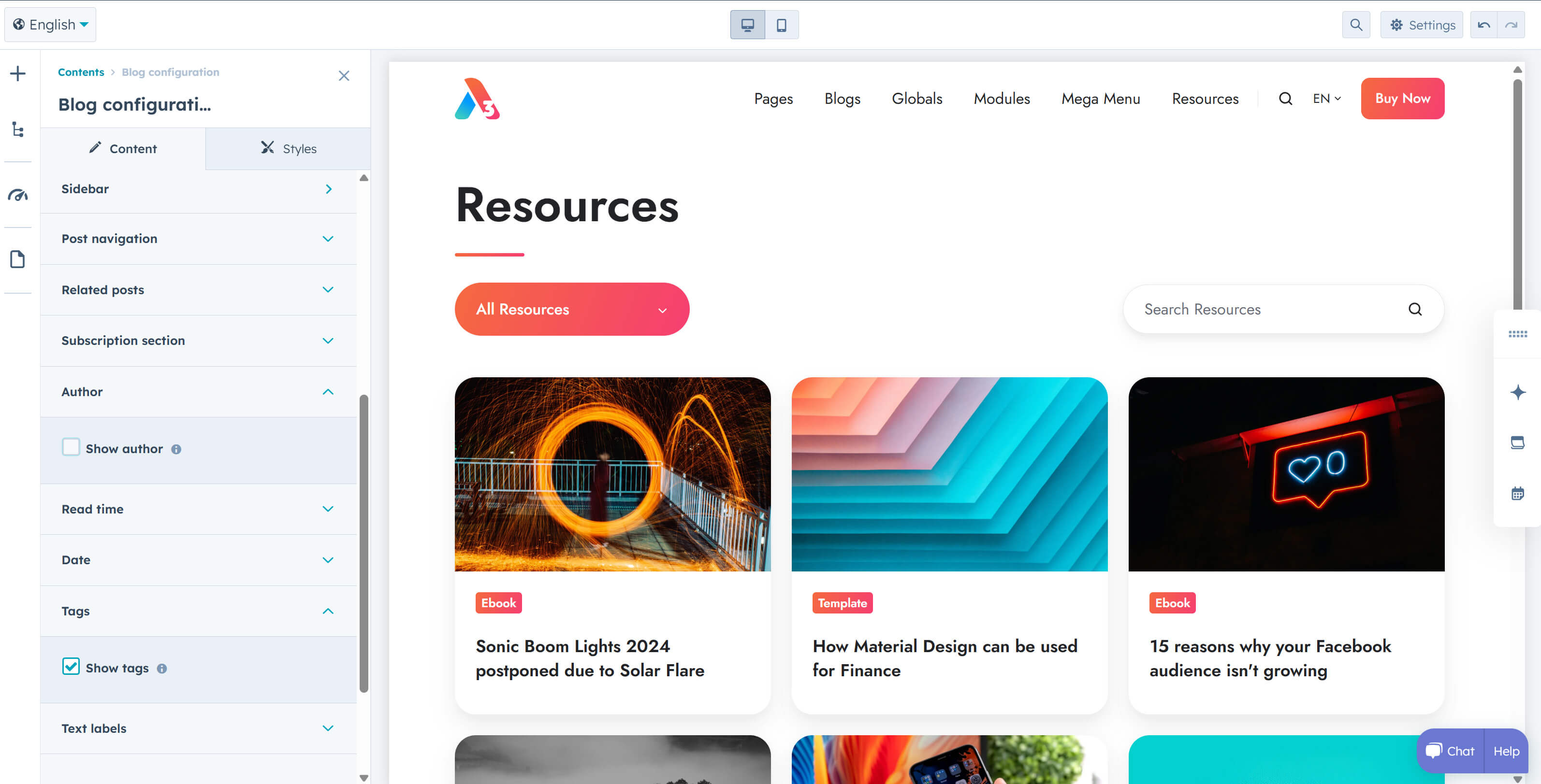
Building on the above idea, we've added more blog options to adjust the top and bottom padding for most blog sections. The Homepage hero > Drag and Drop area can now be displayed on all listing pages, and the Toolbar now includes options to change the color scheme and set a custom background color. Additionally, the Classic pagination can now be aligned, and on Listing 2, you can choose how to align cards when the last row isn't full (left, center, or right). Live example
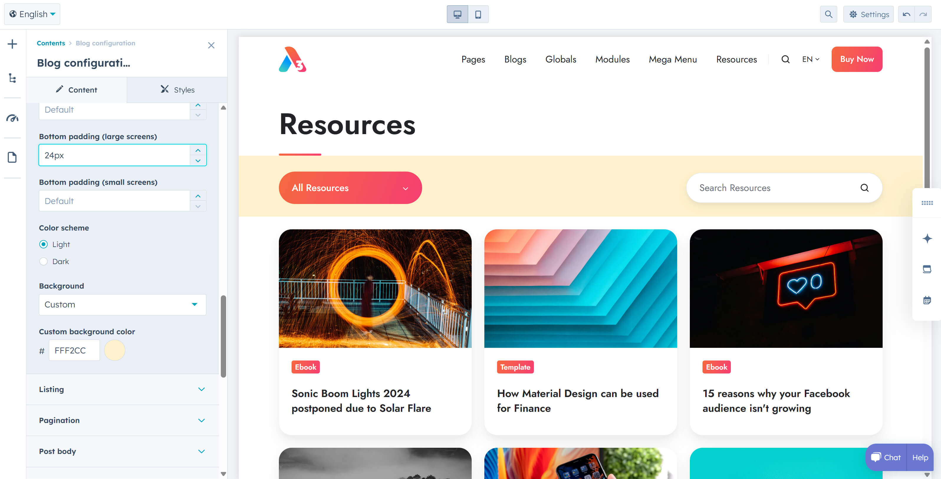
You can now hide the date on the Blog card module.
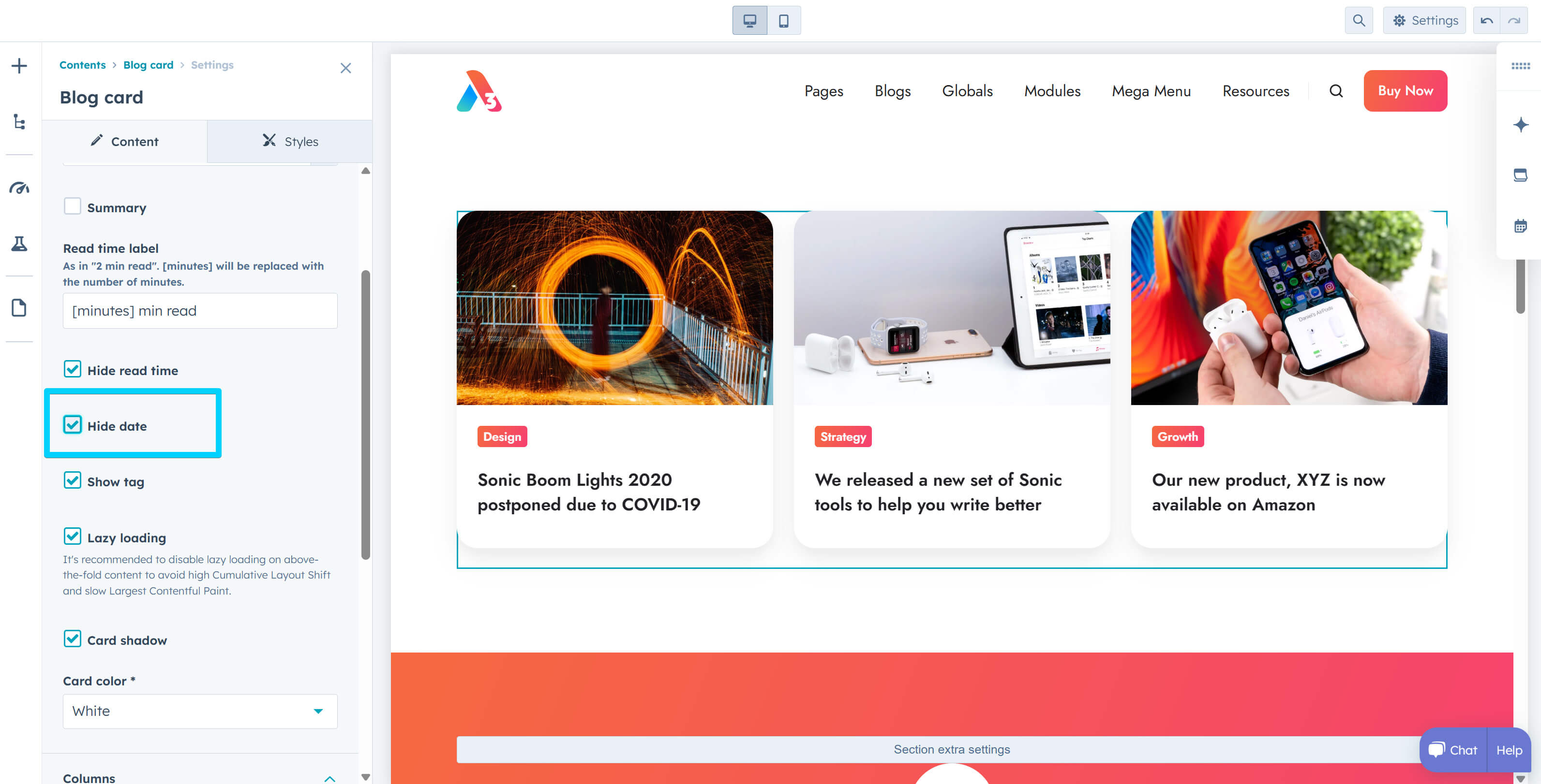
Added Dark color scheme options to the Content card and Rich text in the Listing module. You can now also change the Toolbar color.
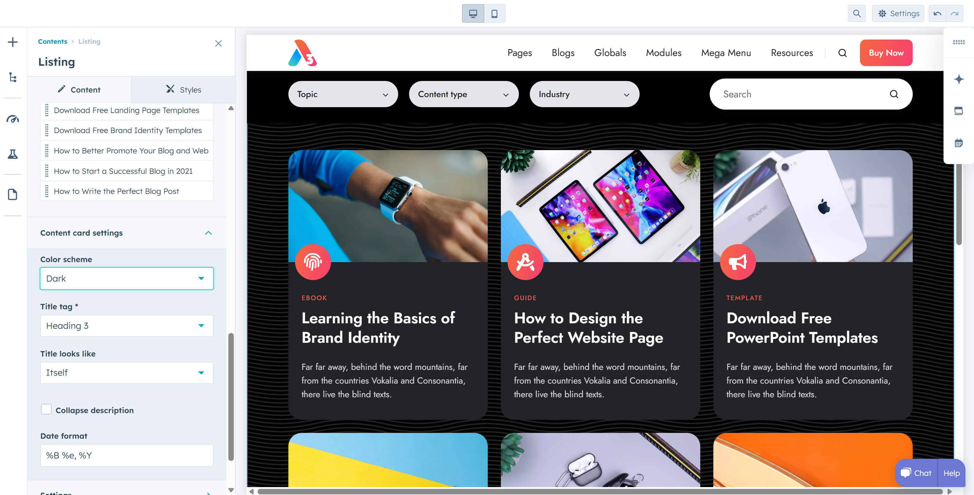
Added a Variable height option to the Features showcase and Shifter modules. This option adjusts the module's height based on the active content item. It's especially useful when one item is significantly taller than the others, which would otherwise create excessive white space above and below. If the height difference isn't extreme, keeping a consistent module height is recommended for a smoother user experience.
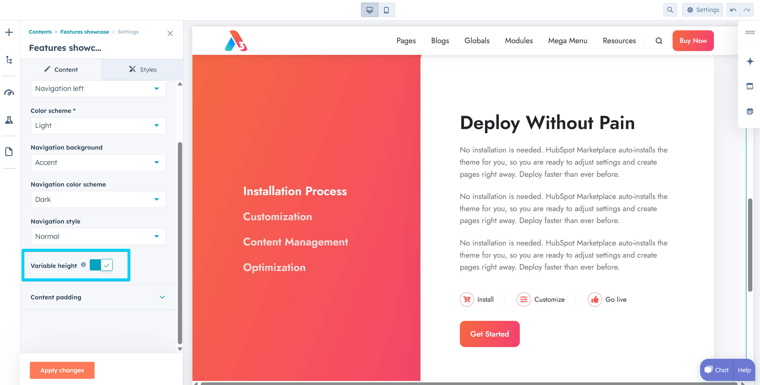
On the Features showcase, we've also added Content padding options for both top and bottom on large and small screens. When making changes, be sure to add enough bottom padding to prevent the dots and arrow navigation from overlapping your content.
Added data-nosnippet to Blog card and Content card (including in Listing) to prevent Google from interpreting the displayed date as the page's publication date.
Updated the X URL in the Sharing module to replace the old Twitter domain.
The blog author line no longer breaks onto a new line on small screens unless there isn't enough space.
Fixed an issue in Safari where the first Contact box column displayed white icons instead of the intended ghost styling effect. This bug occurred only when both the box and its icons used ghost styling, affecting just the initial column in the multi-column module (subsequent columns rendered correctly). This is likely a Safari bug when an element with backdrop-filter: blur() is nested inside another element with the same property. We disabled this effect on the icons, as it's not noticeable when the box already has blur.
Files updated
- css\components\blog-card.css
- css\components\blog-infobar.css
- css\components\blog-pagination.css
- css\components\contact-box.css
- css\components\features-showcase.css
- css\components\hero-slider.css
- css\components\listing-rich-text.css
- css\components\shifter.css
- js\components\splide.js
- modules\blog-card.module\fields.json
- modules\blog-card.module\module.html
- modules\blog-config.module\fields.json
- modules\compact-card.module\fields.json
- modules\compact-card.module\module.html
- modules\content-card.module\module.html
- modules\features-showcase.module\fields.json
- modules\features-showcase.module\module.html
- modules\gallery.module\fields.json
- modules\gallery.module\module.html
- modules\go-card.module\fields.json
- modules\go-card.module\module.html
- modules\hero-slider.module\fields.json
- modules\hero-slider.module\module.html
- modules\image-box.module\fields.json
- modules\image-box.module\module.html
- modules\listing.module\fields.json
- modules\listing.module\module.html
- modules\logos.module\fields.json
- modules\logos.module\module.html
- modules\quote.module\fields.json
- modules\quote.module\module.html
- modules\review.module\fields.json
- modules\review.module\module.html
- modules\sharing.module\module.html
- modules\shifter.module\fields.json
- modules\shifter.module\module.html
- modules\team-card.module\fields.json
- modules\team-card.module\module.html
- partials\blog-listing-1.html
- partials\blog-listing-2.html
- partials\blog-listing-3.html
- partials\blog-listing-4.html
- templates\blog-listing.html
- templates\blog-post.html
Files added
- css\components\splide-sneakpeek.css
Version 36
Jan 21, 2025
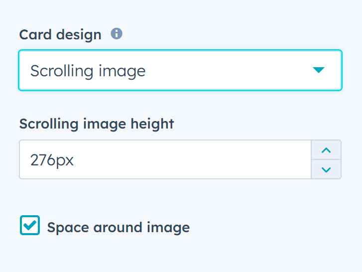
Added Scrolling image and Space around image options to the Go card module and introduced the Go card type to the Listing module. Live preview
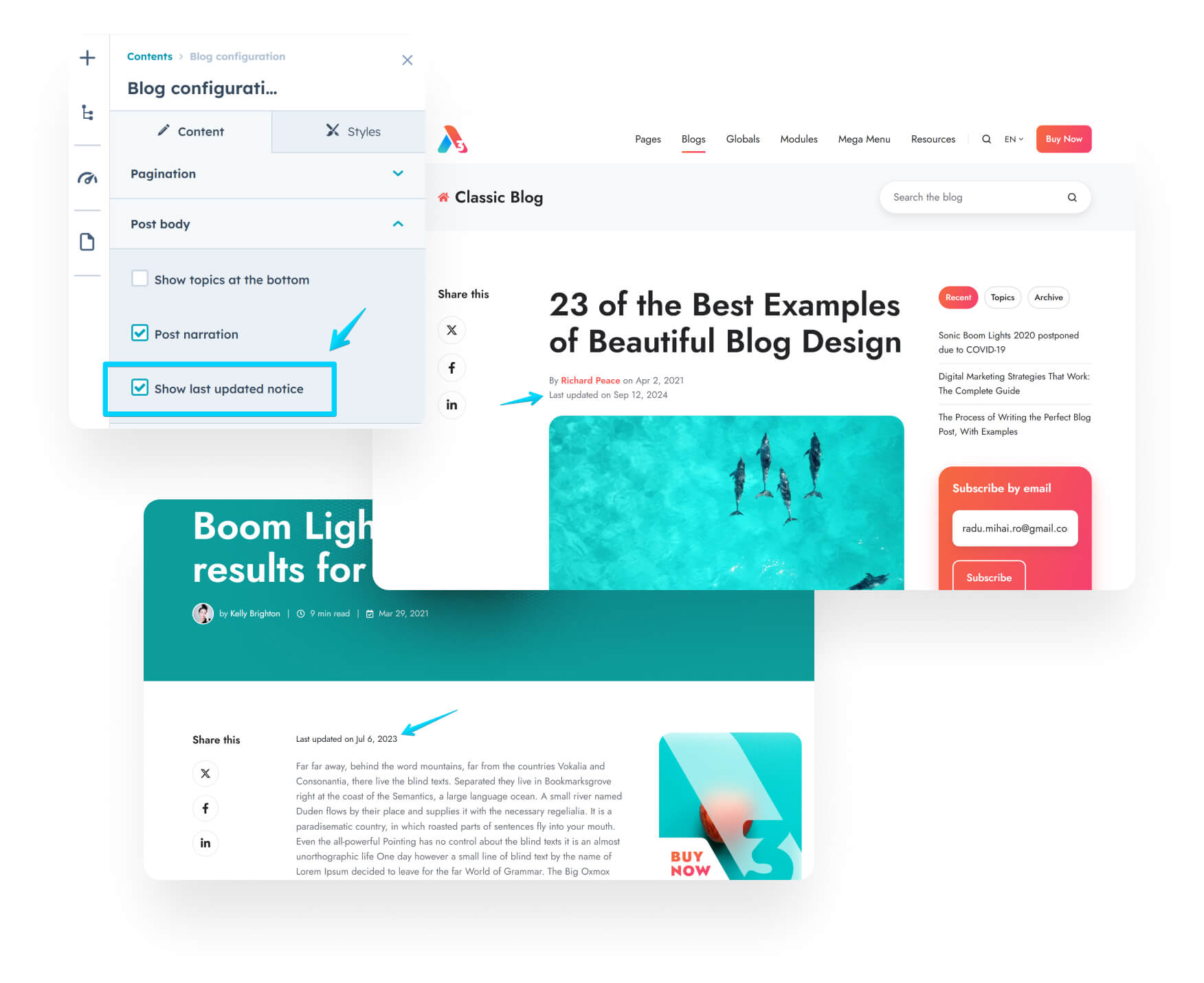
Added an option to display a 'last updated' notice on blog posts, which can be enabled in the Blog configuration.
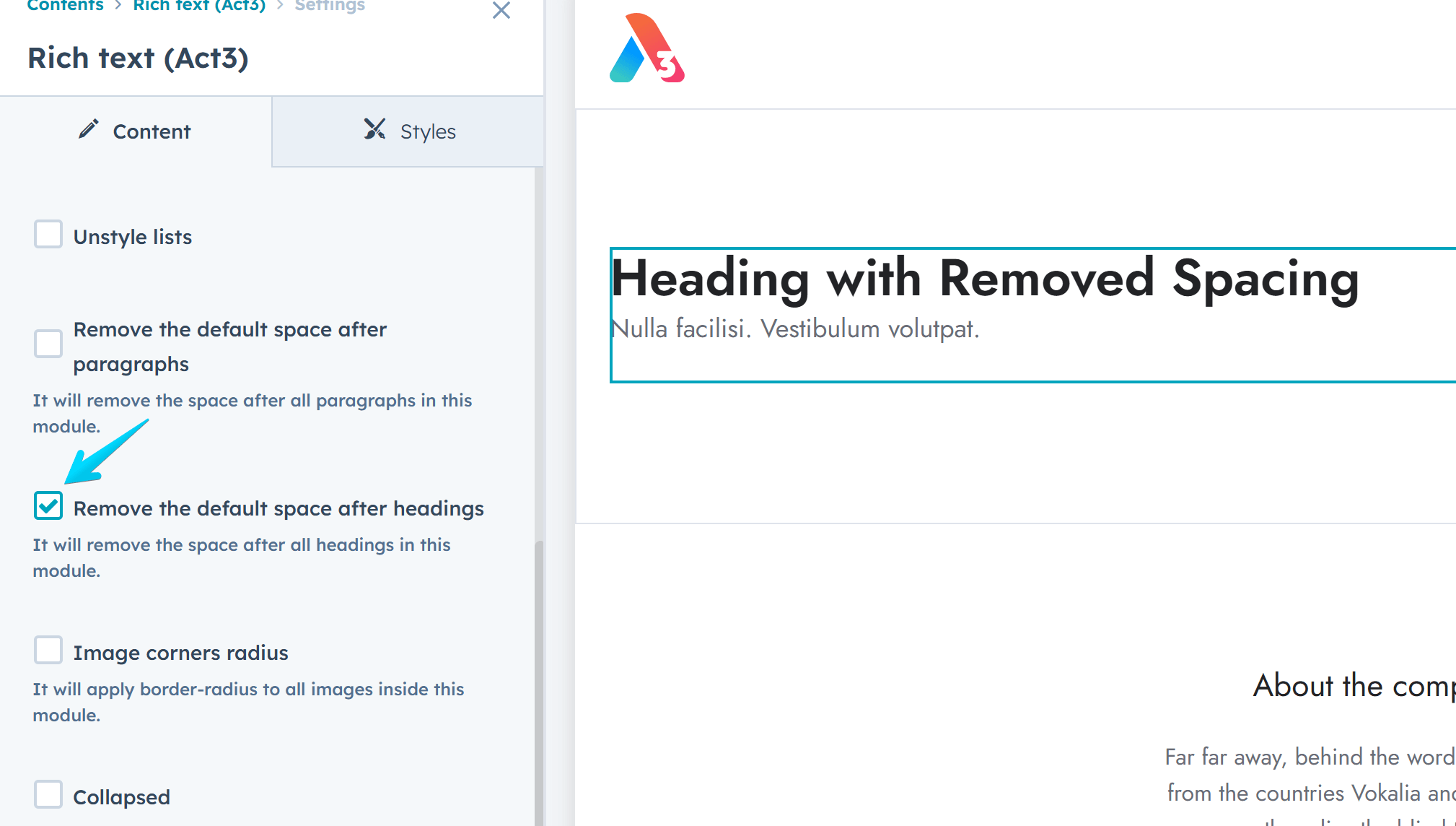
Included the option to remove the default spacing after headings in the Rich text module.
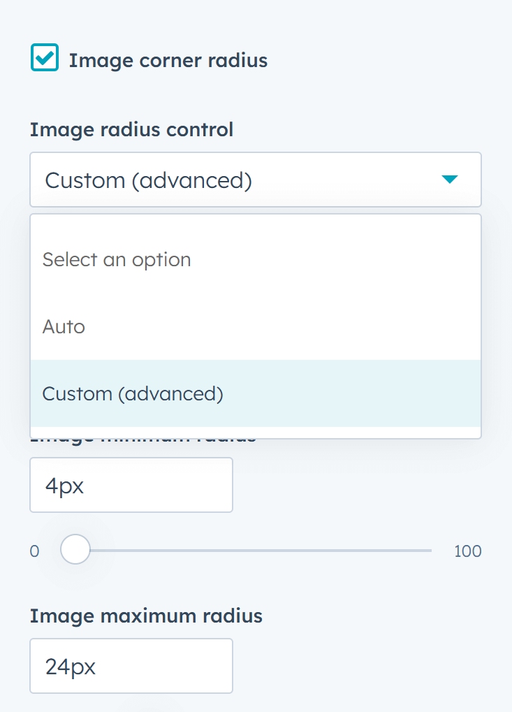
Added advanced custom image radius control to the Image module, allowing the corner roundness to scale proportionally with the viewport width.
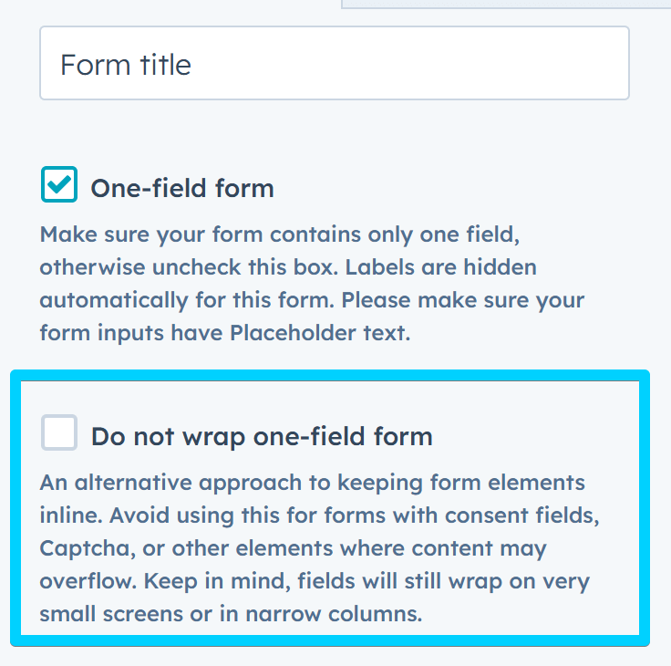
Introduced an alternative method for keeping the one-field form and button inline, as the previous default solution may break the line in some cases. Please do not use this if your form includes other elements (consent, captcha, etc).
Added the option to display 4 columns on large screens in the Content card module.
Fixed an issue with the Features showcase module, where long words caused the navigation to go behind the box. Use the Word breaking option in the theme settings if your language includes long words that impact the layout.
Excluded Global modals from appearing in site search results.
Fixed an issue with the mega menu where the Aside > None option didn't actually remove the column.
Made it possible to translate the error message: "There was a problem loading the page. Try using the same link from a more recent email, or contact the company to update your subscription preferences." on the email-subscription-unsubscribe-backup.html system page template.
Changed the labels of the system page templates introduced in Version 35 to distinguish them from older versions, if present.
Added system page translations for nl-be and fr-be.
Files updated
- css\_base.css
- css\_layout.css
- css\components\features-showcase.css
- css\components\go-card.css
- css\components\one-field-form.css
- js\main.js
- modules\blog-config.module\fields.json
- modules\content-card.module\fields.json
- modules\form.module\fields.json
- modules\form.module\module.html
- modules\go-card.module\fields.json
- modules\go-card.module\module.html
- modules\image.module\fields.json
- modules\image.module\module.html
- modules\listing.module\fields.json
- modules\listing.module\module.html
- modules\nav.module\module.html
- modules\rich-text.module\fields.json
- modules\rich-text.module\module.html
- partials\modals.html
- templates\_locales\da\messages.json
- templates\_locales\de\messages.json
- templates\_locales\en\messages.json
- templates\_locales\es\messages.json
- templates\_locales\fi\messages.json
- templates\_locales\fr\messages.json
- templates\_locales\hu\messages.json
- templates\_locales\it\messages.json
- templates\_locales\ja\messages.json
- templates\_locales\nl\messages.json
- templates\_locales\no\messages.json
- templates\_locales\pl\messages.json
- templates\_locales\pt\messages.json
- templates\_locales\ro\messages.json
- templates\_locales\sv\messages.json
- templates\blog-post.html
- templates\email-subscription-confirmation.html
- templates\email-subscription-preferences.html
- templates\email-subscription-unsubscribe-backup.html
- templates\membership-access-denied.html
- templates\membership-create-new-password.html
- templates\membership-registration.html
- templates\membership-request-password-reset.html
- templates\membership-sign-in.html
- templates\membership-sign-out.html
- templates\system-404-error.html
- templates\system-500-error.html
- templates\system-password-prompt.html
- templates\system-search-results.html
Files added
- templates\_locales\nl_be\messages.json
- templates\_locales\fr_be\messages.json
Version 35
October 8, 2024
Exciting updates! This release introduces several powerful new features: membership templates, the all-new 'Theme corners' and 'Wrap-up' reusable sections, stunning parallax effects, dynamic scrolling animations, a couple of new templates to demonstrate the new features, and much more. Read on to explore the details!
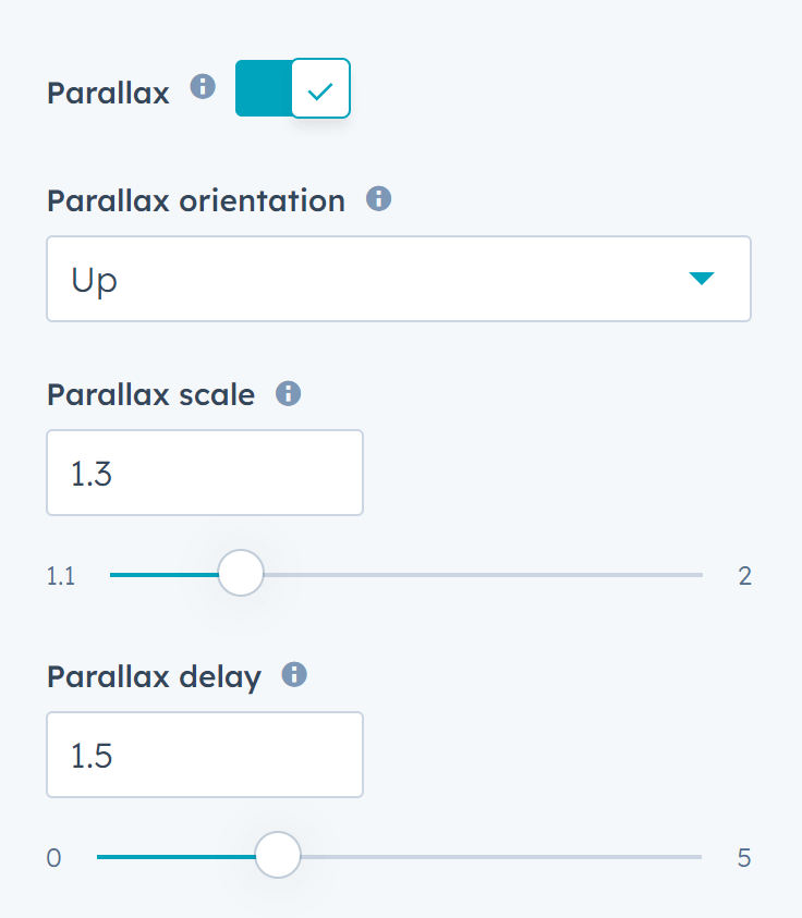
Added parallax options to the background image in the Section extra settings module. View live preview.
Implemented scrolling animations that can be applied to any element with a class option using reveal classes. View the live preview and read this article on how to apply them. Watch YouTube
Added a new reusable section: Theme corners. The drag and drop columns and rows in this section automatically inherit the corner radius settings from your Theme Settings › Corners › Global radius. You can add and modify this section whenever your design requires rounded corners for DnD columns or rows, as long as round corners are enabled in your theme settings. Live preview | Watch YouTube
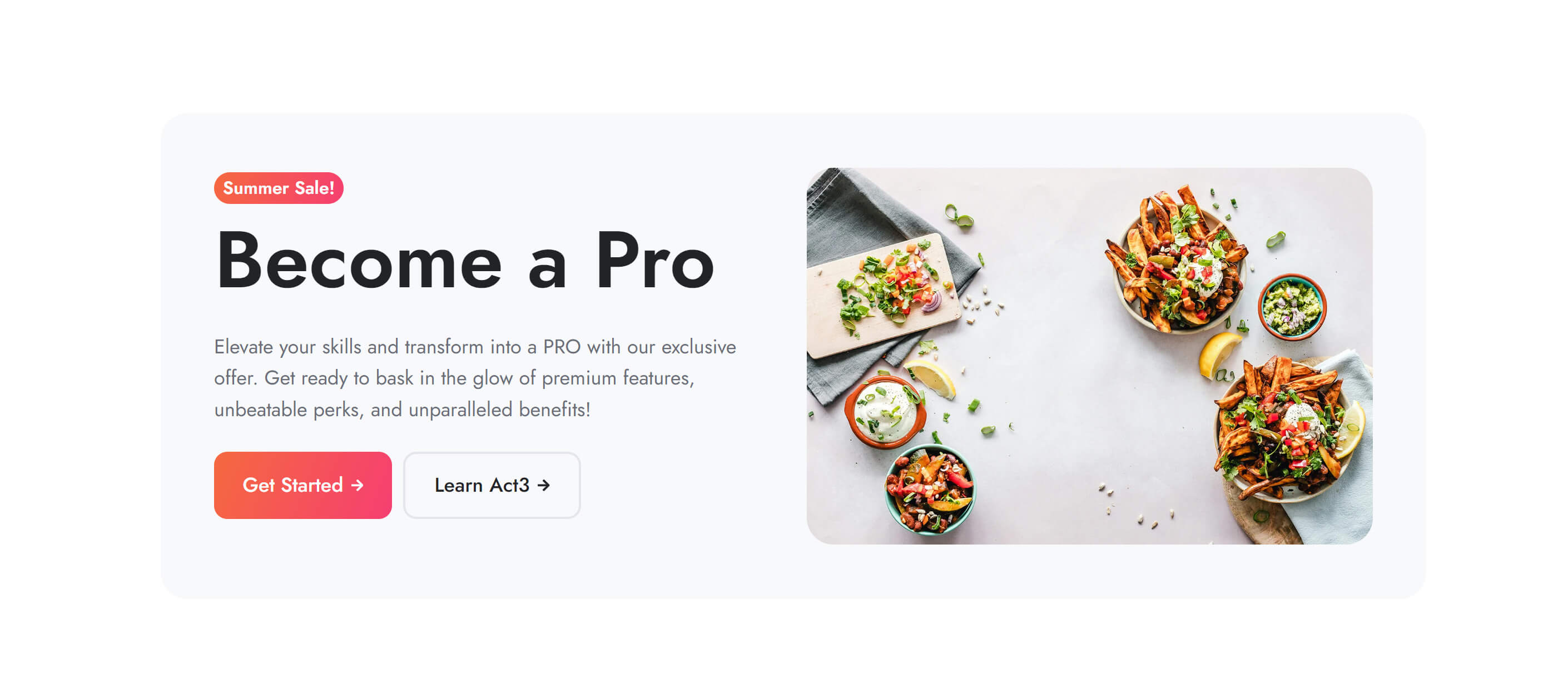
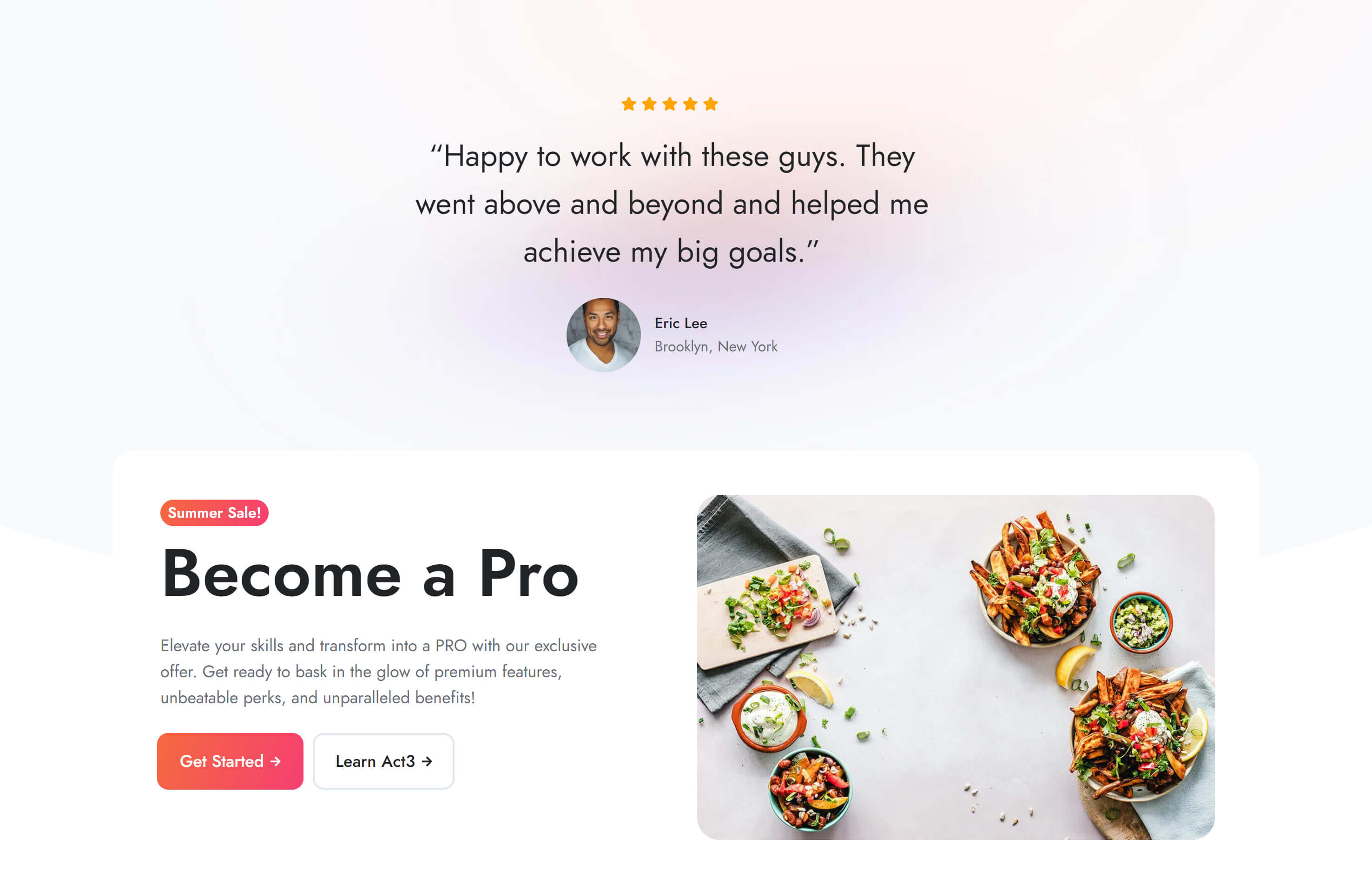
We also added the Wrap-up section, similar to the 'Theme corners' regarding corner radius, but using a row for the box. This section also includes 'reveal' scrolling animations. Live preview
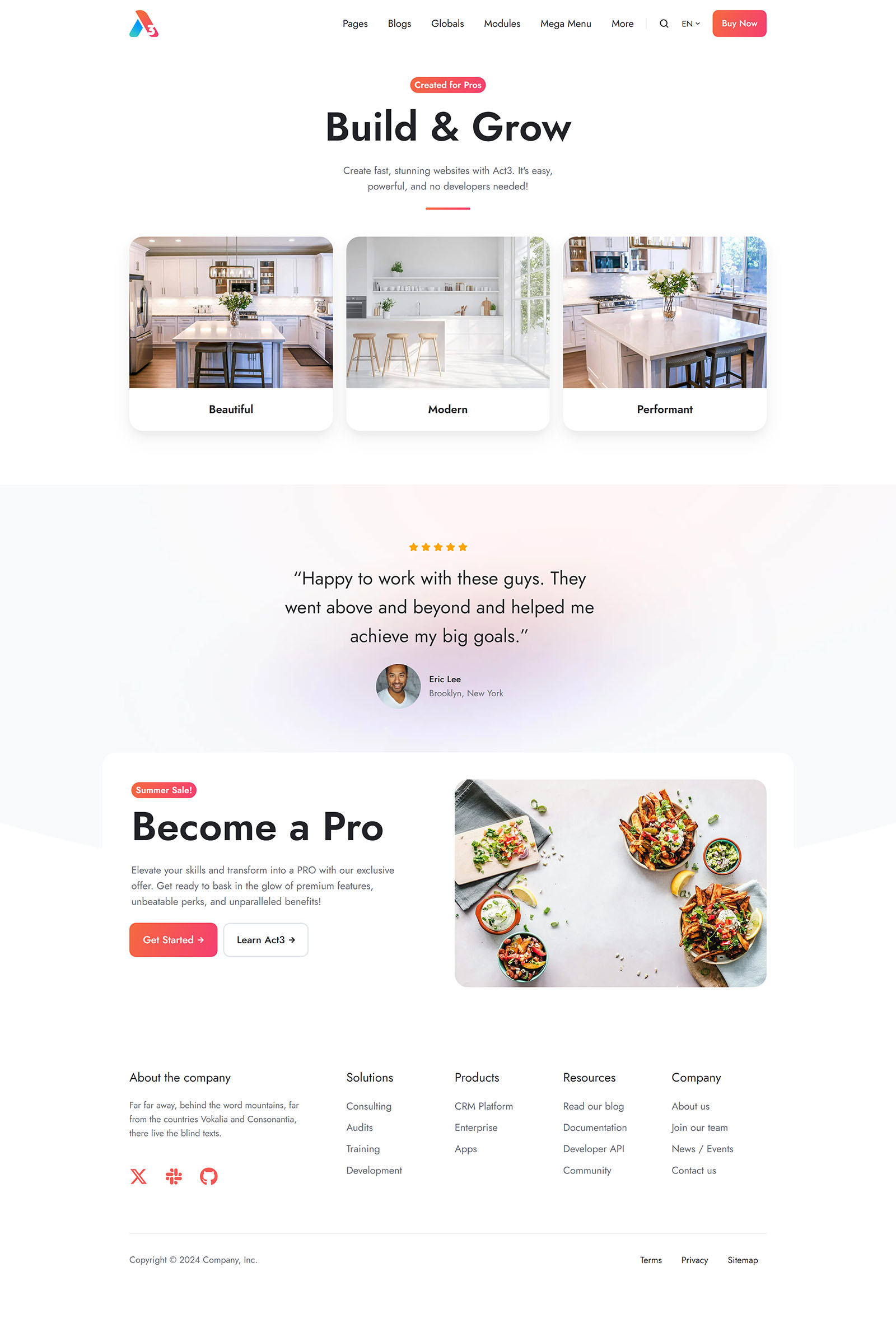
We created a new template—Home 6, designed to showcase the latest features. This template provides a more stylish option for those who prefer a fancier layout and are less focused on achieving the highest page speed score. While it's not the fastest, it strikes a good balance between performance and design. Live preview
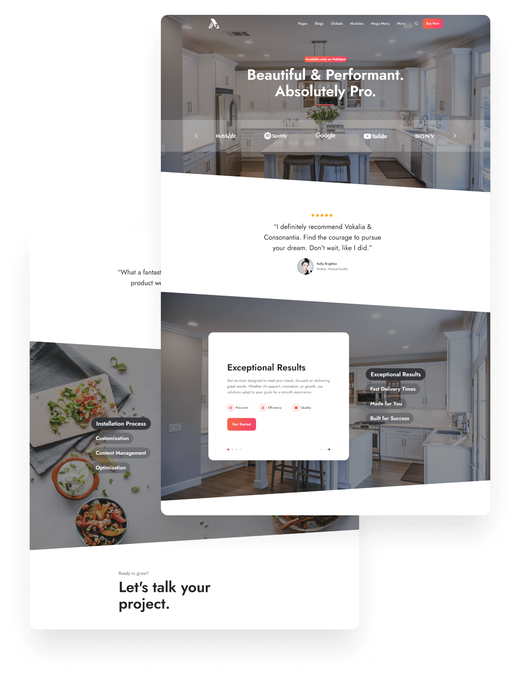
We also created the Quick promo template, which includes the 'Wrap-up' section. Live preview
Added membership templates, available for selection in: Settings › Content › Private Content › Pages. Membership features are only available in Content Hub Professional and above.
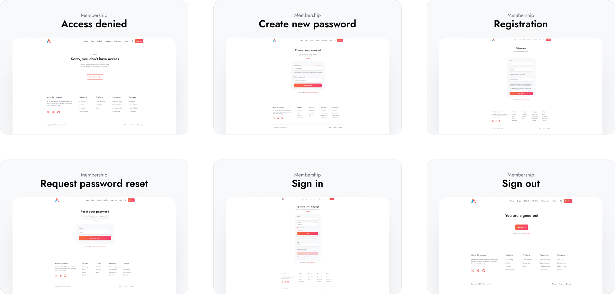
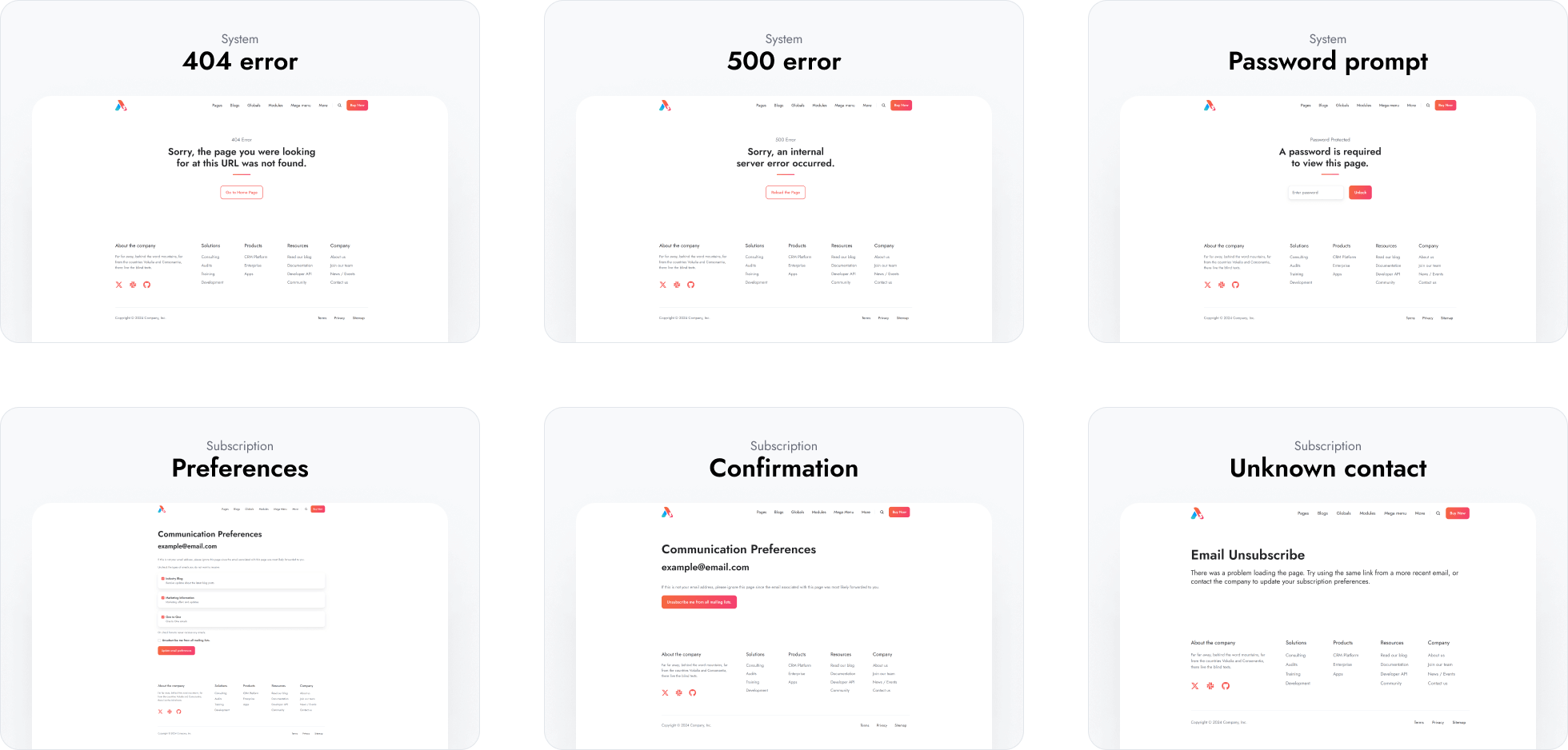
Replaced the existing system page templates with new versions. Your current templates will not be affected. The new templates come with translations for the following languages: da, de, en, es, fi, fr, hu, it, ja, nl, no, pl, pt, ro, sv. You can edit or add more languages in your child theme. Learn more about the new translations here.
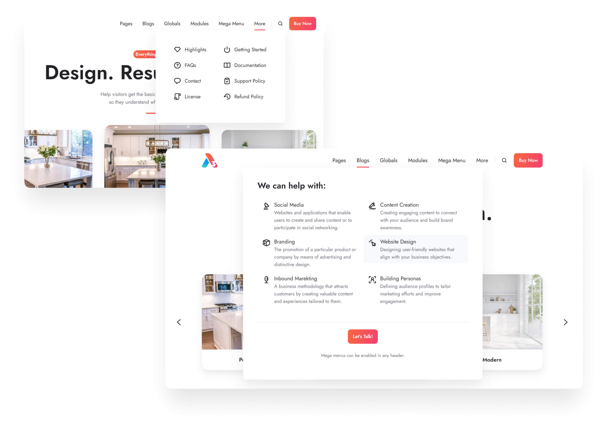
We've added the ability to set custom widths and positions for mega flyouts (mega menu) and introduced new content types. Additionally, we've made it possible to remove the flyout delay entirely (0 ms), which is now the default; you can set a delay only if needed. Learn how to use the mega menu on our Navigation page or watch this quick YouTube video.
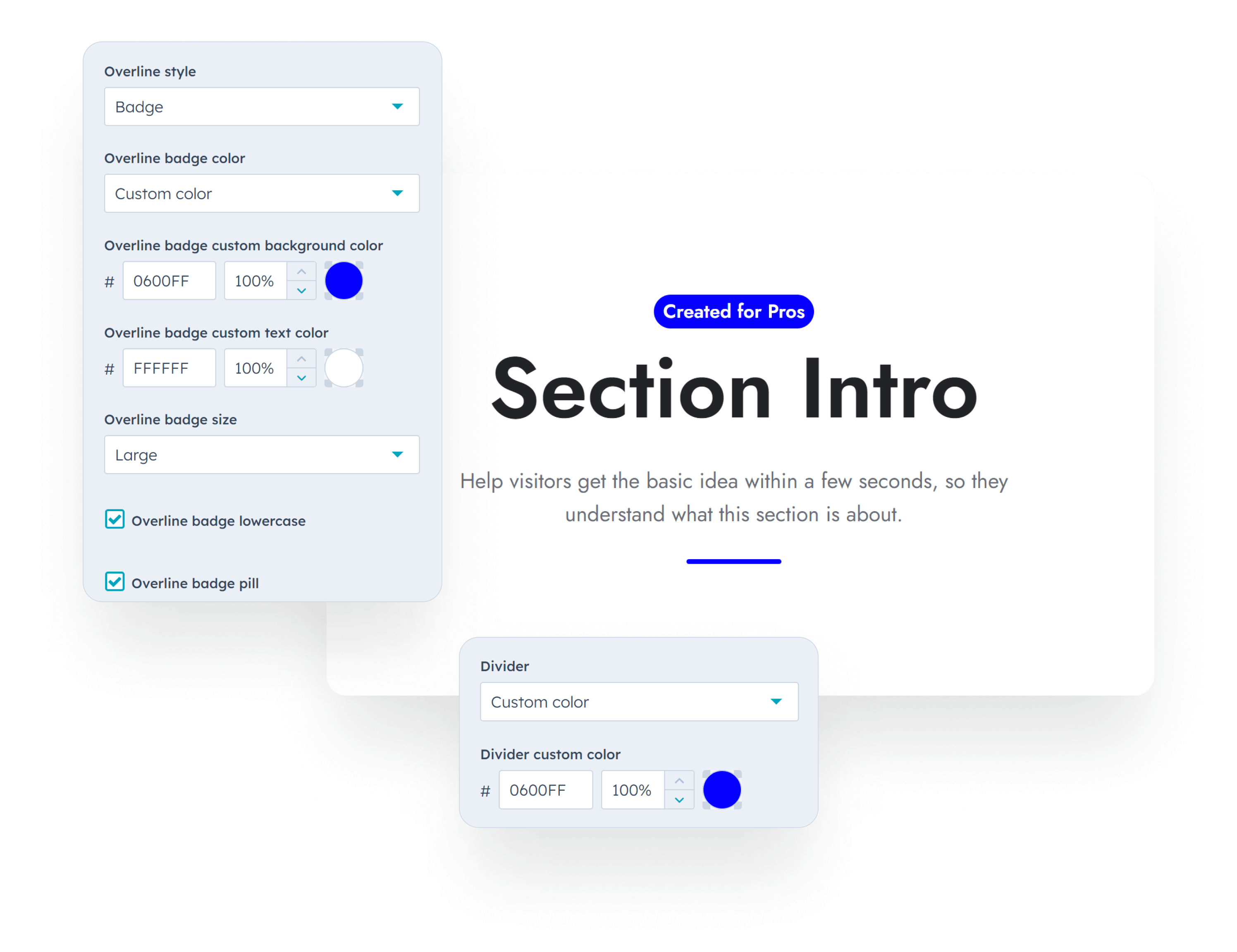
Added an option to turn the Overline into a badge in the Section intro module, with custom color settings for both the badge and the divider in the page editor.
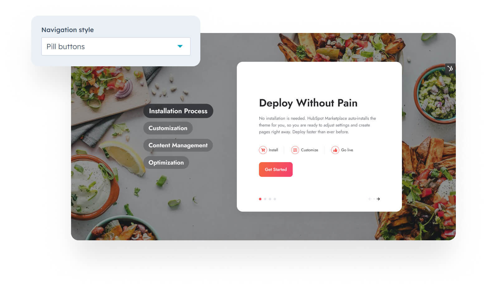
New style for the Features showcase menu items.
Added the option to apply custom classes to text and image elements in the Image plus text module. We also added custom class options for individual items in the Properties and Quick features modules. These class fields can be used to implement the scrolling animations mentioned above.
Fixed an issue where the blog archive page was missing an H1 tag, ensuring better SEO practices.
Fixed an issue where the CTA placeholder image appeared distorted.
Fixed the Language selector button to correctly display the theme font.
Files updated
- css\_base.css
- css\components\features-showcase.css
- css\components\lang-select.css
- css\components\nav.css
- css\main.css
- images\template-previews\case-study.jpg
- images\template-previews\customers.jpg
- images\template-previews\gallery.jpg
- images\template-previews\home-1.jpg
- images\template-previews\home-4.jpg
- images\template-previews\home-5.jpg
- images\template-previews\lp-download.jpg
- images\template-previews\lp-get-a-quote.jpg
- images\template-previews\lp-register.jpg
- images\template-previews\lp-thank-you.jpg
- images\template-previews\partners.jpg
- images\template-previews\pillar.jpg
- images\template-previews\portfolio.jpg
- images\template-previews\resources.jpg
- images\template-previews\success-stories.jpg
- js\components\nav.js
- js\main.js
- modules\features-showcase.module\fields.json
- modules\features-showcase.module\module.html
- modules\image-plus-text.module\fields.json
- modules\image-plus-text.module\module.html
- modules\nav.module\fields.json
- modules\nav.module\module.html
- modules\properties.module\fields.json
- modules\properties.module\module.html
- modules\quick-features.module\fields.json
- modules\quick-features.module\module.html
- modules\section-extra-settings.module\fields.json
- modules\section-extra-settings.module\module.html
- modules\section-intro.module\fields.json
- modules\section-intro.module\module.html
- templates\about.html
- templates\blank-no-header-footer.html
- templates\blank.html
- templates\blog-listing.html
- templates\contact-1.html
- templates\contact-2.html
- templates\contact-3.html
- templates\faqs.html
- templates\home-2.html
- templates\home-3.html
- templates\pricing.html
- templates\product.html
- templates\services.html
- templates\team-member.html
- theme.json
Files added
- css\_reveal.css
- css\templates\email-subscription-confirmation.css
- css\templates\email-subscription-preferences.css
- css\templates\membership-access-denied.css
- css\templates\membership-create-new-password.css
- css\templates\membership-registration.css
- css\templates\membership-request-password-reset.css
- css\templates\membership-sign-in.css
- css\templates\membership-sign-out.css
- css\templates\system-404-error.css
- css\templates\system-500-error.css
- css\templates\system-password-prompt.css
- css\templates\system-search-results.css
- images\section-previews\theme-corners.jpg
- images\section-previews\wrap-up.jpg
- images\template-previews\about.jpg
- images\template-previews\blank-no-header-footer.jpg
- images\template-previews\blank.jpg
- images\template-previews\blog-listing.jpg
- images\template-previews\blog-post.jpg
- images\template-previews\contact-1.jpg
- images\template-previews\contact-2.jpg
- images\template-previews\contact-3.jpg
- images\template-previews\cover.png
- images\template-previews\email-subscription-confirmation.jpg
- images\template-previews\email-subscription-preferences.jpg
- images\template-previews\email-subscription-unsubscribe-backup.jpg
- images\template-previews\faqs.jpg
- images\template-previews\home-2.jpg
- images\template-previews\home-3.jpg
- images\template-previews\home-6.jpg
- images\template-previews\membership-access-denied.jpg
- images\template-previews\membership-create-new-password.jpg
- images\template-previews\membership-registration.jpg
- images\template-previews\membership-request-password-reset.jpg
- images\template-previews\membership-sign-in.jpg
- images\template-previews\membership-sign-out.jpg
- images\template-previews\pricing.jpg
- images\template-previews\product.jpg
- images\template-previews\quick-promo.jpg
- images\template-previews\services.jpg
- images\template-previews\system-404-error.jpg
- images\template-previews\system-500-error.jpg
- images\template-previews\system-password-prompt.jpg
- images\template-previews\system-search-results.jpg
- images\template-previews\team-member.jpg
- js\components\parallax.js
- js\templates\system-500-error.js
- sections\theme-corners.html
- sections\wrap-up.html
- templates\_locales\da\messages.json
- templates\_locales\de\messages.json
- templates\_locales\en\messages.json
- templates\_locales\es\messages.json
- templates\_locales\fi\messages.json
- templates\_locales\fr\messages.json
- templates\_locales\hu\messages.json
- templates\_locales\it\messages.json
- templates\_locales\ja\messages.json
- templates\_locales\nl\messages.json
- templates\_locales\no\messages.json
- templates\_locales\pl\messages.json
- templates\_locales\pt\messages.json
- templates\_locales\ro\messages.json
- templates\_locales\sv\messages.json
- templates\email-subscription-confirmation.html
- templates\email-subscription-preferences.html
- templates\email-subscription-unsubscribe-backup.html
- templates\home-6.html
- templates\membership-access-denied.html
- templates\membership-create-new-password.html
- templates\membership-registration.html
- templates\membership-request-password-reset.html
- templates\membership-sign-in.html
- templates\membership-sign-out.html
- templates\quick-promo.html
- templates\system-404-error.html
- templates\system-500-error.html
- templates\system-password-prompt.html
- templates\system-search-results.html
Version 34
June 20, 2024
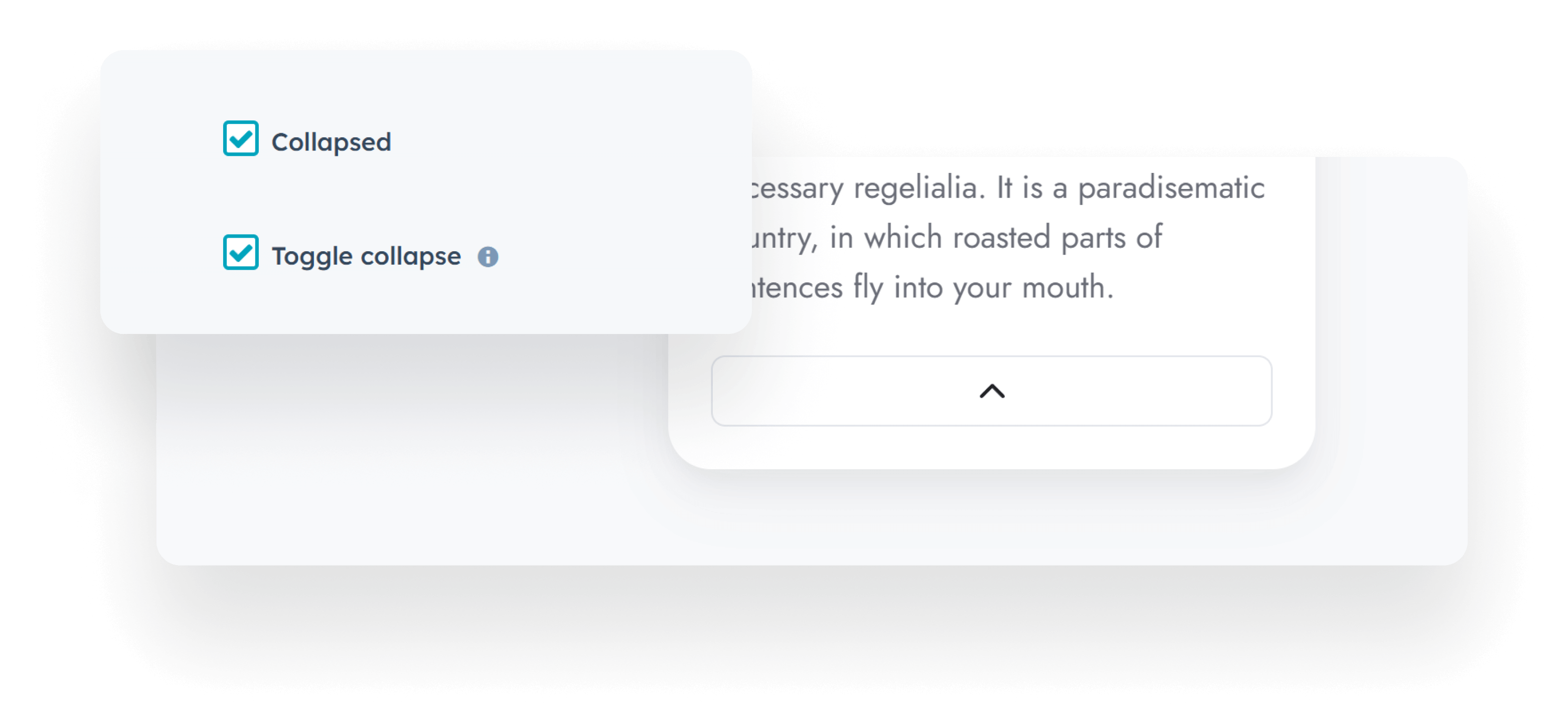
Added a new Toggle collapse option to the Rich text module. When enabled, the collapse/expand button remains visible after expanding the content, allowing users to collapse the content again:
Removed the link from the title on the newer Blog post template.
Added default to Navigation and Mobile navigation menu fields to avoid Code alerts.
Made the Above the header drag-and-drop area in the header functional.
Mapped the contact field in the Mobile navigation module to details to help with page prerendering.
Files updated
- css\components\rich-text-collapsed.css
- js\components\rich-text-collapsed.js
- modules\mobile-nav.module\fields.json
- modules\mobile-nav.module\module.html
- modules\nav.module\fields.json
- modules\rich-text.module\fields.json
- modules\rich-text.module\module.html
- partials\header-01.html
- partials\header-02.html
- partials\header-03.html
- partials\header-04.html
- partials\header-05.html
- partials\header-06.html
- partials\header-lp-01.html
- partials\header-lp-02.html
- templates\blog-post.html
Version 33
June 10, 2024
Fixed an issue with the Post narration. Previously, we checked for the audio file generated with the post narration and rendered the module only if this file existed. We did that to avoid loading unnecessary script and CSS files that come with this module, even if there's no post narration. But this check prevents it from generating narrations on posts that don't already have one, so we are removing this optimization to fix it.
Files updated
- templates/blog-post.html
Version 32
June 4, 2024
Corrected calculation of read time on the Blog card module when extra modules are present in the post body. This issue arose due to the post_body variable not loading extra modules under certain conditions, which we believe it's just a temporary issue in HubSpot that should be resolved shortly.
Fixed variable names that prevented the correct font-weight from being applied to <strong> and <b> elements within heading tags.
Fixed the inconsistent spacing caused by the extra wrapper added by the form dependent fields. For the best results we recommended always using one-column rows when setting up depended fields.
As part of our ongoing effort to adapt to the new Content Security Policy (CSP) settings, we have removed the remaining onclick attributes from the theme. Please note that using our Link onclick field still works as before, but it will no longer generate an onclick attribute.
The Recommended tag used with the Popular posts option in the Blog card module is no longer ignored.
Updated the code of the Blog card module to support displaying more than 10 posts per page.
Files updated
- css\_base.css
- css\_form.css
- js\components\content-card.js
- js\components\modal.js
- js\components\multi-address.js
- modules\blog-card.module\module.html
- modules\image-box.module\module.html
- modules\listing.module\fields.json
- modules\listing.module\module.html
- modules\multi-address.module\module.html
- templates\error-500.html
Version 31
May 2, 2024
We’ve developed a new blog template — Blog listing and Blog post, which contains all previous designs. The new template includes additional customization options and allows you to edit settings and text labels for each individual blog, rather than globally for all blogs using the template.

You can easily edit your blog listing page and access the Blog configuration module in the Contents sidebar, where you can find options for all major blog sections and elements.

You can hide or show the hero area on homepage or post pages, show the latest post, a featured post of your choice, or enable a drag and drop area where you can add any desired content.
The header can still overlap the content as it did before, maintaining the same visual effect. However, you now have the added capability to disable it selectively for either the homepage or post page, depending on the type of hero section you have.
Other features that are worth mentioning: show or hide the toolbar with either the search, topics, or title elements independently for the listing or post views, show summary on blog cards, “Load More” pagination for all listing layouts, global sidebar using a global partial (you can clone and use a different one for each blog if you are using a child theme — learn more here), remove read time, related posts section, etc.
This will also allow us to add new options in the future.
Read more about the Blog configuration.
In the new blog template, we also included the option to specify tags or posts IDs for the "Related posts" section. More details here.
Added the option to hide the 'read time' on the Blog card module.
Introduced the option to add a custom ID and class to the Comparison table module.
Replace the deprecated site_settings.favicon_src with brand_settings.favicon.src in the templates/_base.html file.
Fixed a bug where Properties links to a Modal weren't working properly.
Resolved a problem where the Post narration player overlapped with the sticky header.
Resolved the issue of the thin line occasionally appearing in Safari when using Section extra settings decorations.
Fixed a problem with missing icons in Rich text fields, in Safari and Firefox.
The Modal module will no longer load files if there are no modals.
Files added
- css\components\blog-classic-sidebar.css
- css\components\blog-listing-4.css
- css\components\blog-sidebar.css
- images\template-previews\blog-listing.png
- modules\blog-config.module\fields.json
- modules\blog-config.module\meta.json
- modules\blog-config.module\module.css
- modules\blog-config.module\module.html
- modules\blog-config.module\module.js
- partials\blog-listing-1.html
- partials\blog-listing-2.html
- partials\blog-listing-3.html
- partials\blog-listing-4.html
- partials\blog-sidebar.html
- templates\blog-listing.html
- templates\blog-post.html
- theme.json
Files updated
- css\_base.css
- css\components\blog-body-1.css
- css\components\blog-card.css
- css\components\blog-toolbar-1.css
- css\components\section-extra-settings.css
- css\main.css
- css\templates\blog-4.css
- js\components\blog-search.js
- js\components\modal.js
- js\components\tag-list.js
- js\main.js
- macros\utility.html
- modules\blog-card.module\fields.json
- modules\blog-card.module\module.html
- modules\comparison-table.module\fields.json
- modules\comparison-table.module\module.html
- modules\modal.module\module.html
- templates\_base.html
- theme.json
Version 30
April 2, 2024
Fixed an issue from the previous update where Link onclick events were not firing on Listing items.
Files updated
- js/components/modal.js
- macros/utility.html
Version 29
April 1, 2024
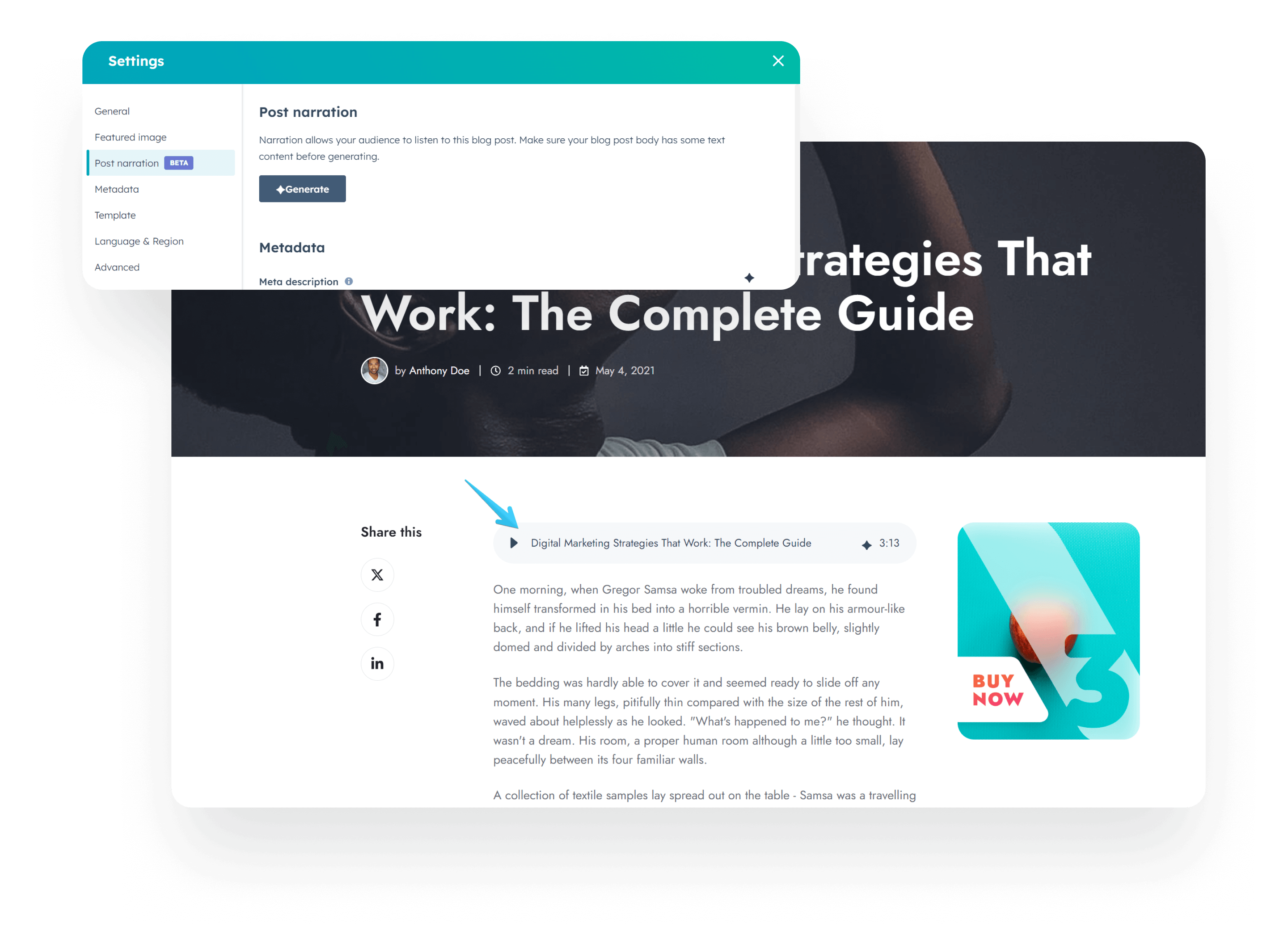
Implemented HubSpot's new Post narration (AI voice) feature in all blog templates:
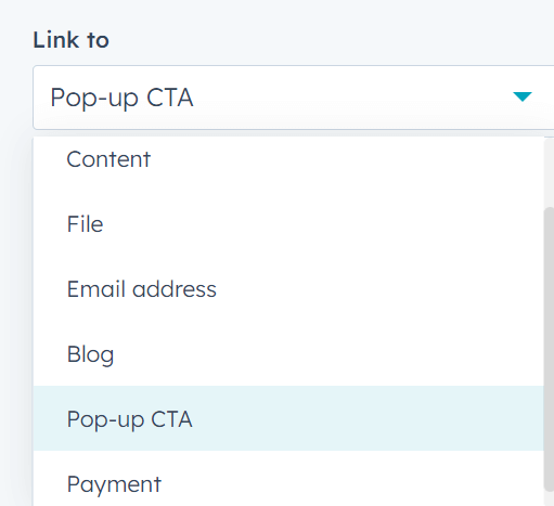
Included the new Pop-up CTA and Payment options to all links:
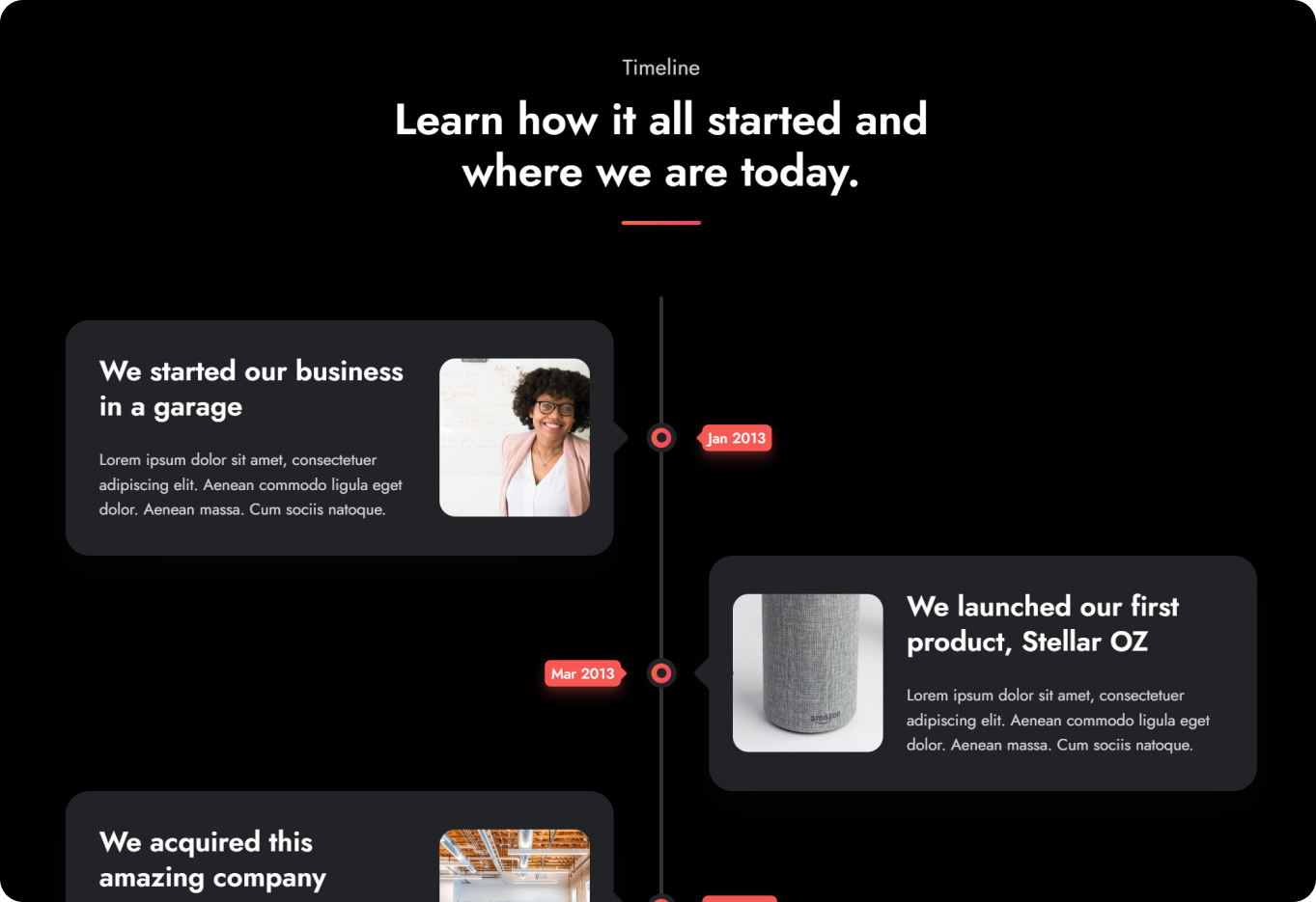
Introduced a Dark color scheme option for the Timeline:
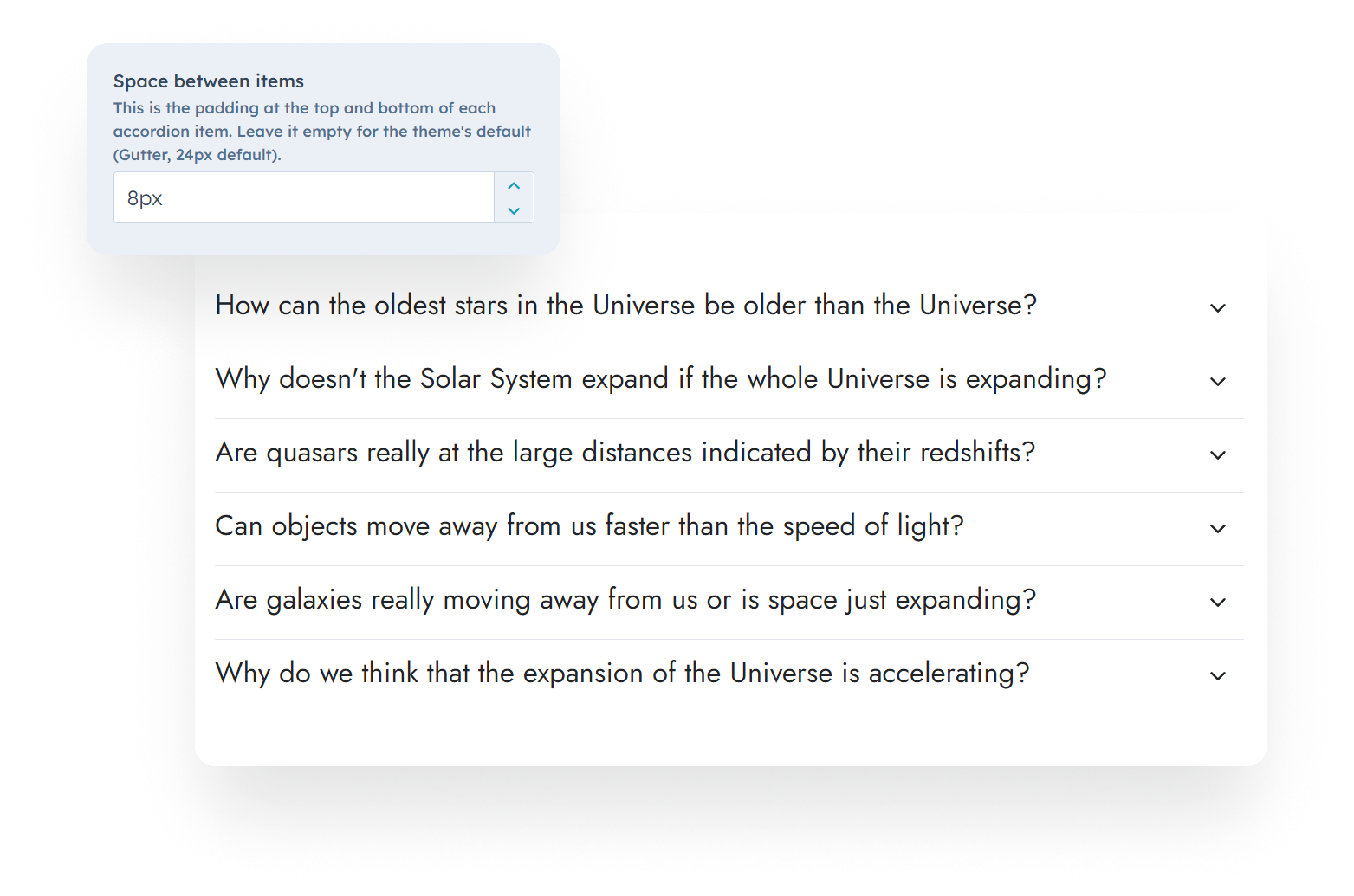
Added the option to adjust the spacing between Accordion items:
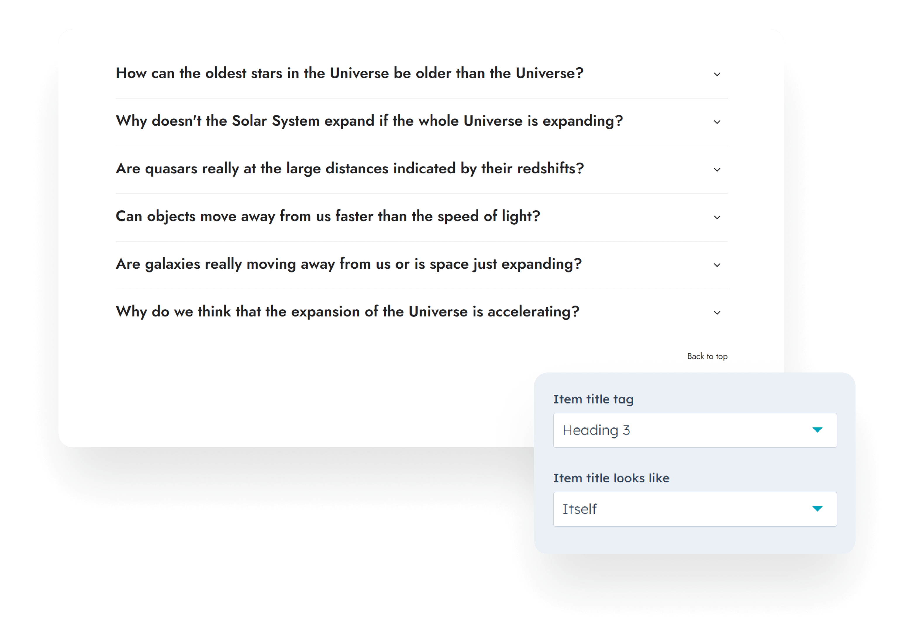
Introduced Item title tag and Item title looks like options to the Accordion module:
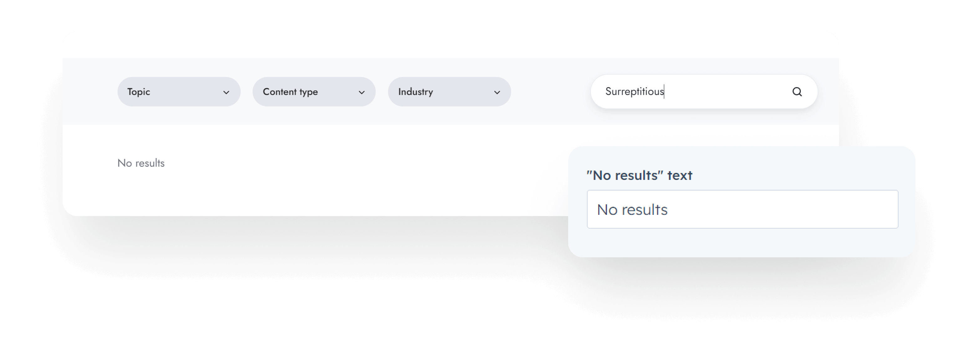
Added the option to display a 'No results' message when the Listing search or filtering yields no items:
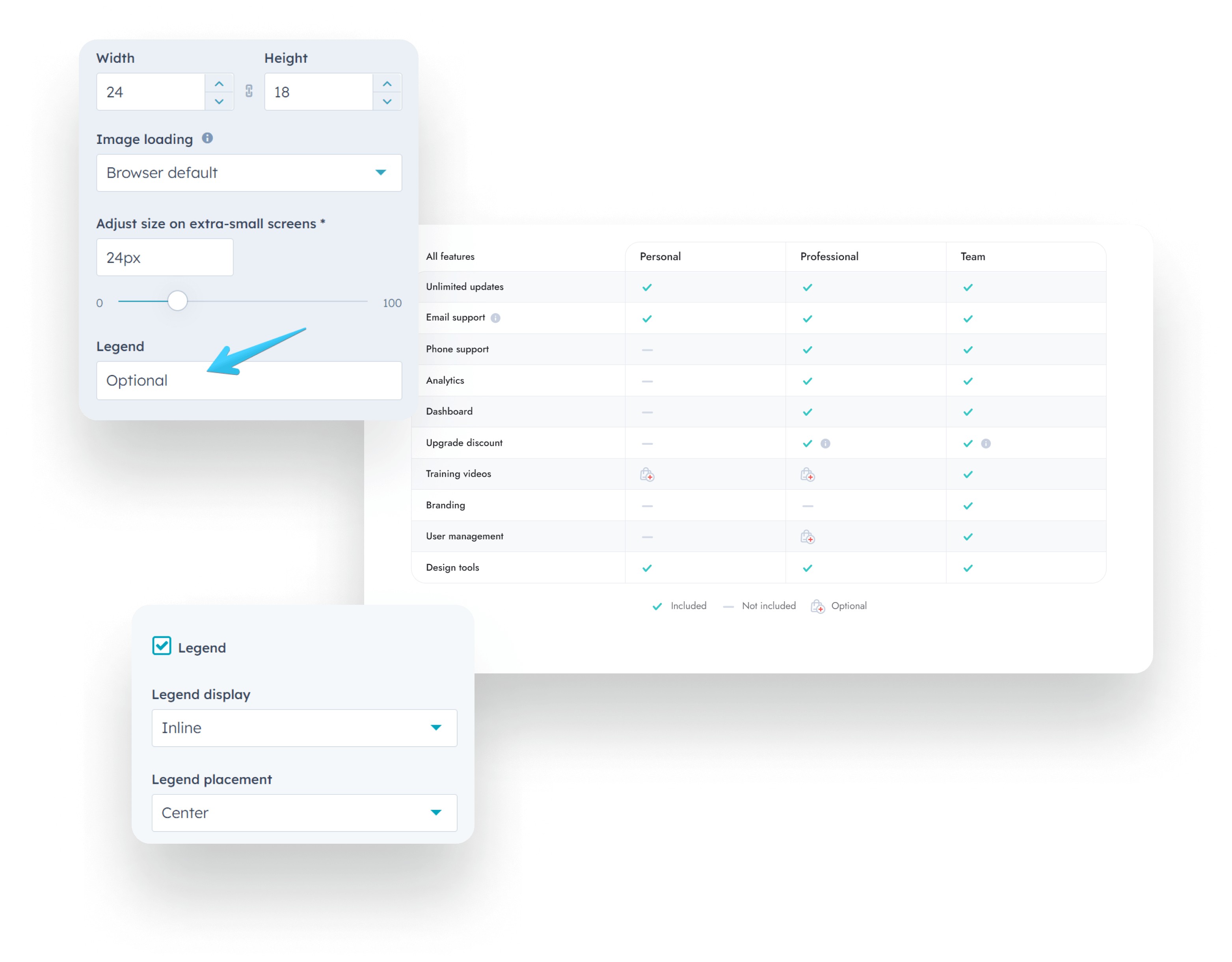
Included the option to display a legend at the bottom of the Comparison table. After enabling this, you can edit the text at the bottom of each icon settings (the place where you select your Icon image):
In the theme settings, you can now select any header for your landing pages, but the LP headers are still recommended. And you can do the same for the regular website header.
Other minor improvements and fixes.
More updates coming soon!
Files updated
- css\_badge.css
- css\_base.css
- css\_button.css
- css\_icon.css
- css\components\accordion.css
- css\components\blog-body-1.css
- css\components\blog-card.css
- css\components\compact-card.css
- css\components\comparison-table.css
- css\components\feature-card.css
- css\components\form-ghost.css
- css\components\form.css
- css\components\go-card.css
- css\components\listing.css
- css\components\quick-action.css
- css\components\review.css
- css\components\rich-text.css
- css\components\scroll-to.css
- css\components\section-extra-settings.css
- css\components\team-card.css
- css\components\timeline.css
- css\templates\blog-4.css
- fields.json
- js\components\listing.js
- js\components\modal.js
- macros\utility.html
- modules\accordion.module\fields.json
- modules\accordion.module\module.html
- modules\box-over-image.module\fields.json
- modules\button.module\fields.json
- modules\column-navigation.module\fields.json
- modules\compact-card.module\fields.json
- modules\comparison-table.module\fields.json
- modules\comparison-table.module\module.html
- modules\contact-box.module\fields.json
- modules\content-card.module\fields.json
- modules\cover-card.module\fields.json
- modules\feature-card.module\fields.json
- modules\features-showcase.module\fields.json
- modules\go-card.module\fields.json
- modules\hero-slider.module\fields.json
- modules\icon.module\fields.json
- modules\image-box.module\fields.json
- modules\image-plus-text.module\fields.json
- modules\image.module\fields.json
- modules\listing.module\fields.json
- modules\listing.module\module.html
- modules\logos.module\fields.json
- modules\mobile-nav.module\fields.json
- modules\modal.module\fields.json
- modules\nav.module\fields.json
- modules\nav.module\module.html
- modules\pricing.module\fields.json
- modules\properties.module\fields.json
- modules\quick-action.module\fields.json
- modules\quick-features.module\fields.json
- modules\quote.module\fields.json
- modules\review.module\fields.json
- modules\shifter.module\fields.json
- modules\team-card.module\fields.json
- modules\timeline.module\fields.json
- modules\timeline.module\module.html
- partials\header-01.html
- partials\header-02.html
- partials\header-03.html
- partials\header-04.html
- partials\header-05.html
- partials\header-06.html
- partials\header-lp-01.html
- partials\header-lp-02.html
- templates\_base.html
- templates\blog-1-post.html
- templates\blog-2-post.html
- templates\blog-3-post.html
- templates\blog-4-listing.html
- templates\blog-4-post.html
Version 28
Feb 20, 2024
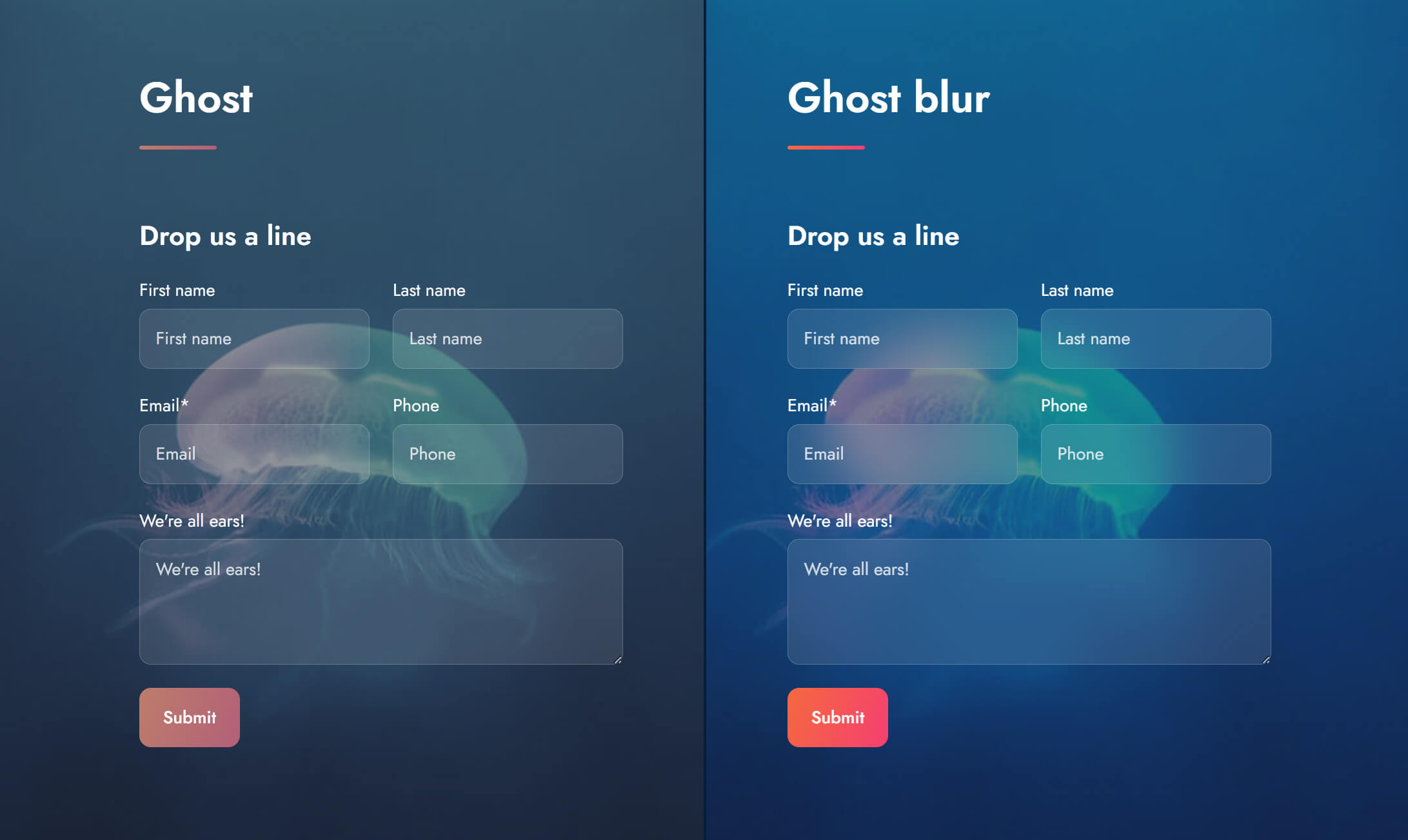
Introduced a couple of new Theme settings: Miscellaneous > Ghost blur and Ghost blur amount, which allows you to apply a background blur effect to elements styled with the 'Ghost' style option, such as Buttons and Cards, enhancing their visual appearance across your entire theme. This option is enabled by default. If you don't want this to apply on your website, we recommend disabling it from your Theme settings > Miscellaneous after installing the update.
Added categories and tags to all Act3 modules following HubSpot's recommendation for improved module organization within the page editor. We strongly recommend using Theme modules whenever possible.
Changed the label of a few modules that had the same name as default HubSpot modules to prevent confusion. We added (Act3) to their label, for example, Image (Act3).
Updated the Features showcase, Shifter, and Tabs modules to no longer use the onclick attribute, in accordance with new security recommendations.
Other minor fixes and improvements.
Files updated
- css\_badge.css
- css\_base.css
- css\_button.css
- css\_form.css
- css\_icon.css
- css\components\blog-card.css
- css\components\compact-card.css
- css\components\feature-card.css
- css\components\form-ghost.css
- css\components\form.css
- css\components\go-card.css
- css\components\quick-action.css
- css\components\review.css
- css\components\rich-text.css
- css\components\scroll-to.css
- css\components\team-card.css
- css\main.css
- fields.json
- js\components\features-showcase.js
- js\components\shifter.js
- js\components\tabs.js
- js\main.js
- modules\accordion\meta.json
- modules\blog-card\fields.json
- modules\blog-card\meta.json
- modules\blog-card\module.html
- modules\blog-settings\meta.json
- modules\box-over-image\meta.json
- modules\button\meta.json
- modules\column-navigation\meta.json
- modules\compact-card\meta.json
- modules\comparison-table\meta.json
- modules\contact-box\meta.json
- modules\content-card\meta.json
- modules\cover-card\meta.json
- modules\feature-card\meta.json
- modules\features-showcase\meta.json
- modules\features-showcase\module.html
- modules\form\meta.json
- modules\gallery\meta.json
- modules\go-card\meta.json
- modules\heading\meta.json
- modules\hero-slider\meta.json
- modules\icon\meta.json
- modules\image-box\meta.json
- modules\image-plus-text\meta.json
- modules\image\meta.json
- modules\lang-select\meta.json
- modules\listing\meta.json
- modules\logos\meta.json
- modules\mobile-nav\meta.json
- modules\modal\meta.json
- modules\multi-address\meta.json
- modules\nav\meta.json
- modules\numbers\meta.json
- modules\pillar-nav\meta.json
- modules\pricing\meta.json
- modules\properties\meta.json
- modules\quick-action\meta.json
- modules\quick-features\meta.json
- modules\quote\meta.json
- modules\review\meta.json
- modules\rich-text\meta.json
- modules\scroll-to\meta.json
- modules\section-extra-settings\meta.json
- modules\section-intro\meta.json
- modules\sharing\meta.json
- modules\shifter\meta.json
- modules\shifter\module.html
- modules\side-menu\meta.json
- modules\site-search\meta.json
- modules\steps\meta.json
- modules\tabs\meta.json
- modules\tabs\module.html
- modules\team-card\meta.json
- modules\timeline\meta.json
- modules\video\fields.json
- modules\video\meta.json
- modules\video\module.html
- templates\home-1.html
- theme.json
Version 27
Feb 12, 2024
You can now set Button widths, ideal for creating evenly sized buttons.
Added Badge pill styling using the badge--pill class.
Introduced the possibility to add custom classes to Mega flyouts in the Navigation module.
Timeline text now fully extends to the width of the box when the image is absent.
Addressed a Lighthouse recommendation to enhance the slider's scrolling performance.
Eliminated the extra space from the blog author page when there is no photo.
Removed unused logo, depending on header type (static vs. overlapping); previously hidden only.
Corrected an issue leading to excess spacing at the bottom of Mega flyouts.
Blog text labels now correctly derive from their respective blog template settings.
Fixed an error that prevented the minification of form.css file.
Resolved an issue where the Video > Embed URL feature was not displaying multiple videos on the page as expected.
Other minor fixes.
Files updated
- css\_badge.css
- css\_layout.css
- css\components\blog-author.css
- css\components\form.css
- css\components\section-extra-settings.css
- css\components\steps.css
- css\components\timeline.css
- js\components\splide.js
- macros\utility.html
- modules\button\fields.json
- modules\button\module.html
- modules\nav\fields.json
- modules\nav\module.html
- modules\section-extra-settings\fields.json
- modules\section-extra-settings\module.html
- modules\section-intro\module.html
- modules\timeline\module.html
- modules\video\module.html
- partials\header-01.html
- partials\header-02.html
- partials\header-03.html
- partials\header-04.html
- partials\header-05.html
- partials\header-06.html
- partials\header-lp-01.html
- partials\header-lp-02.html
- templates\blog-1-listing.html
- templates\blog-2-listing-v2.html
- templates\blog-2-post.html
- templates\blog-3-listing.html
Version 26
Sep 14, 2023
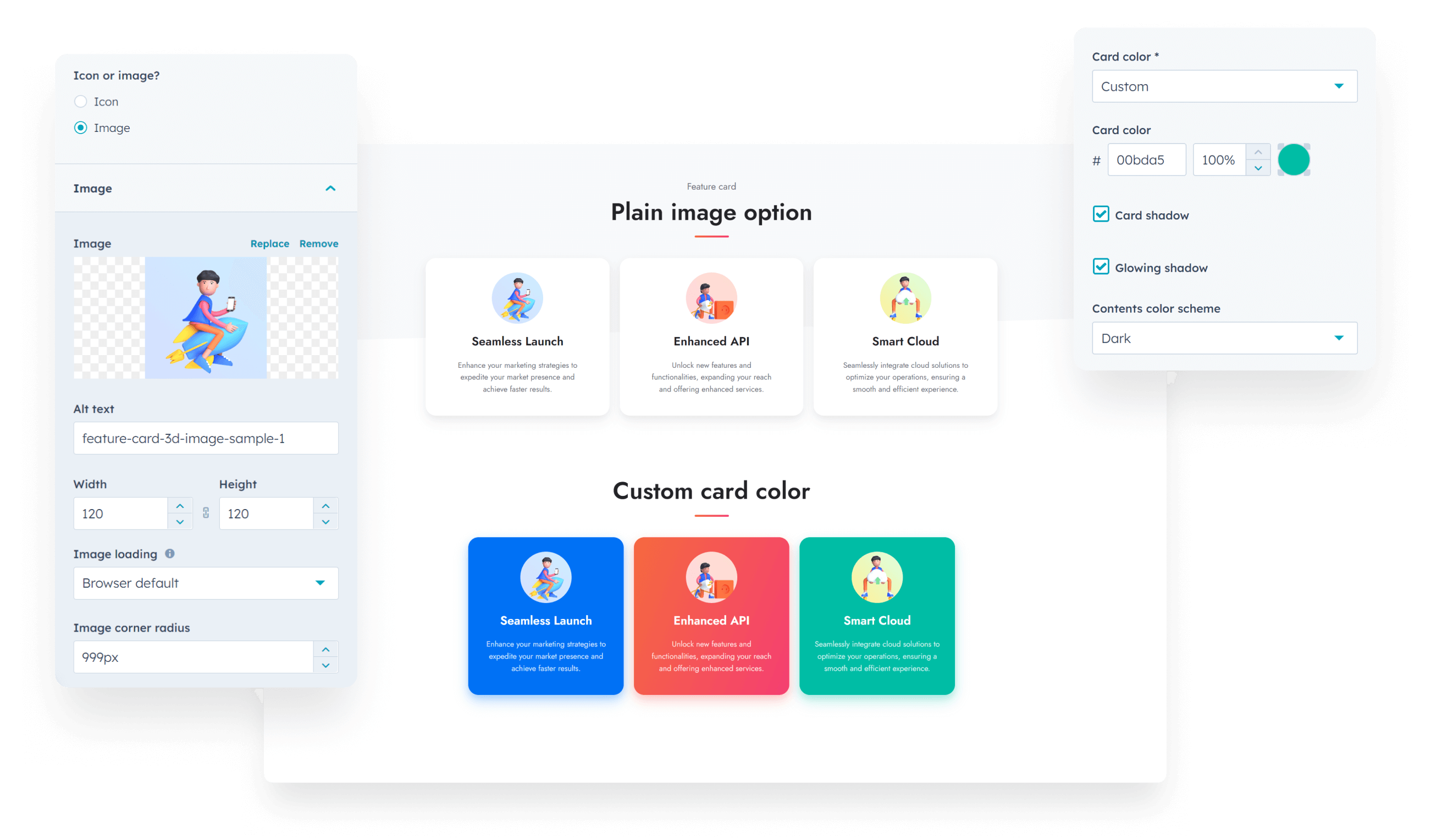
Added custom color options to the Feature card module, plus the possibility to use a plain image instead of a styled icon, and adjust its corner radius:
Introduced a Show caption › Off hover option to the Image box module, along with a Video on hover feature (refer to the instructions within the module), and enhanced the display of captions on non-hover devices. We've also added the option to show an Image on hover:
Applied theme's corner radius setting to the Lightbox to keep it consistent with the rest of the elements.
Updated the X (Twitter) icon on the Sharing module, and also included the option to add custom networks if you use the module in pages.

Updated the X (Twitter) icon on all blog templates.
The top section on the Header 4 will no longer appear if empty.

Files updated
- modules/feature-card/fields.json
- modules/feature-card/module.html
- modules/image-box/fields.json
- modules/image-box/module.html
- css/components/image-box.css
- css/_lightbox.css
- macros/utility.html
- modules/sharing/fields.json
- modules/sharing/module.html
- templates/blog-1-listing.html
- templates/blog-2-listing-v2.html
- templates/blog-3-listing.html
- templates/blog-4-listing.html
- css/components/header-04.css
Version 25
Jul 27, 2023
Added custom card color options to the Compact card module:

Fixed Steps number icons to use the theme's font instead of a generic one, to keep it consistent with similar elements.
Mobile navigation now closes automatically if an anchor inside is clicked.
Added Extra large option to Quick features icons.
Files updated
- modules/compact-card/fields.json
- modules/compact-card/module.html
- css/components/steps.css
- js/components/mobile-nav.js
- js/components/lightbox.js
Version 24
Jun 30, 2023
Added the option to Search specific domains.
Fixed a rendering issue with the Steps SVG icons on Safari.
Added the option to disable the loop on Lightbox mp4/mp3 media files using the noloop class.
Files updated
- css/components/steps.css
- js/components/lightbox.js
- modules/site-search/module.html
- modules/site-search/fields.json
- js/components/site-search.js
Version 23
May 26, 2023
Fixed an issue with the position of tooltips on scrolling.
Added an option in the Blog settings to disable the pill shape for the Topics button.
Updated the theme fields to comply with the new marketplace requirements.
Files updated
- js/main.js
- modules/blog-settings/fields.json
- templates/blog-1-listing.html
- templates/blog-2-listing-v2.html
- templates/blog-3-listing.html
- fields.json
Version 22
May 17, 2023
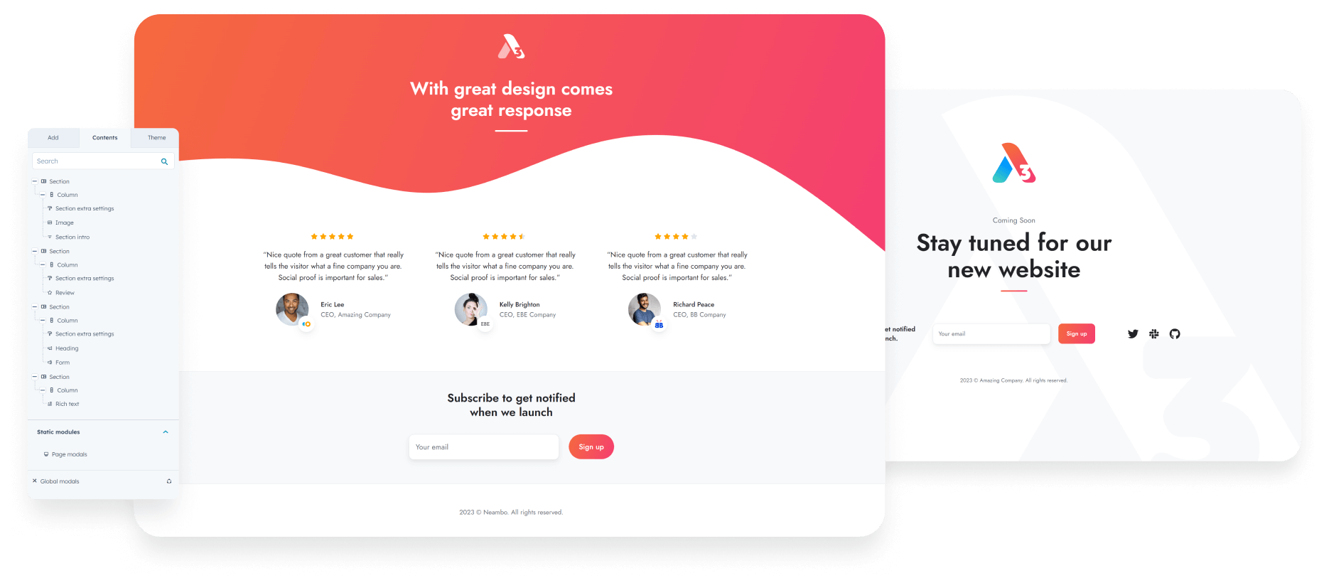
We introduced a new template called Blank, no header & footer, which enables you to create pages with a drag-and-drop layout without the global header and footer:
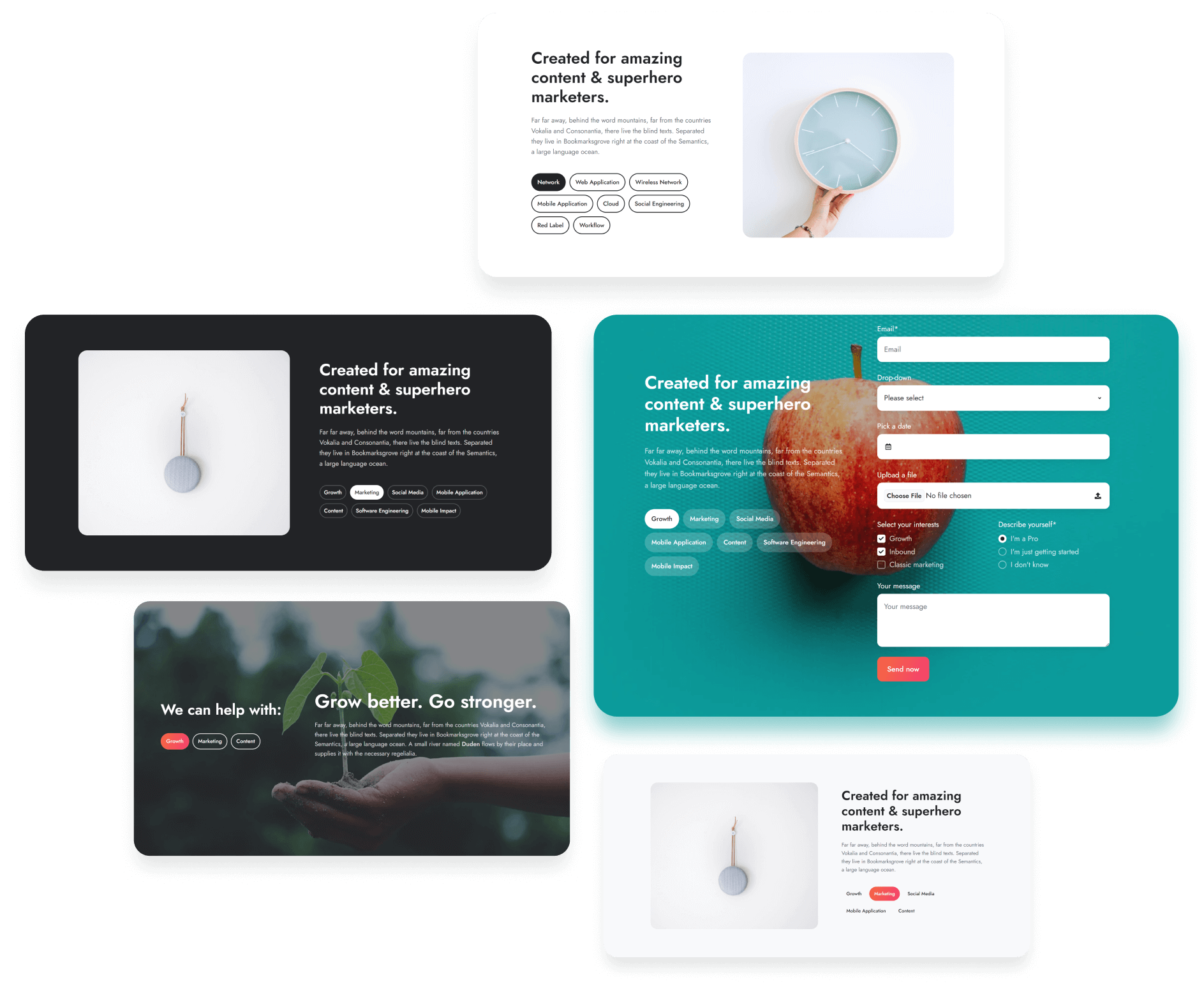
The navigation on the Shifter module can now be styled with buttons:
You can now select a different icon from the HubSpot library for the Scroll to module:
![]()
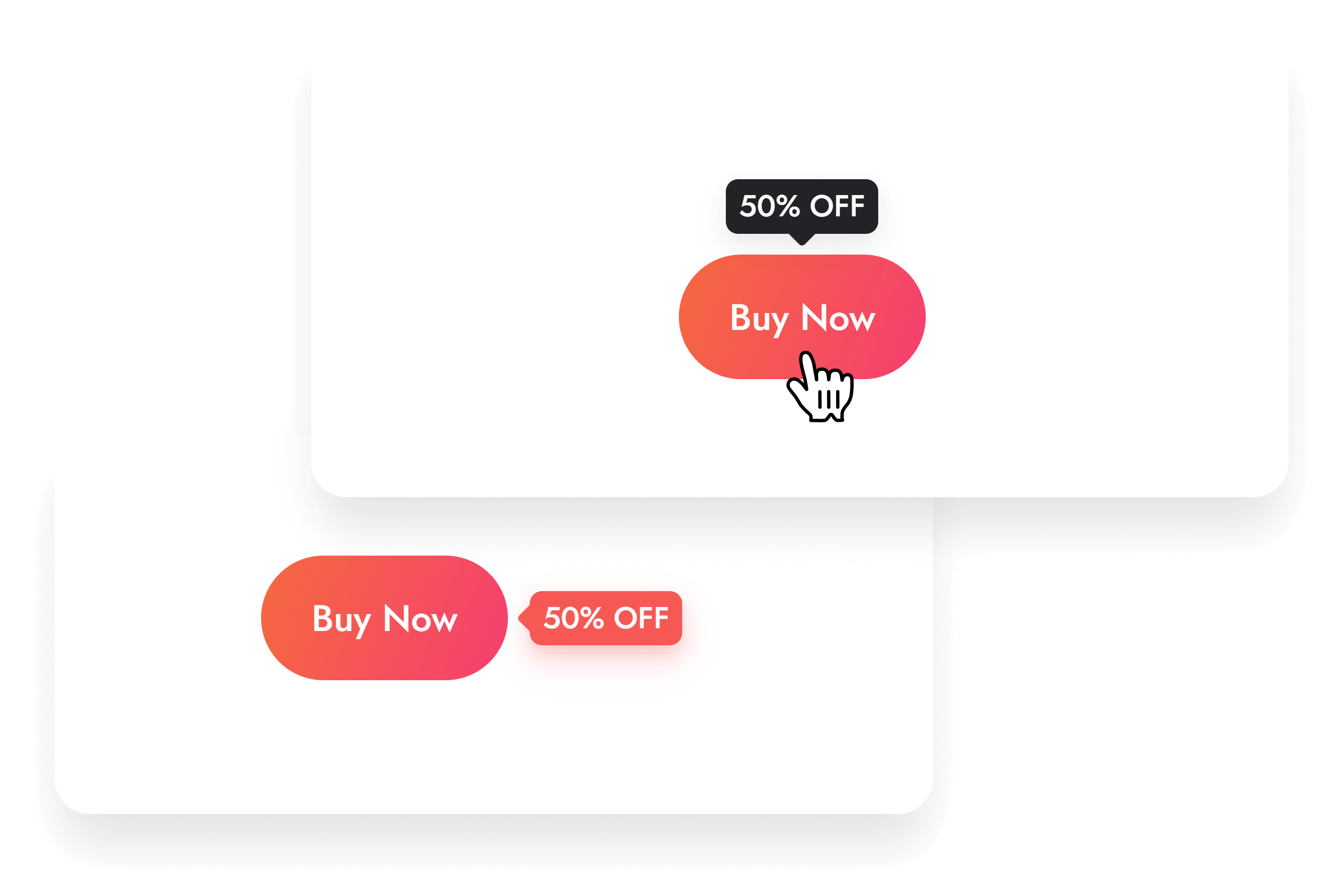
Introduced the option to add Tooltips to the Link buttons on the Button module:
We optimized the CSS generated by the module's Wrapper styles.
Fixed a line break issue with the Info label on the Pricing module.
Added H1 on the tag/topic blog view for SEO. Nothing changed visually.
Appended (Act3) to some module names to distinguish from the default HubSpot modules, as a new Marketplace requirement.
Fixed a Mega Menu position issue in the page editor.
Files added
- templates/blank-no-header-footer.html
Files updated
- modules/shifter/fields.json
- modules/shifter/module.html
- css/components/shifter.css
- js/components/shifter.js
- modules/scroll-to/fields.json
- modules/scroll-to/module.html
- css/components/scroll-to.css
- css/components/pricing.css
- macros/utility.html
- modules/button/fields.json
- modules/button/module.html
- css/_tooltips.css
- templates/blog-1-listing.html
- templates/blog-2-listing-v2.html
- templates/blog-3-listing.html
- css/components/nav.css
Version 21
Mar 17, 2023
Important! Please be aware of the following change if you use the Header 3:
The logo on the sticky header (mobile-only) was the same as from the static or overlapping header, and we corrected that with this update. There is a new module, Sticky header logo (mobile-only), where you can add your version of the logo for the sticky header, on mobile only, as per this header design. Once you update, please check your pages and see if you need to replace the sticky header logo.
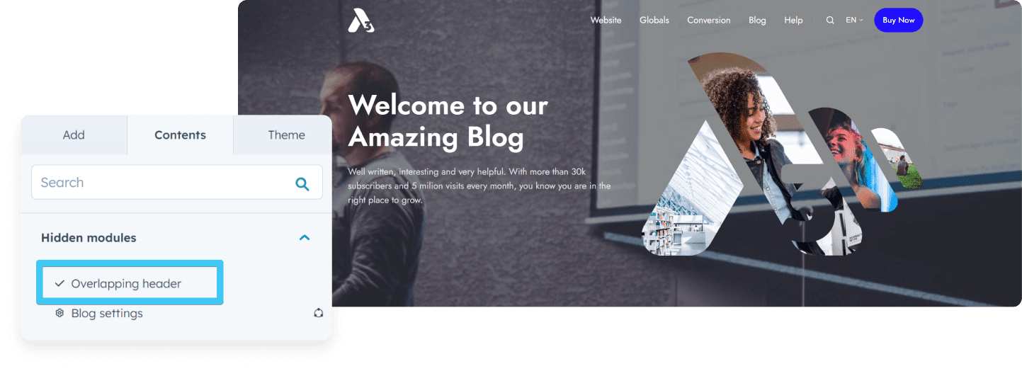
We included the Overlapping header option on the Blog 2 Listing. This option may be useful in case you want to add a large hero area at the top of the blog homepage using the DnD area:
We addressed a problem with the Gallery module when the Grid gallery type was set to display 5 columns, but there were actually 6.
The columns on the Blog 1 Post, Blog 2 Post, Blog 3 Post templates now stack on medium screens so the sidebar is no longer too narrow.
Files updated
- partials/header-03.html
- css/components/header-03.css
- modules/gallery/module.html
- blog-2-listing-v2.html
- templates/blog-1-post.html
- templates/blog-2-post.html
- templates/blog-3-post.html
Version 20
Mar 1, 2023
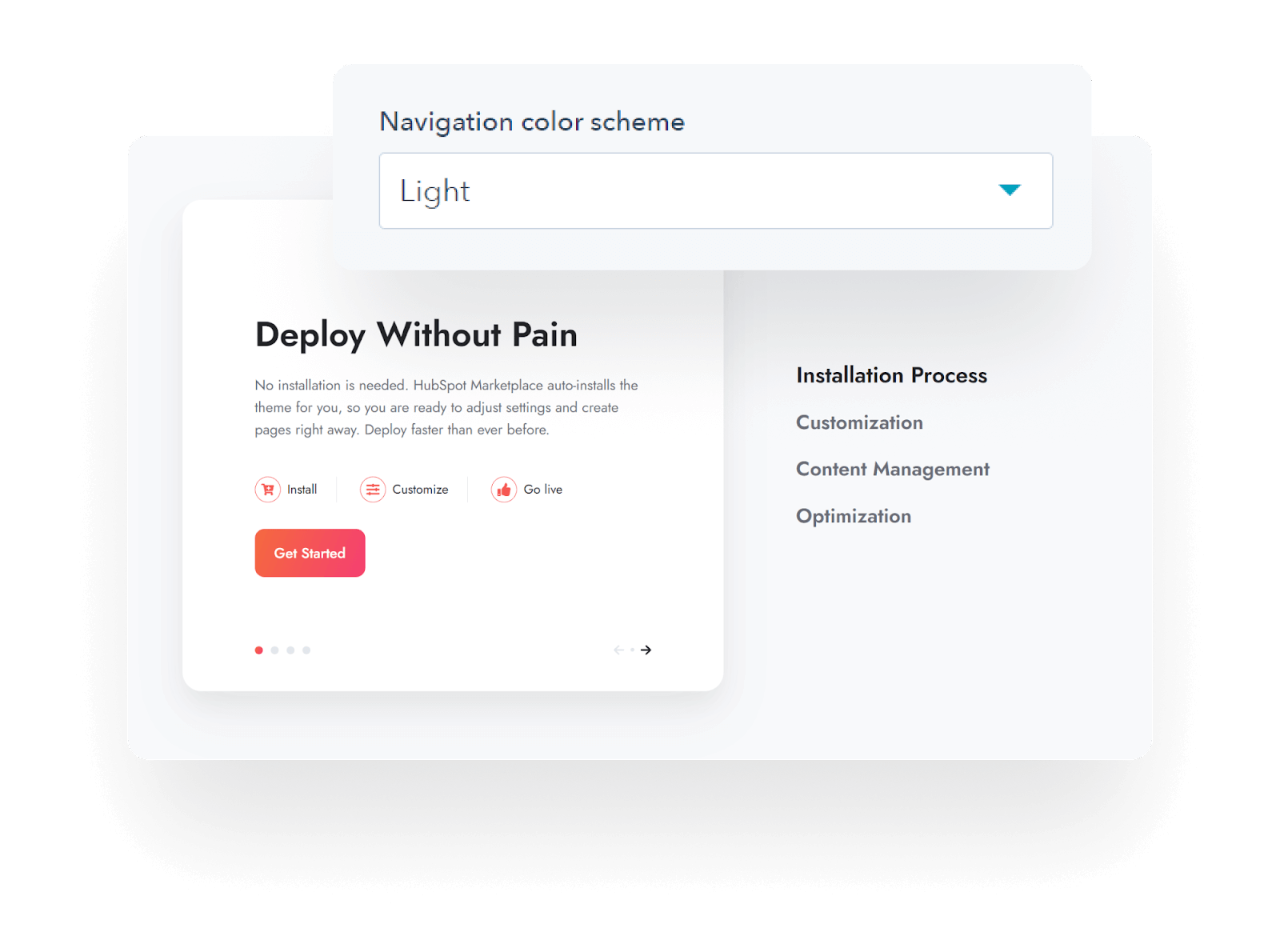
Added the option to select a Dark or Light color scheme for the Navigation on the Features showcase module:
Fixed a bug with the Language selector that caused the language to appear in the drop-down, even if the translated variation was only a draft and not published yet.
Fixed a bug with the Team card not showing the Code field when the Icon › Code type was selected.
Fixed an issue that caused black bars to appear in some cases on videos with 16:9 aspect ratio, when the Embed option was used with the Video module.
Updated the Timeline module to remove the date badge entirely if no date is specified.
We no longer attach the CSS and JS files to modules via the meta.json file. Instead we now reference them directly within the module.html* due to some recent marketplace installation problems; and we decided this is a better method anyway.
Files updated
- * All modules have the module.html and meta.json files updated
- modules/team-card/fields.json
- modules/listing/fields.json
- css/components/features-showcase.css
Version 19
Jan 24, 2023
Fixed an issue with the Comparison table not displaying correctly on some portals.
Files updated
- modules/comparison-table/module.html
Version 18
Jan 20, 2023
Fixed the Collapse description functionality on the Listing › Content card.
Added option to the Mega menu to specify how the browser distributes space between the columns.
Files updated
- js/components/content-card.js
- modules/nav/fields.json
- modules/nav/module.html
Version 17
Jan 18, 2023
Addressed a problem with the accent gradient background not being applied to certain elements in the following components: Compact card, Feature card, Features showcase, Go card, Mobile navigation, Shifter, Side menu, and Timeline. This was caused by a wrong variable being used: accent instead of accent_bg, as designed.
Resolved a problem with the Concave decoration in the Section extra settings module, that caused a half-pixel browser glitch when the page was zoomed-in.
Files updated
- css/components/compact-card.css
- css/components/feature-card.css
- css/components/features-showcase.css
- css/components/go-card.css
- css/components/mobile-nav.css
- css/components/shifter.css
- css/components/side-menu.css
- css/components/timeline.css
- modules/section-extra-settings/module.html
Version 16
Dec 5, 2022
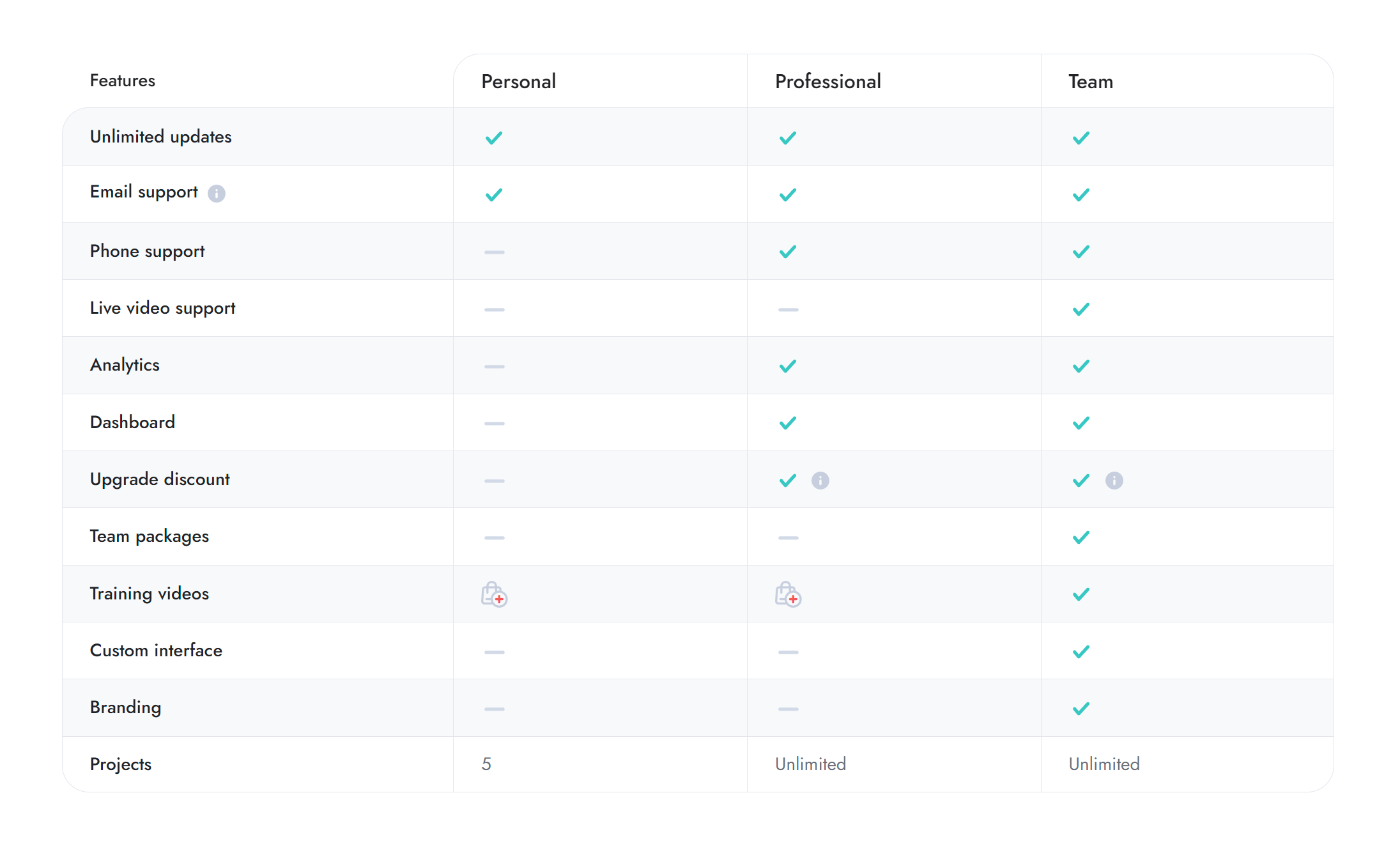
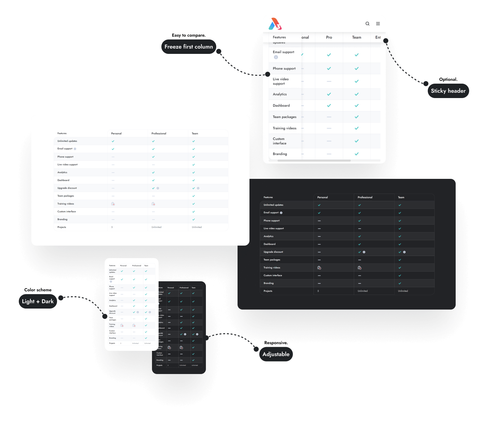
New module available! – Comparison table. Up to 10 columns, freeze first column, scrollable, optional sticky table header, replaceable icons, tooltips, adjustable cell padding and font-size on all screen-sizes, light and dark color schemes, and many other options. Browse a live example.
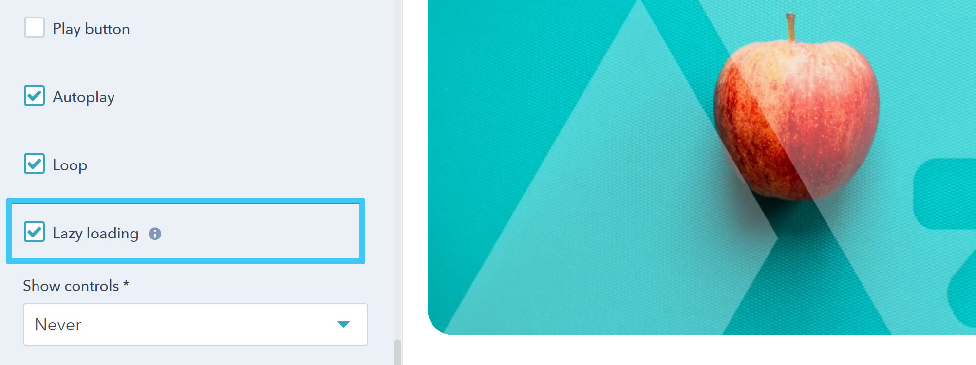
Videos can now be lazy-loaded:
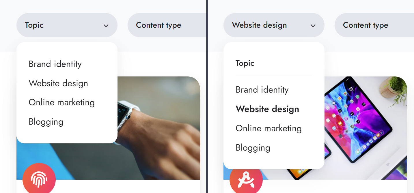
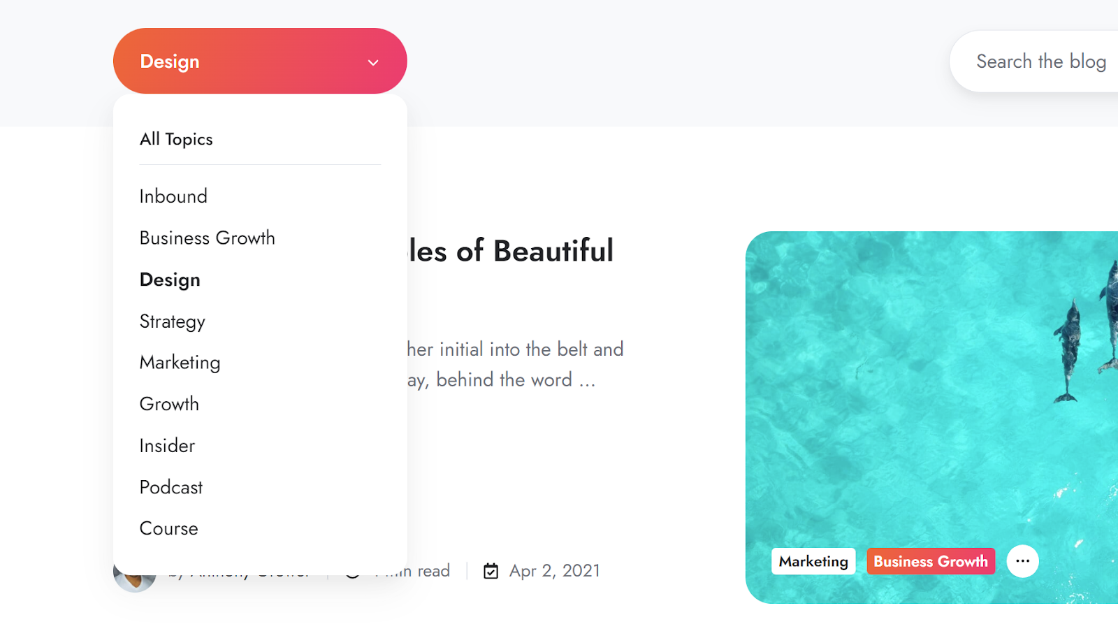
Slightly improved the user experience with the drop-down component on the Listing module and the blog templates. We removed the placeholder from the drop-down list when nothing is selected, and also made the placeholder and the active category in the drop-down more distinguishable:
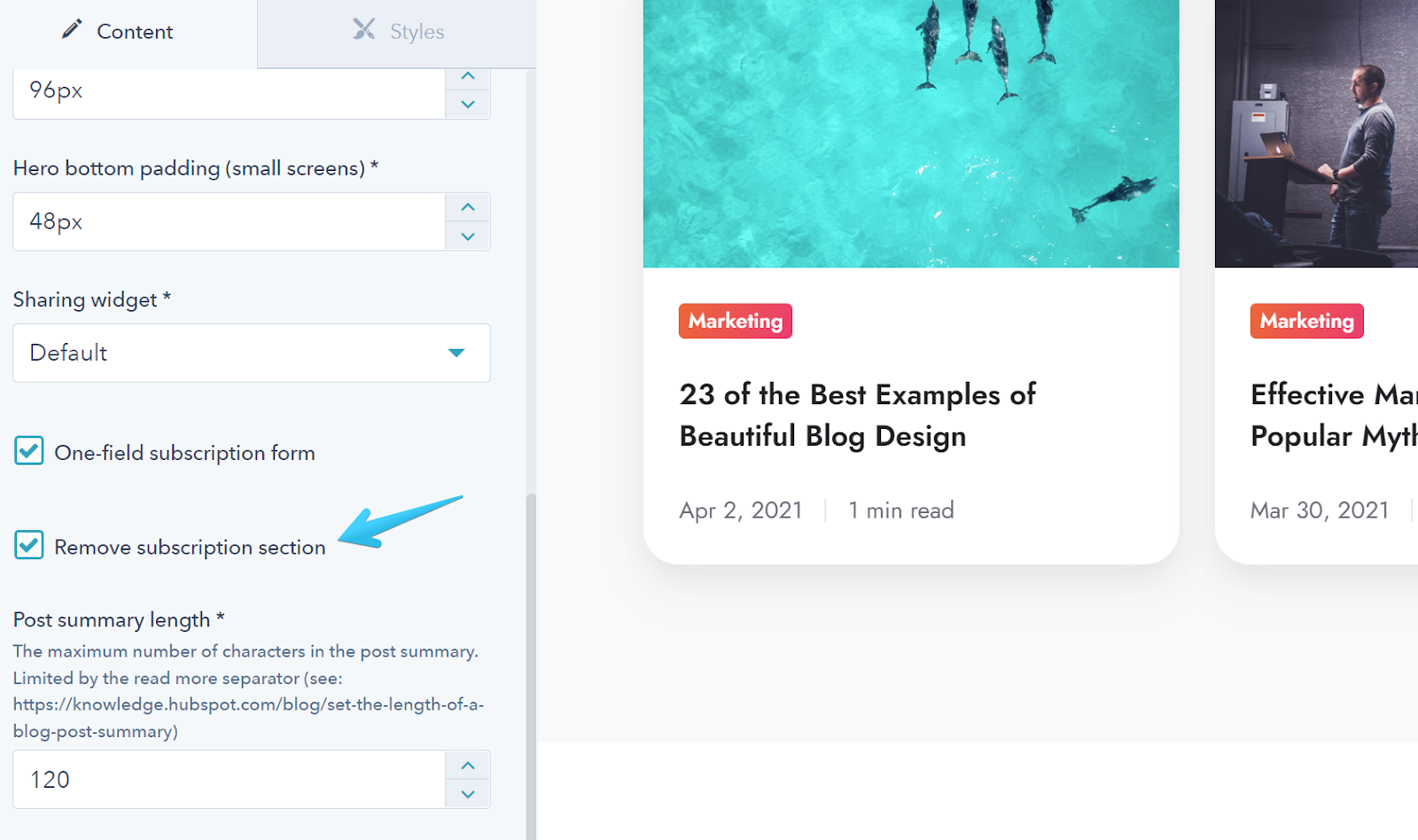
Added the option to remove the subscription section/box from the blog templates:
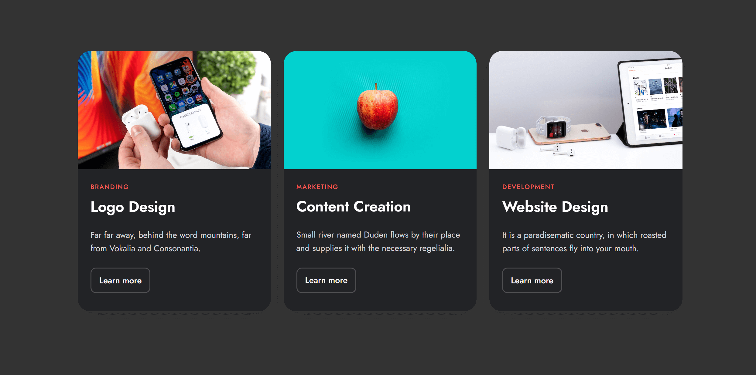
Added Dark color scheme to the Content card module:
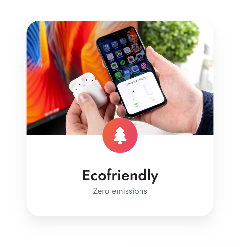
Added the option to remove the default space after the title on the Content card module, to allow for more card design options. Use wisely! — this is recommended only if you have a title and some short description or date after. Otherwise we recommend leaving this off. Here is an example:
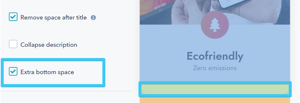
Additionally, we added an option for extra space at the bottom of the card, which is useful for a more even space on this card design:
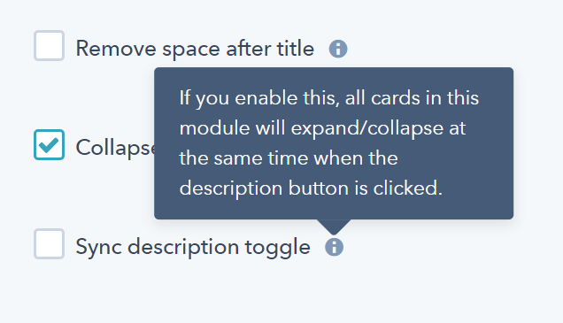
Content card description can now expand/collapse on all cards in a module at the same time:
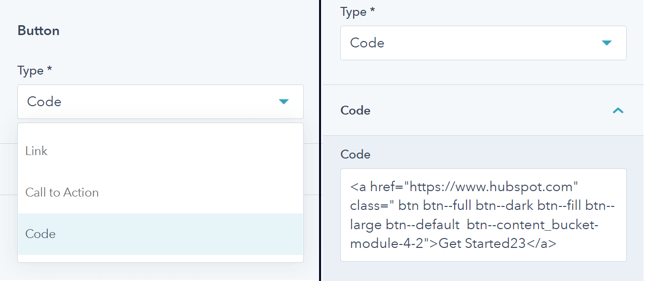
Added Code option for the Pricing buttons, in case you need to embed external buttons:
Addressed a recent problem with the Subscription preferences labels constructed by HubSpot from multiple text fields separated by a vertical bar | symbol.

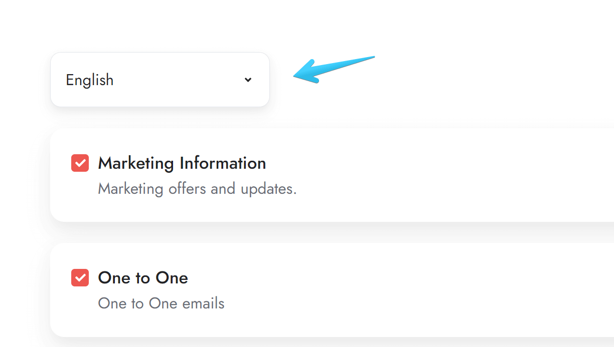
Applied theme styles to the new Subscription preferences language drop-down:
Removed our sample image from the blog sidebar on Blog 1, Blog 2, and Blog 3 templates. Moving on, when creating a new post, the Post aside will be empty by default.
We have also thoroughly analyzed the possibility to add global content in the sidebar, and developed a method described here. The blog templates have been updated to include HubL comments to make it easier for your to proceed with the described method.
Fixed a CSS issue that caused wrong space in headers when using CTA buttons.
Resolved a problem with the Gallery and Lightbox not functioning correctly when images contained URL parameters.
Fixed some issues with certain Text fields in the Blog 3 settings not updating on the blog.
Fixed an issue with Team cards not being of equal height in the Listing module.
Removed the unnecessary srcset attribute when using SVGs.
Resolved a problem that prevented images to render when served from folders with commas , in their name.
Fixed a minor problem caused by a recent form style in HubSpot regarding the legal consent required-field message (the inline style was making the text red and not visible with similar accent colors).
Files added
- modules/comparison-table
- css/components/comparison-table.css
- js/components/comparison-table.js
- js/components/tippy.js
Files updated
- css/_form.css
- css/components/content-card.css
- css/components/drop-down.css
- css/components/header-01.css
- css/components/header-02.css
- css/components/header-03.css
- css/components/header-04.css
- css/components/header-05.css
- css/components/header-06.css
- css/components/header-lp-02.css
- css/components/team-card.css
- css/templates/subscription-preferences.css
- js/components/content-card.js
- js/components/lightbox.js
- js/components/video.js
- js/main.js
- macros/utility.html
- modules/blog-settings/fields.json
- modules/content-card/fields.json
- modules/content-card/module.html
- modules/listing/module.html
- modules/pricing/fields.json
- modules/pricing/module.html
- modules/video/fields.json
- modules/video/module.html
- templates/blog-1-listing.html
- templates/blog-1-post.html
- templates/blog-2-listing-v2.html
- templates/blog-2-post.html
- templates/blog-3-listing.html
- templates/blog-3-post.html
- templates/blog-4-post.html
Version 15
May 11, 2022
Fixed an issue with the Modal module when both page and global modals contain forms.
Files updated
- modules/modal/module.html
Version 14
Apr 20, 2022
Fixed an issue with external fonts.
Files updated
- css/_base.css
- css/_variables.css
Version 13
Mar 3, 2022
Fixed an issue with the Shifter module from the previous update.
Files updated
- modules/shifter/fields.json
Version 12
Mar 1, 2022
There is a new version of the Blog 2 Listing template (Blog 2 Listing v2), where you can easily edit and drag-and-drop the intro content using HubSpot's new blog listing editor. Your previous Blog 2 Listing template and blogs won't be affected if you install this new update, but if you want to use the new template, you need to select it in your blog settings and enable the new editing experience. This way you can use the Blog 2 design for multiple blogs, each with its own intro.
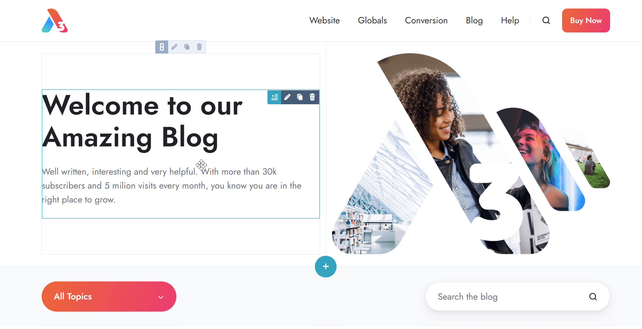
Along with the new blog template version mentioned above, we updated the Blog settings module to include an explanation for the intro rich text fields. They will no longer be used with the new template version, but still applied to your existing Blog 2 Listing template.
Included an option to remove the half-screen accent background from the Features showcase module.
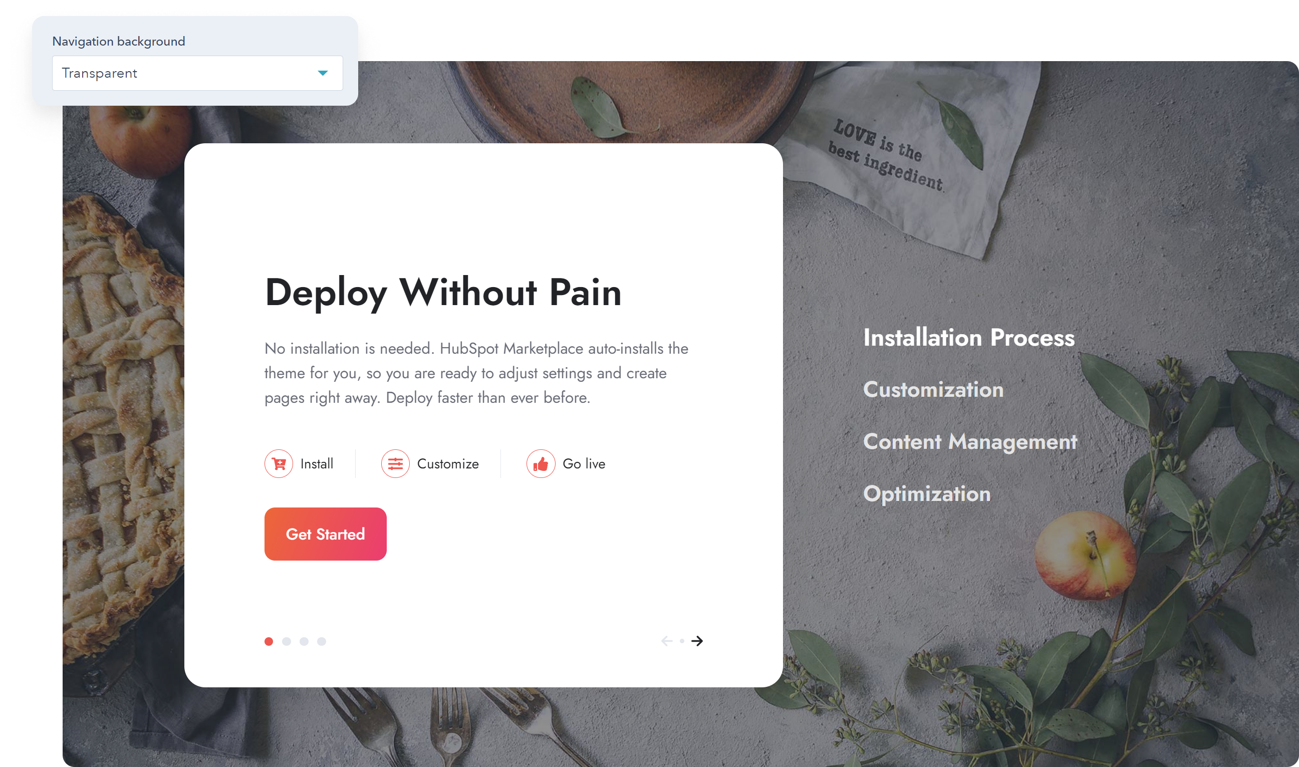
Added slides to adjust the price size on the Pricing module.
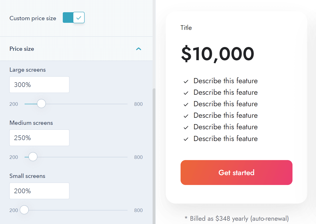
Included an option with the Shifter module that allows you to make the navigation a bit more compact, which may be useful and look a little better with many items.
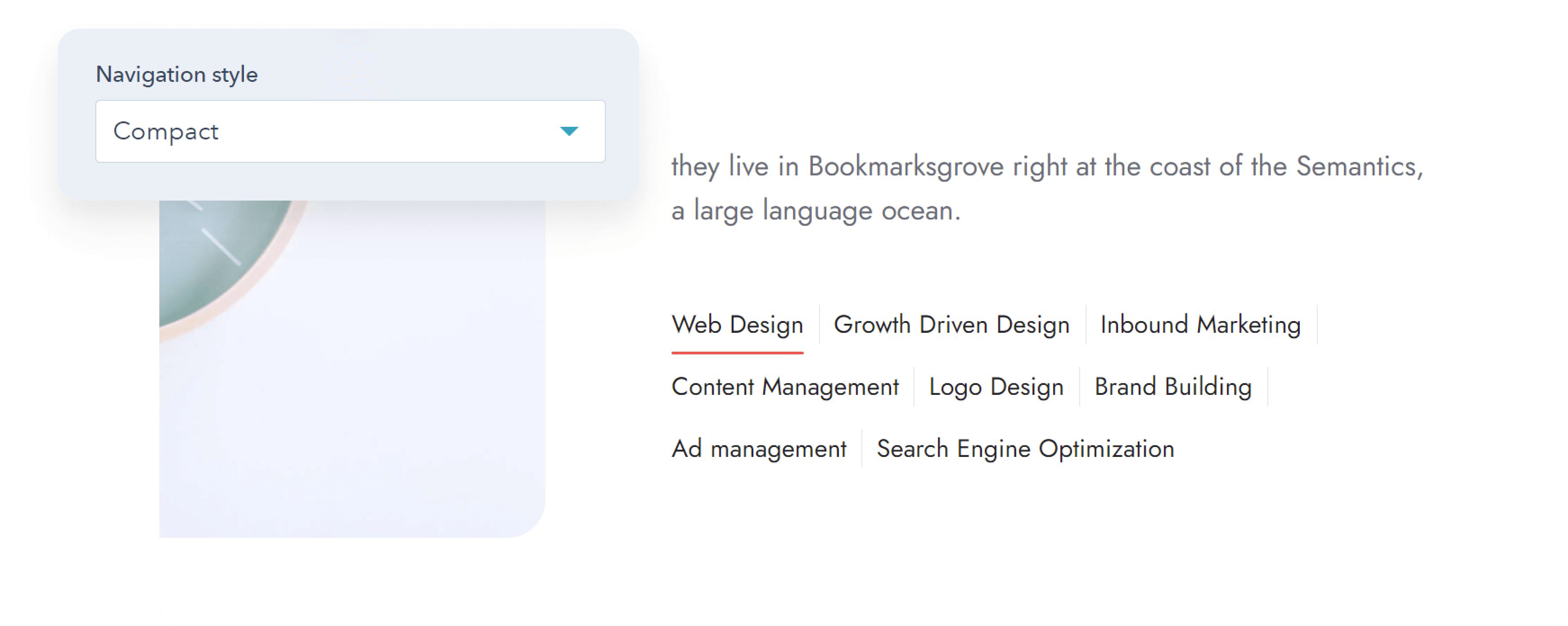
Added a custom class (important-quote) that you can apply to <blockquote> elements in Rich text (Advanced > Source code) for a special styling (see the full code below):
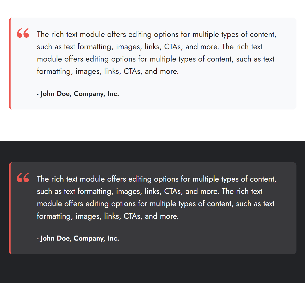
<blockquote class="important-quote">
  <p>The rich text module offers editing options for multiple types of content, such as text formatting, images, links, CTAs, and more. The rich text module offers editing options for multiple types of content, such as text formatting, images, links, CTAs, and more.</p>
  <p style="font-size: 16px;"><strong>- John Doe, Company, Inc.</strong></p>
</blockquote>
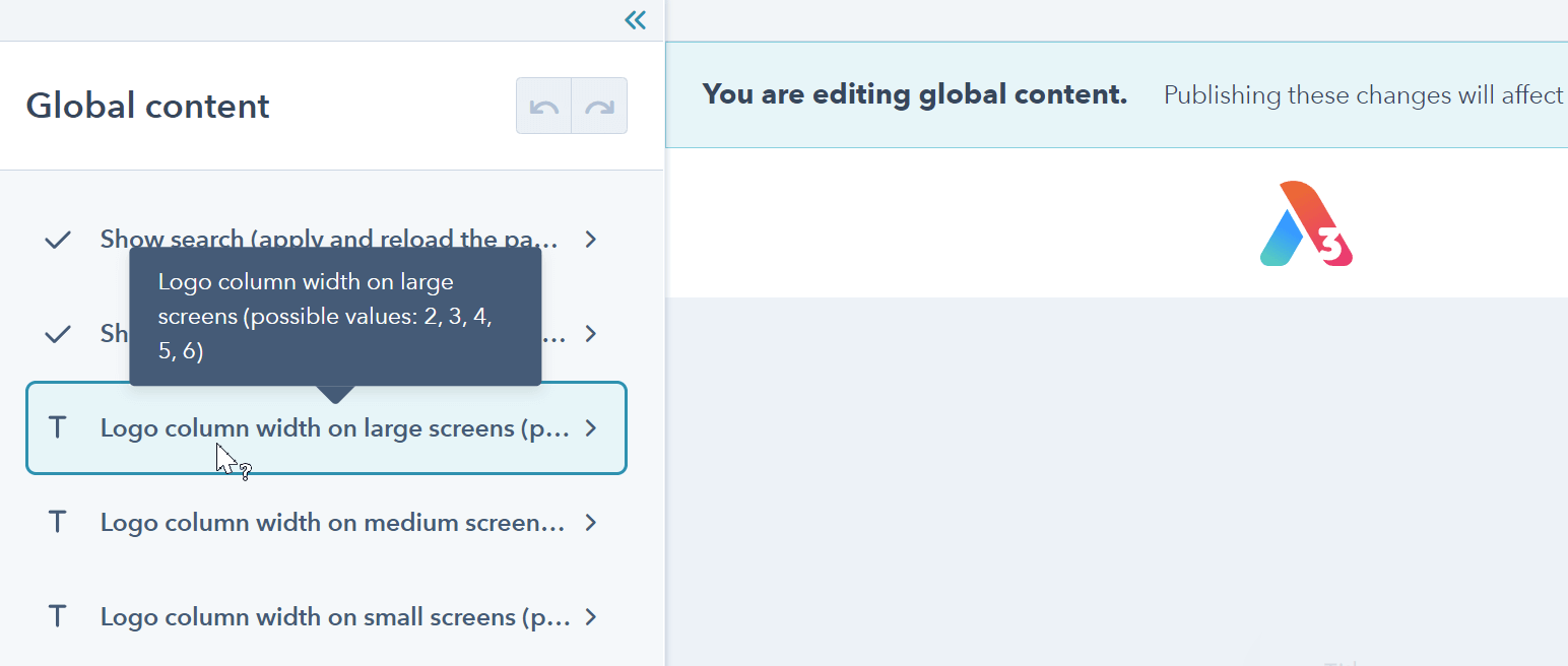
Added the possibility to adjust the logo column width (based on a 12-column grid) when editing your header. You will find three text boxes in your header, one for each screen size, where you can add a number from 2 to 6. Header 5 doesn't need this.
Improved the performance of the Modal animation on Safari.
Fixed a problem with the Pricing checkmarks being shrunk if the text was too long.
Files updated
- css/_base.css
- css/components/features-showcase.css
- css/components/modal.css
- css/components/pricing.css
- css/components/shifter.css
- js/components/listing.js
- modules/blog-settings/fields.json
- modules/features-showcase/fields.json
- modules/features-showcase/module.html
- modules/listing/module.html
- modules/shifter/fields.json
- modules/shifter/module.html
- partials/header-01.html
- partials/header-02.html
- partials/header-03.html
- partials/header-04.html
- partials/header-06.html
- partials/header-lp-01.html
- partials/header-lp-02.html
Version 11
Jan 4, 2022
Important!
Please take the time to read all notes below before updating because there are some major changes in this version that may impact your live website, especially if you are using a modified child theme.
If you have a child theme and don't use the child.css or child.js or their equivalent that HubSpot automatically creates when you make your child theme first, then we recommend deleting the templates/_base.html file from your child theme, so the new updated version is used instead. Otherwise, some of the updates here, including the modals, won't apply. In which case, you'll have to copy and paste the new modals code block from the original templates/_base.html template to your child theme file. Please reach out if you need help with this.
You can now add Modals (popups) to your pages, either globally or on a specific page, as stand-alone or gallery, and can open them from any link or element on the page, usually with an onclick event. Modals are also navigable with the keyboard and can be closed with the Escape key or Tab away. More details | Examples
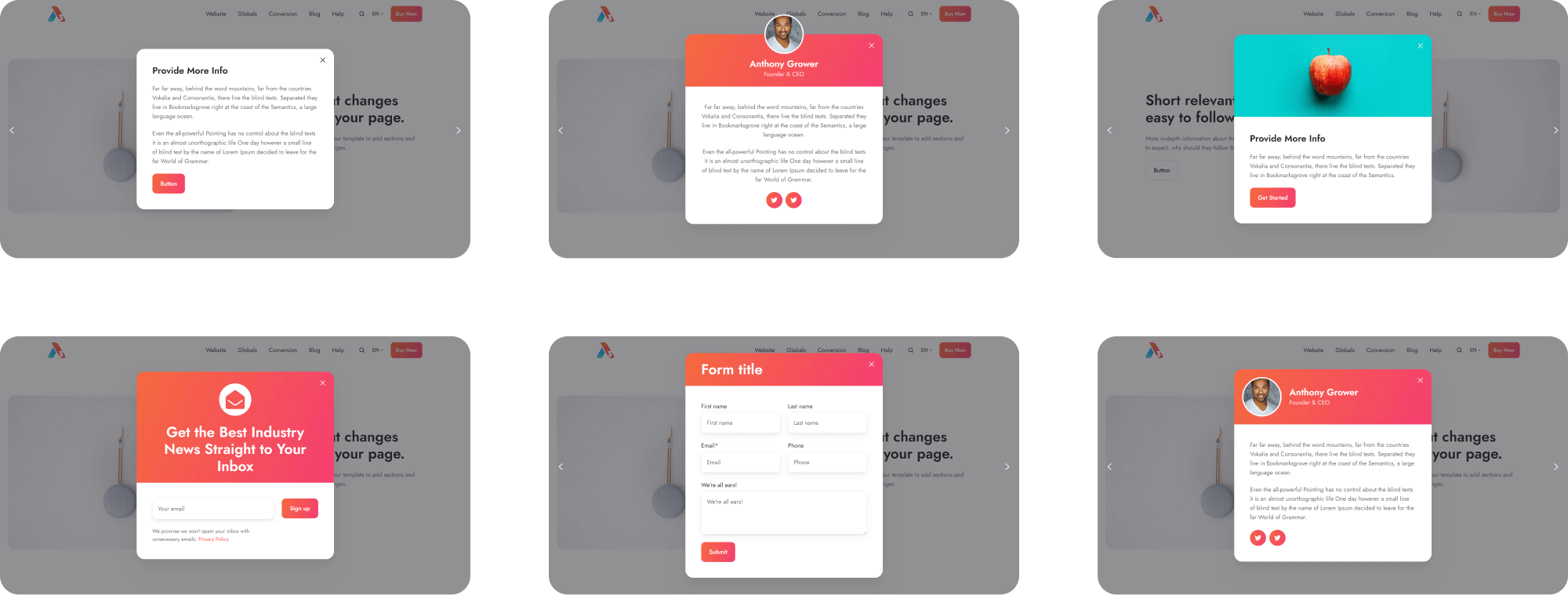
The theme is now RTL-ready. If you are using a modified child version, please be aware that some elements are now using RTL-friendly properties, such as padding-inline-start instead of the old padding-left, or text-align: end instead of text-align: right, etc. So if you've made CSS changes, you may experience minor spacing issues that you need to address after updating. Some editor labels still refer to the 'Left' / 'Right' direction, but they actually have an inverse meaning on an RTL page (e.g., Column align: Left will actually align the columns to the Right).
To not burden other theme copies with unnecessary code, we added an option in the Theme settings > Miscellaneous, where you can make your theme RTL-ready if you are planning on using an RTL language:
We added a very simple Footer 12 that some users may prefer to set for landing pages.
Dropped support for IE, following HubSpot's announcement back in July 2021 that it's no longer supporting this browser. This allows us to use more modern technologies (ES6, CSS variables, etc.) and make the theme even more lightweight. Although the global usage of IE has declined to near zero, if your website in particular still needs to support this browser to an extent, we recommend not updating to Version 11.
Replaced the method to add space between buttons and icons with a more performant, simple, and efficient way that uses CSS gap instead of margin.
Because of the change mentioned above, the sharing.css file used with the Sharing module is no longer needed, so we deleted it.
Fixed a problem with the Pillar navigation scroll offset, which now gets the values from the Theme Settings, as initially intended, instead of just using a fixed value.
The Listing pagination is no longer shown if there's only one page.
Files updated
- Most files have been updated.
Version 10
Dec 13, 2021
Added options for word breaking in Theme settings > Typography
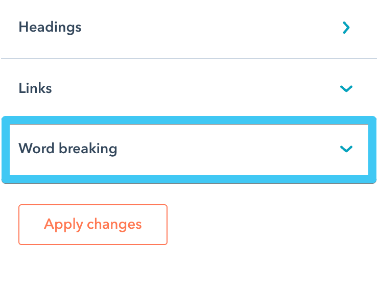
Added variables so you can edit/translate the text on your system pages. More details: How to edit the text on system pages

Added custom color and gradient options for buttons
Added custom gradient options for icons
![]()
Added Column layout options to the mega menu
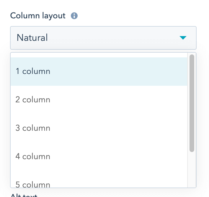
Made the Mega flyouts delay option available in the Navigation module settings
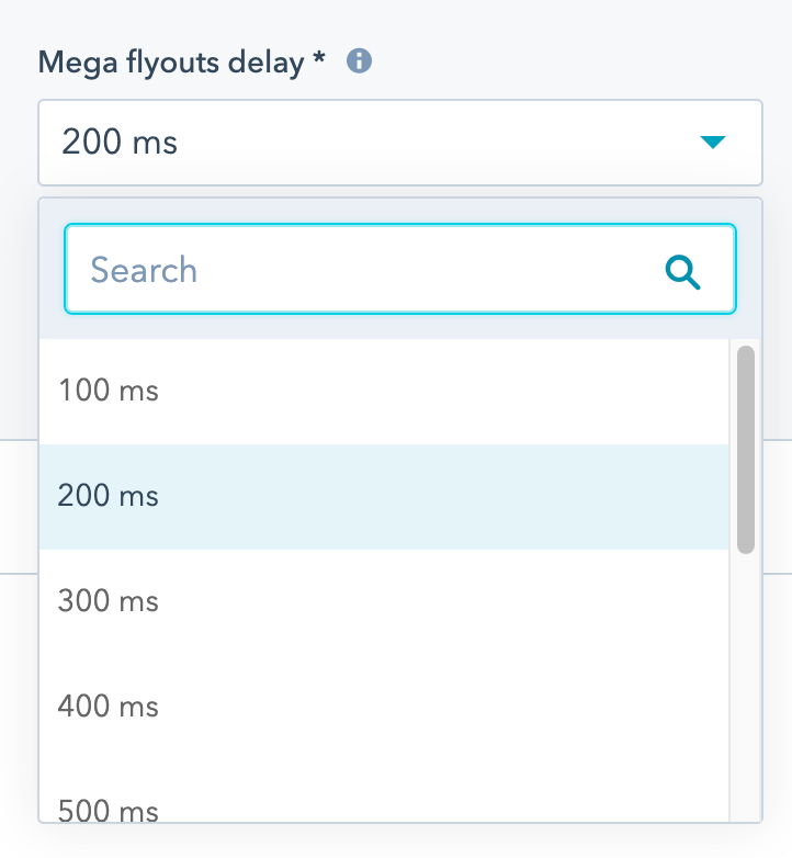
Made the mega menu scrollable if it doesn’t fit the viewport height
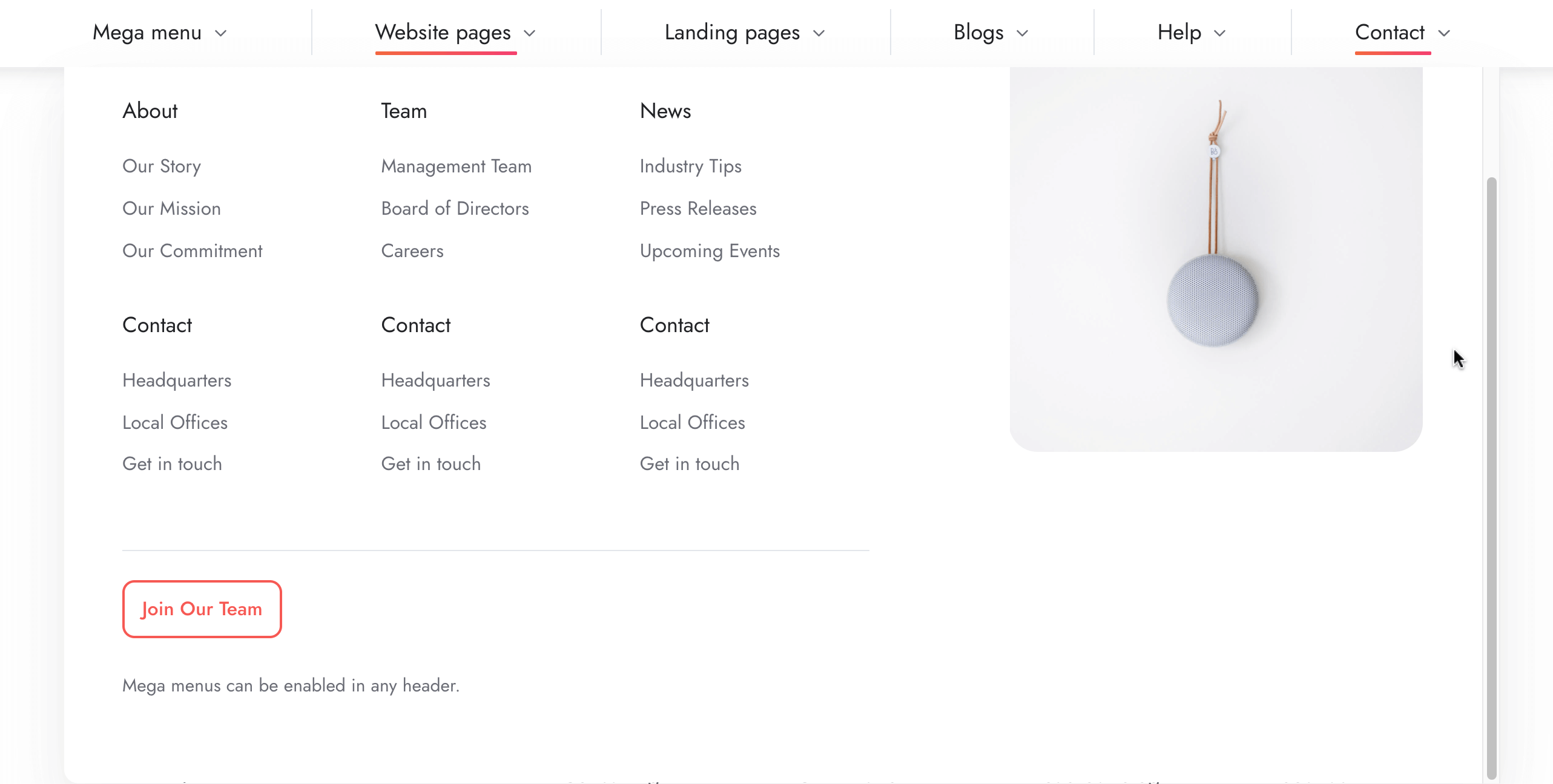
Added onclick attributes to all module links, so you can also trigger onclick actions with JavaScript. For example, activate a tab from another link on the page by adding this function to the onclick attribute: go_to_tab('tab4')

Included the option to add a link to the image on the Box over image module.
Made the Hero slider content take the full width of the container if no maximum width is set.
Fixed a problem with the Hero slider button text on hover, being overridden by the dark color scheme.
Updated the Go card and Image box modules to follow the column settings even in case there’s only one item in the repeater, keeping it consistent with other similar components.
Fixed a minor spacing problem with the icons on the Mobile navigation module, if one of the items didn’t include a link.
Removed the link from the blog post title on the blog post view.
Fixed a problem with the position and space between multiple buttons if at least one is a Call to Action.
Fixed an overlapping issue in the page editor with the header, pillar nav and the module that's being edited.
Other minor fixes.
Files updated
- css/_base.css
- css/_variables.css
- css/components/header-01.css
- css/components/header-01-overlap.css
- css/components/header-02.css
- css/components/header-02-overlap.css
- css/components/header-03.css
- css/components/header-03-overlap.css
- css/components/header-04.css
- css/components/header-04-overlap.css
- css/components/header-05.css
- css/components/header-05-overlap.css
- css/components/header-06.css
- css/components/header-06-overlap.css
- css/components/header-lp-01-overlap.css
- css/components/header-lp-02-overlap.css
- css/components/hero-slider.css
- css/components/mobile-nav.css
- css/components/nav.css
- css/components/pillar-nav.css
- fields.json
- macros/utility.html
- module/box-over-image/fields.json
- module/box-over-image/module.html
- modules/button/fields.json
- modules/button/module.html
- modules/contact-box/fields.json
- modules/contact-box/module.html
- modules/content-card/fields.json
- modules/content-card/module.html
- modules/cover-card/module.html
- modules/feature-card/fields.json
- modules/feature-card/module.html
- modules/features-showcase/module.html
- modules/form/fields.json
- modules/form/module.html
- modules/go-card/module.html
- modules/hero-slider/fields.json
- modules/hero-slider/module.html
- modules/icon/fields.json
- modules/icon/module.html
- modules/image-box/module.html
- modules/image-plus-text/fields.json
- modules/image-plus-text/module.html
- modules/listing/fields.json
- modules/listing/module.html
- modules/mobile-nav/fields.json
- modules/mobile-nav/module.html
- modules/nav/fields.json
- modules/nav/module.html
- modules/pricing/fields.json
- modules/pricing/module.html
- modules/properties/fields.json
- modules/properties/module.html
- modules/quick-features/fields.json
- modules/quick-features/module.html
- modules/shifter/fields.json
- modules/shifter/module.html
- partials/header-01.html
- partials/header-02.html
- partials/header-03.html
- partials/header-04.html
- partials/header-05.html
- partials/header-06.html
- templates/blog-1-post.html
- templates/blog-2-post.html
- templates/blog-3-post.html
- templates/error-404.html
- templates/error-500.html
- templates/password-prompt.html
- templates/subscription-confirmation.html
- templates/subscription-preferences.html
- templates/unsubscribe-backup.html
Version 9
Oct 26, 2021
Fixed a problem with the Nav module, where the link applied to the aside image in the mega menu was not functional.
Files updated
- modules/nav/module.html
Version 8
Oct 4, 2021
Included email notification and follow-up options with the Form and Shifter modules.
Set absolute URLs in the Language selector module.
Disabled language URL rewrite for the Language selector, Nav and Mobile nav modules.
Files updated
- modules/form/fields.json
- modules/form/module.html
- modules/form/shifter.json
- modules/lang-select/module.html
- modules/mobile-nav/module.html
- modules/nav/module.html
- modules/shifter/module.html
Version 7
Sep 28, 2021
Fixed an issue with the font-family property when using certain web safe fonts.
Files updated
- css/_variables.css
Version 6
Sep 20, 2021
We included 20 reusable sections so you can create pages even faster. Watch video
You can now list specific posts by ID with the Blog card module, even mixing posts from different blogs. Watch video
Updated the Logos module so the logos in the carousel are now centered by default.
Added an option to remove the default space after paragraphs in the Rich text module.
Fixed an issue with the Image plus text module, where the dark color scheme affected some button color on hover.
Files updated
- css/_base.css
- modules/blog-card/module.html
- modules/image-plus-text/module.html
- modules/logos/fields.json
- modules/rich-text/module.html
Version 5
Aug 30, 2021
Files updated
- css/_variables.css
Version 4
Aug 26, 2021
Fixed a bug with the Thumbnails gallery not working properly with multiple sliders on the same page.
Fixed an issue with the Rich Text columns not being equal in the Listing module.
Improved the look of textarea with large round corners.
Set a higher z-index for the Lightbox component to prevent overlapping in the page editor.
Added Settings and Wrapper to the Sharing module.
Files updated
- css/_form.css
- css/_lightbox.css
- css/_variables.css
- css/components/listing-rich-text.css
- css/components/sharing.css
- modules/gallery/module.html
- modules/sharing/fields.json
- modules/sharing/module.html
Version 3
Aug 23, 2021
Added an option to list Recent posts by author in the Blog card module.
Set absolute URL paths for posts in the Blog card module to support blog subdomains.
Set a higher z-index on drop-down menus to always appear in front of other content on the page.
Files updated
- css/components/nav.css
- modules/blog-card/fields.json
- modules/blog-card/module.html
Version 2
Aug 11, 2021
Fixed a bug with the Listing component, when an unescaped special character caused an error
Set relevant covers for the blog templates
Files updated
- modules/listing/module.html
Version 1
Jul 30, 2021
