- Home
- Getting started
-
Modules
- General info
- Accordion
- Blog card
- Box over image
- Button
- Column navigation
- Compact card
- Comparison table
- Contact box
- Content card
- Cover card
- Feature card
- Features showcase
- Form
- Gallery
- Go card
- Heading
- Hero slider
- Icon
- Image
- Image box
- Image plus text
- Language selector
- Listing
- Logos
- Mobile navigation
- Modal
- Multi address
- Navigation
- Numbers
- Pillar navigation
- Pricing
- Properties
- Quick action
- Quick features
- Quote
- Review
- Rich text
- Scroll to
- Section extra settings
- Section intro
- Sharing
- Shifter
- Side menu
- Site search
- Steps
- Tabs
- Team card
- Timeline
- Video
- Blog configuration
- Articles
- Changelog
-
- License
- Support policy
- Refund policy
Cover card


Use case:
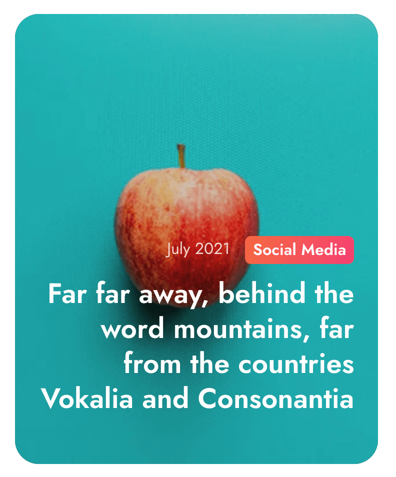
Complex card with multiple elements and styles. It has options to add background images on various screen sizes, transparent overlay, labels, text and button. You can add a single card or multiple equal cards in rows and columns. Can be used for almost anything: feature important content, link to resources, showcase products, services, etc.
Page speed impact:
Low, if not above-the-fold and you are using Link buttons instead of Call to Action buttons.
Medium, if placed above-the-fold or you are using Call to Action buttons instead of Link buttons, especially on mobile.
It also depends a lot on the size of your background image. The smaller it is, the faster the page will be.
Available in pages:
Yes
Reserved block class:
cover-cardResources:
css/components/cover-card.cssAlso available as a type of content in the Listing module.