- Home
- Getting started
-
Modules
- General info
- Accordion
- Blog card
- Box over image
- Button
- Column navigation
- Compact card
- Comparison table
- Contact box
- Content card
- Cover card
- Feature card
- Features showcase
- Form
- Gallery
- Go card
- Heading
- Hero slider
- Icon
- Image
- Image box
- Image plus text
- Language selector
- Listing
- Logos
- Mobile navigation
- Modal
- Multi address
- Navigation
- Numbers
- Pillar navigation
- Pricing
- Properties
- Quick action
- Quick features
- Quote
- Review
- Rich text
- Scroll to
- Section extra settings
- Section intro
- Sharing
- Shifter
- Side menu
- Site search
- Steps
- Tabs
- Team card
- Timeline
- Video
- Blog configuration
- Articles
- Changelog
-
- License
- Support policy
- Refund policy
Reveal (scrolling animations)
Important notes!
- Available as of Version 35.
- Adding reveal animations to the above-the-fold elements may be perceived as slowing down the page. Add it above-the-fold only when the visual appeal of your page is more important than perceived performance.
- Known issue: Ghost style's blurred background may appear disabled during the animation due to the following browser limitation: https://drafts.fxtf.org/filter-effects-2/#backdrop-root
- Elements that already have CSS transform or opacity applied will have these styles overwritten according to the animation's end keyframe styles.
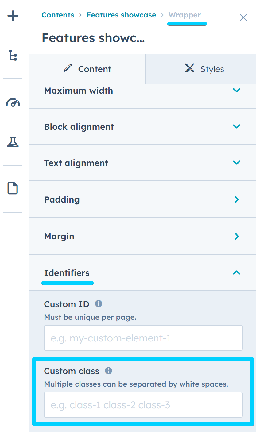
This is a core component available on all pages, which you can apply to any element that can have a custom class. You can add custom classes to most modules in Act3 in the Wrapper › Identifiers › Custom class field.

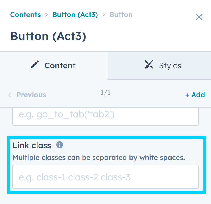
Many modules also include similar fields for specific elements, such as link/button classes, item classes in a repeater, etc. These fields can also be used to add scrolling animations. And we plan to add more of these fields to other elements where it makes sense.

You can also add classes to rich text elements in Advanced › Source code, like this:
<h1 class="reveal">Hello World!</h1>Required class
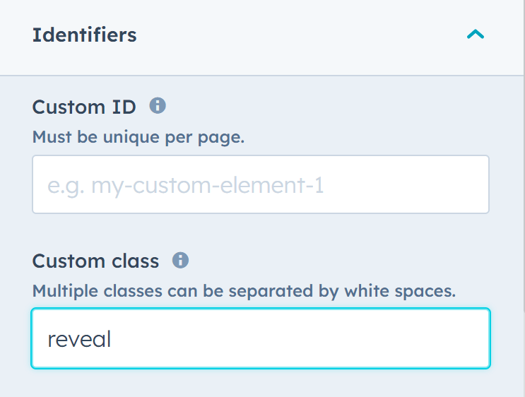
To apply a scrolling animation to a module or element, add the required reveal class. This alone will apply the default scrolling animation and may be enough for most elements:

Animation
However, if you want to change the direction or type of your animation, you can also add one of the preset animation classes from the list below. For example, an element that should animate towards the right will have these classes applied:
reveal reveal--rightHere are all the available classes:
reveal--up
reveal--down
reveal--left
reveal--right
reveal--zoom
Rerun
By default, once an element has been revealed, it will stay that way even if you scroll away and return to it later. It will not animate again. However, if you want the animation to run every time the element appears in view again, you can add this class to your element: reveal--rerun. For example:
reveal reveal--up reveal--rerunDuration
You can specify a custom duration for the animation with a class like this: reveal--duration-400, where 400 is the duration in milliseconds (ms). Example:
reveal reveal--up reveal--rerun reveal--duration-400Delay
Similarly, if you want the animation to delay for a moment (usually when you want elements in a group to appear one after the other), you can add a class like this: reveal--delay-300, where 300 is the delay in milliseconds (ms). Example:
reveal reveal--up reveal--rerun reveal--delay-300Timing
To apply an easing function to your animation, you can use a class like this: reveal--timing-ease-in-out, where ease-in-out can be replaced with your desired easing value. For example:
reveal reveal--up reveal--rerun reveal--delay-300 reveal--timing-ease-inOffset
Sometimes you may want the animation to start only after a certain portion of the element has entered the viewport. In that case, you can use the reveal--offset-100 class, where 100 is the number of pixels the element needs to be inside the viewport before the animation starts. For example:
reveal reveal--up reveal--rerun reveal--offset-100