- Home
- Getting started
-
Modules
- General info
- Accordion
- Blog card
- Box over image
- Button
- Column navigation
- Compact card
- Comparison table
- Contact box
- Content card
- Cover card
- Feature card
- Features showcase
- Form
- Gallery
- Go card
- Heading
- Hero slider
- Icon
- Image
- Image box
- Image plus text
- Language selector
- Listing
- Logos
- Mobile navigation
- Modal
- Multi address
- Navigation
- Numbers
- Pillar navigation
- Pricing
- Properties
- Quick action
- Quick features
- Quote
- Review
- Rich text
- Scroll to
- Section extra settings
- Section intro
- Sharing
- Shifter
- Side menu
- Site search
- Steps
- Tabs
- Team card
- Timeline
- Video
- Blog configuration
- Articles
- Changelog
-
- License
- Support policy
- Refund policy
Modules general info
Content vs Styles
In the page editor you will see that all modules have two parts — Content and Styles:
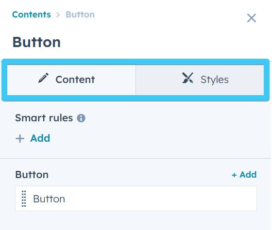
At this moment, the Styles tab is not used in our custom modules because we rely on an extra breakpoint (medium screens/tablet) for an improved page responsiveness, that's not currently available natively in the HubSpot drag and drop page editor or the Styles tab. You will find that only default HubSpot modules have some style options enabled. This however doesn't mean we haven't included any style options in our Theme modules. You will just have to find them under the Content tab > Wrapper section, as explained below, or under the Content > Settings section for specifc module styles.
So for now you will only need to make edits in the Content panel, which is the actual content of the module, including settings, style options, etc.
For a better undestanding of the HubSpot drag and drop page editor, please consult this HubSpot guide: Edit page content in a drag and drop area
Act3 modules
Act3 contains pretty much all the modules you need. Most of our theme modules are structured this way:
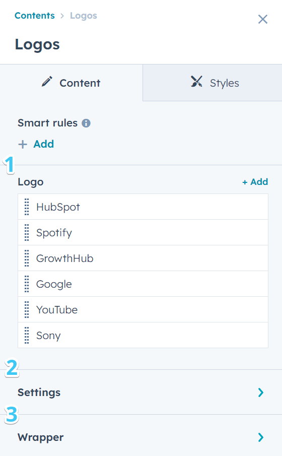
1. Content
Module fields are used to populate the module with your own content. Some modules include Repeaters, which means a component or sub-component can be repeated, each with its own content. For example, you can use the Button module to include multiple buttons. Or add multiple cards in a card module.
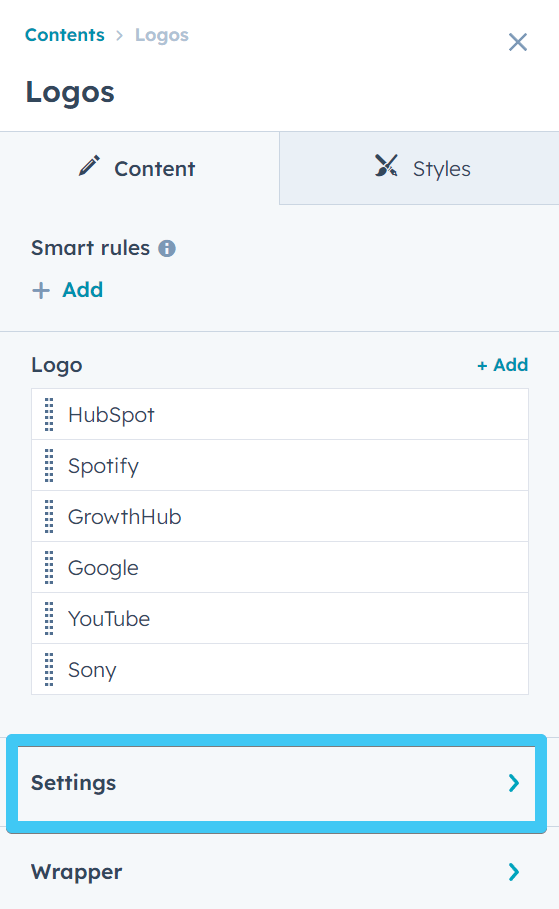
2. Settings
Apart for the content and individual component settings, we grouped most of the more advanced settings and styles of a module, or settings that apply to all sub-components of a repeater, in a group named Settings. Depending on the module, this may contain column options, slider functionality, color scheme, etc. This may be missing on some very simple modules, with only a few fields.
3. Wrapper
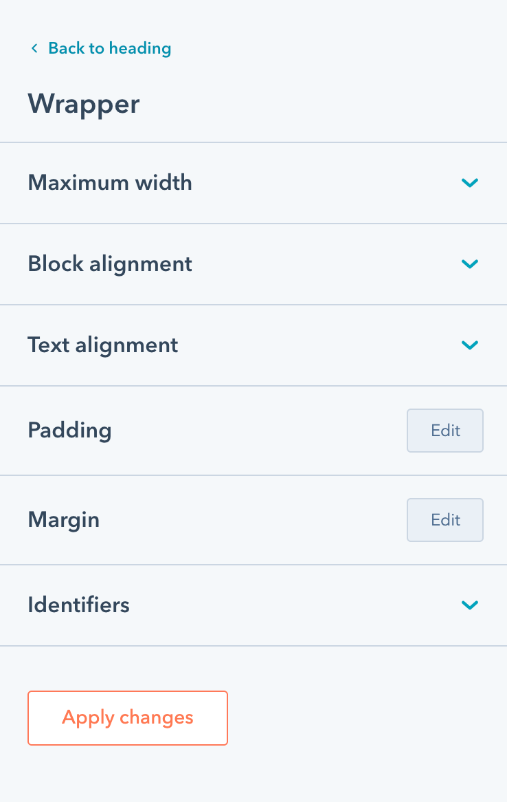
This is where we included our own module wrapper styles, such as padding, margin, text and block alignment, and other wrapper-specific styles:
Quick demo
Take a look at this quick demo that shows how you can use the drag-and-drop page editor, in combination with the various module settings, and also the amazing wrapper styles that really expand what you can do with it:
Really great way to make the most of the built-in tools and unleash your creativity! You're no longer limited to using only the section's alignment and spacing styles. Now, you have the freedom to adjust the width or spacing for individual modules within a section without affecting the entire content in that section. It gives you more control over the design and layout of your page.
It's also great for those cases where you want the section background to go behind all the modules inside. Wrapper styles can be handy to adjust width and spacing for individual modules that share the same background.
This is pretty much the same on all our theme modules. Some modules may not have this group at all, and others may include styles that override these wrapper styles, such as text alignment.
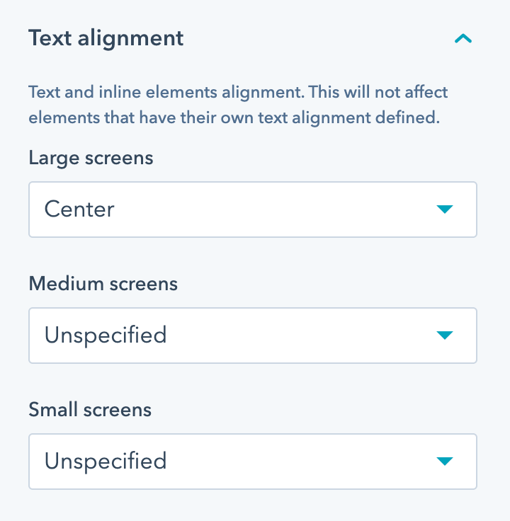
All wrapper styles are available for three screen sizes: large, medium and small. The styles are applied following a desktop-first approach, to keep a consistency with the HubSpot layout and tools. That means if you set your text alignment on large screens, but don't specify it for medium or small screens, it will inherit the same alignment for those screen sizes as well:
Adding classes or custom IDs to Act3 modules
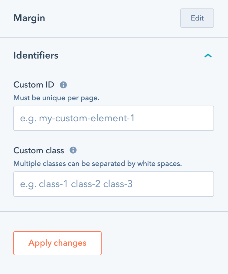
We also included two fields where you can specify an unique ID or a custom class that will apply to this module wrapper. This may be useful to developers that want to apply custom styles to a specific module, or if you want to add an anchor that will scroll to your module:
Notes:
- It isn't recommended to align content horizontally using padding or margin, because that may break the layout. Use maximum width and block alignment instead.
- Some of these styles may be overridden with specific CSS styles in modules used in headers and footers.