- Home
- Getting started
-
Modules
- General info
- Accordion
- Blog card
- Box over image
- Button
- Column navigation
- Compact card
- Comparison table
- Contact box
- Content card
- Cover card
- Feature card
- Features showcase
- Form
- Gallery
- Go card
- Heading
- Hero slider
- Icon
- Image
- Image box
- Image plus text
- Language selector
- Listing
- Logos
- Mobile navigation
- Modal
- Multi address
- Navigation
- Numbers
- Pillar navigation
- Pricing
- Properties
- Quick action
- Quick features
- Quote
- Review
- Rich text
- Scroll to
- Section extra settings
- Section intro
- Sharing
- Shifter
- Side menu
- Site search
- Steps
- Tabs
- Team card
- Timeline
- Video
- Blog configuration
- Articles
- Changelog
-
- License
- Support policy
- Refund policy
Header
This is the global header that appears at the top of your website pages, including your company logo, menu, search icon, etc.:

Table of Contents
Theme settings
Choosing your headers
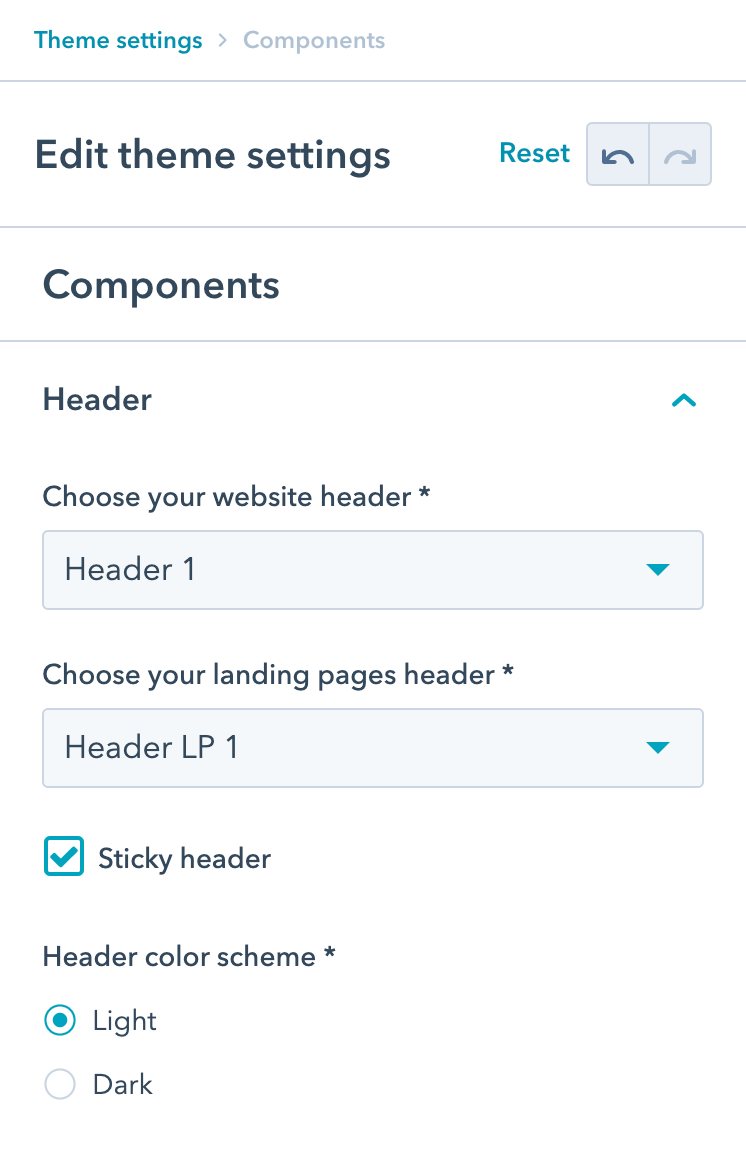
Currently, there are 6 website headers available in Act3, and 2 navigation-free landing page headers that you can select in the Theme settings > Components > Header:
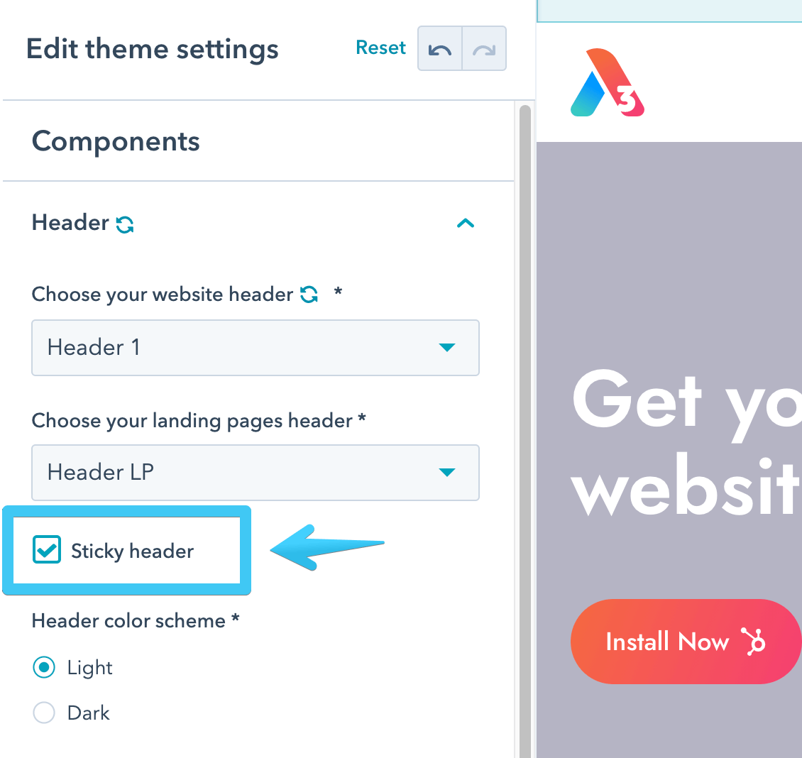
Sticky header
If you want your website header to remain sticky while scrolling, check the Sticky header box:
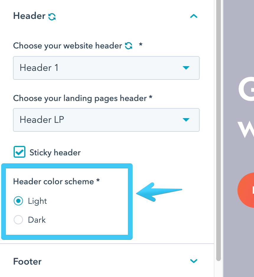
Header color scheme
There is also an option to select a Light or a Dark color scheme for your headers:
Page settings
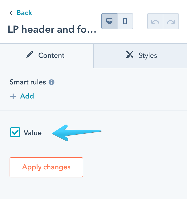
LP header and footer
You can use every page template in Act3 for either website pages or landing pages. You only need to check this box on your page to apply your landing page header and footer, or uncheck it to use the default website versions:
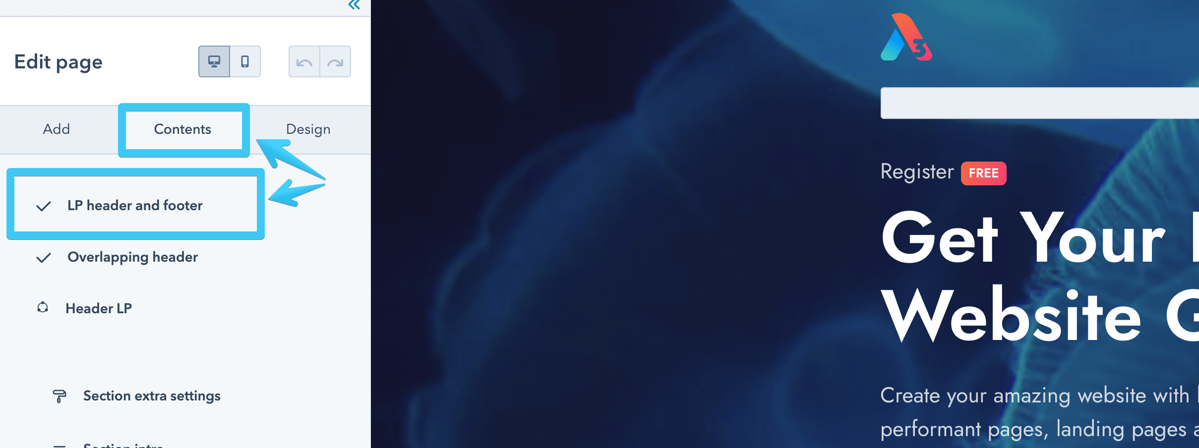
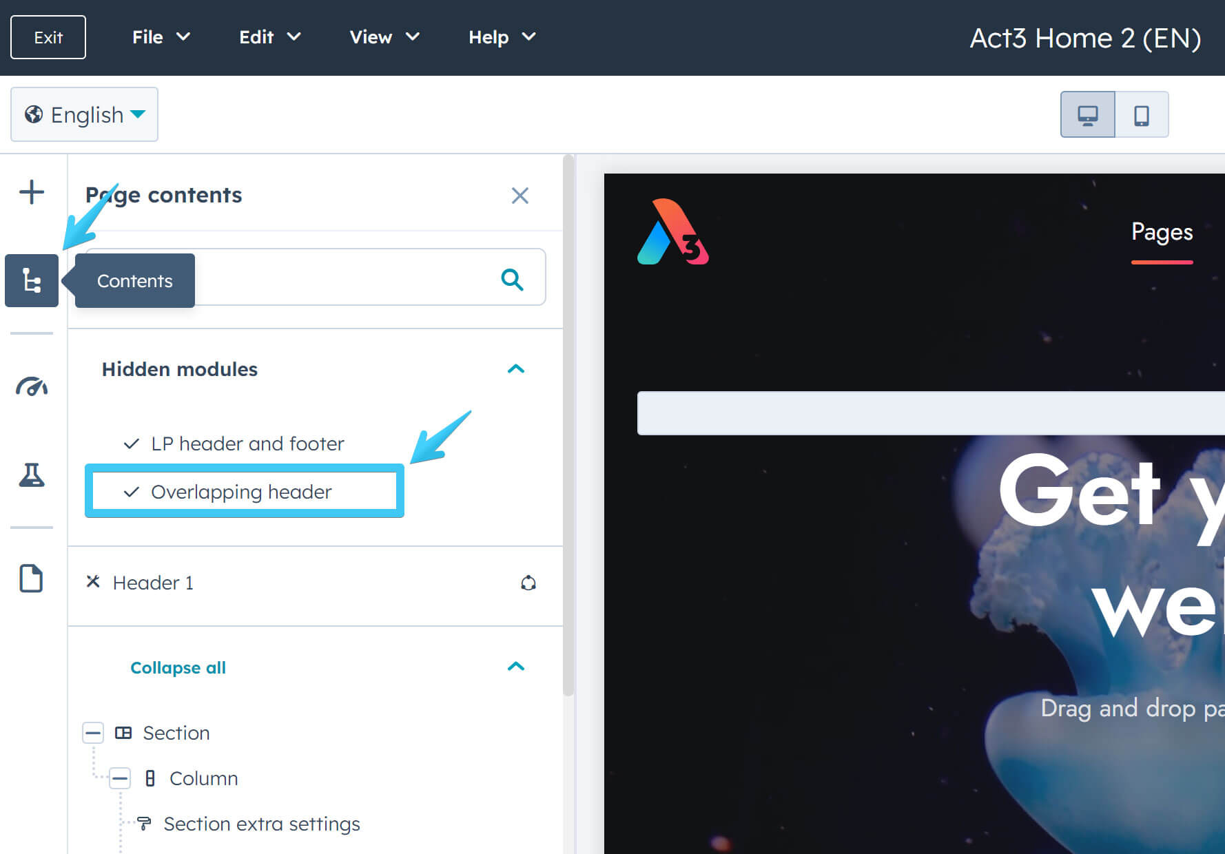
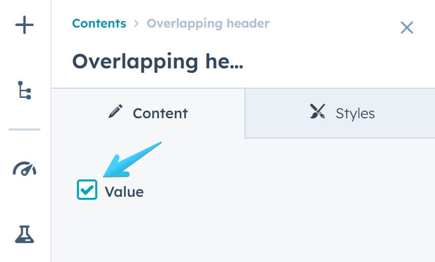
Overlapping header
If your page has a large background at the top and you want your header to overlap that section, you can check this box:
Global content editor
You can edit the content of a header by clicking it in the page editor, which will open your header in the Global content editor:
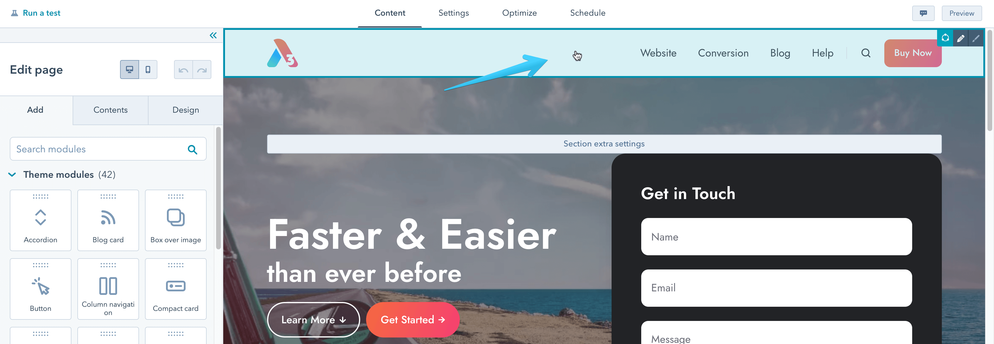

All three header instances — default, sticky and overlapping — are part of the same header. Only the logo, buttons, and icons are different content, in case you need a white logo version for the overlapping header or some smaller buttons or a simpler, smaller logo in the sticky header. The rest remains the same, with minor color adjustments (e.g., the text is white on the overlapping header).
Here are all the available headers and their options:
Previews
Header 1
Live previews: Static | Overlapping


Header 2
Live previews: Static | Overlapping


Header 3
Live previews: Static | Overlapping


Header 4
Live previews: Static | Overlapping


Header 5
Live previews: Static | Overlapping


Header 6
Live previews: Static | Overlapping


Header LP 1
Live previews: Static | Overlapping


Header LP 2
Live previews: Static | Overlapping

