- Home
- Getting started
-
Modules
- General info
- Accordion
- Blog card
- Box over image
- Button
- Column navigation
- Compact card
- Comparison table
- Contact box
- Content card
- Cover card
- Feature card
- Features showcase
- Form
- Gallery
- Go card
- Heading
- Hero slider
- Icon
- Image
- Image box
- Image plus text
- Language selector
- Listing
- Logos
- Mobile navigation
- Modal
- Multi address
- Navigation
- Numbers
- Pillar navigation
- Pricing
- Properties
- Quick action
- Quick features
- Quote
- Review
- Rich text
- Scroll to
- Section extra settings
- Section intro
- Sharing
- Shifter
- Side menu
- Site search
- Steps
- Tabs
- Team card
- Timeline
- Video
- Blog configuration
- Articles
- Changelog
-
- License
- Support policy
- Refund policy
Modal

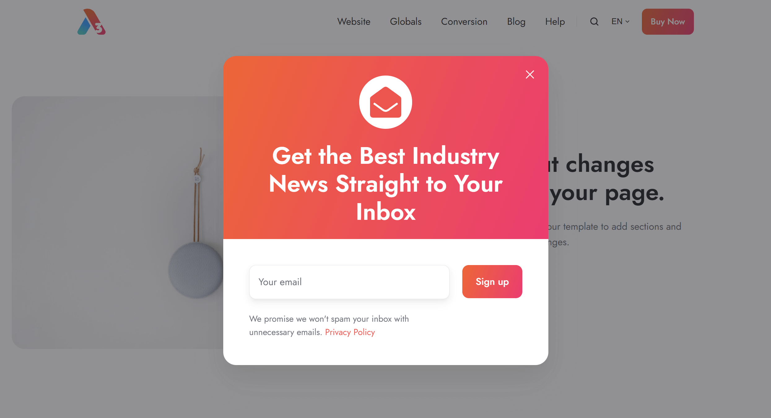
modalcss/components/modal.cssjs/components/modal.jsAdding a modal
To add a modal, edit your page and go to the Contents tab:
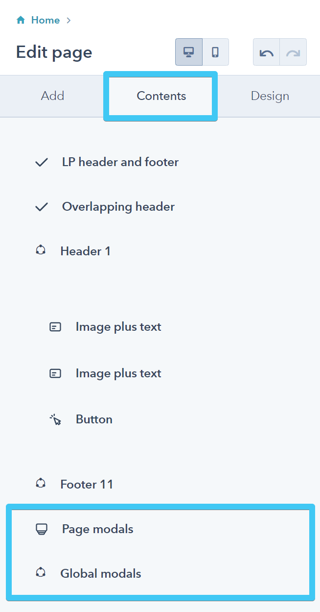
There are two modules available: Page modals and Global modals.
Use the Page modals to add modals that are only available to the current page (e.g., team members on an About page). Or use the Global modals for modals that you want to open from any page, such as modals that can be triggered by a button in the header, or footer, etc.
Please do not add modals you are not going to use globally to the Global modals, because that will only make all your pages heavier for no reason.
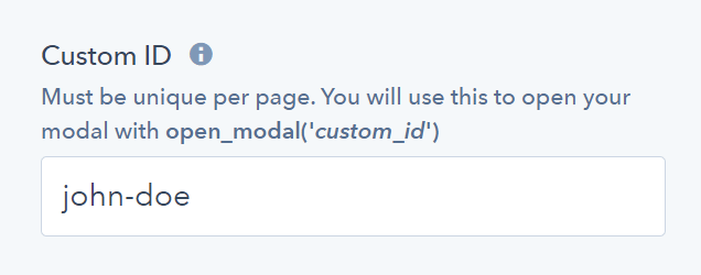
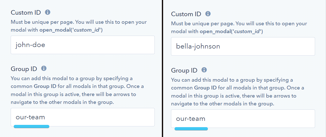
Specify a unique Custom ID for your modal (no other element on the page must have this ID). For example, john-doe
Opening a modal
You will use the Custom ID you specified above within an onclick field with a simple function to open your modal, like so:
open_modal('john-doe')
We also recommend adding this to your link External URL:
javascript:;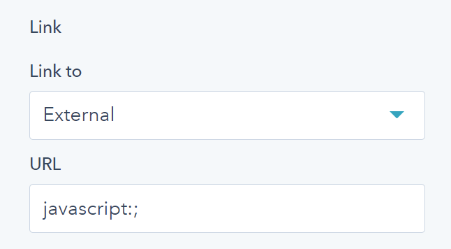
Please note that HubSpot may show a warning that this is not a valid URL, but it's perfectly acceptable and common practice when JavaScript handles the link action. You can perfectly use it — that's just a warning, unjustified in this case.
HubSpot Call-to-Action buttons redirect the browser to a tracking domain first and only then to the target page, so they cannot open these modals. This only works with regular links/buttons.
Closing a modal
If you want to close your modal from a button or link within the modal window (for example, a Cancel button), you can use use the onclick field/attribute to call a simple function like this:
close_modal('john-doe')
Same as before, consider adding this to your link External URL:
javascript:;
Modal gallery
You can group modals in a gallery — where the user can browse through all the modals with prev/next arrows/keys — by adding the same Group ID to all modals you want in that gallery. For example, add our-team Group ID to your team member modals on your About page:
Adding a video, audio or iframe to your modal (advanced)
Please refer to our Lightbox documentation if you just want to open an image or video in a popup window. That may be better suited for this use-case. The modal, however, may be helpful if you don't want your video to autoplay or you need to add additional content along with it, such as a title, description, etc.
In case you want to add YouTube, Vimeo, or other iframes to your modal, we recommend modifying your embed code to replace the src attribute with data-src, and adding this class to your iframe: modal__iframe. This way your iframe is lazy-loaded and won't add to the page loading time.
Here is an example of a YouTube embed code with the mentioned attribute, class, and the autoplay parameter at the end of the YouTube URL. The video will only play when the modal is open, and will stop playing when closing the window. You can compare this with your embed code and change it accordingly to obtain the same functionality. You can check the differences here.
Before (YouTube original embed code):
<iframe width="560" height="315" src="https://www.youtube.com/embed/qDCyvvdzND4" title="YouTube video player" frameborder="0" allow="accelerometer; autoplay; clipboard-write; encrypted-media; gyroscope; picture-in-picture" allowfullscreen></iframe>After (modified YouTube embed code):
<iframe class="modal__iframe" width="560" height="315" data-src="https://www.youtube.com/embed/qDCyvvdzND4?autoplay=1" title="YouTube video player" frameborder="0" allow="accelerometer; autoplay; clipboard-write; encrypted-media; gyroscope; picture-in-picture" allowfullscreen></iframe>Here is the Live example
If you have a <video> or <audio> HTML element you want to autoplay only when the modal is open, you can add this class to that element: modal__media and instead of an autoplay attribute, use data-autoplay.
Here is an example:
<video width="430" height="242" style="width: 100%; height: auto;" class="modal__media" src="https://273774.fs1.hubspotusercontent-na1.net/hubfs/273774/act3/videos/sample-1293jmdsm.mp4" controls preload="metadata" data-autoplay></video>