Badge
This is a core component available with all pages, which you can include with simple lines of code. You can use this to highlight quick info regarding a label, text, etc.
You can add a badge next to a text line or in a Rich Text field with a code like this:
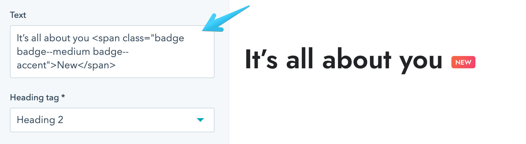
<span class="badge badge--medium badge--accent">New</span>Here is an example with a Heading module:
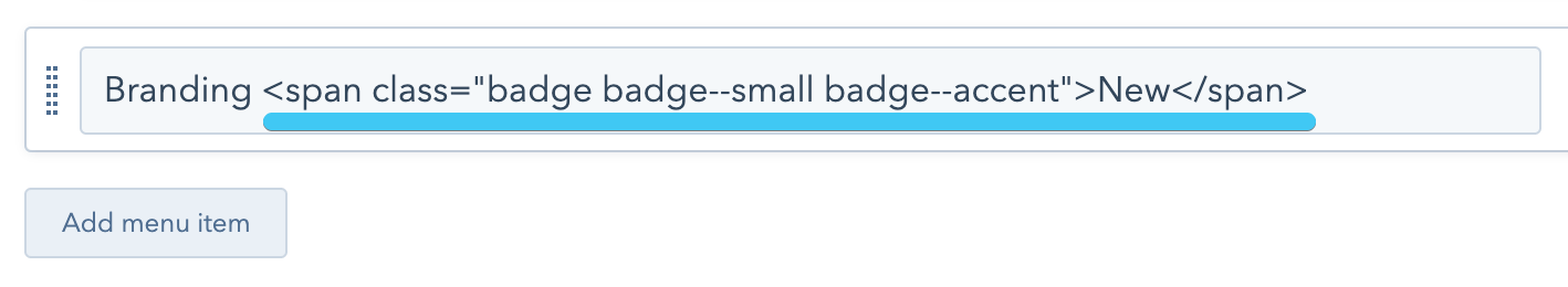
Another example of a badge in the menu:
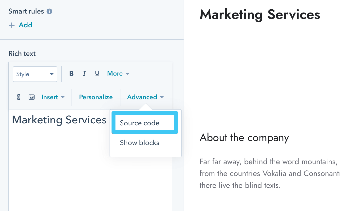
In a Rich Text field, you need to edit the source code:
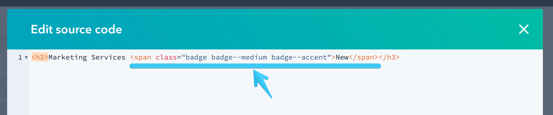
Then find your text element and paste the code:
You can replace badge--medium with one of the Size modifier classes below and the badge--accent class with one of the Color modifier classes below.
You can add the badge--lowercase to disable the uppercase text styling.
Starting with Version 27, you can also add the badge--pill class for a pill-shaped badge.
Here is an example of a large dark badge with the uppercase disabled:
<span class="badge badge--large badge--dark badge--lowercase">New</span>
Here are all the available classes:
badge
badge--smallbadge--mediumbadge--largebadge--accentbadge--darkbadge--whitebadge--ghostbadge--lowercasebadge--pill (starting Version 27)