Theme settings

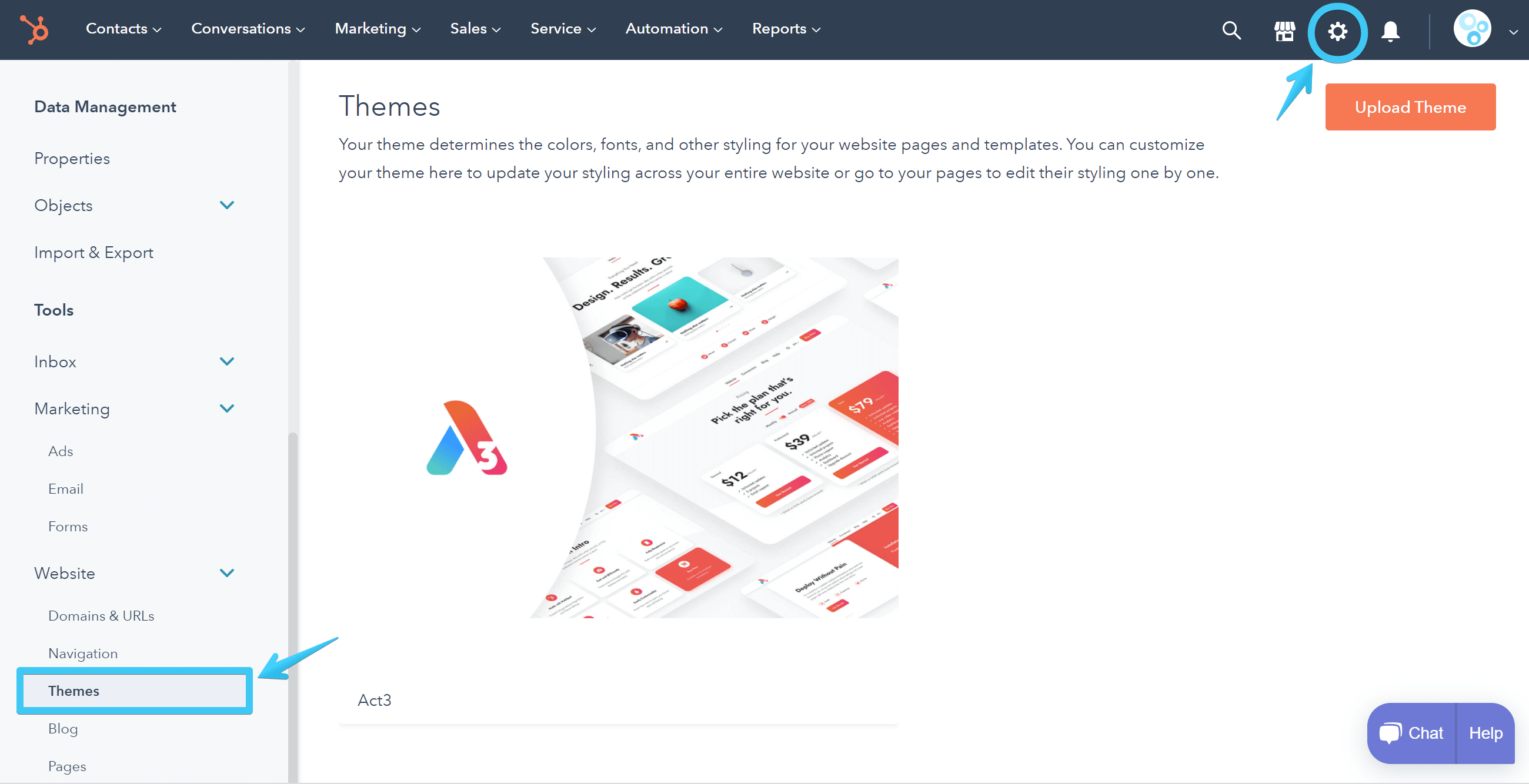
Go to Settings > Website > Themes to customize your theme:

Act3 - HubSpot > Settings > Website > Themes

Table of Contents

Here are all the theme settings included with Act3 and their effect on your pages, grouped by category, as they appear in the editor:

Color
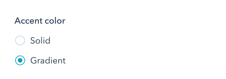
Accent color
Act3 Theme Settings - Color - Accent color
This will set the tone for your theme. You can select a Solid accent color or a Gradient depending on what you choose here. The gradient is composed of a start color and an end color, and there is also a fallback color for those elements that don't support CSS gradients. Whether it's a solid color or a gradient, the accent color is your primary brand color that will appear everywhere across your website, from buttons, icons, to even some cards and glow shadows. For the best results, the accent color should look great and be visible on both white and dark backgrounds.
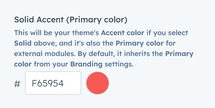
Solid Accent (Primary color)
Act3 Theme Settings - Color - Solid Accent (Primary color)
This will be your theme's Accent color if you select Solid above, and it's also the Primary color for external modules. By default, this inherits the Primary color from your Branding settings.
Gradient start
Act3 Theme Settings - Color - Gradient start
It only appears if you choose a Gradient Accent color.
Gradient end
Act3 Theme Settings - Color - Gradient end
It only appears if you choose a Gradient Accent color.
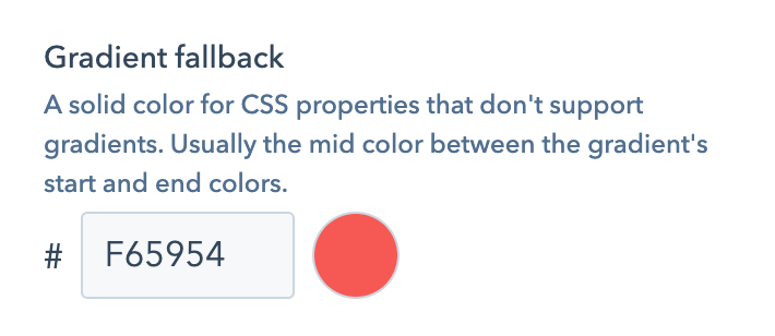
Gradient fallback
Act3 Theme Settings - Color - Gradient fallback
It only appears if you choose a Gradient Accent color.
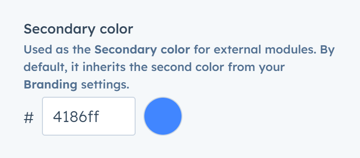
Secondary color
Act3 Theme Settings - Color - Secondary color
Used as the Secondary color for external modules. By default, it inherits the second color from your Branding settings.
Tertiary color
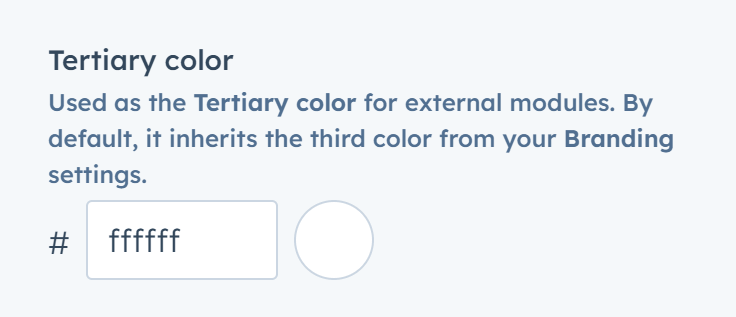
Act3 Theme Settings - Color - Tertiary color
Used as the Tertiary color for external modules. By default, it inherits the third color from your Branding settings.
Dark gray
Act3 Theme Settings - Color - Dark gray
Part of your theme's grayscale or neutral colors. Please do not choose a vivid color here or anything else than — as the name suggests — a very dark gray or a black nuance. This color goes on the header navigation, UI icons, transparent dark overlays on top of background images, headings (unless you choose something else), and other dark elements. Dark gray must be the darkest gray in your theme's grayscale.
Light gray
Act3 Theme Settings - Color - Light gray
Part of your theme's grayscale or neutral colors. Please do not choose a vivid color here or anything else than a very light gray, as the name suggests. It mainly applies to very light, almost white, backgrounds, especially to distinguish alternate sections. Light gray must be the lightest gray in your theme's grayscale.
Borders
Act3 Theme Settings - Color - Borders
Part of your theme's grayscale or neutral colors. Please choose a gray that's a bit darker than your Light gray. It mainly applies to borders (sections, headers, menus, inputs, etc.). Some borders become white and transparent in components with dark schemes.
Text
Act3 Theme Settings - Color - Text
This is the default color of your website's body text. We recommend a neutral color, which can be the same as Dark gray or a bit lighter. And since your text is essential, we recommend using a contrast checker like webaim.org to make sure the text is visible, including for users with visual disabilities. Text becomes white in components with dark schemes.
Headings
Act3 Theme Settings - Color - Headings
This is the default color of your website's headings/titles. It will automatically inherit the Dark gray value unless you select something else here. We recommend a neutral dark gray color, maybe something darker than the body text, with a bit more contrast to grab the attention better than the rest of the text. Headings become white and fully opaque in components with dark schemes.
Links
Act3 Theme Settings - Color - Links
This is the default color of your links. It will automatically inherit the Accent color (or Gradient fallback if you use a gradient accent color) unless you select something else here. Some links from particular components (menus, cards, etc.) may use other colors (e.g., Dark gray, Text, or Headings color, depending on the component design). This color applies to all the other regular links from your text blocks. Links become white and fully opaque in components with dark schemes.
Links hover
Act3 Theme Settings - Color - Links hover
This is the default color of your links when hovered over. It will automatically inherit the Accent color (or Gradient fallback if you use a gradient accent color) unless you select something else here. Some links from particular components (menus, cards, etc.) may use other colors (e.g., Dark gray, Text, or Headings color, depending on the component design). This color applies to all the other regular links from your text blocks. Links become white and fully opaque in components with dark schemes.
White text opacity
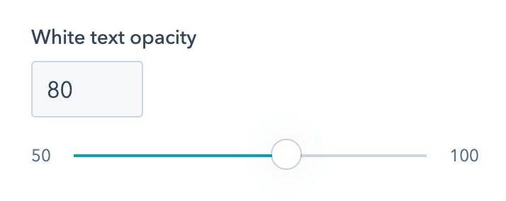
Act3 Theme Settings - Color - White text opacity
This is the opacity of the white base text that appears in components with dark schemes or have accent backgrounds. The headings, links, and other essential elements are fully opaque (100% white). The opacity of different elements in these components, such as transparent white borders, background, etc., are pre-defined in Act3 to simplify things for you. But we think the base text's opacity should be adjustable, and that's why we included this option here. You will probably not need to change this, but if you do, you can set it from half-transparent (50) to fully opaque (100).

Typography

Fonts

This is where you'll define your theme fonts. For consistency and best practices, we recommend using the same font on all fields and only choosing weight variations for the normal and bold text. If possible, use websafe fonts (e.g., Arial, Georgia, Times New Roman, Tahoma, Verdana, Helvetica, etc.) for better page speed. External fonts, such as Google Fonts, may have an impact on your page speed.

Use external fonts
Act3 Theme Settings - Typography - Fonts - Use external fonts
Check this box if you want to serve your own font files or have a script or stylesheet from your font vendor. This will remove all font fields from the theme settings, and you will have to follow our guide on how to include external fonts.
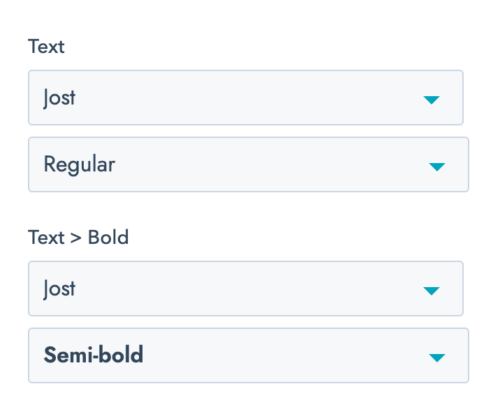
Text
Act3 Theme Settings - Typography - Fonts - Text
This is the font you are using for your body text. Please choose the same font (font name) for both Text and Text > Bold fields. Only the font variation (second drop-down) can be different.
Headings
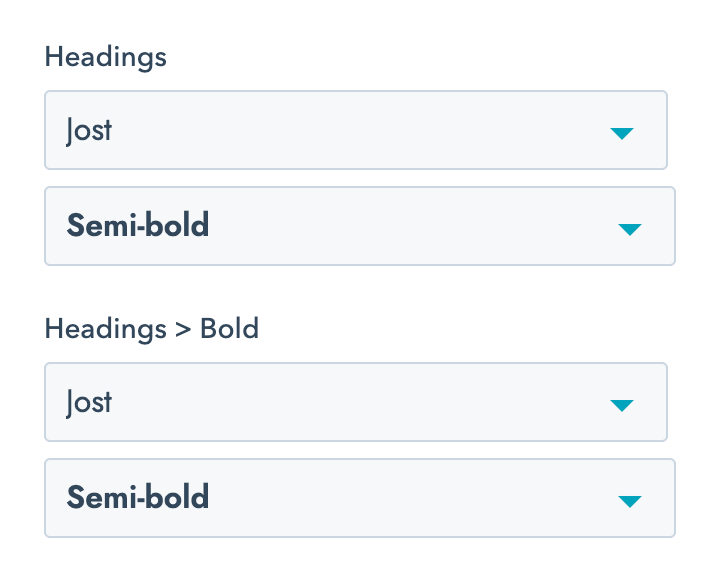
Act3 Theme Settings - Typography - Fonts - Headings
This is the font you are using for your headings. Please choose the same font (font name) for both Headings and Headings > Bold fields. Only the font variation (second drop-down) can be different. The only time it makes sense to choose a different font variation for the Headings > Bold field is when your headings are not bold by default, and you still want to manually make certain words in your headings bold while using a rich text editor.
UI
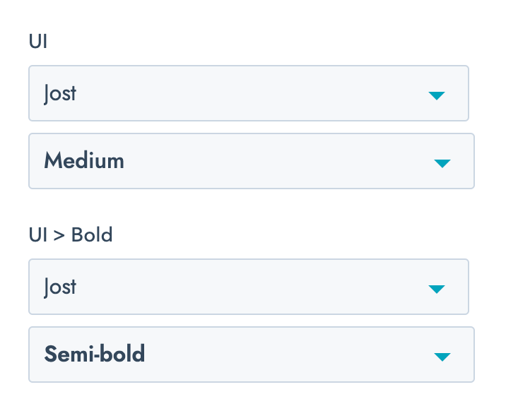
Act3 Theme Settings - Typography - Fonts - UI
This font is used on some of the UI elements, such as buttons, tooltips, some card labels, blog tags, pagination, numbers, etc. This can, in most cases, be the exact same font used on Headings. Please choose the same font (font name) for both UI and UI > Bold fields. Only the font variation (second drop-down) can be different.

Text

Font size
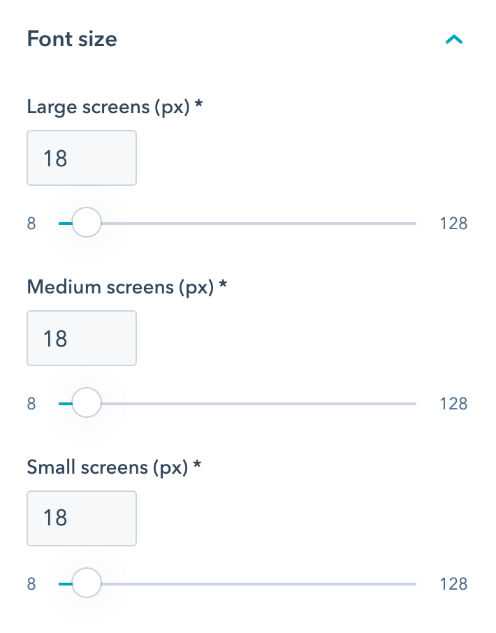
Act3 Theme Settings - Typography - Text - Font size
This is where you can adjust your website's body text size for all three screen sizes (breakpoints). The font sizes are set in pixels for easier customization, but we are actually converting them into `rem` units behind the scenes as a best practice. Most of the times all three values can be the same, but depending on your font size, you may want to adjust it on smaller screens.
Line height
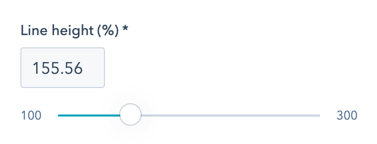
Act3 Theme Settings - Typography - Text - Line height
Use this to increase or decrease the distance between lines of text.
Large text
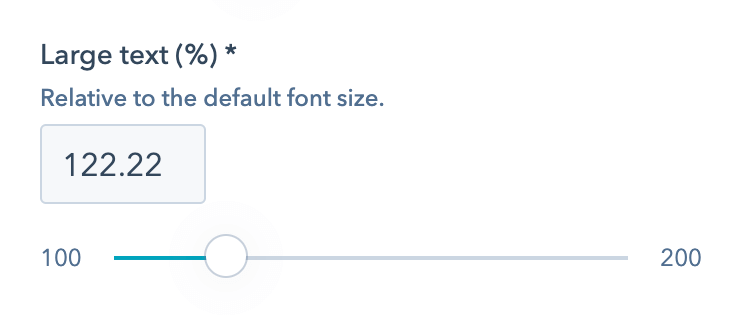
Act3 Theme Settings - Typography - Text - Large text
We designed certain elements in Act3 to use a larger font-size (e.g., section intro overline, blog next/previous post links, column navigation title, some footer titles, etc.). This is where you can adjust your large text size, which is relative to the body text size and will adjust accordingly on all three screen sizes if the body text size is different.
Small text
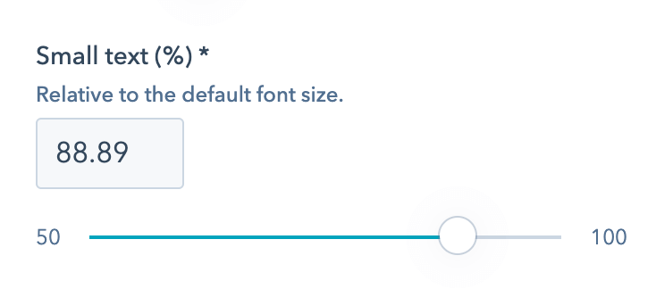
Act3 Theme Settings - Typography - Text - Small text
Certain elements in Act3 use a smaller font-size (e.g., accordion back-to-top links, some card text, info text, etc.). This is where you can adjust your small text size, which is relative to the body text size and will adjust accordingly on all three screen sizes if the body text size is different.

Headings

Act3 Theme Settings - Typography - Headings

Font size and line height
Act3 Theme Settings - Typography - Text - Font size
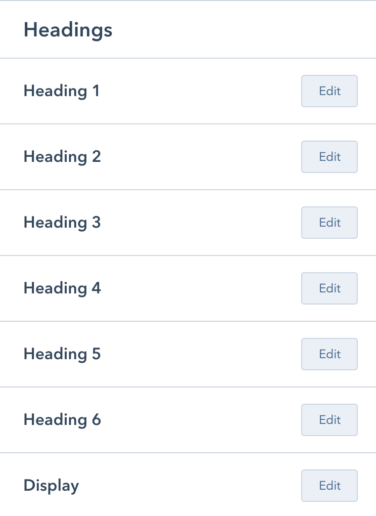
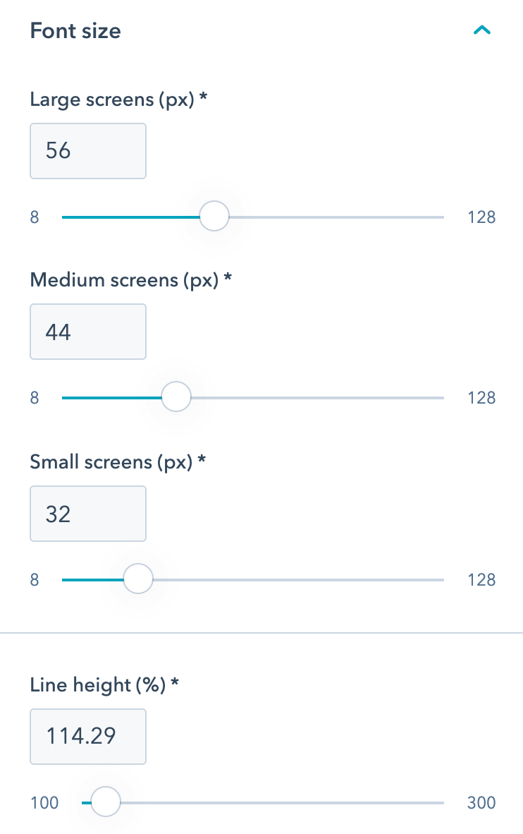
Here is where you can adjust the font size of your headings on all three screen sizes (breakpoints) and select the line-height for each heading tag. This is the same for all headings and is pretty much self-explanatory. For the best results, please make sure Display is the largest heading, then: Heading 1 > Heading 2 > Heading 3 > Heading 4 > Heading 5 > Heading 6.
Underline and hover underline
Act3 Theme Settings - Typography - Links - Underline
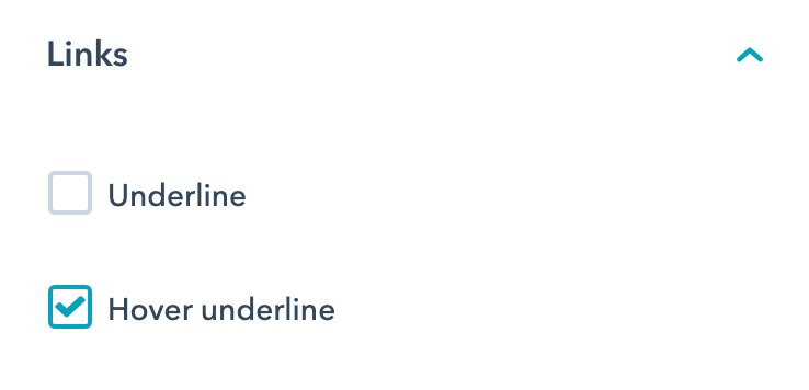
You can specify whether the links are underlined by default or hovering over them. We recommend keeping one of these boxes checked and the other unchecked for a better visual clue while users hover over your links. By design, some links from specific components are not affected by this setting and are either underlined or simple.

Word breaking

Overflow-wrap and hyphens
Act3 Theme Settings - Typography - Word breaking
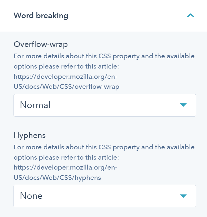
Specify whether the browser should insert line breaks within an otherwise unbreakable string to prevent text from overflowing its line box, and how words should be hyphenated when text wraps across multiple lines.

Layout

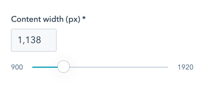
Content width
Act3 Theme Settings - Layout - Content width

The default width of your content, set in pixels.
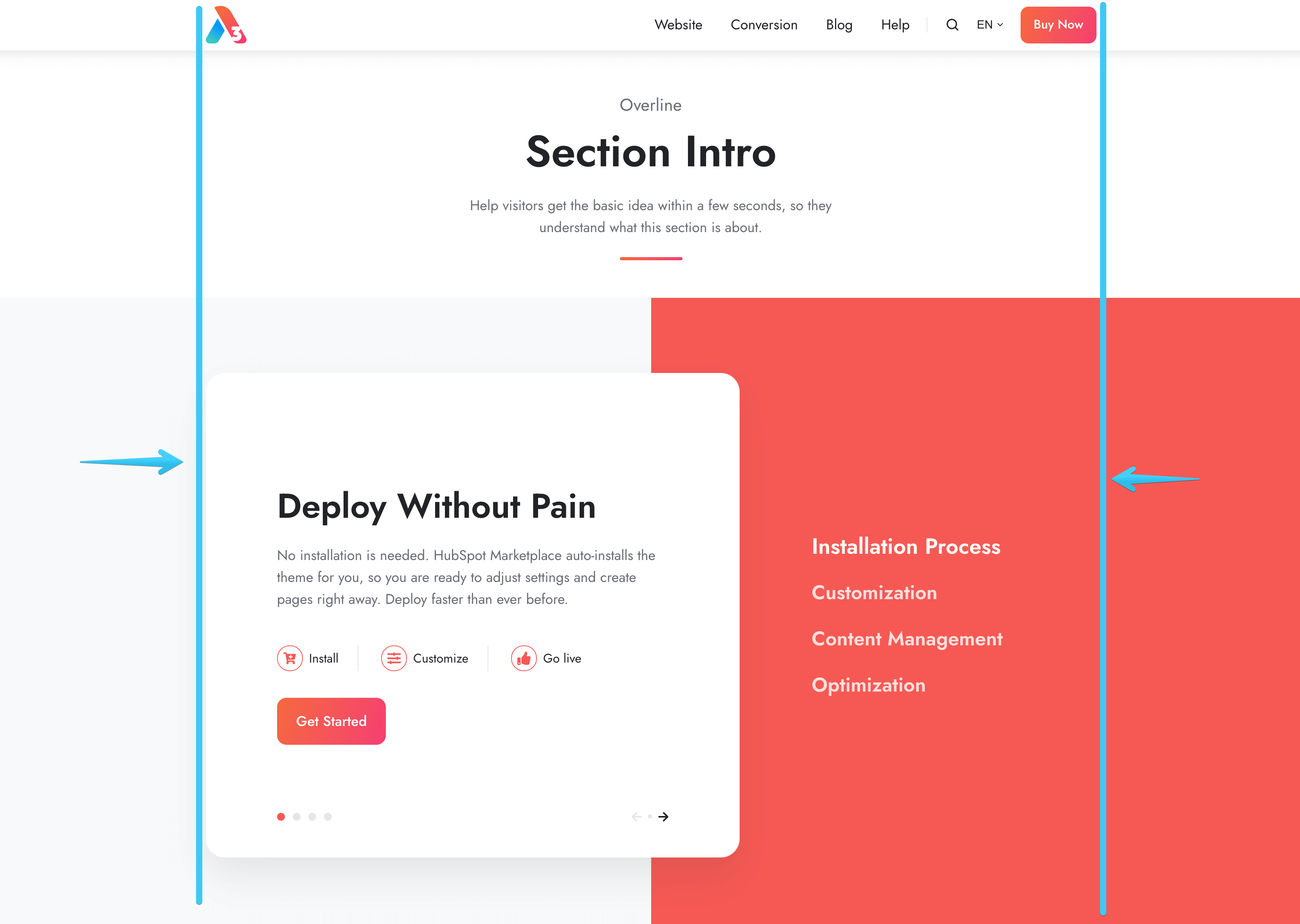
Act3 - Theme settings - Layout - Content width - Example

You can change or remove this on a particular section by clicking the section, then Alignment and spacing and Center content to specify a Maximum content width, or Full width to remove this maximum width altogether:
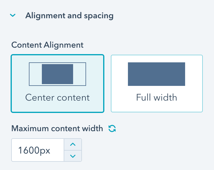
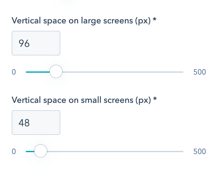
HubSpot section center content

Vertical space
Act3 Theme Settings - Layout - Vertical space on large screens

This is the default padding at the top and bottom of your sections, and it can be different on large and small screens.
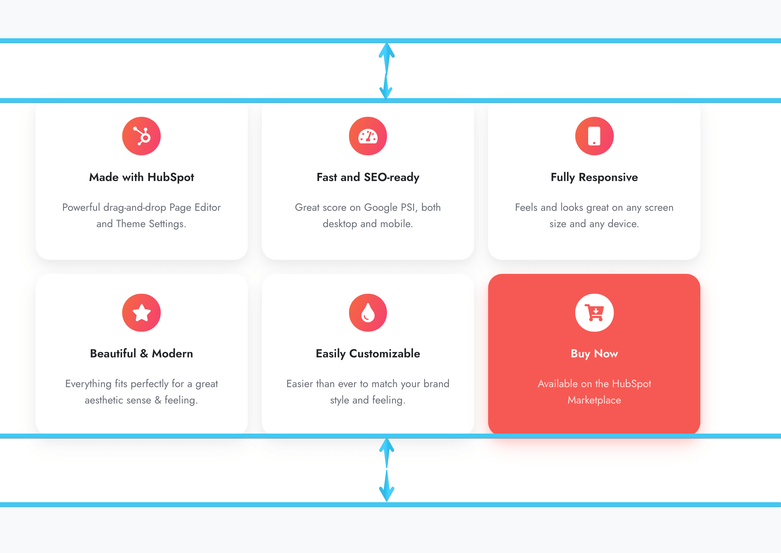
Act3 - Theme settings - Layout - Vertical space

Some default templates contain sections that have this value adjusted to that particular design.

You can change or remove this padding on a particular section by clicking the section, then Alignment and spacing > Padding and margin and make sure the Padding tab is selected, then adjust the Top and/or Bottom values:
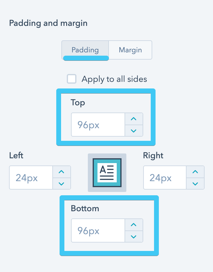
HubSpot section padding

You can do the same while editing for mobile.
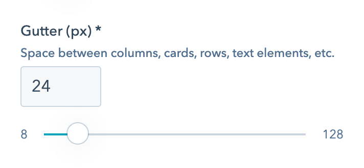
Gutter
Act3 Theme Settings - Layout - Gutter

The regular space between columns, cards, headings, text elements, etc. You may probably not need to change this, but if you do, please keep it relatively small (e.g., 15px, 20px, 30px, etc, are all good values).

Act3 Gutter example

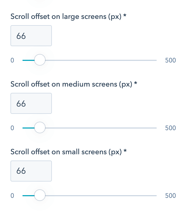
Scroll offset
Act3 Theme Settings - Layout - Scroll offset
The number of pixels at the top of a programmatically scrolled page (e.g., when the user changes a listing page, or clicks an anchor to scroll to an element on that page, etc.). This compensates for the height of the sticky header, so the top of the target content doesn't get behind the sticky header upon these scrollings. So basically, you need to set this depending on your sticky header height, adjusting it until it fits right. There are values for all three screen sizes (breakpoints) because the sticky header may be of different height depending on screen size. These fields will disappear if you disable the sticky header from your theme settings.

Corners

Global radius
Act3 Theme Settings - Corners - Global radius
This rounds the corners of the various elements and components in the theme. Select Square for a more sober, classic design or Small, Medium or Large for a more modern, friendly UI. With the Large value selected, all buttons and form inputs will be pill-shaped unless specified otherwise in the fields below.
Button radius
Act3 Theme Settings - Corners - Button radius
Applies to buttons. Choose Auto to keep it consistent with your Global radius or select a different value.
Input radius
Act3 Theme Settings - Corners - Input radius
Applies to form inputs. Choose Auto to keep it consistent with your Global radius or select a different value.
Search box radius
Act3 Theme Settings - Corners - Search box radius
Applies to search boxes. Choose Auto to keep it consistent with your Global radius or select a different value.

Components

Learn more about the headers and these options from our Header documentation.

Choose your website header
Act3 Theme Settings - Components - Header - Choose your website header
Choose your landing pages header
Act3 Theme Settings - Components - Header - Choose your landing pages header
Sticky header
Act3 Theme Settings - Components - Header - Sticky header
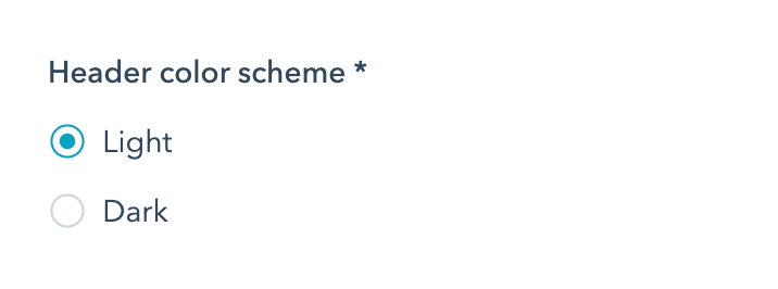
Header color scheme
Act3 Theme Settings - Components - Header - Header color scheme

Learn more about the footers and these options from our Footer documentation.

Choose your website footer
Act3 Theme Settings - Components - Footer - Choose your website footer
Choose your landing pages footer
Act3 Theme Settings - Components - Hooter - Choose your landing pages footer
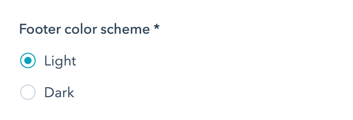
Footer color scheme
Act3 Theme Settings - Components - Footer - footer color scheme

UI icon size

UI icon size
Act3 Theme Settings - Components - UI icon size
Resize the various UI icons such as the search icon, hamburger menu, and arrows, as necessary. This adjustment can be particularly useful when making significant changes to the default font size. The UI icons may not appear aesthetically pleasing when paired with very small or large text, making this resizing adjustment necessary.

Miscellaneous

Ghost blur

Starting Version 28.
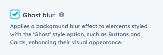
Ghost blur
Act3 — theme settings misc ghost blur
Applies a background blur effect to elements styled with the 'Ghost' style option, such as Buttons and Cards, enhancing their visual appearance.
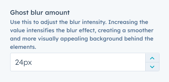
Ghost blur amount
Act3 — theme settings misc ghost blur amount
Use this to adjust the blur intensity. Increasing the value intensifies the blur effect, creating a smoother and more visually appealing background behind the elements.

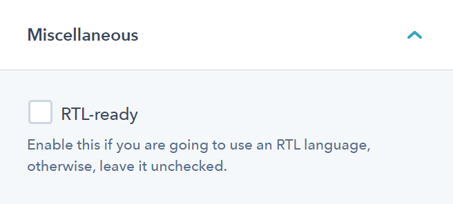
RTL-ready

RTL-ready
Act3 Theme Settings - Miscellaneous - RTL-ready
Enable this if you are going to use an RTL language. Otherwise, leave it unchecked.