Mega Menu
If your website navigation contains a lot of items, maybe grouped in columns and categories, or if you want to list social icons, display a form, or use other type of modules, this is the component you would want to use.

Act2's Mega Menu is entirely drag-and-drop, so you have the freedom to create your own layout for each branch. You can also use it along with your normal drop-down menu, so while a menu item shows a regular drop-down on hover, another could show a Mega Menu.
In order for this to work, it must be placed inside the Header Wrapper, so we created three additional header global groups to include the Mega Menu:
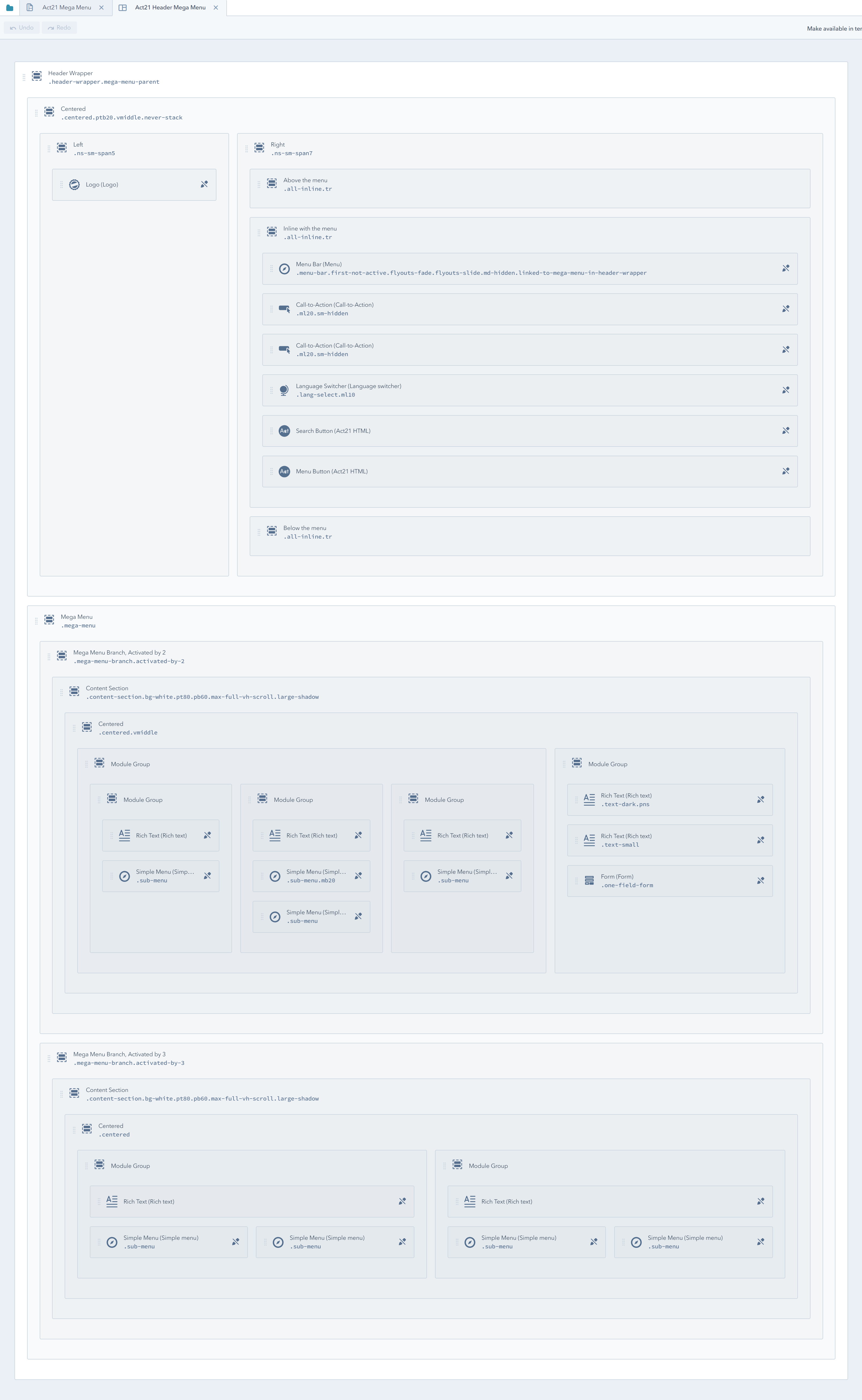
Act21 Header Mega Menu
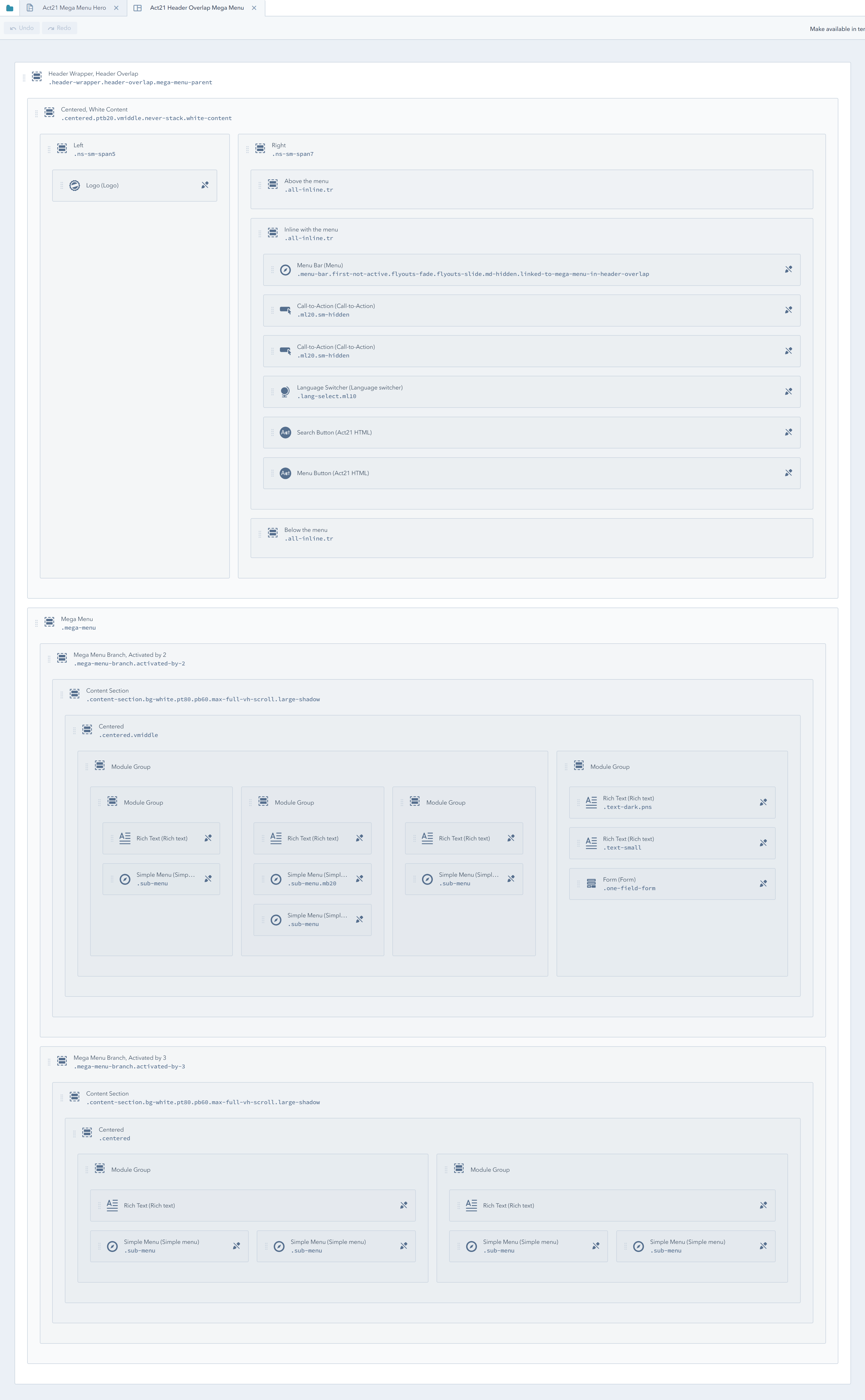
Act21 Header Overlap Mega Menu
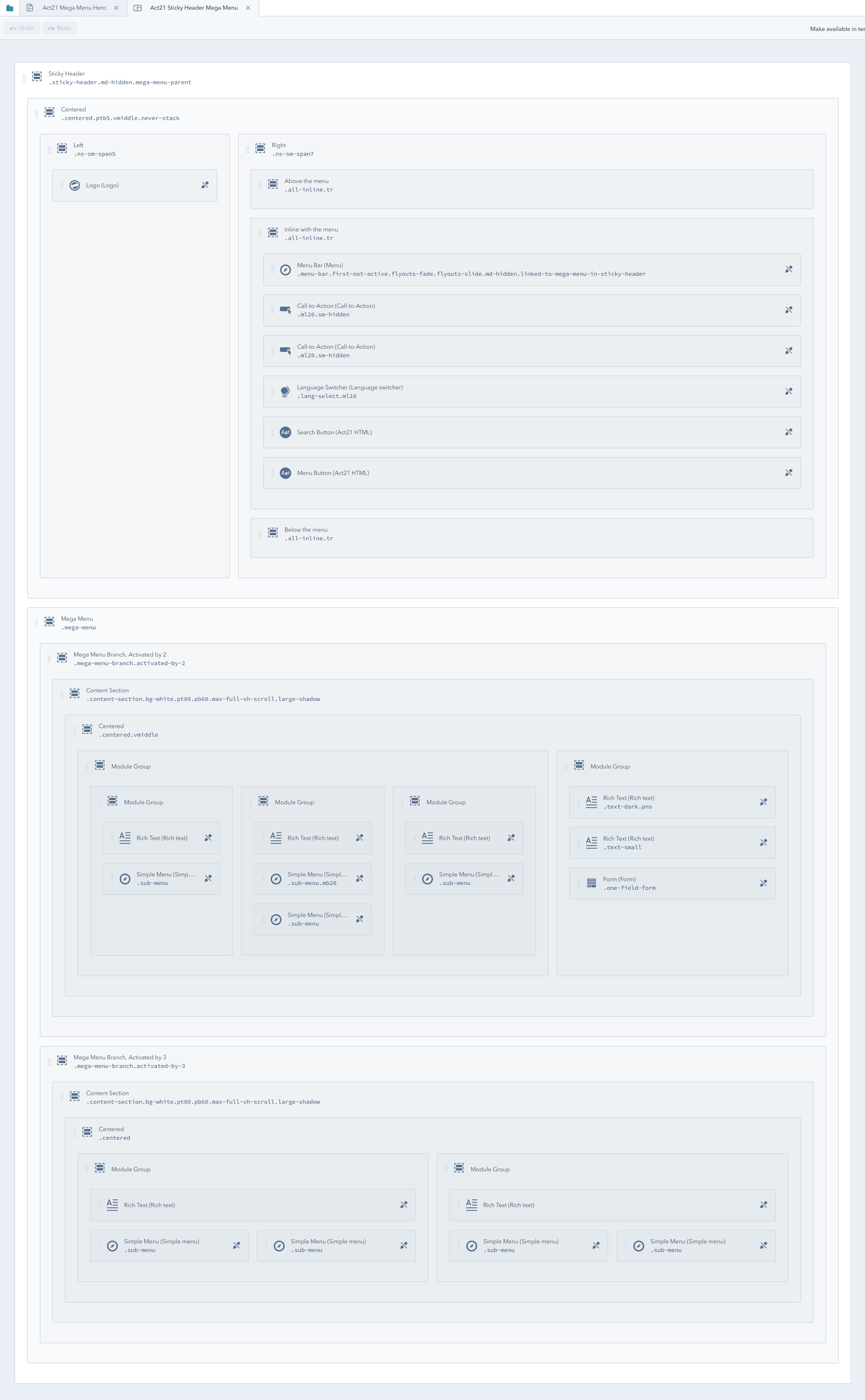
Act21 Sticky Header Mega Menu
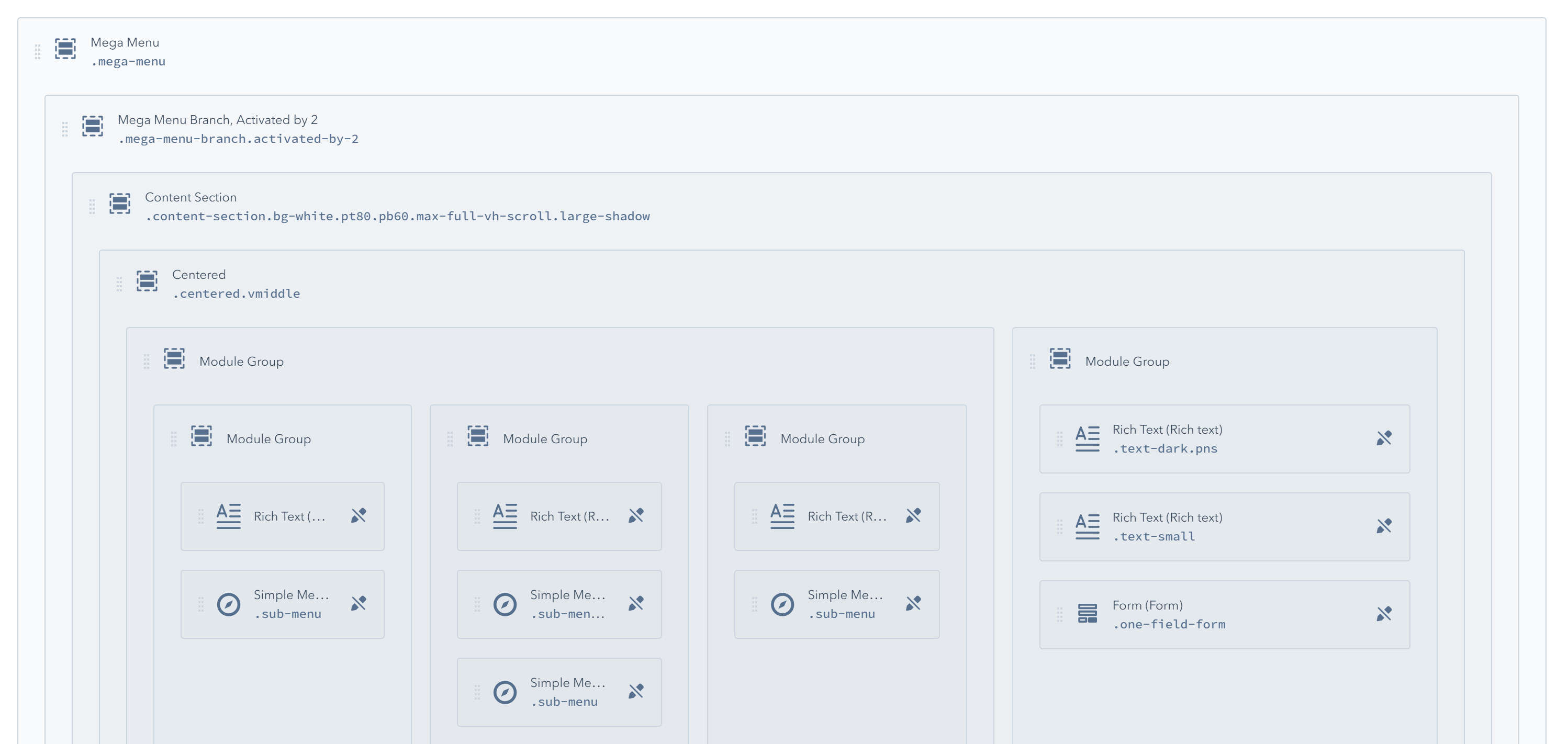
Here is their default structure:
Act21 Header Mega Menu:
Act21 Header Overlap Mega Menu:
Act21 Sticky Header Mega Menu:
You can find these headers on Act21 Mega Menu and Act21 Mega Menu, Hero templates.
How does it work?
Inside these header global groups you will find your regular header stuff (logo, menu, CTA, etc) and if you scroll down you'll see the Mega Menu containing the menu branches (the slides that pop-up when hovering over the menu links). These branch groups have unique classes that are used to activate them when hovering over certain items in the Menu Bar. For example, the branch/group with the class activated-by-2 will be visible when the user hovers over the second item in the Menu Bar. activated-by-3 will be visible when user hovers over the third item in the Menu Bar, and so on.
If you want to add a new branch you'd have to clone an existing group, then change the activated-by-X class with the desired number.
There is, of course, more technical stuff about the Mega Menu, but it isn't important as long as you don't change the code behind it. For example, the Header Wrapper containing a mega menu has this class: mega-menu-parent. Also, the Menu Bar has a class (e.g. linked-to-mega-menu-in-header-wrapper) that makes the connection between that Menu Bar and the Mega Menu. But if you don't change these, it should work as designed.
You only need to make your changes to the Mega Menu Branches, and if for example, you add more branches make sure they have the correct activated-by-X class, as mentioned before. It's up to you what you add in those groups. We've built the sample branches with Content Sections > Centered > then Rich Text, Simple Menus and Form modules, but you can create your own layout. It's actually a huge benefit and the main reason we've made this drag-and-drop instead of hard-coding it into the template and limiting your options.
Once you've built your branches in a Mega Menu group you can use our HubX extension to simply copy each of those branches (just the branches, not the Mega Menu group itself) from that global group to another Mega Menu global group (e.g. Act21 Sticky Header, Mega Menu).
Here is a quick video showing the process:
Instead of having a mega menu branch on the second item, we moved the functionality to the first item. We also added a new mega menu branch, and finally, we used HubX to copy a mega menu branch to a different global group (Act21 Sticky Header Mega Menu).