- Get started
- Assets
- Components
- Content Section
- Centered
- Section Intro
- Hero Banner
- Hero Slider
- Hero Format
- Equal Height
- No Gutter
- All Inline
- Vertical Center
- Stack
- Shift Col
- Buttons
- Icons
- Social Icons
- Tabs
- Slider
- Accordion
- Advanced Gallery
- Tooltips
- Video Background
- RSS Cards
- Change Image
- List Type Buttons
- List Type Tabs
- List Type Dropdown
- List Type Inline
- List Type Tags
- Sticky
- Reveal
- Animation
- Popups
- Image Box
- Listing
- Mega Menu
- Scroll to Top
- Breakpoints
- Utility classes
- Templates
RSS Cards
Showcase your recent blog posts with beautiful cards on any page on your website. To not be confused with the blog listing page. This is not a replacement for your blog layout.

To use this component, just add a HubSpot RSS Listing module with this class: rss-cards

No Masonry
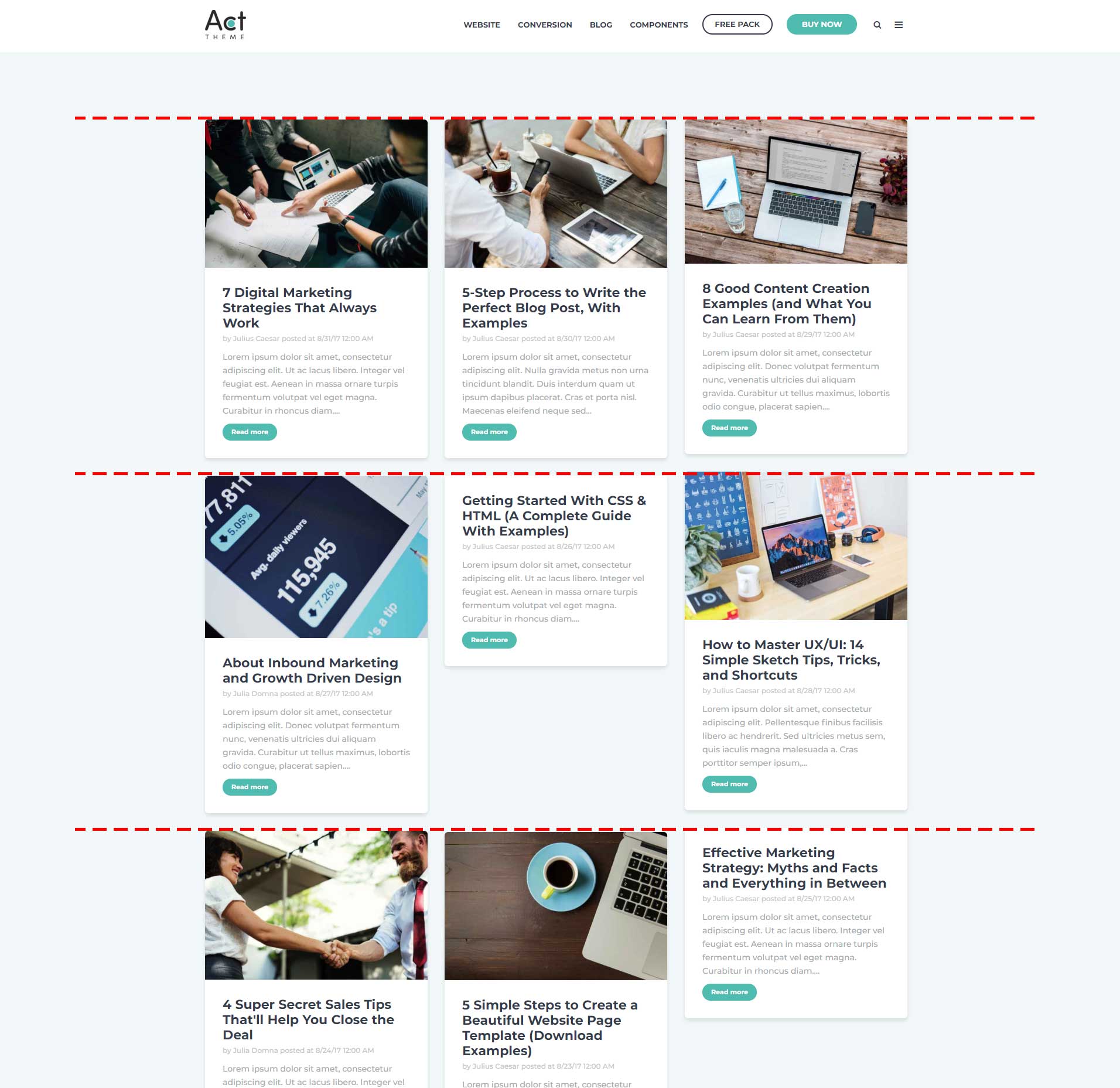
By default the cards are placed in a masonry layout that optimizes the use of space by reducing any unnecessary gaps, placing the next card at the highest availabe point in the layout, even if that's just a few pixels above the others:

You can disable the masonry layout by adding this class: no-masonry


Equal Height
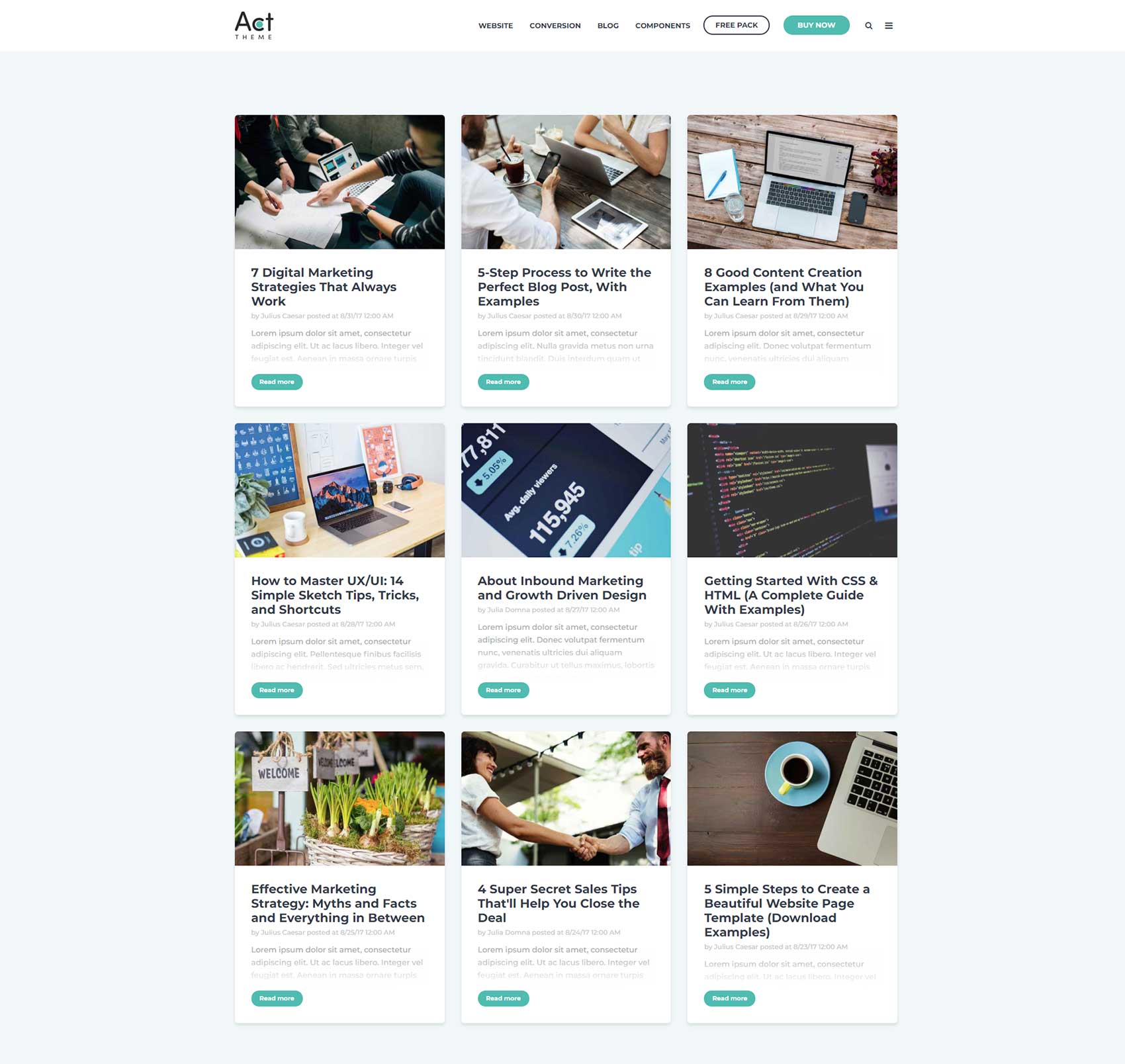
If you disabled the masonry layout, you can also make equal height columns by adding this class: equal-height


Notes:
This only works for posts with featured images.
The featured image may be cut off if doesn't fit the available space, or there may be extra space if the image aspect ratio is wider than normal (about 16:10 or 16:9, e.g. 380 x 240 px -or- 750 x 470 px).
Text that doesn't fit will fade out at the bottom.
Full Links
If you want to place the links on top of the cards, you can add this class: full-links


Columns
You can speciy the number of columns with one of these classes:
| CSS Class | Description |
|---|---|
| one-column | |
| two-column | |
| three-column | This is the default, if no other is specified. |
| four-column |


No Shadow
If you want to remove the drop shadow from the cards you can add this class: no-shadow

