- Get started
- Assets
- Components
- Content Section
- Centered
- Section Intro
- Hero Banner
- Hero Slider
- Hero Format
- Equal Height
- No Gutter
- All Inline
- Vertical Center
- Stack
- Shift Col
- Buttons
- Icons
- Social Icons
- Tabs
- Slider
- Accordion
- Advanced Gallery
- Tooltips
- Video Background
- RSS Cards
- Change Image
- List Type Buttons
- List Type Tabs
- List Type Dropdown
- List Type Inline
- List Type Tags
- Sticky
- Reveal
- Animation
- Popups
- Image Box
- Listing
- Mega Menu
- Scroll to Top
- Breakpoints
- Utility classes
- Templates
Tabs
Improve usability and content organization with beautiful and responsive tabs.
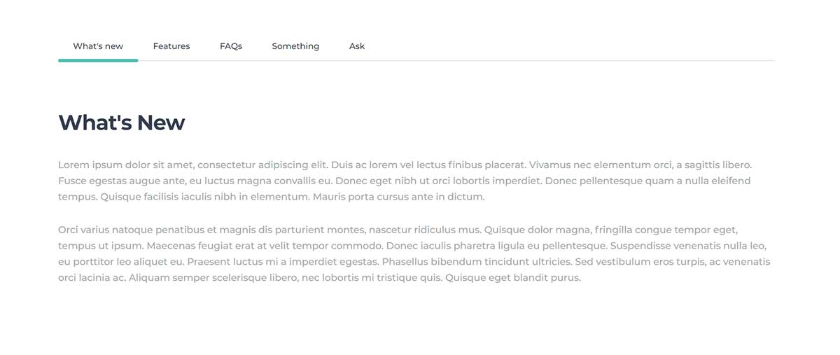
This component is available as a custom module or entirely drag and drop for more content choices and better customization. Find both implementations on Act21 Tabs template.
Custom module
The custom module is named Act21 Tabs:

Module options
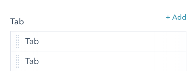
Tabs
Edit, add, remove or reorder tabs:
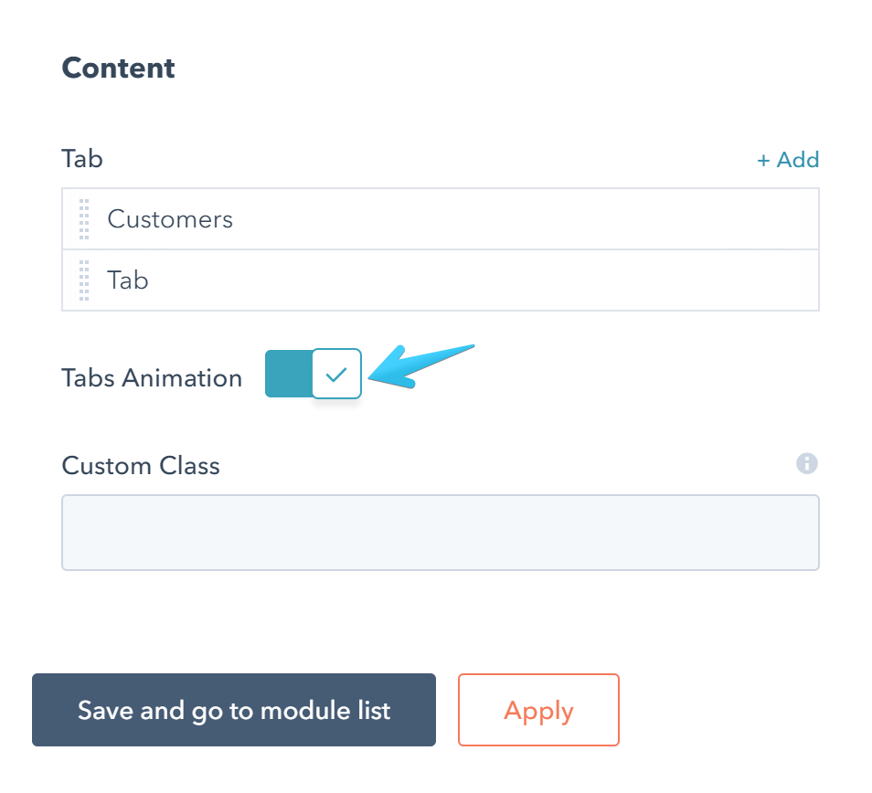
Tabs animation
Uncheck this box if you want to disable the animation when changing tabs.
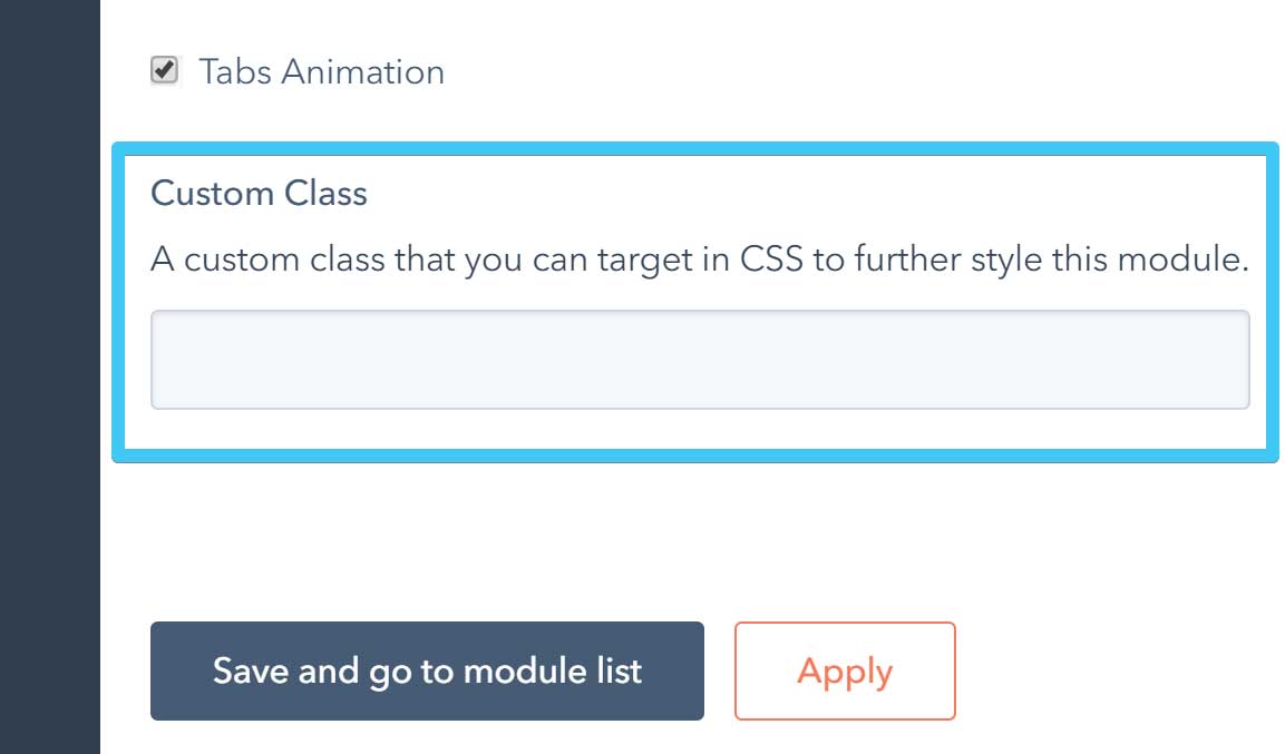
Custom class
Use this box if you want to add a custom class to your module at the page level.
Each tab has these editable fields:
Label
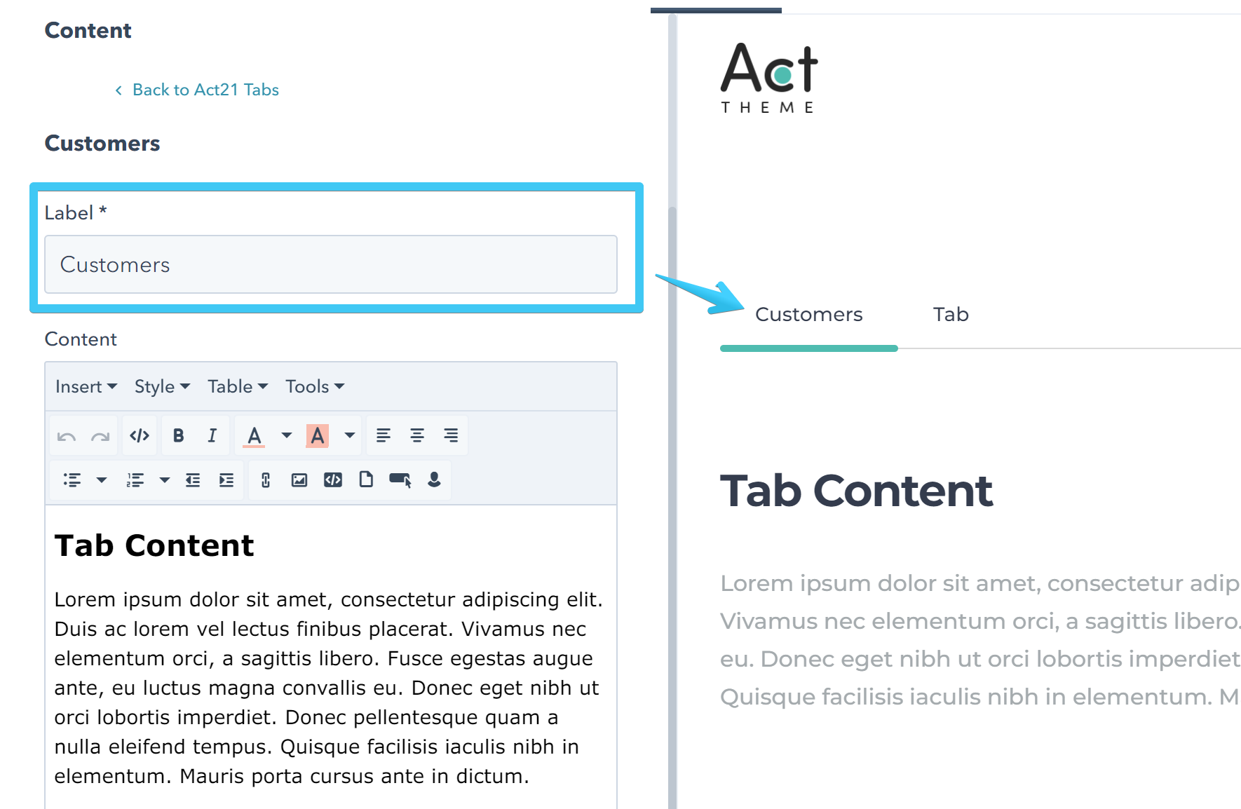
Content
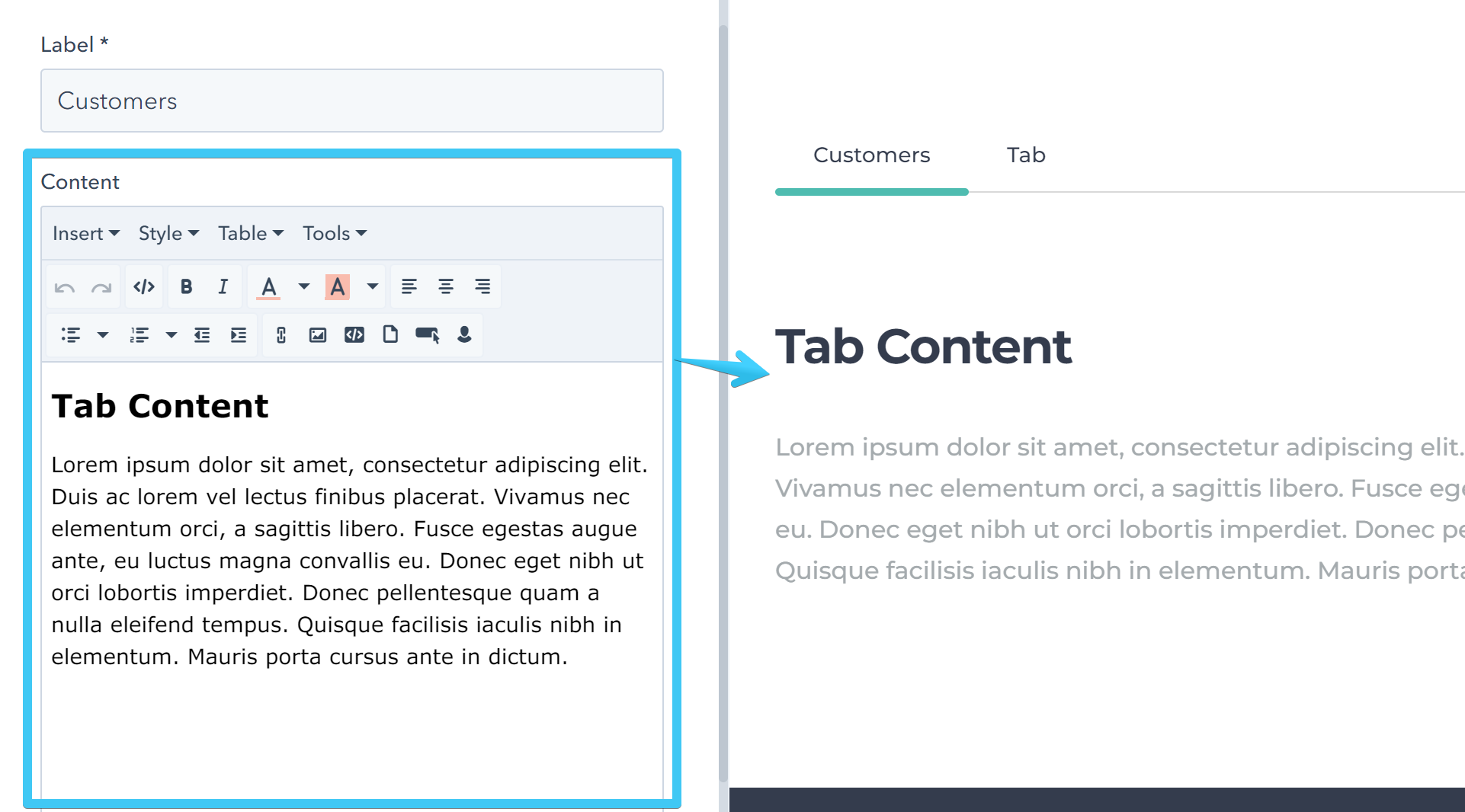
Custom anchor
Use this for custom anchors instead of the default #tab1, #tab2, etc. No spacing or special characters allowed, except alpha-numeric characters and - or _.
Example: inbound_marketing_2018
By default this is blank.

Drag and drop
Tabs container
Add a group with these classes: tabs-container responsive styled

The tabs-container class is required. The others are optional and can be removed if your design requires it.
The responsive class is used to create the accordion navigation on mobile by cloning and adding each tab link before its related content. It's not styled by default:
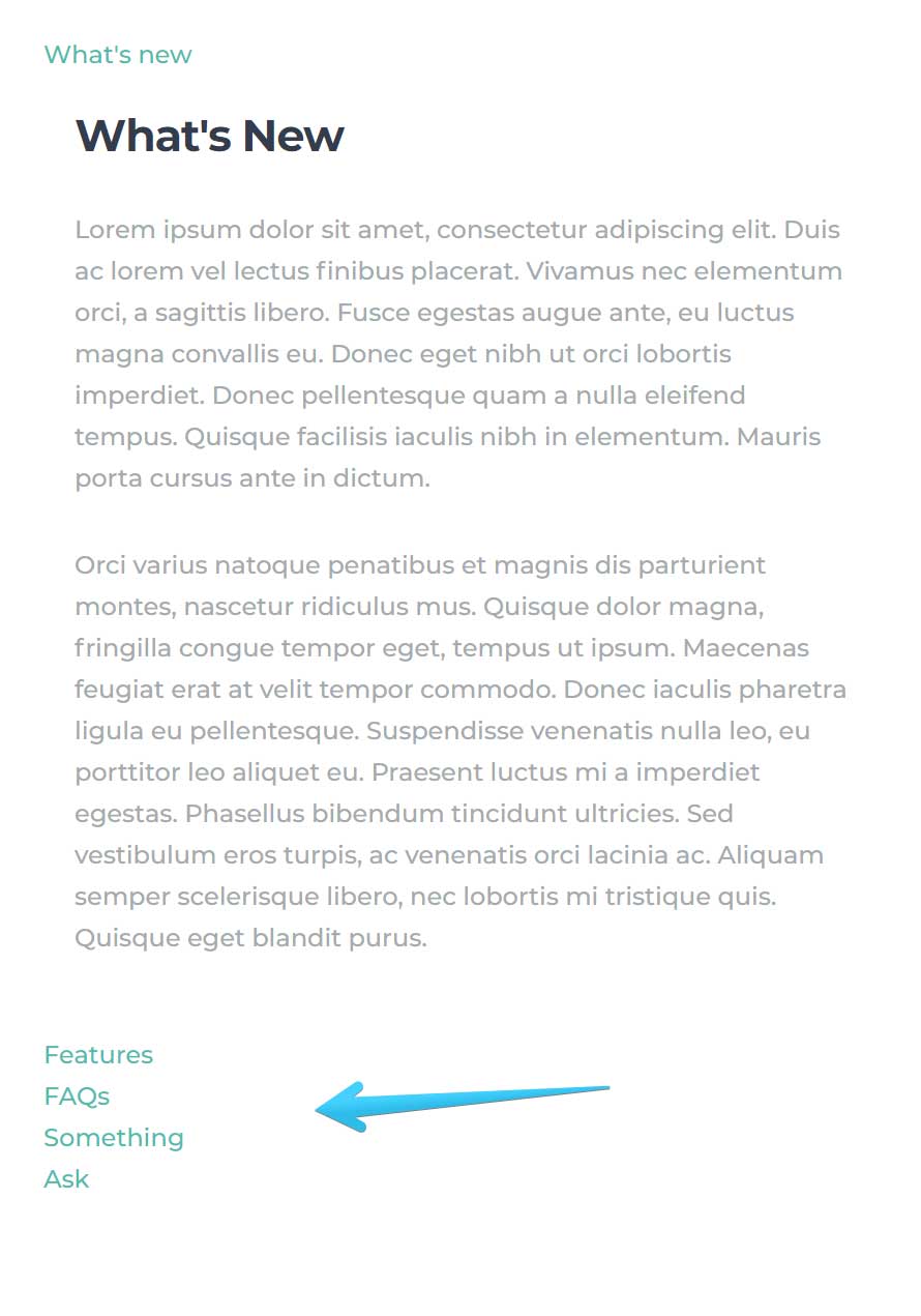
To include the styles add the styled class as well:
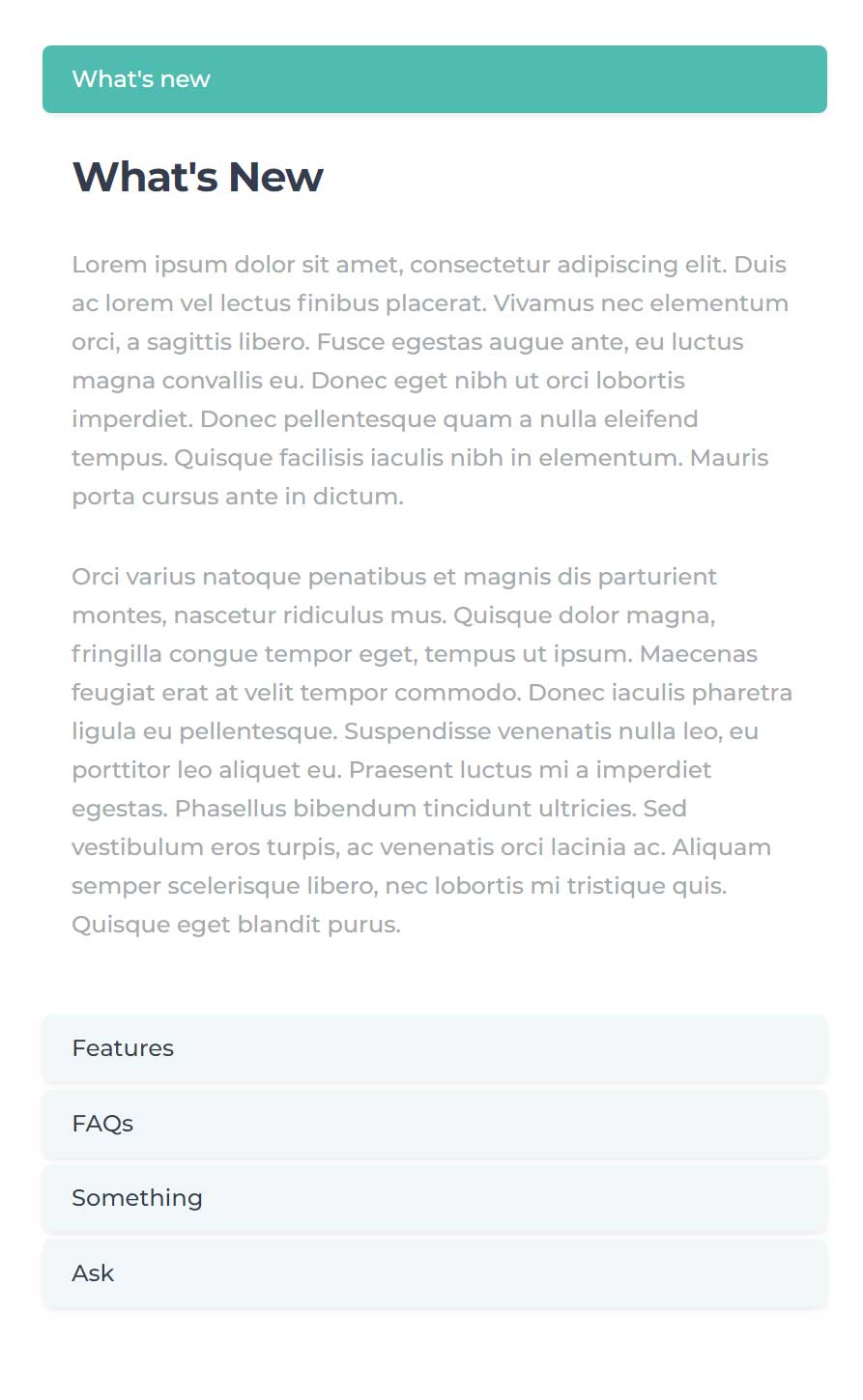
Or you can use a custom class if you want to apply your own styles.
Tabs nav
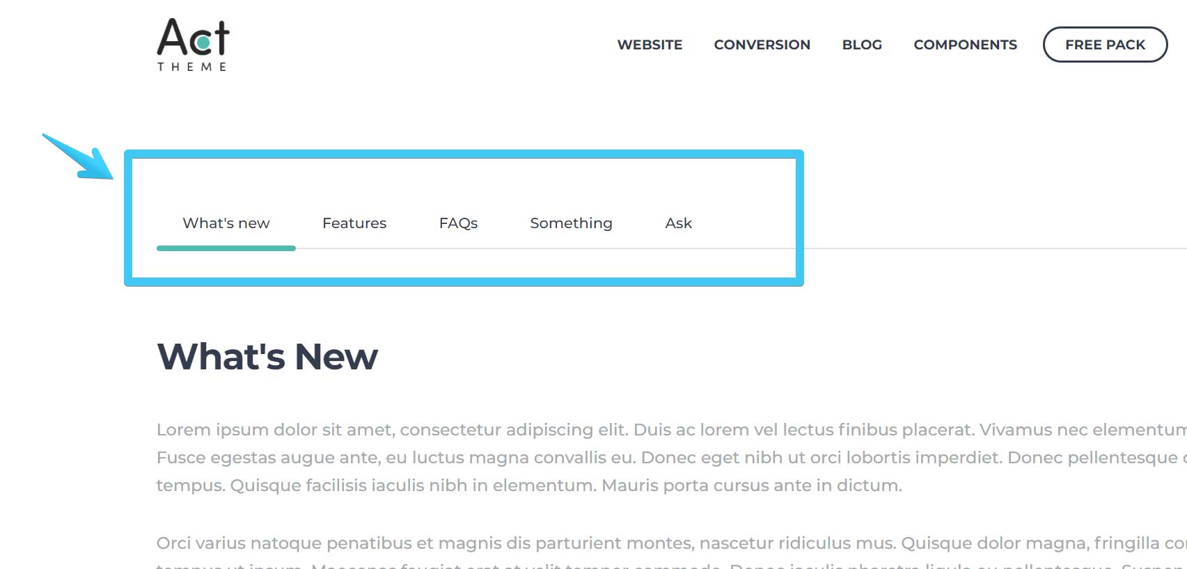
Add one Act21 List module (or any module/group that can contain links) inside your Tabs container group with these classes: tabs-nav mb80 sm-hidden
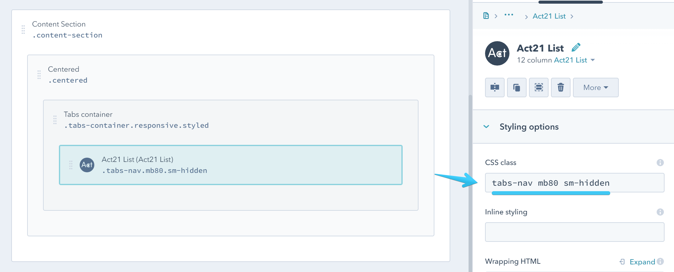
The first class tabs-nav is required, the others are modifiers for adding bottom margin and hidding this module on small screens, where we'll show the reponsive navigation instead.
If you choose not to use the responsive class, you can also remove the sm-hidden class from your Tabs nav, to keep showing the initial navigation on mobile as well.
Edit the items to add your tab names and links:
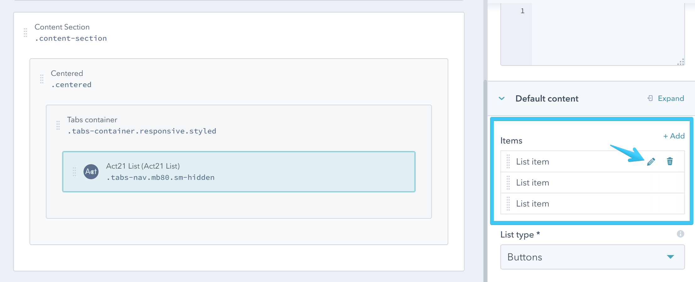
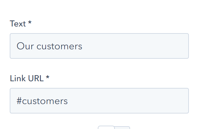
To properly link to your tab, you must first add a #, followed by the ID of your tab group, as shown in the Tab content section below.
Tab content (Tab group)
Add a group for each of your tab content with the class tab-group and an unique ID:
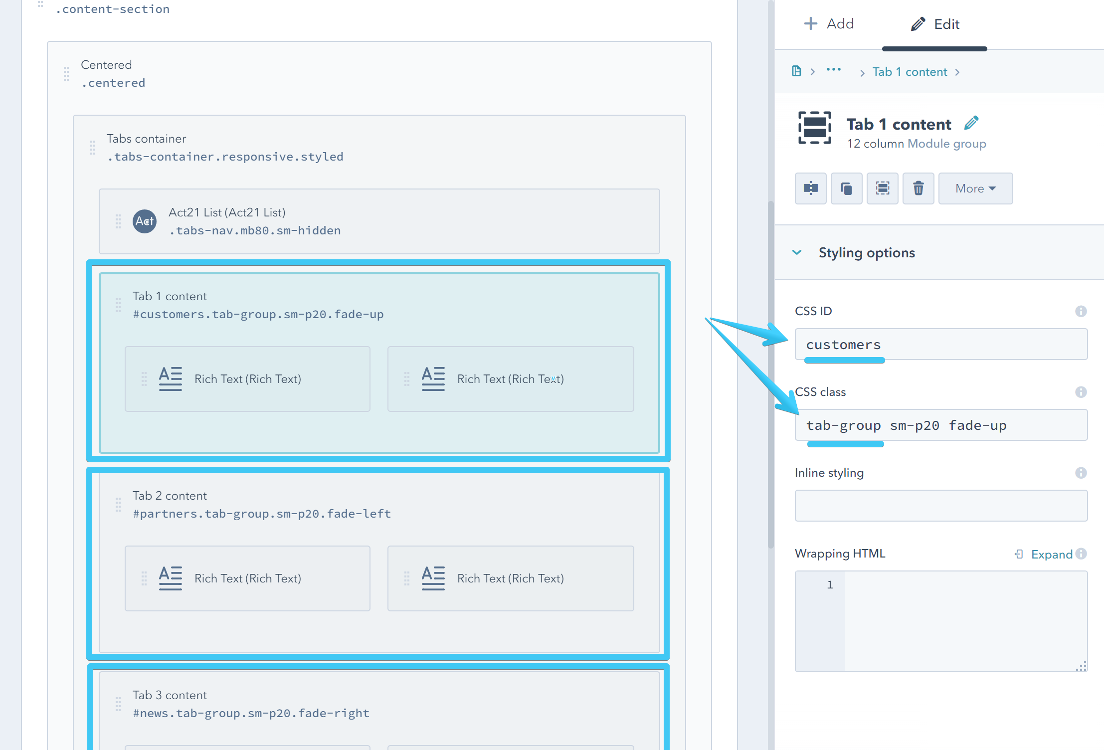
The ID should be unique per page. Also, please make sure your links in the Tabs nav point to the correct IDs. For example, if you have this ID on one of your Tab groups: my_new_tab_1, the anchor that links to this tab content in your Tab nav should be: #my_new_tab_1. Please notice the leading #.
The sm-p20 class, used to add padding on mobile, and the animation class fade-up in this example are optional.
For more utility classes please read this article.
For more animations read this article.
Now you can have whatever layout or modules in your tab groups.
Here is a video to demonstrate the entire process: