- Get started
- Assets
- Components
- Content Section
- Centered
- Section Intro
- Hero Banner
- Hero Slider
- Hero Format
- Equal Height
- No Gutter
- All Inline
- Vertical Center
- Stack
- Shift Col
- Buttons
- Icons
- Social Icons
- Tabs
- Slider
- Accordion
- Advanced Gallery
- Tooltips
- Video Background
- RSS Cards
- Change Image
- List Type Buttons
- List Type Tabs
- List Type Dropdown
- List Type Inline
- List Type Tags
- Sticky
- Reveal
- Animation
- Popups
- Image Box
- Listing
- Mega Menu
- Scroll to Top
- Breakpoints
- Utility classes
- Templates
Hero Banner
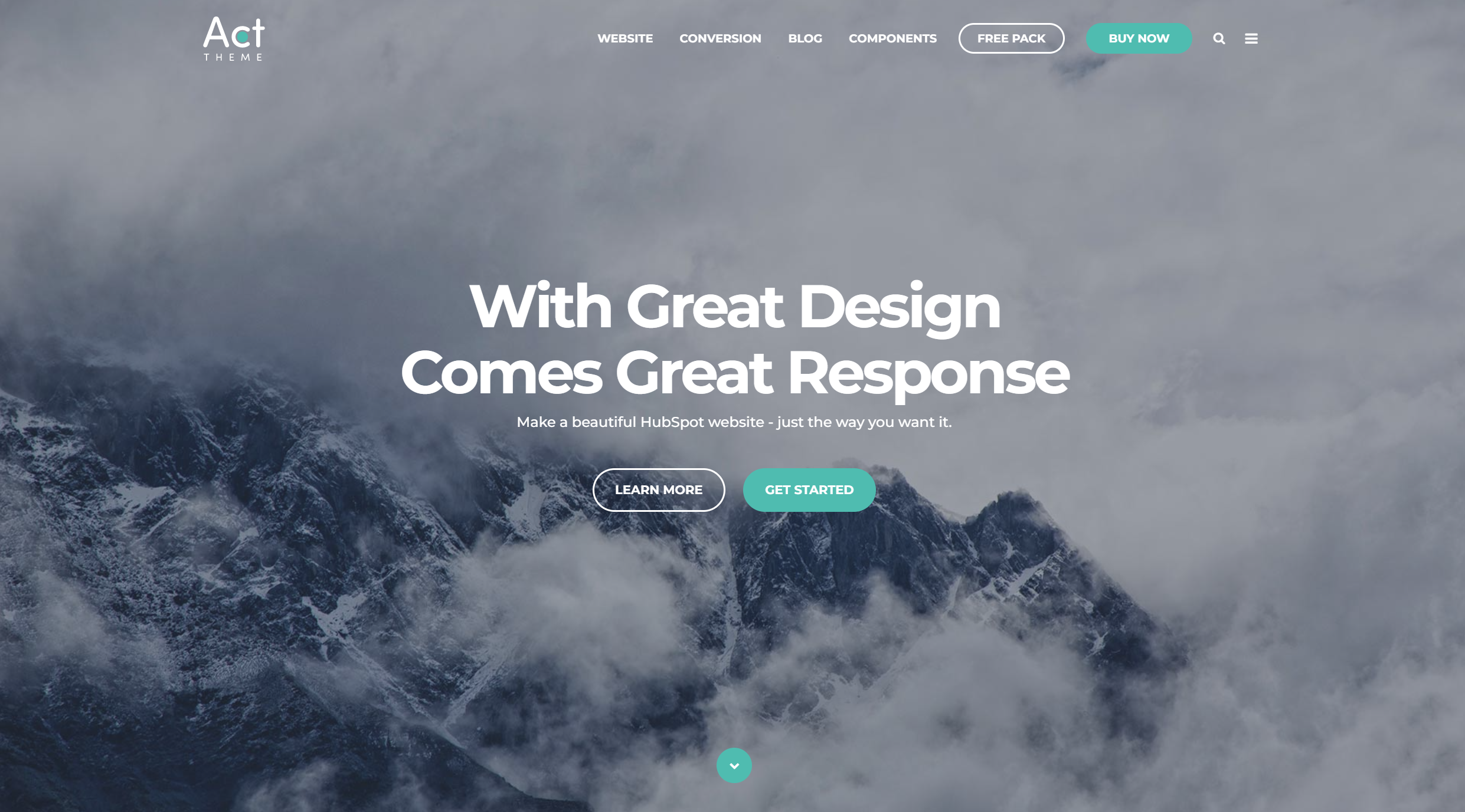
This is the Act21 Hero Banner custom module:

Options
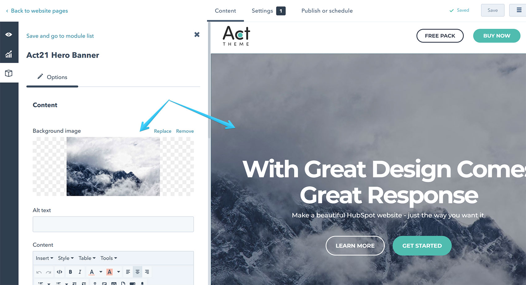
Background Image
There are no specific image dimensions, but just as an example, we used this for the default sample image with the default settings: 1920x1216px. For repeatable textures you would probably need to use smaller dimensions.
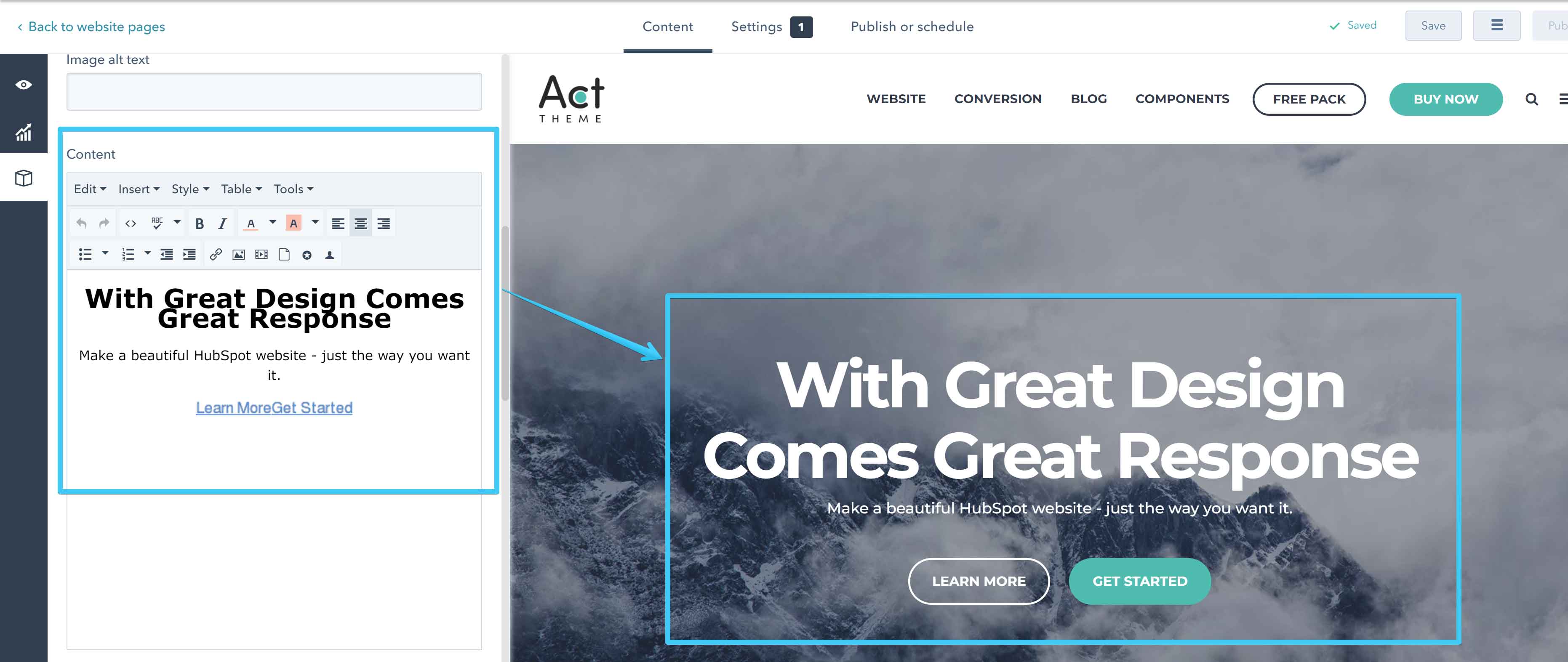
Content
You can add your text and the Call to Action buttons in a Rich Text editable area.
Background Position
This sets the starting position of your background image. If Parallax or Video Background is enabled this setting will be ignored and the value will automatically be set to Center.

Background Repeat
This specifies if your background image should be repeated and how. If Parallax or Video Background is enabled this setting will be ignored and the value will automatically be set to Do not repeat.

You can use this to apply a repeatable texture background to your hero banner. For that to work, you would also need to select these options: Background Size -> Natural and Background Scroll -> Static.
Background Size
This specifies the size of the background image.
If Parallax or Video Background is enabled this setting will be ignored and the value will automatically be set to Cover.

- Cover (default), recommended and pretty much the standard. It may stretch and crop, but does not distort the image. Covers the entire section.
- Natural, does not stretch or distort the image, but may not cover the entire section. May cut off the edges of the image if it's too large. Useful for images that you want to repeat (eg. textures).
- Full, may stretch and distort, but does not crop the image. Covers the entire section.
- Full Width, may stretch, but does not distort the image. Covers the entire width of the section, but may not cover the height. May cut off the top or bottom.
- Full Height, may stretch, but does not distort the image. Covers the entire height of the section, but may not cover the width. May cut off the sides.
Background Scroll
This specify if your background image should scroll with the page, remains fixed, or has a parallax scrolling effect. It doesn't apply to video backgrounds.

Overlay Color
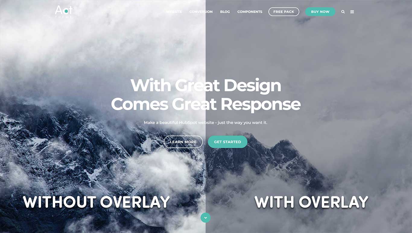
Sometimes you would want to add a transparent overlay to your Hero Banner, especially if you applied a background image or video background and your text is not very visible. This specifies the color of that overlay.
Choose None to remove the overlay.

Overlay Opacity
This will set the opacity of the overlay described above. 0% means the overlay is fully transparent (invisible), 100% means the overlay is fully opaque.

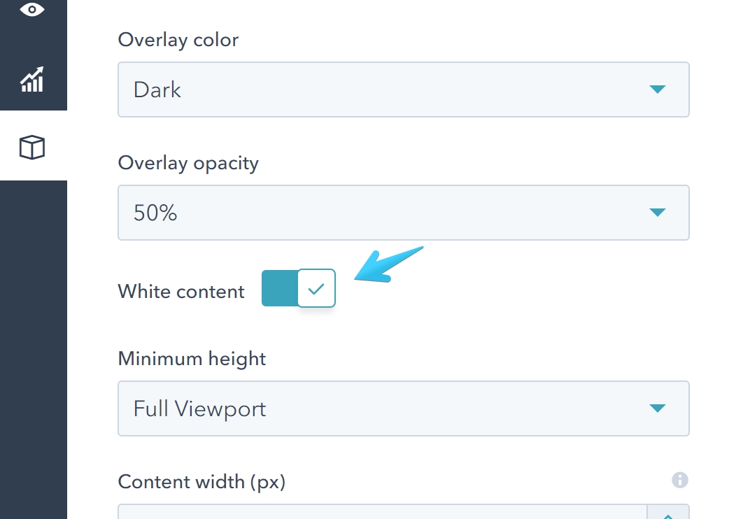
White Content
Check this box if you want the content inside your Hero Banner to be white.
Minimum Height
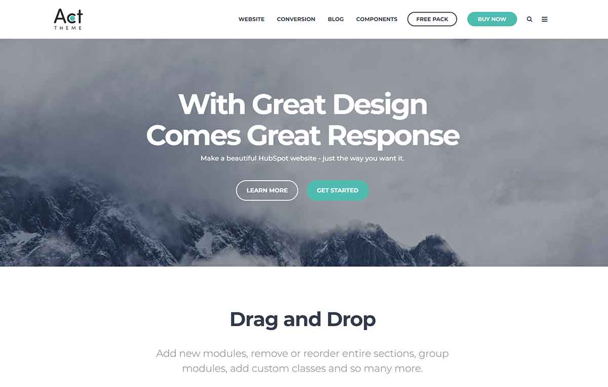
This specifies how tall your Hero Banner should be.

If you choose Natural, no minimum height is specified, so the height of your Hero Banner is determined by the content inside, plus its default top and bottom padding.
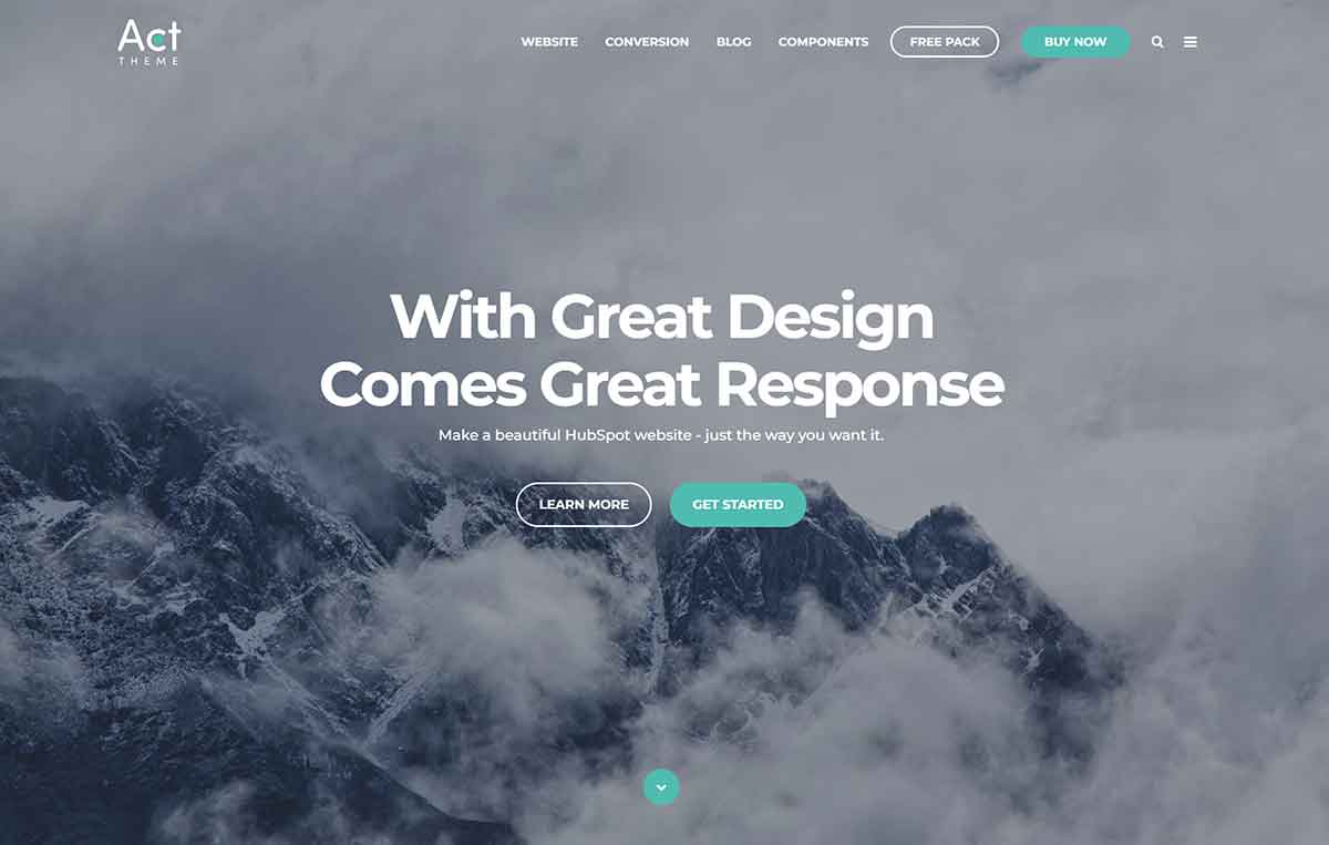
Full Viewport will make your Hero Banner at least as tall as the viewport (browser window). It will exceed that height if your content is taller. This option is useful on pages with Header Overlap, when the Hero Banner is the first content section.
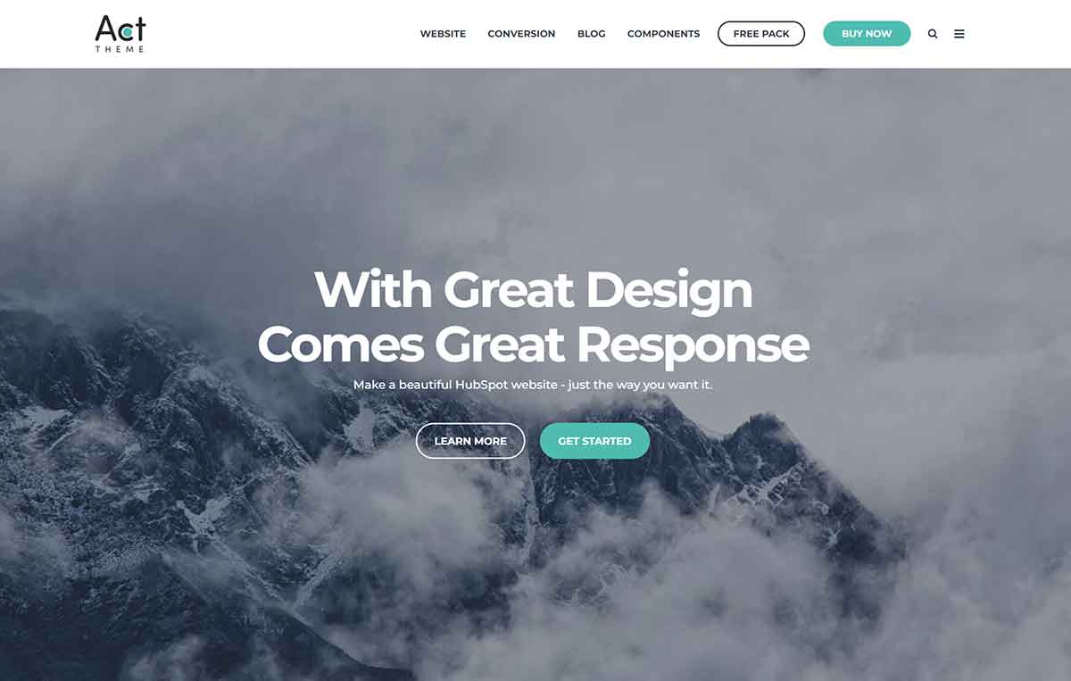
Full Viewport Minus Header will make your Hero Banner at least as tall as the viewport (browser window), minus the header height. It will exceed this minimum height if your content is taller. This option is useful on pages with normal header (not Header Overlap), when the Hero Banner is the first content section.
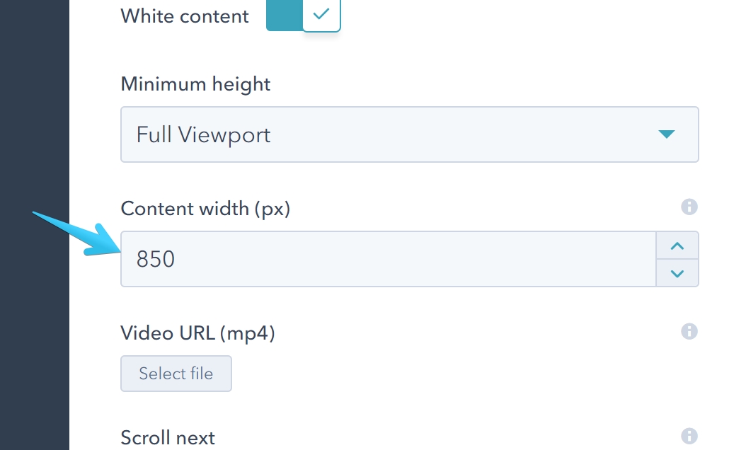
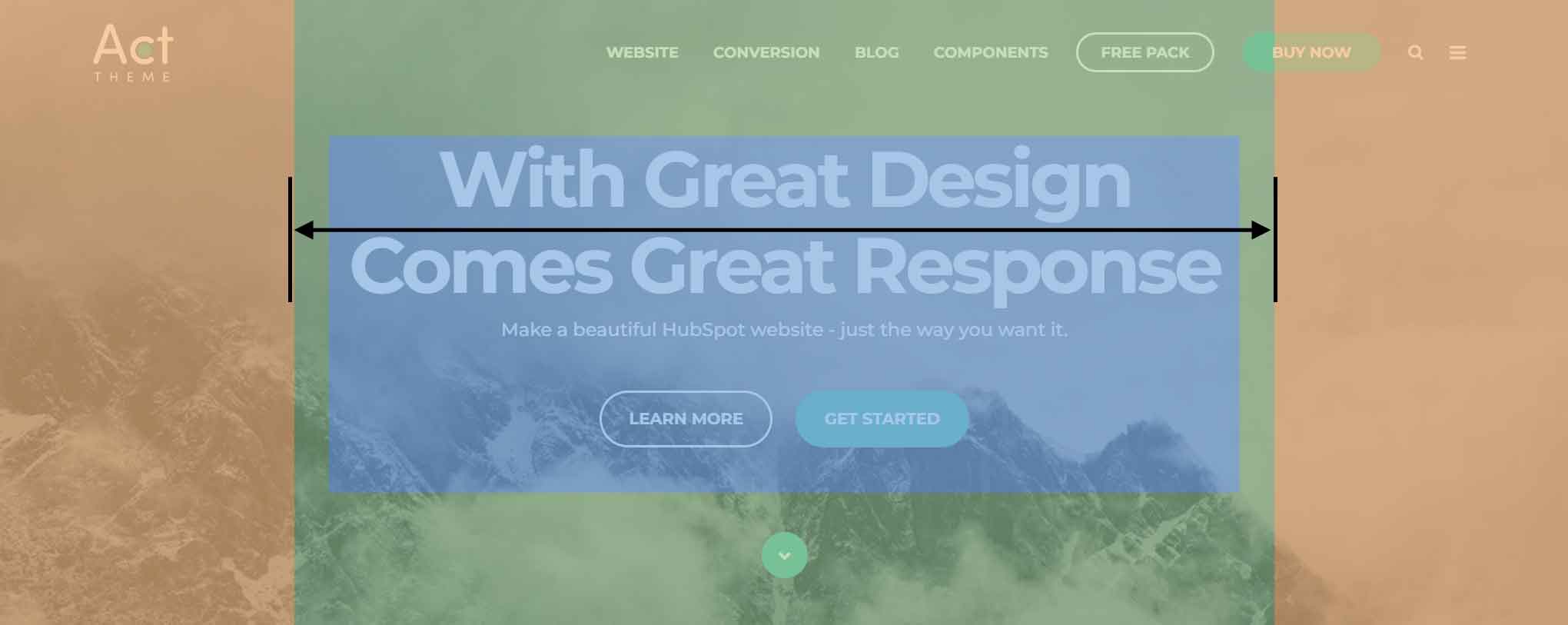
Content Width
Specifies the width of your content inside the Hero Banner.
Video Background
Add an MP4 file to set a video background on your Hero Banner. We recommend uploading a file smaller than 5 MB.
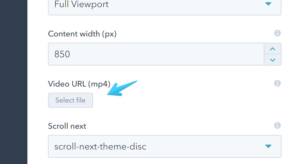
You will also need an image with the first frame of your video to show until your video starts playing and on older browsers that don't allow or support playing videos in the background.
You need to add this image on the Background Image module we previously described.
Scroll Next
Adds an arrow at the bottom of your Hero Banner that, when clicked, will scroll your page to the next Content Section. If it doesn't exist, the arrow will not appear.

| Option | Sample |
|---|---|
| scroll-next-theme-dot |  |
| scroll-next-theme-circle |  |
| scroll-next-theme-disc |  |
| scroll-next-dark-dot |  |
| scroll-next-dark-circle |  |
| scroll-next-dark-disc |  |
| scroll-next-white-dot |  |
| scroll-next-white-circle |  |
| scroll-next-white-disc |  |
Custom Class
Use this box if you want to add a custom class to your Hero Banner module.
