- Get started
- Assets
- Components
- Content Section
- Centered
- Section Intro
- Hero Banner
- Hero Slider
- Hero Format
- Equal Height
- No Gutter
- All Inline
- Vertical Center
- Stack
- Shift Col
- Buttons
- Icons
- Social Icons
- Tabs
- Slider
- Accordion
- Advanced Gallery
- Tooltips
- Video Background
- RSS Cards
- Change Image
- List Type Buttons
- List Type Tabs
- List Type Dropdown
- List Type Inline
- List Type Tags
- Sticky
- Reveal
- Animation
- Popups
- Image Box
- Listing
- Mega Menu
- Scroll to Top
- Breakpoints
- Utility classes
- Templates
Vertical Center
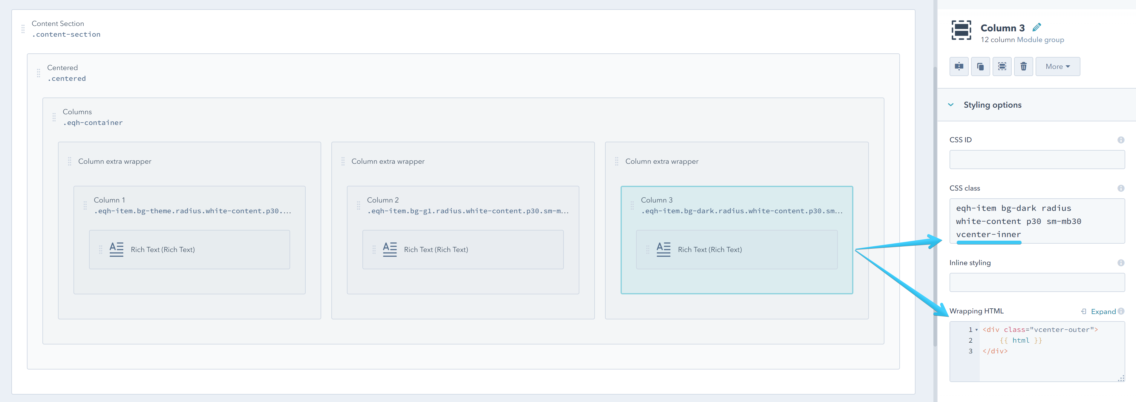
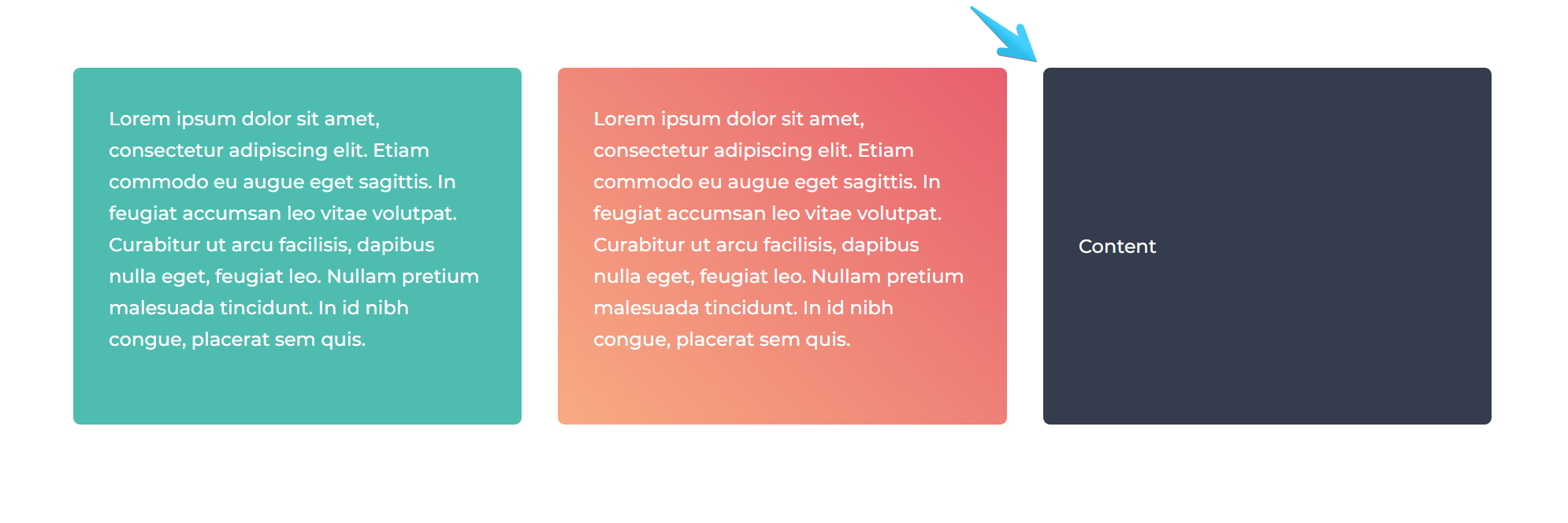
1. Vertically center the content inside a wrapper (vcenter)

Add the vcenter-inner class and the wrapping code below to a module or group that takes up the full width of its container/group. If the module is already split, you can wrap it up in an extra group, such that it becomes full-width.
<div class="vcenter-outer">
    {{ html }}
</div>

Important Notes:
This doesn't work with divided modules or groups, because it will mess up with the grid system in HubSpot. If by design your module or group where you want to vertically center the content is not full-width (that row has already been splitted) you can group each column in individual groups. That will make your modules inside full-width (not divided) so you can apply the vcenter class and wrapper.
FYI, we needed this elaborate method in order to support IE11, which doesn't play very well with CSS flexbox.
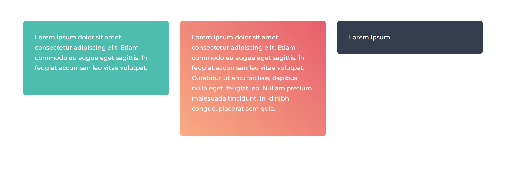
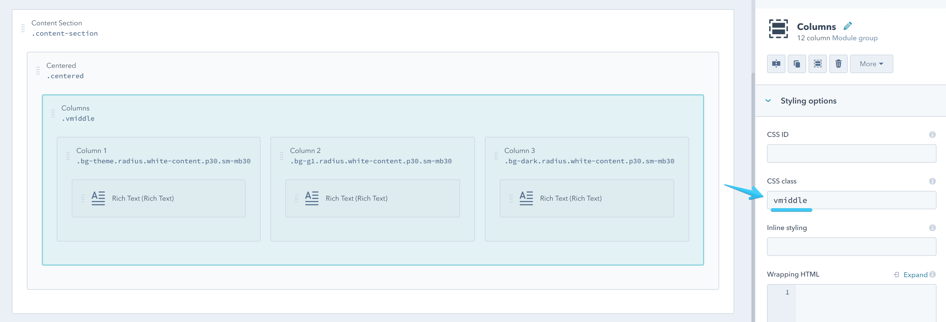
2. Vertically center the columns in a row (vmiddle)
Add this class vmiddle to a group if you want to perfectly center its direct columns in a row.


