- Get started
- Assets
- Components
- Content Section
- Centered
- Section Intro
- Hero Banner
- Hero Slider
- Hero Format
- Equal Height
- No Gutter
- All Inline
- Vertical Center
- Stack
- Shift Col
- Buttons
- Icons
- Social Icons
- Tabs
- Slider
- Accordion
- Advanced Gallery
- Tooltips
- Video Background
- RSS Cards
- Change Image
- List Type Buttons
- List Type Tabs
- List Type Dropdown
- List Type Inline
- List Type Tags
- Sticky
- Reveal
- Animation
- Popups
- Image Box
- Listing
- Mega Menu
- Scroll to Top
- Breakpoints
- Utility classes
- Templates
List Type Dropdown
Add this class list-type-dropdown to a Rich text or other modules with an unordered list and plain links (like the Post Listing module or Post Filter) to place them in a single dropdown button. Please make sure your module contains only links in an unordered list.
A lot easier to use is an Act21 List module that has all these options built-in, so classes are not required there.

If you use Rich Text make sure to use a recognizable name for your module. It may be hard to edit inline in the Page Editor, due to its design. You will most likely need to find the module in the sidebar on the left.
Alternatively, you can use an Act21 HTML module, with a coded list, like this:
<ul>
    <li><a href="#link1">Link 1</a></li>
    <li><a href="#link2">Link 2</a></li>
    <li><a href="#link3">Link 3</a></li>
</ul>
Undefined label, URL links and anchors
If you use this for the Tabs or Listing navigation and no other item is active, the first one will automatically be selected.
If you want to use this for plain URL links (your own custom links [e.g. /about-us] or the Post Listing or Post Filter modules) instead of element IDs/anchors (e.g. #tab1, #ebooks, as in the Tabs and Listing) you will need to add a H1, H2, or H3 just before the list with the default text that will be shown instead of the undefined label, along with adding this class to the module as well: plain-links

Color
For a dark button add this class: dark

For a white button add this class: white

Width
The button takes the full width of its container. If you want to make it smaller you can either split the column, or use a width utility class.
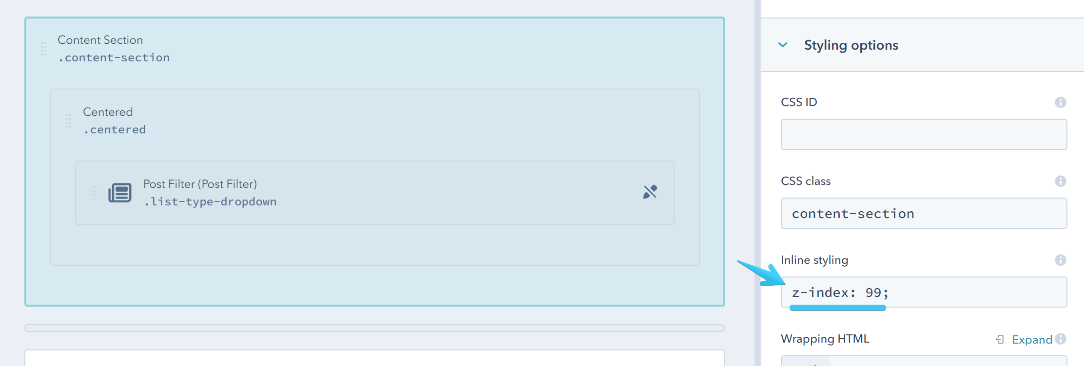
Overlapping dropdown
If the dropdown goes behind other elements on the page, you can add a quick CSS property to bring it forward. For most cases, you would need to apply this style to the Content Section containing the module: z-index: 99;
