- Get started
- Assets
- Components
- Content Section
- Centered
- Section Intro
- Hero Banner
- Hero Slider
- Hero Format
- Equal Height
- No Gutter
- All Inline
- Vertical Center
- Stack
- Shift Col
- Buttons
- Icons
- Social Icons
- Tabs
- Slider
- Accordion
- Advanced Gallery
- Tooltips
- Video Background
- RSS Cards
- Change Image
- List Type Buttons
- List Type Tabs
- List Type Dropdown
- List Type Inline
- List Type Tags
- Sticky
- Reveal
- Animation
- Popups
- Image Box
- Listing
- Mega Menu
- Scroll to Top
- Breakpoints
- Utility classes
- Templates
Slider
There are three types of sliders in Act2:
- a basic slider using the Image Gallery module
- an advanced drag-and-drop component for a better customization and content choices
- and a custom module (Hero Slider) described here.
Basic (Image Gallery module)
A quick and easy-to-use slider is the built-in HubSpot Image Gallery module. You can beautify this slider with Act2 by adding this class to the module: slider-type-1


By default the pagination (dots) is placed in the center. If you want to change that you can add one of the two classes: dots-left or dots-right:

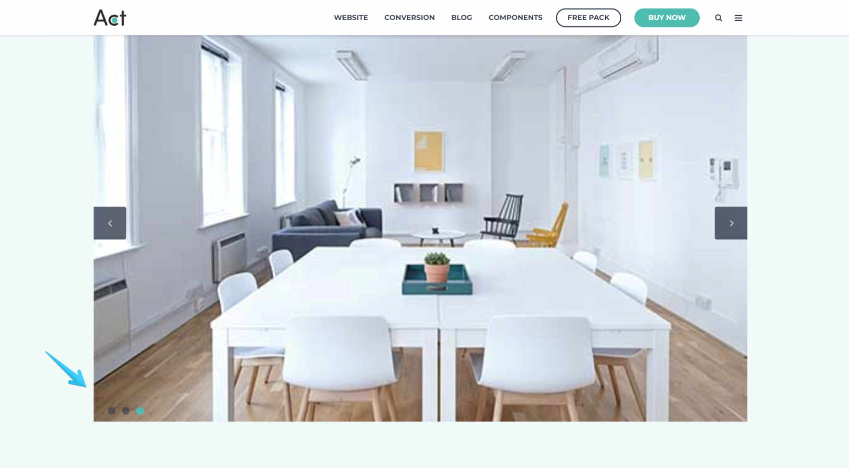
If you want to place the pagination below, just add this class: pagination-below


Module options
Edit, add, remove or reorder slides:
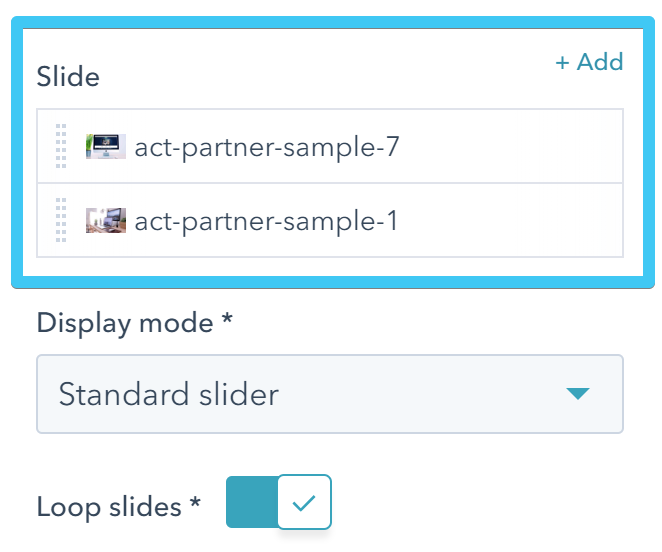
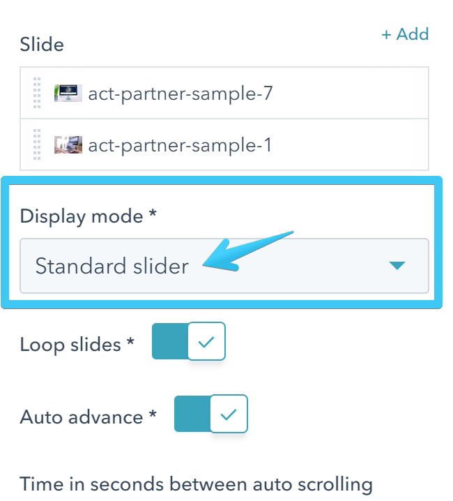
For this slider please make sure Standard slider is selected:
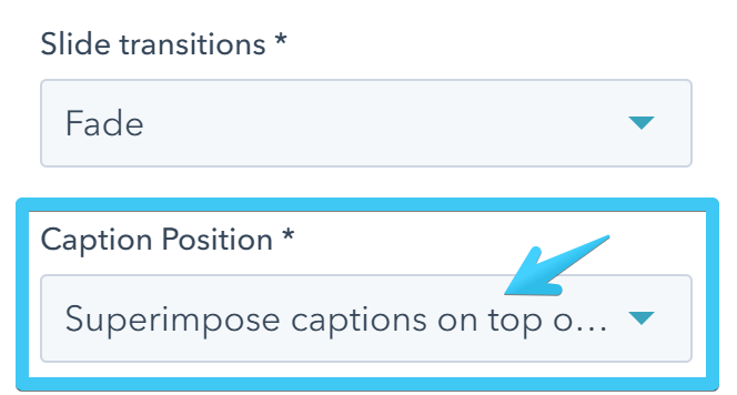
If you want to add captions, the Caption Position must be set to Superimpose captions on top of images:
Add captions using paragraphs, quotes or headings. Watch the video below (the process is similar in the page editor):
Advanced (fully drag and drop)
For a better customization, more options and content choices you can use the advanced drag and drop slider. You basically need to add a group with a few classes, including the base class slider-container and each direct-child row in that group (either module or group) will be converted to a slide:
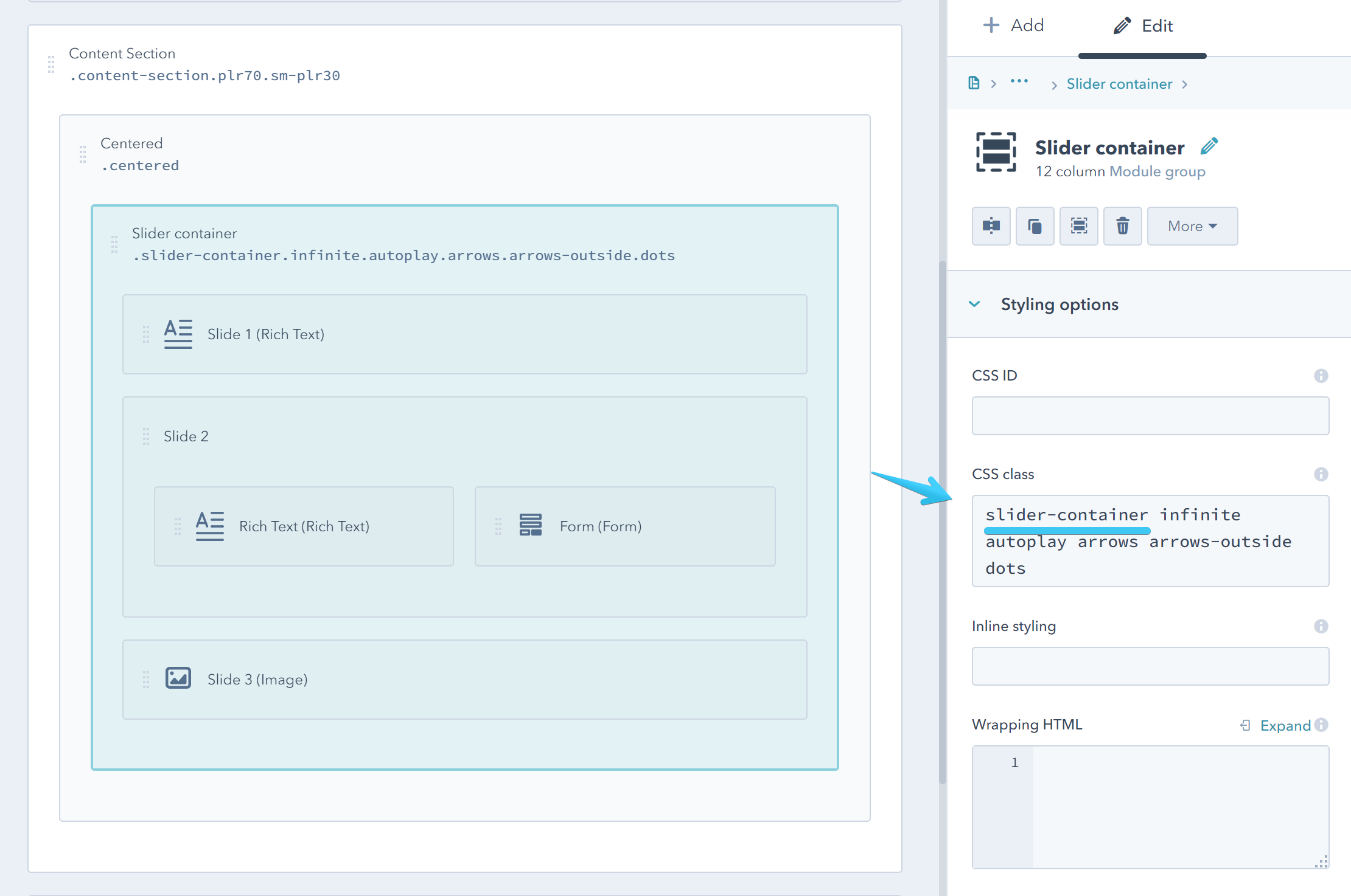
Configuration
The slider-container class doesn't do much on its own, although the slider is there. For a proper slider and some advanced configuration, we need to add additional classes. We'll explain each one of those classes below.
Before getting started here are a bunch of classes that you can use to provide the slider with the basic functionality:
slider-container infinite autoplay arrows dotsInfinite
Infinite loop sliding:
infiniteAutoplay
Slider plays automatically:
autoplayAdaptive Height
Adjusts the slider container height to the active slide instead of the tallest. The slider height will automatically change if the slides have different heights:
adaptive-heightArrows
Adds navigation arrows to the slider. This class is required for all the modifier classes in the table below:
arrows| CSS Class | Description |
|---|---|
| arrows-hover | Shows the navigation arrows only when the mouse hovers the slider |
| arrows-white | Makes the arrows white |
| arrows-outside | Places the arrows outside the slider container. If the arrows go outside the viewport, you can add padding and overflow utility classes to the content section. Example: plr80 sm-plr20 ovh |
| arrows-tap | A bolder arrows design |
| md-no-arrows | Hides the arrows on screens smaller than 1140px |
| sm-no-arrows | Hides the arrows on screens smaller than 768px |
| xs-no-arrows | Hides the arrows on screens smaller than 480px |
Dots
Adds pagination to the slider. This class is required for all the modifier classes in the table below:
dots| CSS Class | Description |
|---|---|
| dots-below | Places the dots below the slider |
| dots-white | Makes the dots white |
Fade
Enables fade animation:
fadeAutoplay Speed
Autoplay speed in milliseconds. Default is 3000. You can replace 3000 with a different number:
autoplay-speed-3000Animation Speed
Slide/fade animation speed in milliseconds. Default is 300. You can replace 300 with a different number:
animation-speed-300Pause On Hover
Pauses the slideshow on hover:
pause-on-hoverSlides To Show
Number of slides/columns to show at a time. Default is 1. Replace 1 with a different number. If you also enable the Center Mode, please choose an odd number (e.g. 3):
slides-to-show-1You can reset the slider to a normal view on smaller screens, with a single slide being visible at a time, by adding one of the stack classes below:
| CSS Class | Description |
|---|---|
| md-stack | Viewport smaller than 1140px |
| sm-stack | Viewport smaller than 768px |
| xs-stack | Viewport smaller than 480px |
Slides To Scroll
Number of slides/columns to scroll when navigating between slides. Default is 1. Replace 1 with a different number. Obviously, this should not be larger than the number of Slides To Show:
slides-to-scroll-1Center Mode
Enables centered view with the active slide being in the center and a bit larger than the rest:
center-modeYou can reset the slider to a normal view on smaller screens, with a single slide being visible at a time, by adding one of the stack classes below:
| CSS Class | Description |
|---|---|
| md-stack | Viewport smaller than 1140px |
| sm-stack | Viewport smaller than 768px |
| xs-stack | Viewport smaller than 480px |
Center Padding
Side padding (space between slides/columns) when in center mode, expressed in pixels. Default is 50. You can replace 50 with a different number:
center-padding-50Slides Vmiddle
Centers slides/columns vertically:
slides-vmiddleVariable Width
Variable width slides:
variable-widthNot Draggable
Disable mouse dragging:
not-draggableNot Swipeable
Disable swiping:
not-swipeableVertical (experimental)
Vertical slider (not fully styled, for advanced users):
verticalVertical Swiping (experimental)
For vertical sliders (not fully styled, for advanced users):
vertical-swiping