- Get started
- Assets
- Components
- Content Section
- Centered
- Section Intro
- Hero Banner
- Hero Slider
- Hero Format
- Equal Height
- No Gutter
- All Inline
- Vertical Center
- Stack
- Shift Col
- Buttons
- Icons
- Social Icons
- Tabs
- Slider
- Accordion
- Advanced Gallery
- Tooltips
- Video Background
- RSS Cards
- Change Image
- List Type Buttons
- List Type Tabs
- List Type Dropdown
- List Type Inline
- List Type Tags
- Sticky
- Reveal
- Animation
- Popups
- Image Box
- Listing
- Mega Menu
- Scroll to Top
- Breakpoints
- Utility classes
- Templates
Services II
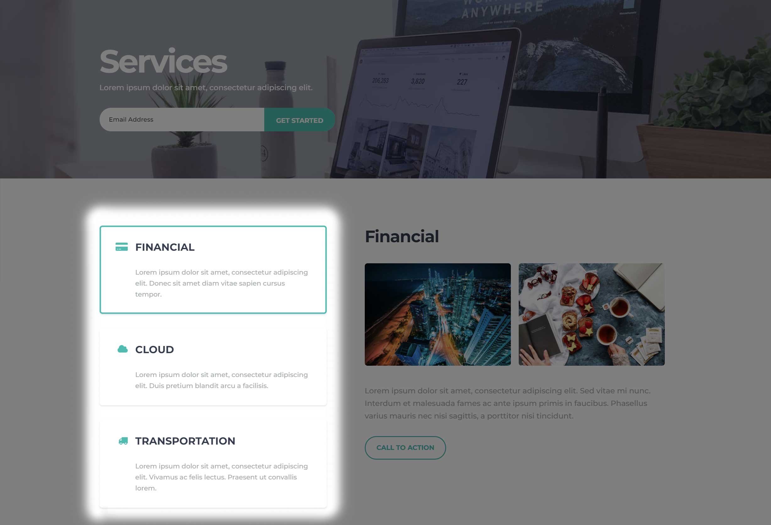
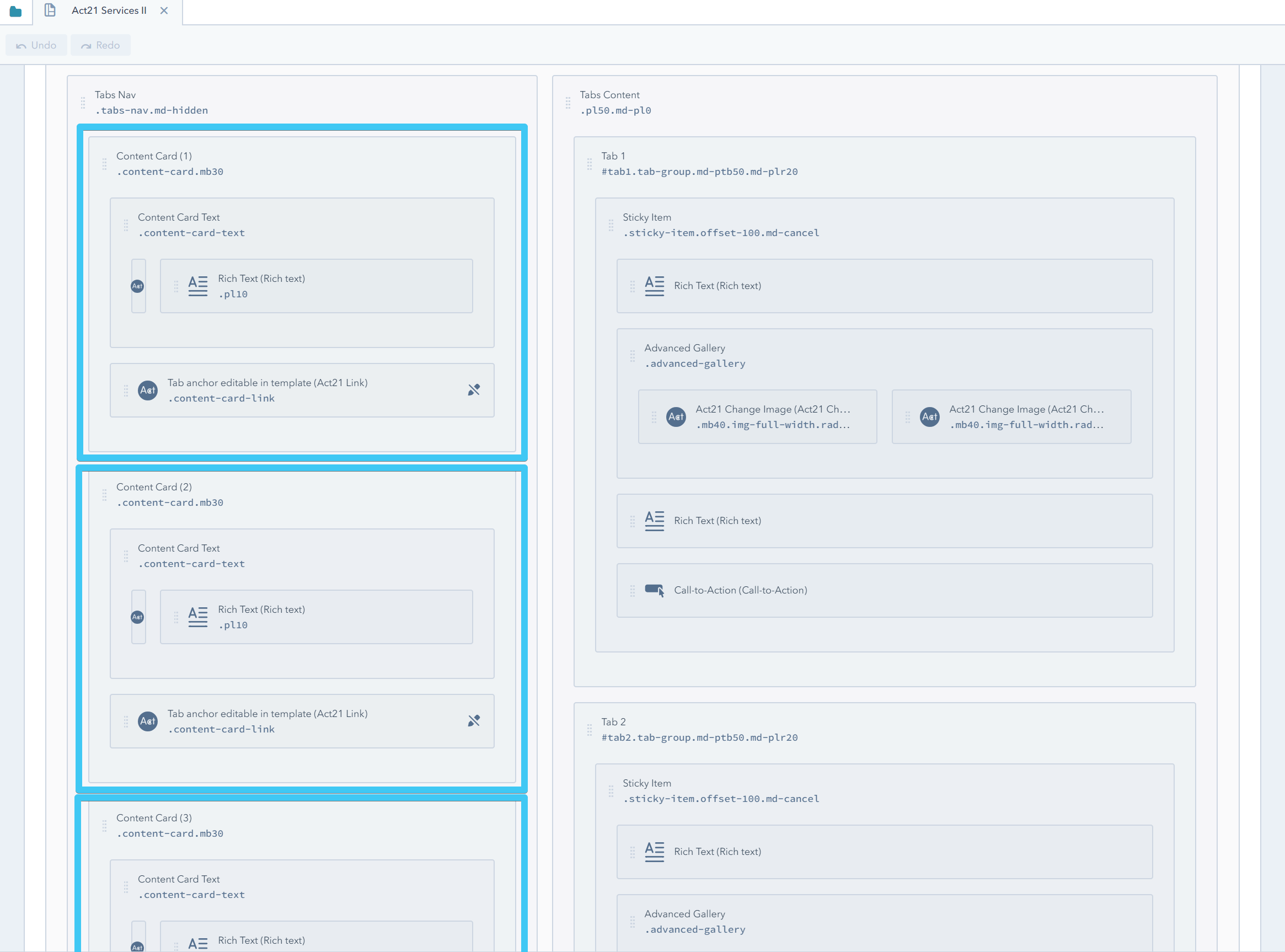
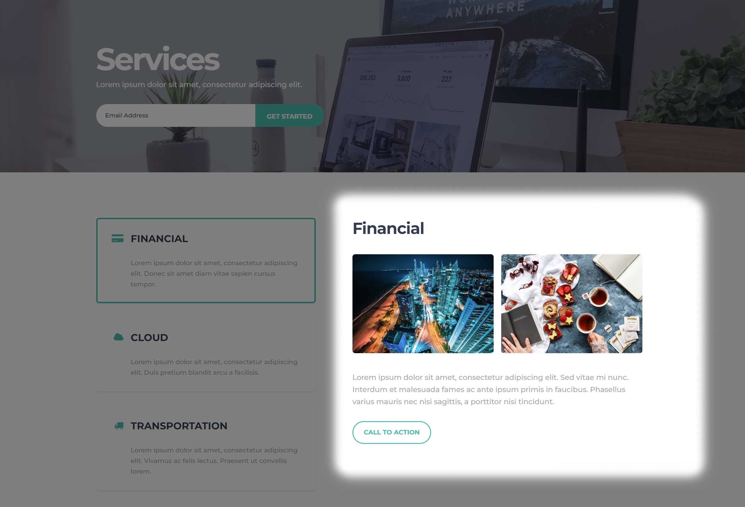
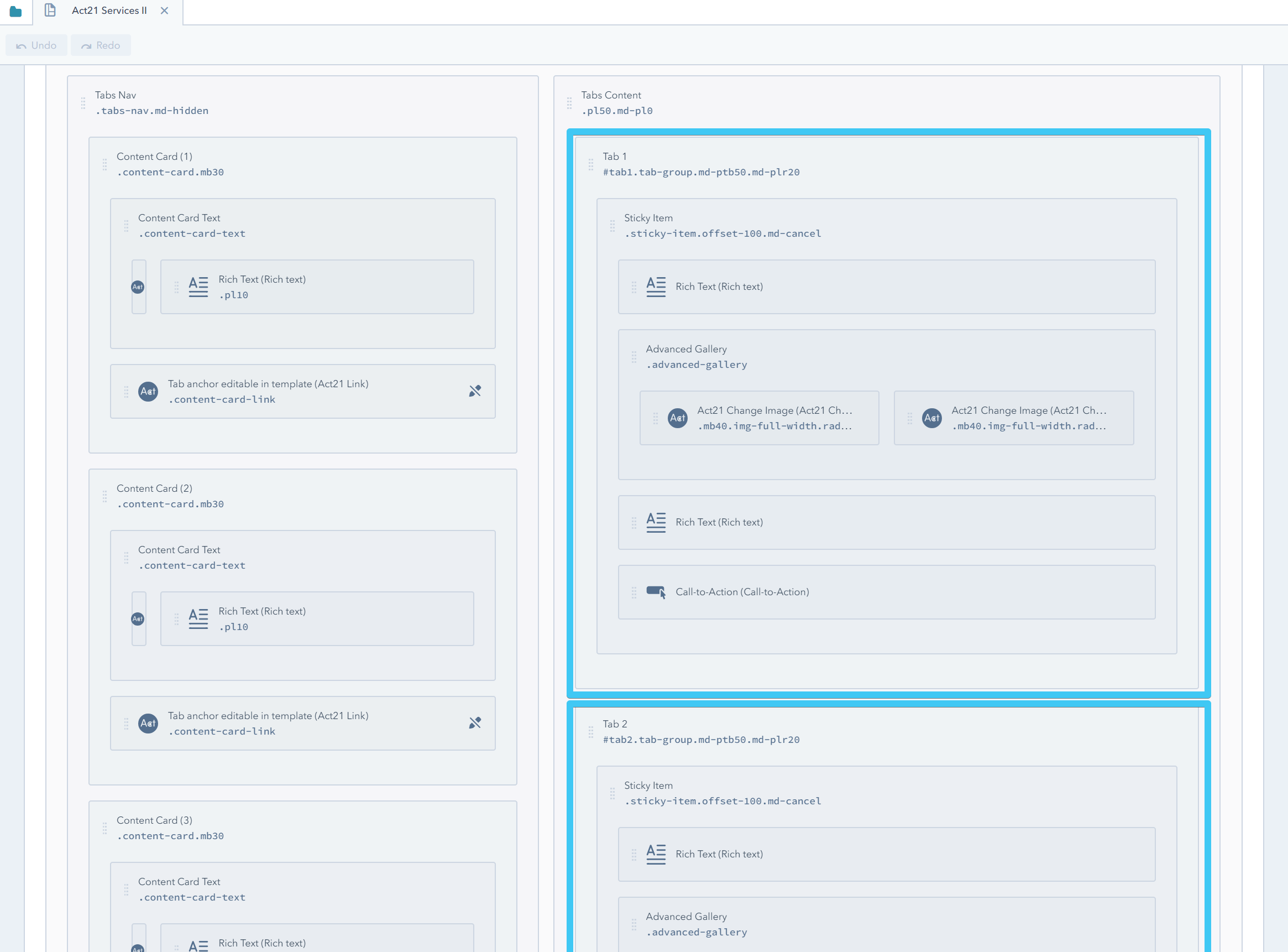
This template is pretty much based on the Tabs drag and drop component. The cards in the left column are forming the navigation:
While the groups in the right column represent the content of those tabs:
How to add new tabs?
Clone the last card in the left column and the last tab in the right column:
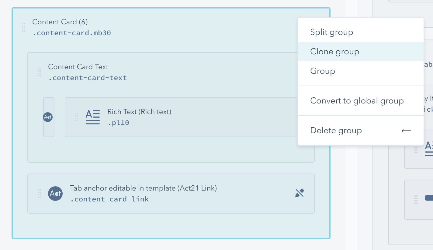
Then update the tab ID and anchor. This video shows the entire process:
In the same way, if you want to remove a tab, you can delete the last card group in the left column and the last tab group in the right column.
How to change the labels on mobile and the tab anchors?
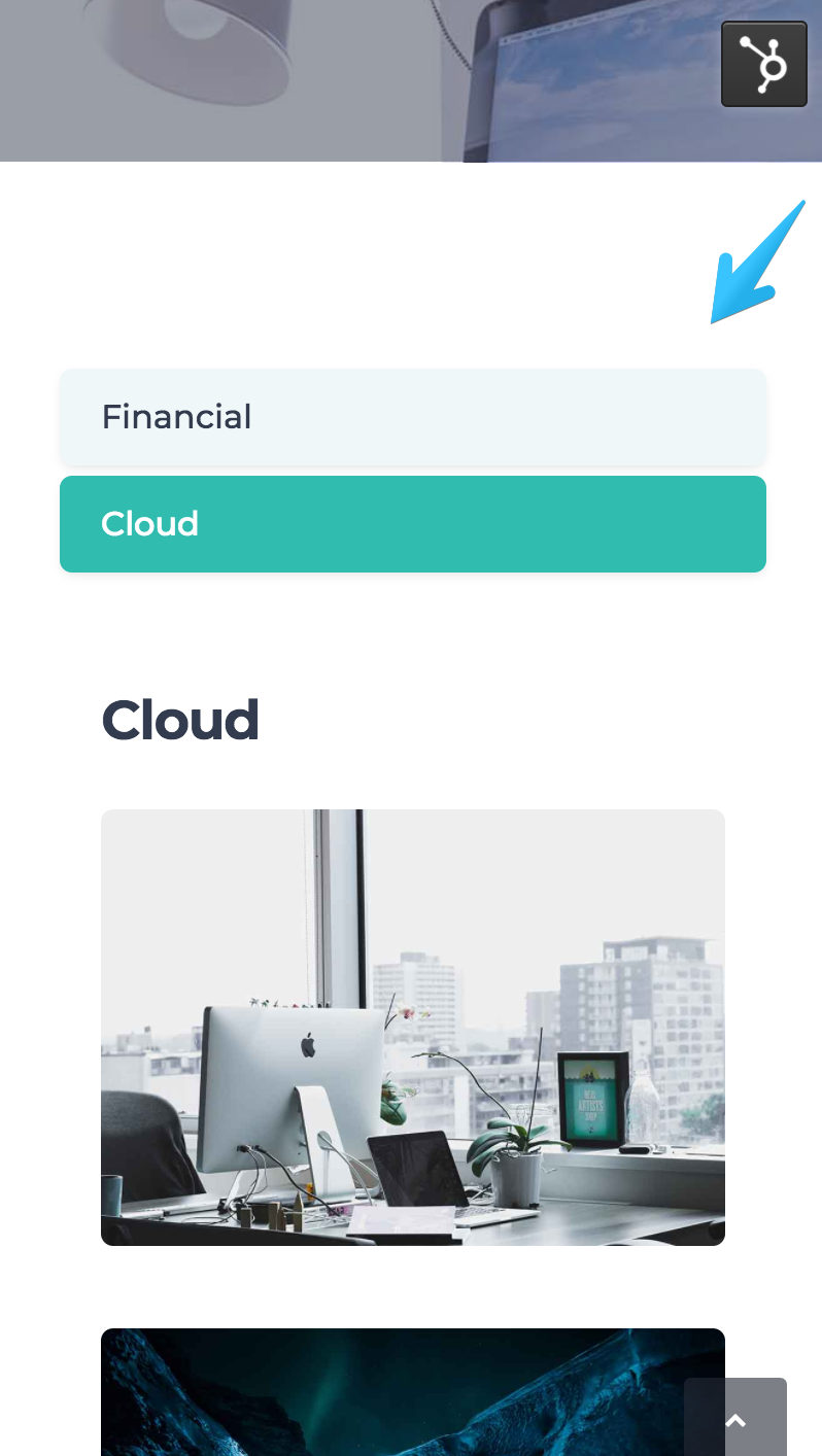
The navigation on mobile is simplified. Instead of the Content Cards placed at the top, it injects simple responsive tabs right before each tab content, more like an accordion menu, and these links have their own text labels:
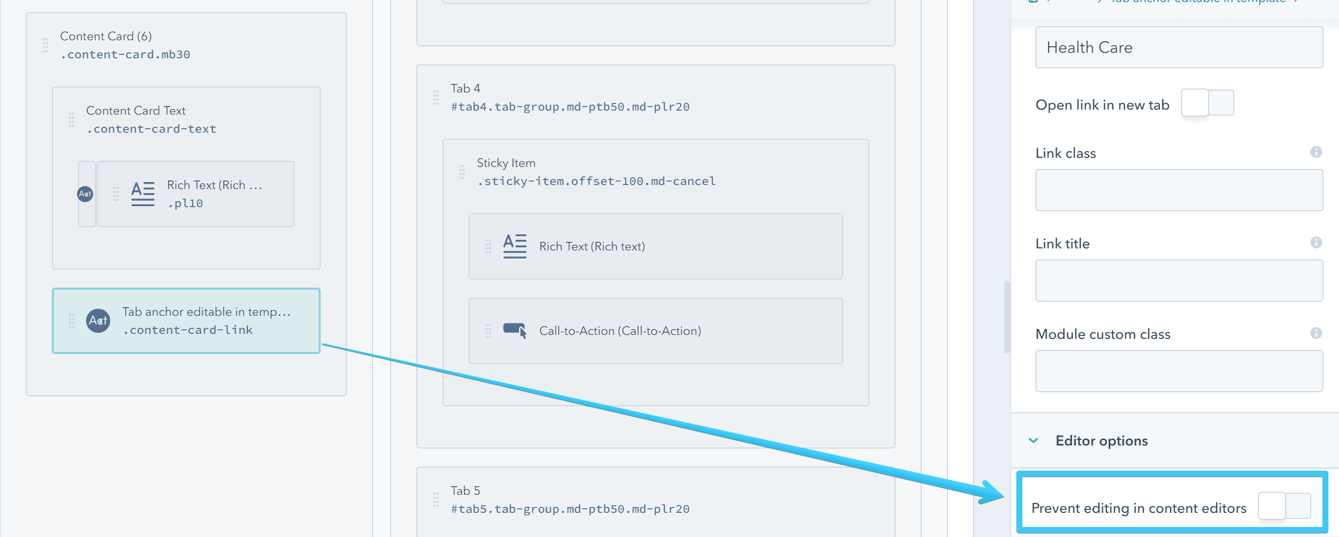
Because this whole section is a drag-and-drop layout, the number of tabs and their IDs can only be changed at the template level. The links in the tab navigation use those IDs, so they are directly depended on them. That's why it makes sense to keep them locked in the template:
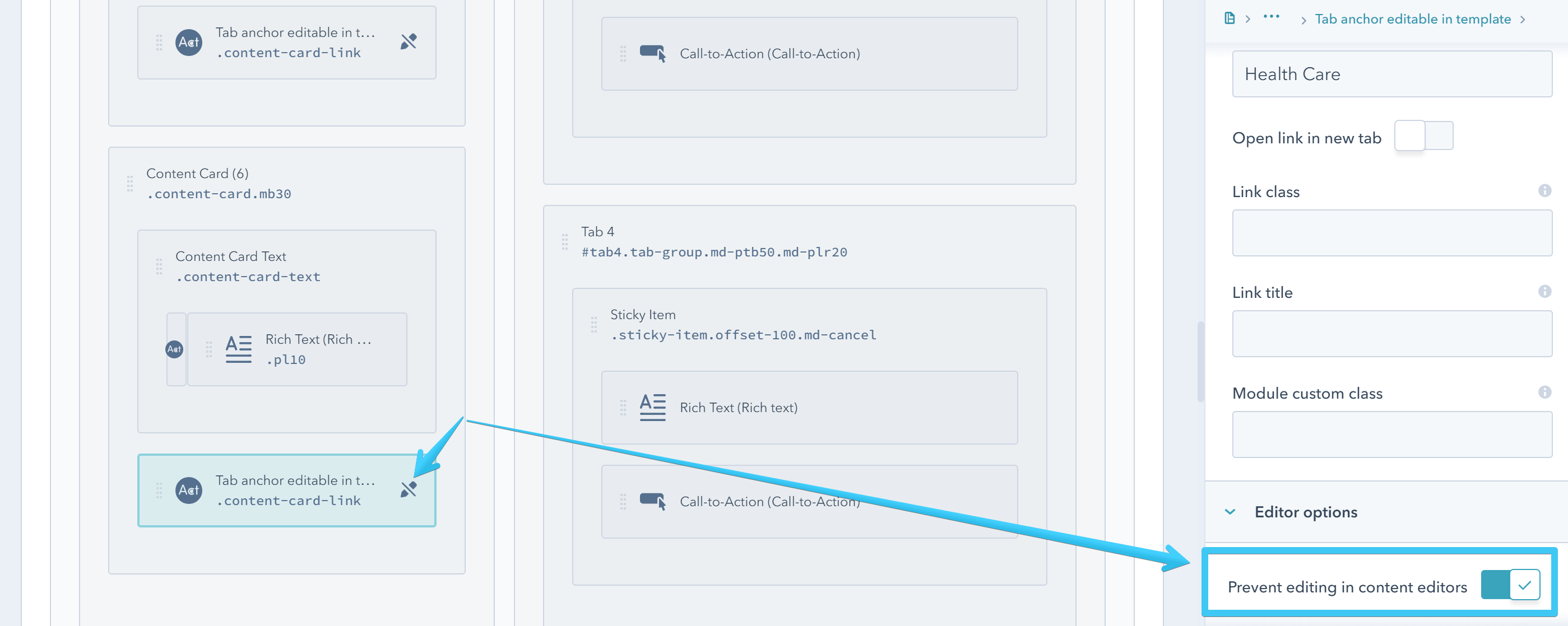
This way you can change the tab IDs (tab1, tab2, tab3, etc) with something more user-friendly, like the name of the service or product:
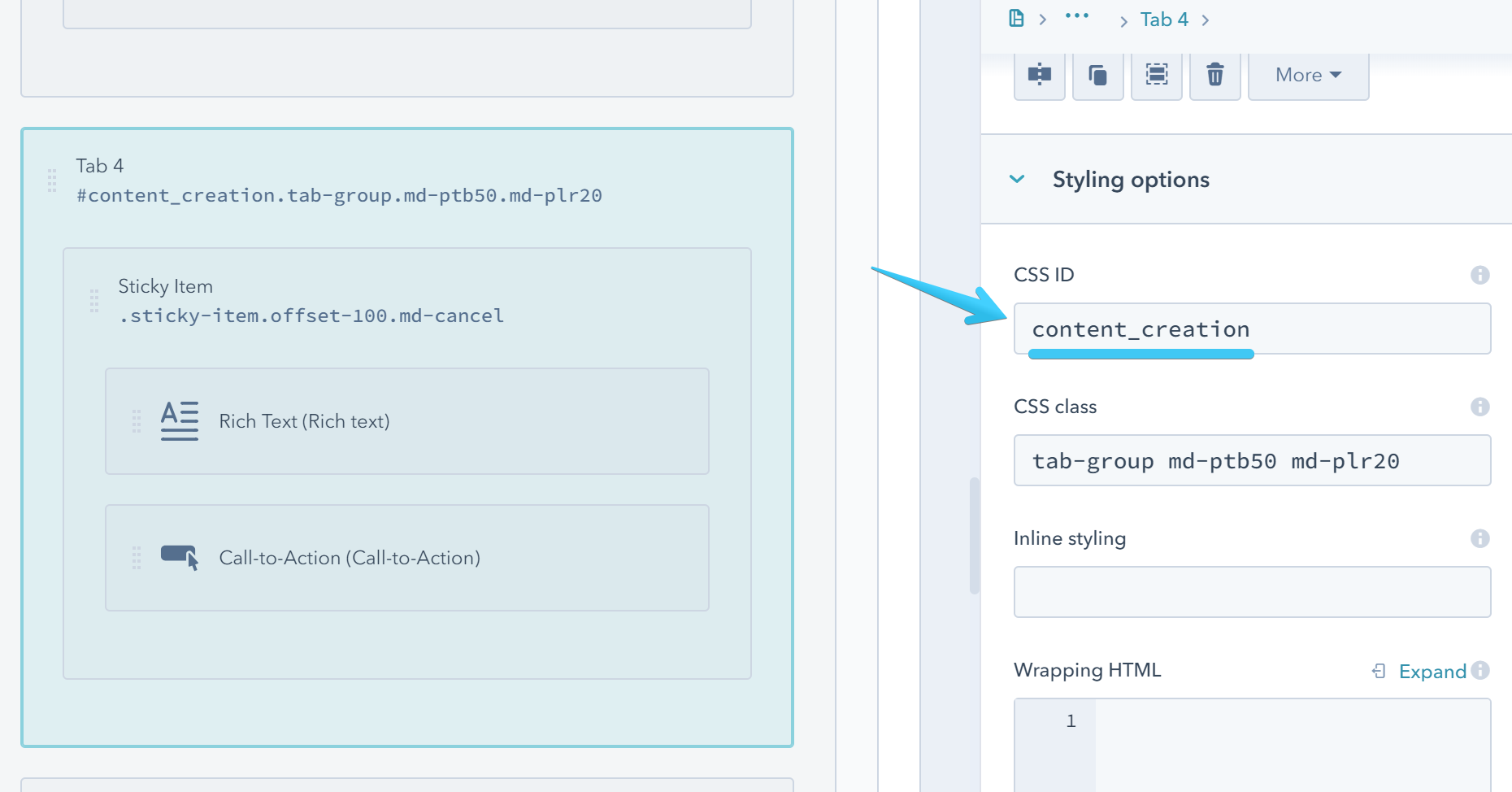
Then change the link too:

Although this text appears only on the mobile tab buttons, the anchor itself is used by the tab navigation on both mobile and desktop.
Since the existing number of elements don't always match your content, you will probably have to use a unique template clone for each page with this design. But if you want to keep it for multiple pages with the same number of tabs and generic anchor names (e.g. tab1, tab2, tab3), you can unlock the links:
