Icons
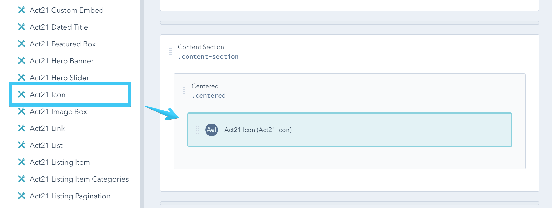
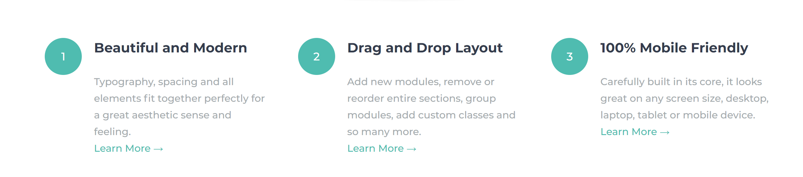
This is the Act21 Icon custom module:
Adding an icon
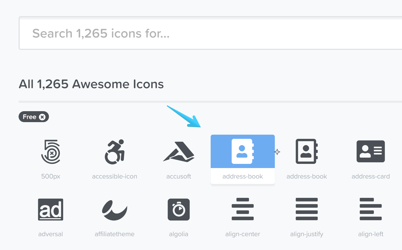
Go to https://fontawesome.com/icons?d=gallery&m=free (or https://fontawesome.com/icons?d=gallery if you integrated Pro) and click the icon you need:
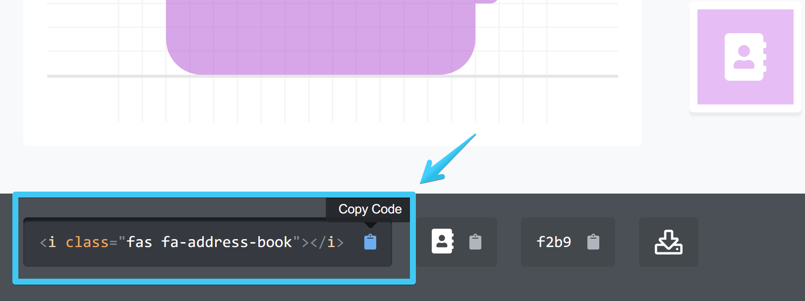
Then copy its code:
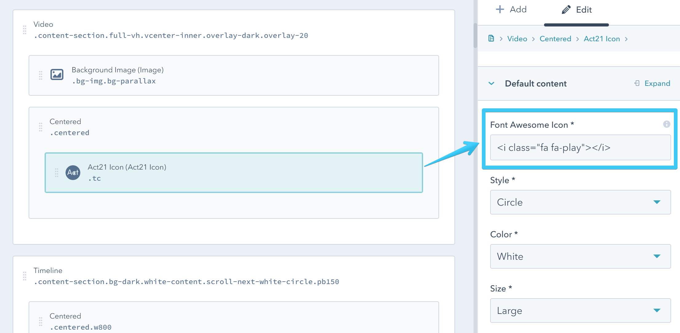
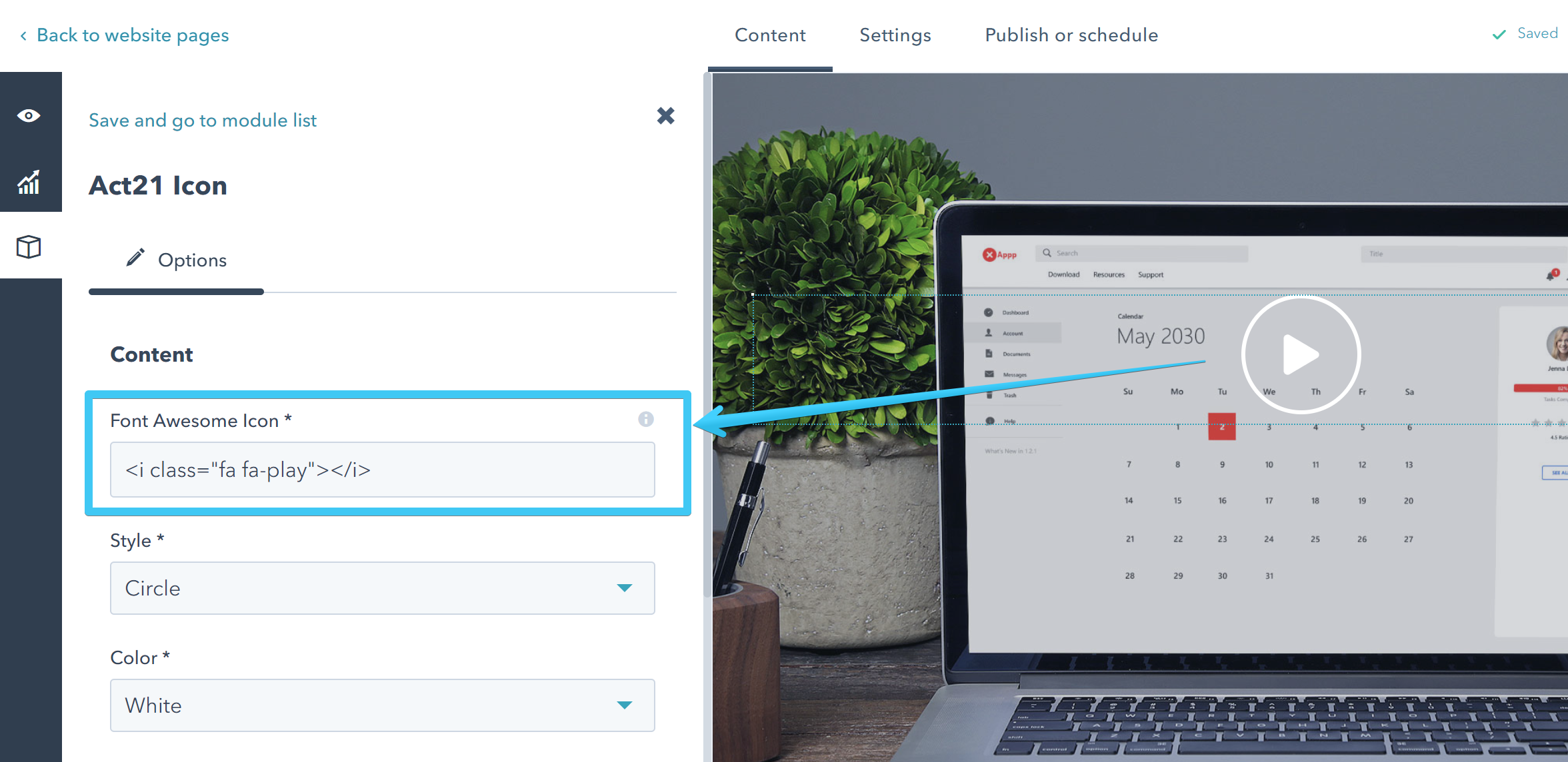
And paste it into your icon module in your template:
Or in your page:
Instead of a Font Awesome icon you can also add up to three characters, with a code like this:
<i>1</i>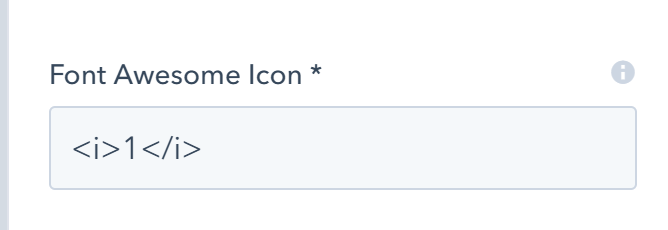
Please also see the Font Awesome asset.
Module options
Style
| Dot |  |
| Circle |  |
| Disc |  |
| Unstyled |  |
Color
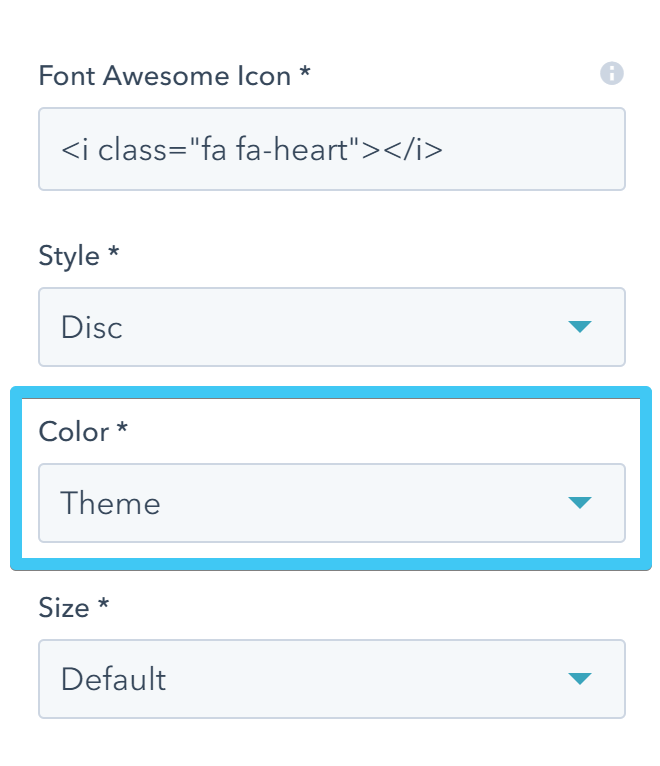
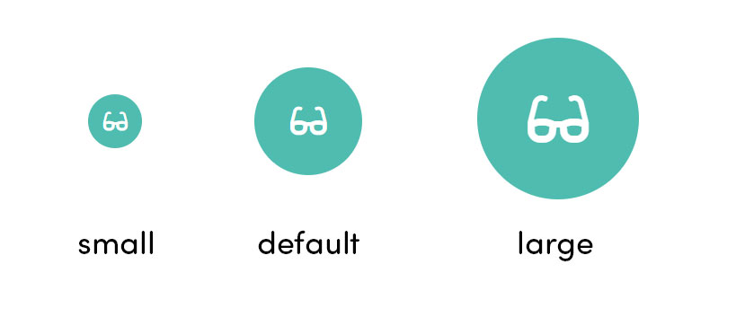
Size
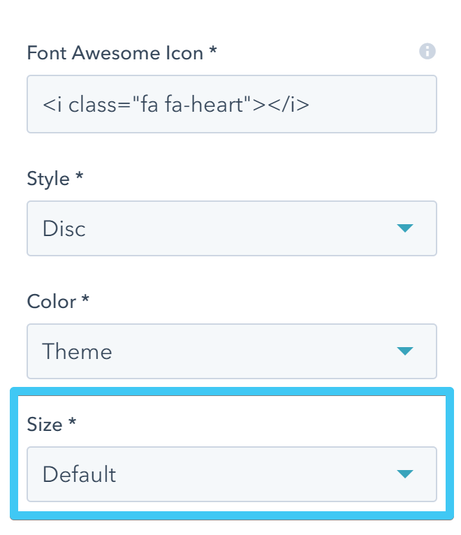
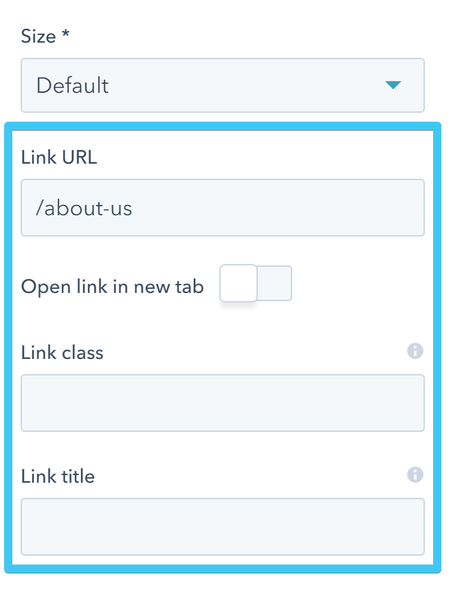
Link
Add an anchor #some_id_on_the_page, relative URL /about-us or a full URL https://hubspot.com
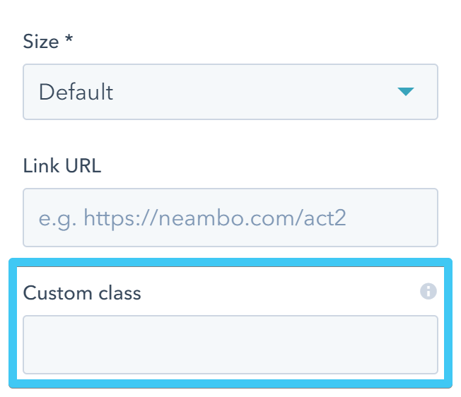
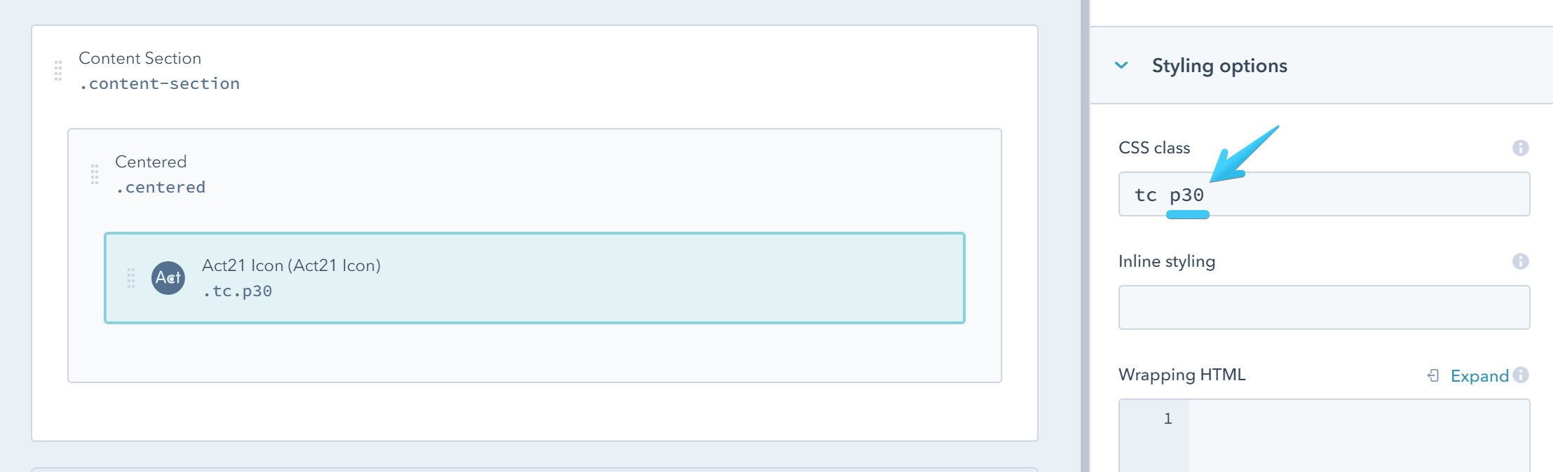
Custom class
Use this box if you want to add a custom class to your Icon module at the page level.
Alignment and spacing
You can use one of the alignment utility classes to align your icon:
To add some space at a side or around your icon you can use the padding utility classes: