- Home
- Getting started
-
Modules
- General info
- Accordion
- Blog card
- Box over image
- Button
- Column navigation
- Compact card
- Comparison table
- Contact box
- Content card
- Cover card
- Feature card
- Features showcase
- Form
- Gallery
- Go card
- Heading
- Hero slider
- Icon
- Image
- Image box
- Image plus text
- Language selector
- Listing
- Logos
- Mobile navigation
- Modal
- Multi address
- Navigation
- Numbers
- Pillar navigation
- Pricing
- Properties
- Quick action
- Quick features
- Quote
- Review
- Rich text
- Scroll to
- Section extra settings
- Section intro
- Sharing
- Shifter
- Side menu
- Site search
- Steps
- Tabs
- Team card
- Timeline
- Video
- Blog configuration
- Articles
- Changelog
-
- License
- Support policy
- Refund policy
Breakpoints
A breakpoint is a point at which the page content, layout, and design, in general, adapt to the size of the viewport (screen, browser window). Generally, you can set different styles for these breakpoints.
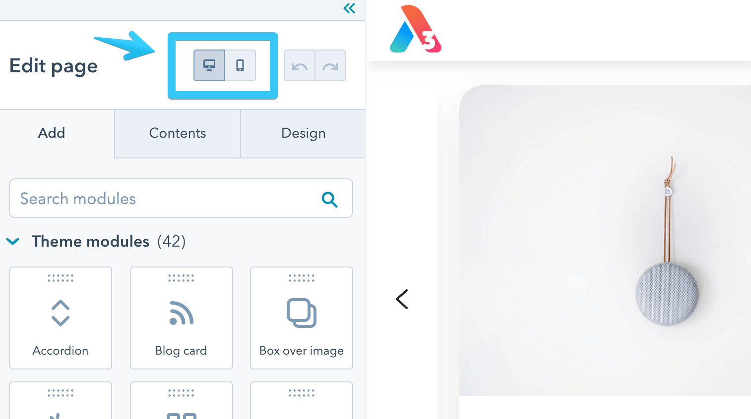
There are two editing modes in HubSpot's page editor: Desktop and Mobile. We have linked the Mobile mode to our Small screens breakpoint.

Here are all three breakpoints in Act3:
Large screens
Desktop, Laptop
Desktop, Laptop
Our theme follows a desktop-first approach to keep consistency with the HubSpot layout and tools. That means, for example, if you set your text alignment on large screens but don't specify it for medium or small screens, it will inherit the same alignment for those screen sizes as well.
Medium screens
Tablet, Small Laptop
Tablet, Small Laptop
Screens smaller than 1140px.
Small screens
Mobile
Mobile
Screens smaller than 768px