Utility classes
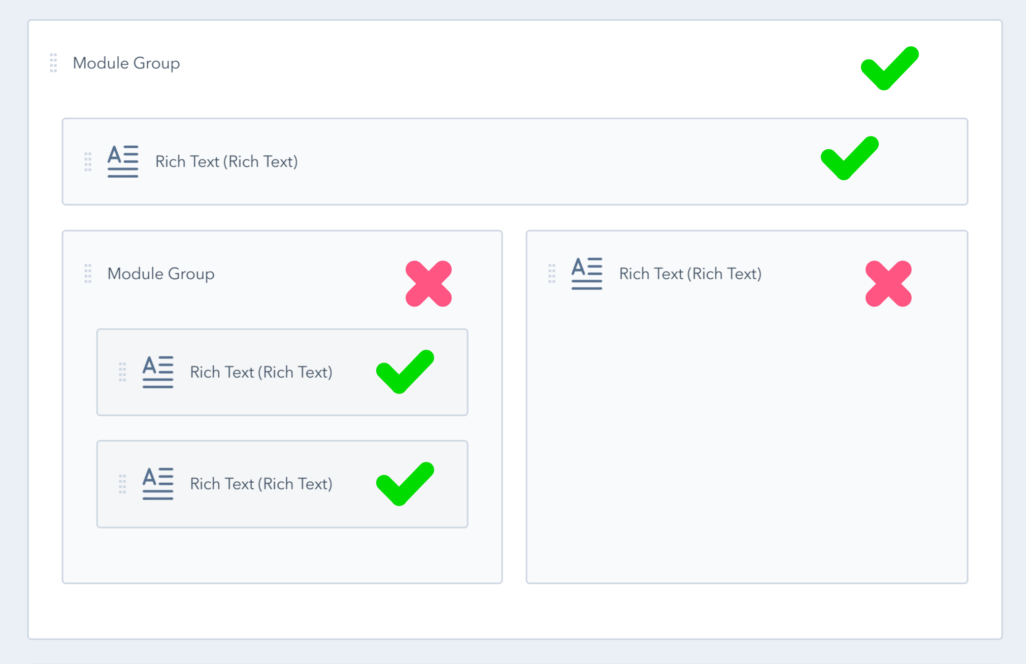
Utility or helper classes are useful CSS classes that you can add to HubSpot modules, groups or other elements on your template to justify text, hide or show content at various screen sizes, add or remove space, set content width, and so many more.
Visibility
Show or hide elements on various screen sizes. For example, if you want to hide an element on desktop but show on small screens, you can use thesse classes:
hidden sm-visibleOr vice versa, if you want to show the element on desktop but hide on small screens, you can use this class:
sm-hiddenHere are all the avilable classes:
| CSS Class | Description |
|---|---|
| hidden | Hidden by default |
| visible | Visible by default |
| md-hidden | Hidden on screens smaller than 1140px |
| md-visible | Visible on screens smaller than 1140px |
| sm-hidden | Hidden on screens smaller than 768px |
| sm-visible | Visible on screens smaller than 768px |
| xs-hidden | Hidden on screens smaller than 480px |
| xs-visible | Visible on screens smaller than 480px |
Alignment
Align text and inline elements (such as buttons, icons) on various screen sizes. For example, if you want to right align text on desktop but center on mobile, you would use:
tr sm-tcHere are all the available classes:
| CSS Class | Description |
|---|---|
| tl | Stands for "Text Left". Aligns the text and inline elements to the left |
| tc | Stands for "Text Center". Centers the text and inline elements |
| tr | Stands for "Text Right". Aligns the text and inline elements to the right |
| tj | Stands for "Text Justify". Stretches the text by adding white spaces to make all lines appear equal. |
| md-tl | Stands for "Medium Text Left". Aligns the text and inline elements to the left on screens smaller than 1140px |
| md-tc | Stands for "Medium Text Center". Centers the text and inline elements on screens smaller than 1140px |
| md-tr | Stands for "Medium Text Right". Aligns the text and inline elements to the right on screens smaller than 1140px |
| md-tj | Stands for "Text Justify". Stretches the text by adding white spaces to make all lines appear equal on screens smaller than 1140px |
| sm-tl | Stands for "Small Text Left". Aligns the text and inline elements to the left on screens smaller than 768px |
| sm-tc | Stands for "Small Text Center". Centers the text and inline elements on screens smaller than 768px |
| sm-tr | Stands for "Small Text Right". Aligns the text and inline elements to the right on screens smaller than 768px |
| sm-tj | Stands for "Text Justify". Stretches the text by adding white spaces to make all lines appear equal on screens smaller than 768px |
| xs-tl | Stands for "Extra Small Medium Text Left". Aligns the text and inline elements to the left on screens smaller than 480px |
| xs-tc | Stands for "Extra Small Text Center". Centers the text and inline elements on screens smaller than 480px |
| xs-tr | Stands for "Extra Small Text Right". Aligns the text and inline elements to the right on screens smaller than 480px |
| xs-tj | Stands for "Text Justify". Stretches the text by adding white spaces to make all lines appear equal on screens smaller than 480px |
Space
In CSS, the margin property is used to add outer space around elements while padding is used to add space inside elements.
Important notes:
-
Left and right margin should not be used on HubSpot grid layout (modules or groups), except on certain situations (e.g. All Inline child elements) because the additional space around columns will break the layout. For that we recommended padding.
-
Do not use these classes to center content. Use Centered instead.
-
Use large values with caution.
If you want to add 20px margin around an element, you would add this class: m20
m stands for margin and for padding you would use: p20
Sides
To specify the side of the element where the space should be added you can use:
| Margin | Padding | ||
| m | Margin | p | Padding |
| mtb | Margin Top Bottom | ptb | Padding Top Bottom |
| mt | Margin Top | pt | Padding Top |
| mb | Margin Bottom | pb | Padding Bottom |
| mlr | Margin Left Right | plr | Padding Left Right |
| ml | Margin Left | pl | Padding Left |
| mr | Margin Right | pr | Padding Right |
For example, you can add 40px margin at the bottom of an element with this class: mb40
You can also add negative top/bottom margin with a class like this nmt100. That means Negative Margin Top 100px. Please use this with caution. All values bellow are supported.
Values
For 30 pixels padding-left, you would add: pl30. Or, for 15 pixels margin-bottom: mb15. Here are all the values you can specify within your class, for either margin or padding:
| 0 | 5 | 10 | 15 | 20 | 30 | 40 | 50 | 60 | 70 | 80 | 90 | |
| 100 | 110 | 120 | 130 | 140 | 150 | 200 | 250 | 300 | 400 | 500 |
Breakpoints
Use breakpoint prefixes to add, change or remove the space values on various screen sizes. For example, md-p10 adds 10px padding on screens smaller than 1140px.
Another example: if you want to add 300px top and bottom padding on large screens, reduce that padding to 200px on medium screens, 100px on small screens and 50px on extra small screens, you would add these classes: ptb300 md-ptb200 sm-ptb100 xs-ptb50.
These are all the breakpoint prefixes you can use with your space classes:
| Class prefix | Description | Example |
|---|---|---|
| No prefix for the initial value (desktop) | p30 | |
| md- | Medium screens, smaller than 1140px | md-p20 |
| sm- | Small screens, smaller than 768px | sm-p10 |
| xs- | Extra small screens, smaller than 480px | xs-p5 |
Here is a graph for a quick and better view of the space class composition:

Width
Adds a maximum width (CSS max-width) to a module, group or element. Should not be used on divided modules or groups because it will break the HubSpot grid layout:
This can also be used with the Centered component to change the default width.
Here are all the available values:
| w100 | w150 | w200 | w250 | w300 | w350 | w400 | w450 | w500 | w550 | w600 | w650 | w700 |
| w750 | w800 | w850 | w900 | w950 | w1000 | w1050 | w1100 | w1150 | w1200 | w1250 | w1300 | w1350 |
| w1400 | w1450 | w1500 | w1550 | w1600 | w1650 | w1700 | w1750 | w1800 | w1850 | w1900 | w1950 | w2000 |
You can also add a breakpoint prefix to specify different values on various screen sizes. For example, if you want a group with a maximum width of 1200px on desktop, but only 400px on mobile, you can add: w1200 sm-w400
These are all the available breakpoints:
| Class prefix | Description | Example |
|---|---|---|
| No prefix for the initial value (desktop) | w1200 | |
| md- | Medium screens, smaller than 1140px | md-w900 |
| sm- | Small screens, smaller than 768px | sm-w400 |
| xs- | Extra small screens, smaller than 480px | xs-w200 |
Text size
Apply one of the pre-defined classes below to a group or module to increase/reduce text size. This may not work on certain components, where text size is already defined.
| Class | Description |
|---|---|
| text-tiny | 65.2% of the default font size. |
| text-small | 75% of the default font size. |
| text-medium | 87.5% of the default font size. |
| text-large | 150% of the default font size. |
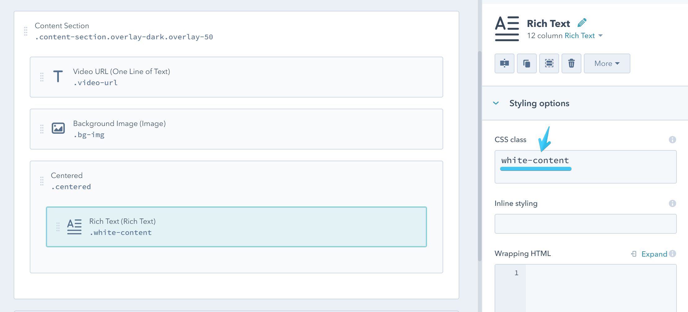
White content
white-content
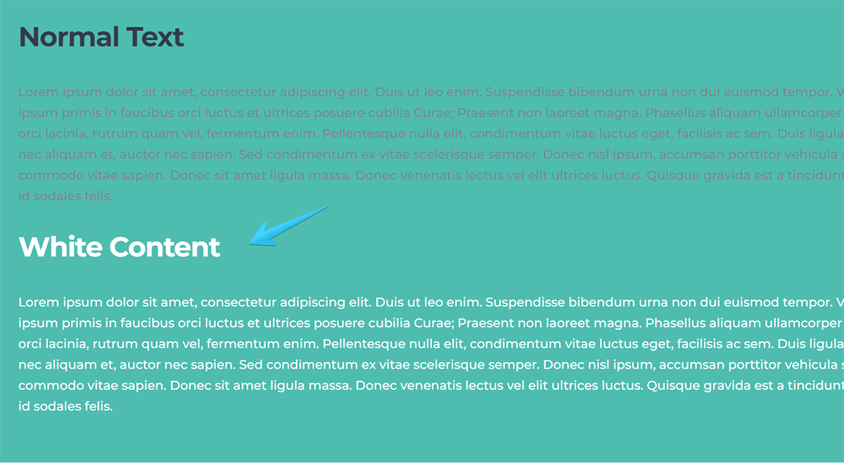
Add this class white-content to the groups or modules where you need white content. For example, on those sections with background images or videos.
Sometimes the best way is to apply this class individually to those modules or groups where you want the content to be white, instead of the entire section, because it may contain elements where white content is not necessary, like Card Boxes, Content Cards, etc.
Links
You can apply these classes to the links directly, e.g. <a class="link-theme" href="..., or to the modules or groups containing your links.
| Class | Description |
|---|---|
| link-inherit | Links are inheriting the color from the text inside the container. |
| link-theme | Applies the theme color to your links. |
| link-hover-theme | Applies the theme color to your links on hover. |
| link-dark | Applies the dark color to your links. |
| link-hover-dark | Applies the dark color to your links on hover. |
| link-white | Makes the links white. |
| link-hover-white | Makes the links white on hover. |
| link-hover-underline | Adds a stylish underline to your links on hover. You can also apply the underline class to a span, link or other inline element to show the same underline. This is white on white-content. |
Paragraphs
Apply this class p to an element to add same bottom margin as on your paragraphs.
Apply this class pns to a module or group to remove the spacing (margin-bottom) between paragraphs. To remember it better, pns stands for Paragraphs No Spacing.
Headings
Apply this class hns to a module or group to remove the default spacing (margin-bottom) from all headings. To remember it better, hns stands for Headings No Spacing.
You can also use hs0, hs10, hs20, hs30 to change the default headings margin-bottom. These are pixels (e.g. hs20 sets the headings with a margin-bottom: 20px).
List
Apply this class reset-list to a list, <ul class="reset-list" ... or <ol class="reset-list" ..., to reset the list to browser's default styling.
Blockquotes
Change the color of the default quotes from the <blockquote> element by adding one of the classes below. E.g. <blockqupte class="quote-theme" ...
| Class |
|---|
| quote-theme |
| quote-dark |
The quote is automatically white on white-content, so changing the quotes to either theme or dark color may look better in that case.