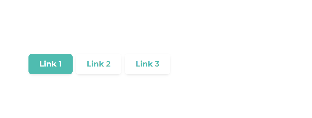
List Type Buttons
Add this class list-type-buttons to a Rich text or other modules with an unordered list and plain links (like the Post Listing module or Post Filter) to make the links look like buttons. Please make sure your module contains only links in an unordered list.
A lot easier to use is an Act21 List module that has all these options built-in, so classes are not required there.
If you use Rich Text make sure to use a recognizable name for your module. It may be hard to edit inline in the Page Editor, due to its design. You will most likely need to find the module in the sidebar on the left.
Alternatively, you can use an Act21 HTML module, with a coded list, like this:
<ul>
    <li><a href="#link1">Link 1</a></li>
    <li><a href="#link2">Link 2</a></li>
    <li><a href="#link3">Link 3</a></li>
</ul>
There are a few additional classes that you can use to add other colors to your buttons:
| CSS Class | Sample (with the dafault theme colors) |
|---|---|
| theme | 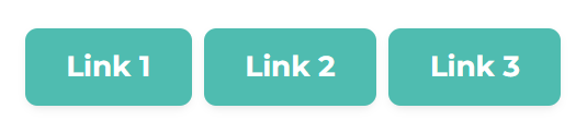 |
| dark | 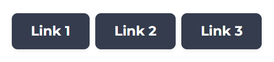 |
| white | 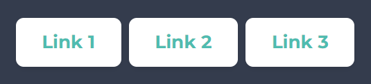 |
| light | 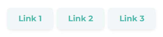 |
If you use this type of list as the navigation of other Act2 components (like Tabs or Listing), there will be a special CSS class applied to the active link: active. This needs a special styling, so in case you use the other colors available above, you would probably want to use a different color for your active link. For that you can use one of the active classes:
| CSS Class | Sample (with the dafault theme colors) |
|---|---|
| active-theme | 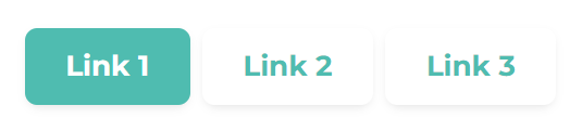 |
| active-dark | 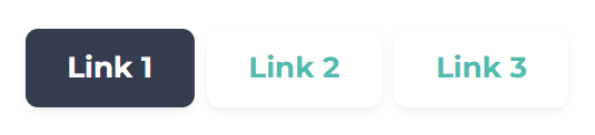 |
| active-white | 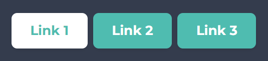 |
| active-light | 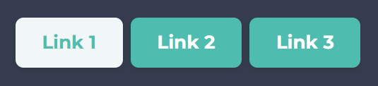 |