Popups
There are three types of pop-ups in Act2:
1. Popup Image
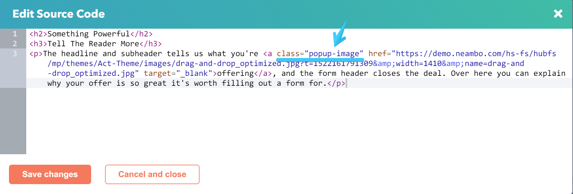
Add this class popup-image to your anchor <a> that links to an image (JPEG or PNG).
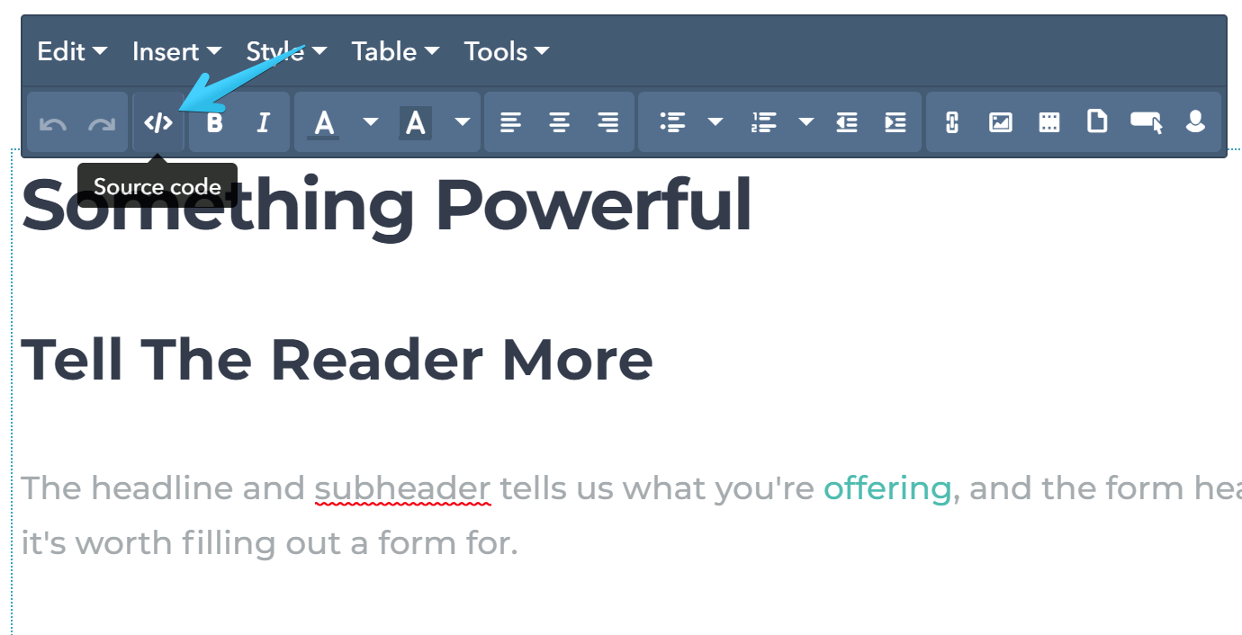
Open your module's source code panel:
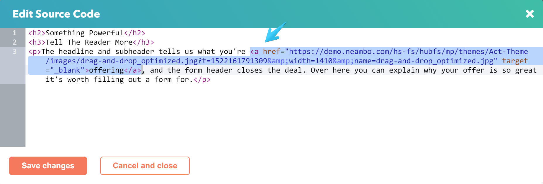
Then find your anchor code that looks like this (starting with <a , ending with </a>):
And add the class attribute right after the opening <a , separated by empty spaces, like this:
<aclass="popup-image"href="...
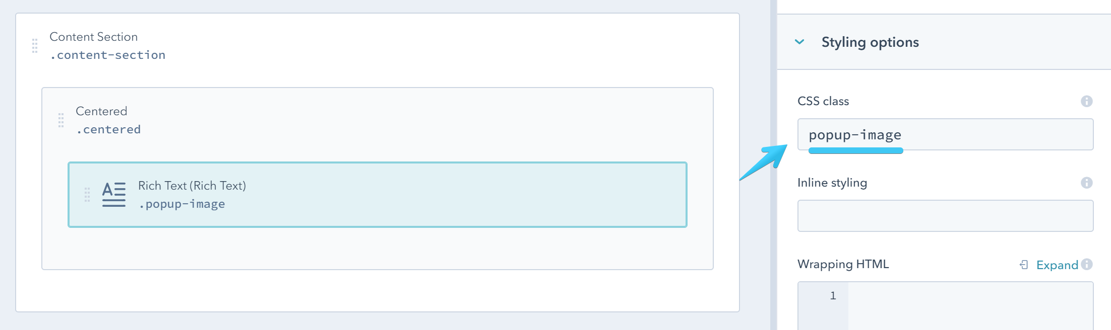
Another method is to add the class to the module directly, but it must contain only the link that points to your image. If you add more links, they will simply not work.
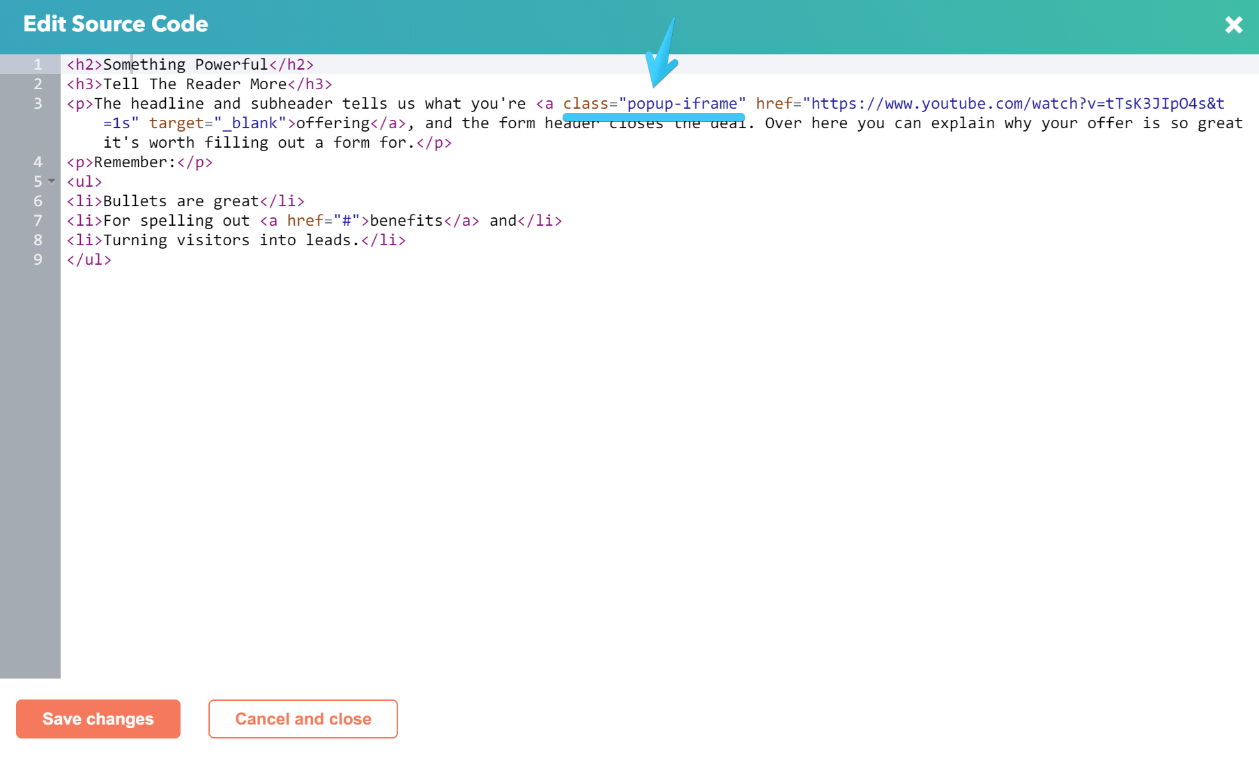
2. Popup Iframe (video)
This can be used for Vimeo or YouTube videos.
Add the link as before, but in this case the class must be popup-iframe and the link should point to a URL from a YouTube or Vimeo video page:
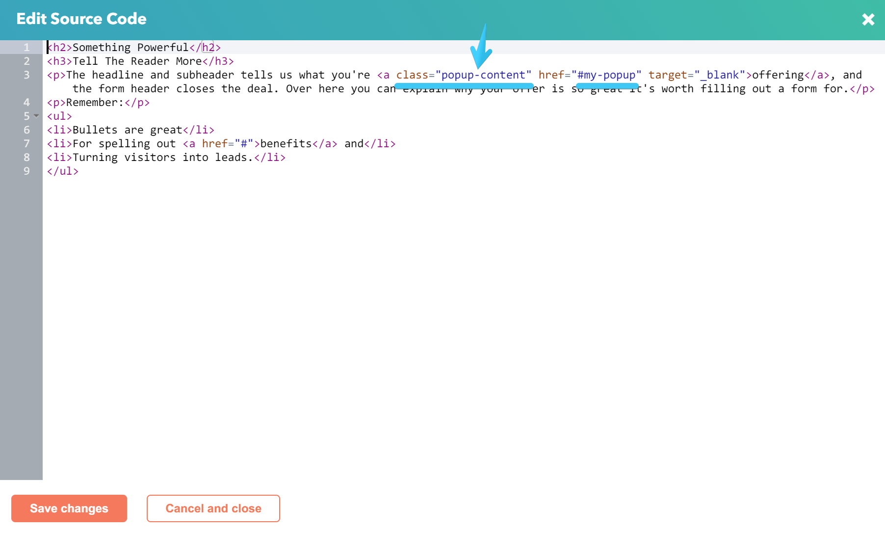
3. Popup Content
This can be used for popups containing text, forms or other content on your page.
Add the link as before, but in this case the class must be popup-content and the link should point to an ID of an element on that page, preceded by a hash. e.g. #my-popup
You can add the popup content at the bottom of your template, before the footer delimiter:
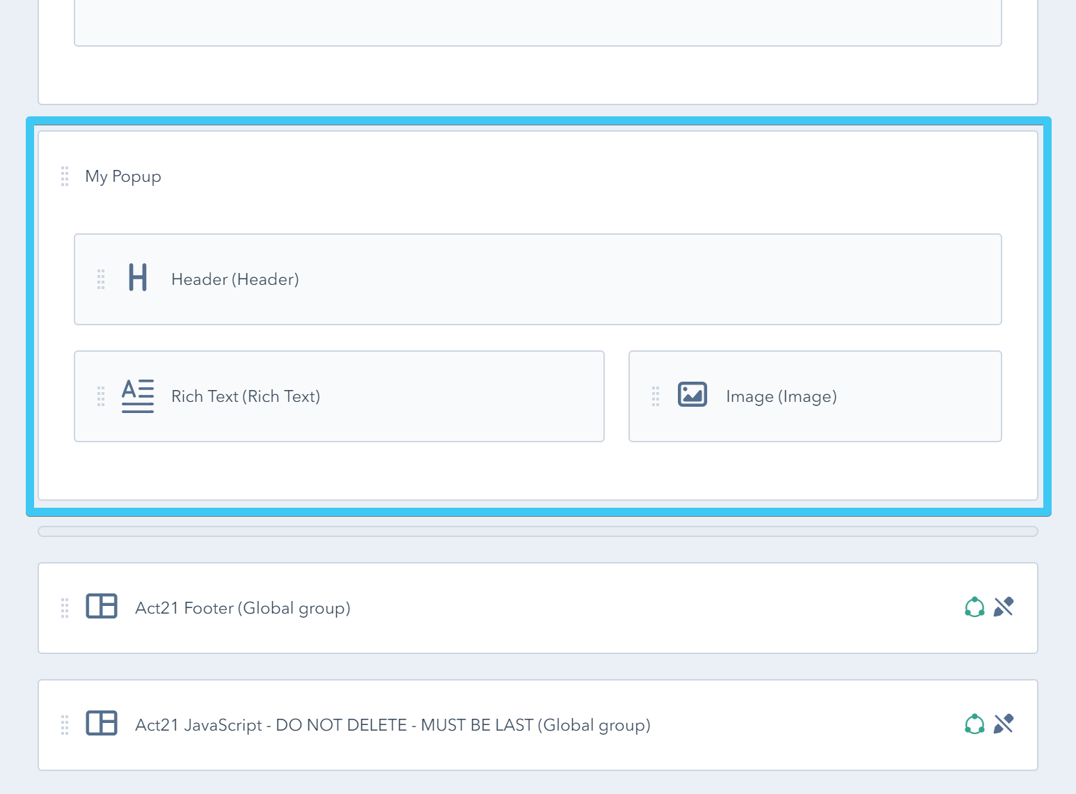
If you want your popup content hidden by default (most common) wrap it in a group with the class: hidden
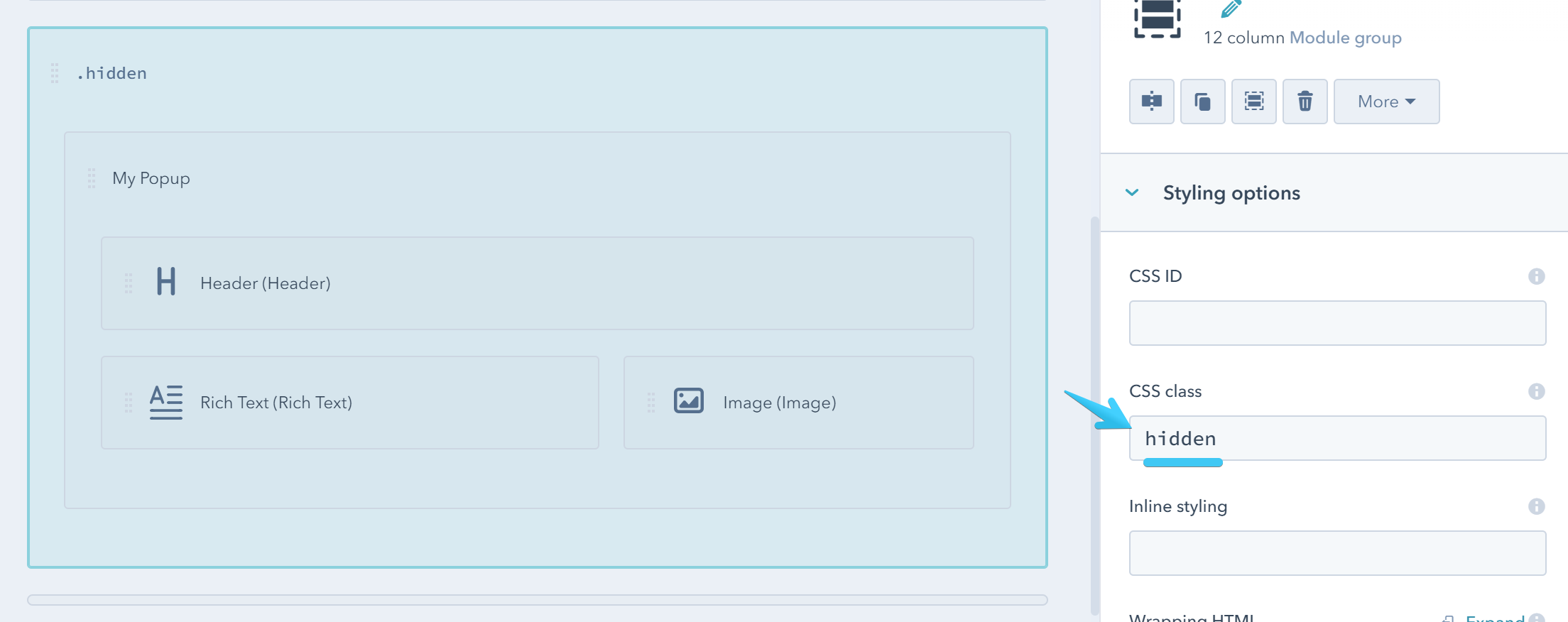
Then add this class to your actual popup: popup-target
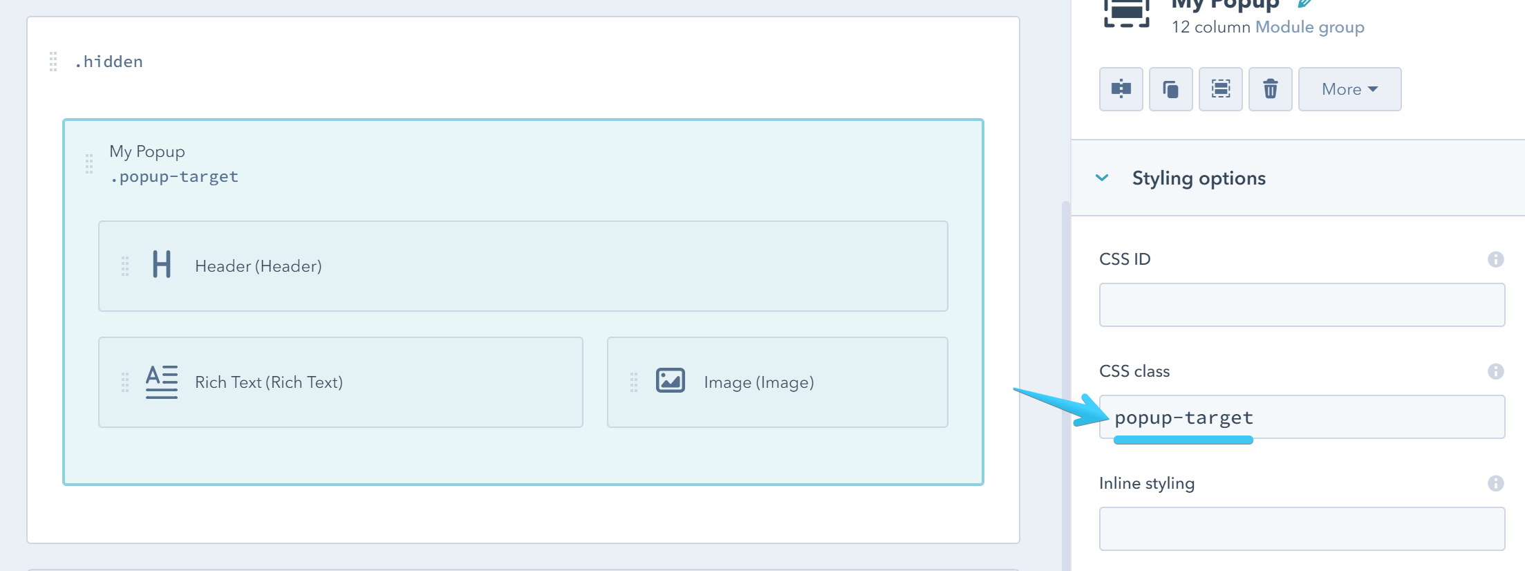
And the same ID you used on your link, without hash:
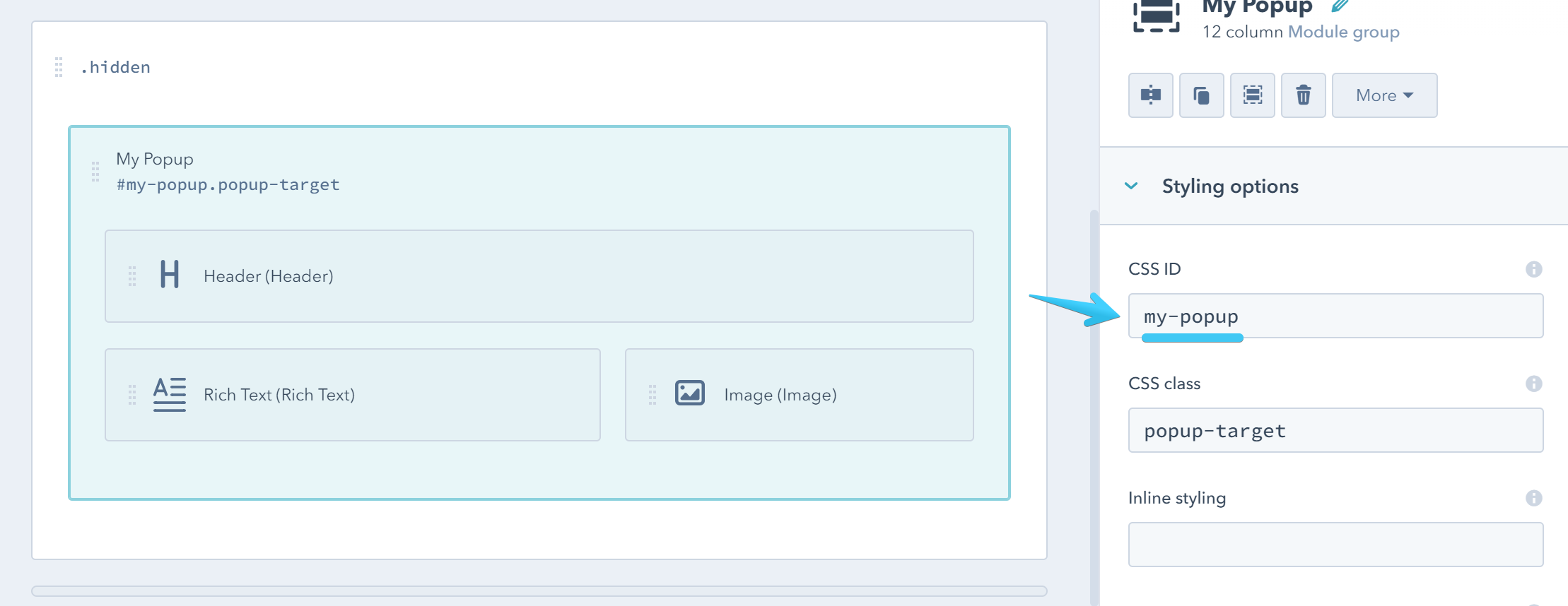
_ and - are allowed. e.g. inbound_marketing_2018Except for the close button, the popup is not styled by default. It's up to you to choose the layout or styles to apply, but here are some utility classes that may help you get started:
popup-target w600 p30 bg-white radius-left radius-bottom-right large-shadow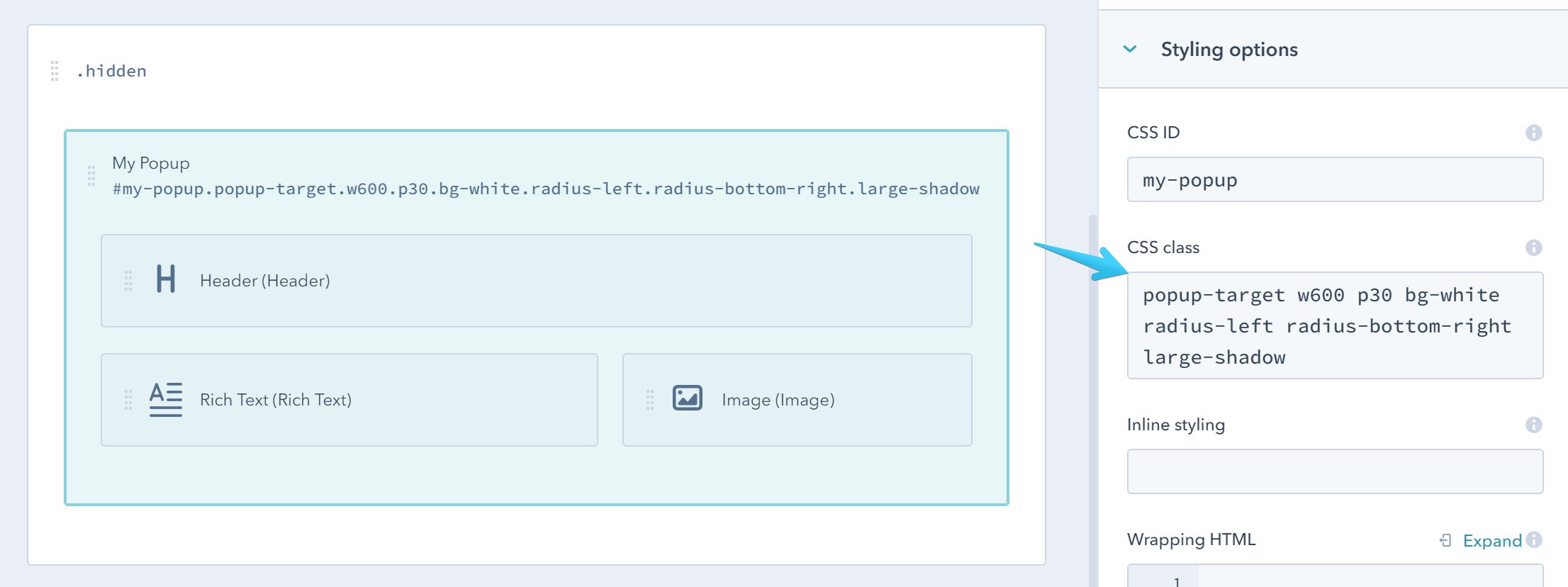

You can see how we designed other popups on Act21 One-Field Form or Act21 Services I templates.
Popup Group (navigation)
If you have more content popups and want to group them so the visitor can navigate to the next or previous item, you can add all your modules/groups containing the popup links in a group with this class: popup-group
In this case, the links and modules must not include the popup-content or other popup classes. You can see this in action on Act21 Team II template.
Any other link that is not supposed to open a popup should be placed in a module with this class: external-link
Important note:
The Popup Group works only with the Popup Content. For image and video galleries please see the Advanced Gallery component instead.