Tooltips
Provide your visitors with hints or short descriptions by using tooltips. See live examples.
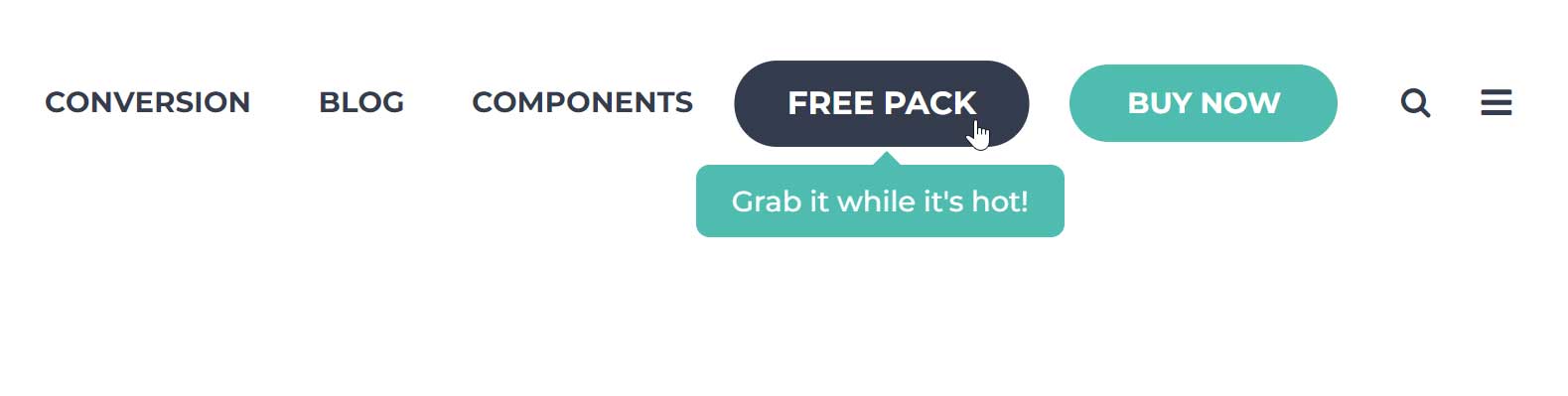
You can add tooltips to virtually any element on your page. Just add this class tooltip to your element and a title attribute with the content of your tooltip.
Example of a tooltip added to a plain link button:
<a href="/page" class="button theme tooltip" title="Your tooltip text">Link text</a>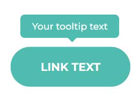
Direction
You can specify the direction of your tooltip with this attribute: data-tooltip-direction
Example:
<a href="/page" class="button theme tooltip" title="Your tooltip text" data-tooltip-direction="left">Link text</a>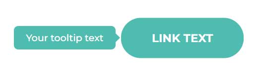
Here are all the available directions:
| data-tooltip-direction="top" |
| data-tooltip-direction="right" |
| data-tooltip-direction="bottom" |
| data-tooltip-direction="left" |
Important notes:
If you don't add the direction attribute, the tooltip will be positioned at the top of your element by default.
Act2 tooltips use smart positioning. If the tooltip exceeds the edge of the page, it will automatically change direction so the tooltip is always visible.
Color
You can specify the color of your tooltip by adding this attribute: data-tooltip-color
Example:
<a href="/page" class="button theme tooltip" title="Your tooltip text" data-tooltip-color="dark">Link text</a>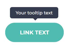
Here are all the available colors:
| data-tooltip-color="theme" |
| data-tooltip-color="dark" |
| data-tooltip-color="white" |
Trigger
You can choose to display the tooltip either on hover or click with this attribute: data-tooltip-trigger
Example:
<a href="/page" class="button theme tooltip" title="Your tooltip text" data-tooltip-trigger="click">Link text</a>Here are all the available options:
| data-tooltip-trigger="hover" |
| data-tooltip-trigger="click" |
Width
You can limit the tooltip's maximum width with this attribute: data-tooltip-maxwidth
Example:
<a href="/page" class="button theme tooltip" title="Long long long long long long long text" data-tooltip-maxwidth="200">Link text</a>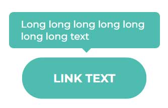
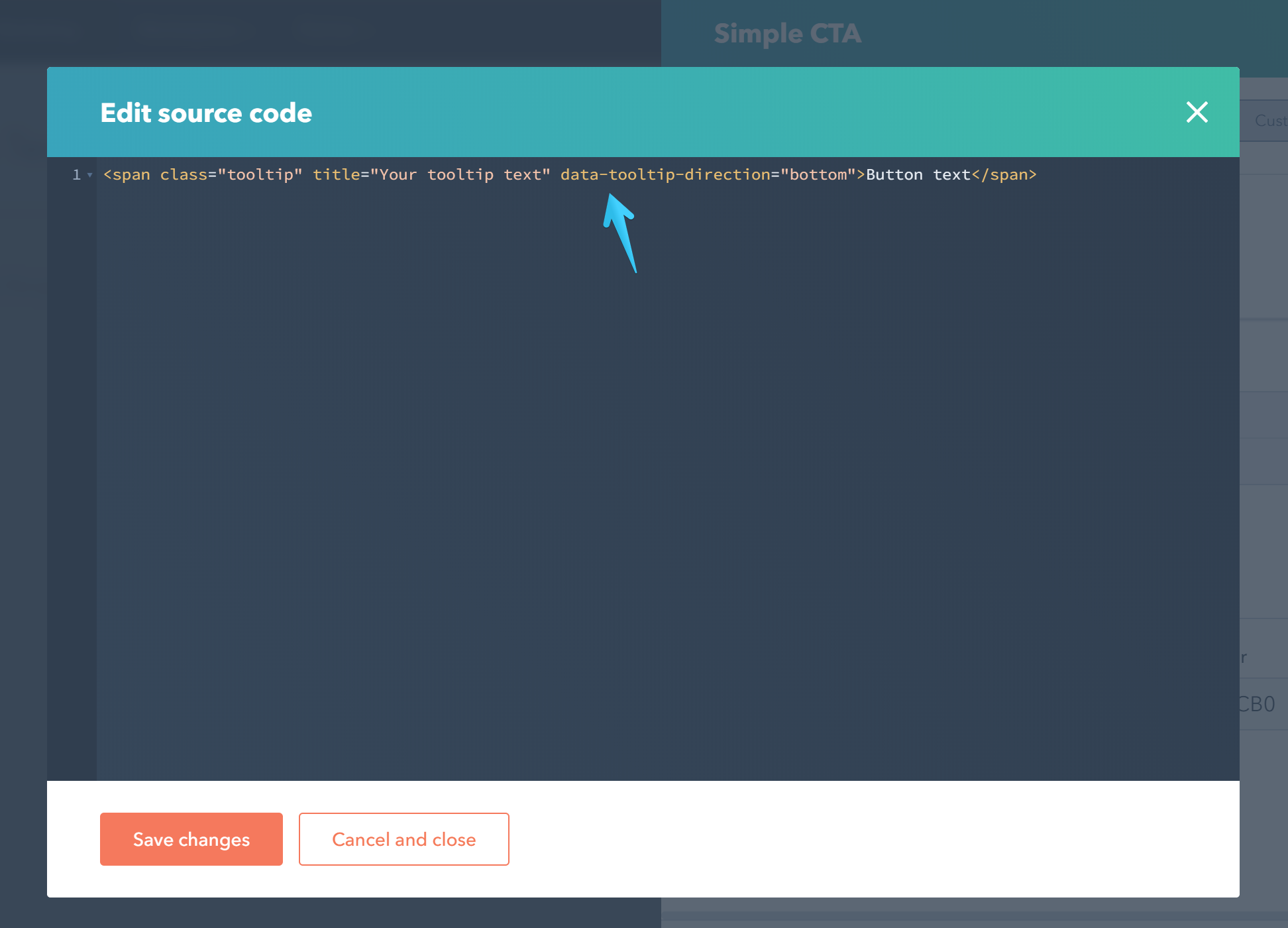
Adding tooltips to Call to Action buttons
Edit your Call to Action button and under the Design tab click this little icon to open the source code pane:
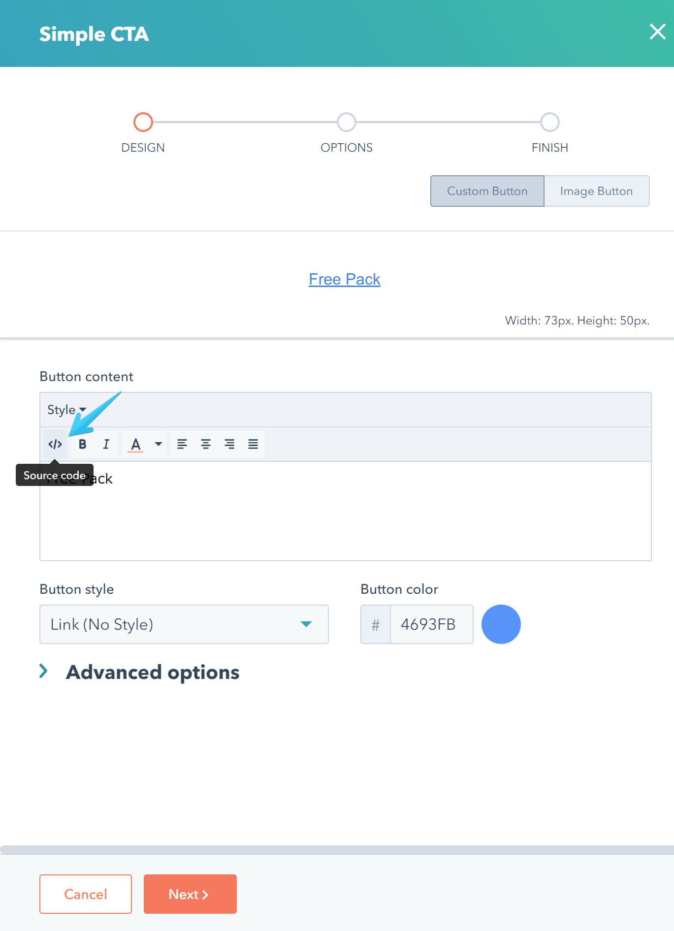
Then wrap your text in a <span> with the class tooltip, the title attribute and the other optional attributes we described in this article:
<span class="tooltip" title="Your tooltip text" data-tooltip-direction="bottom">Button text</span>