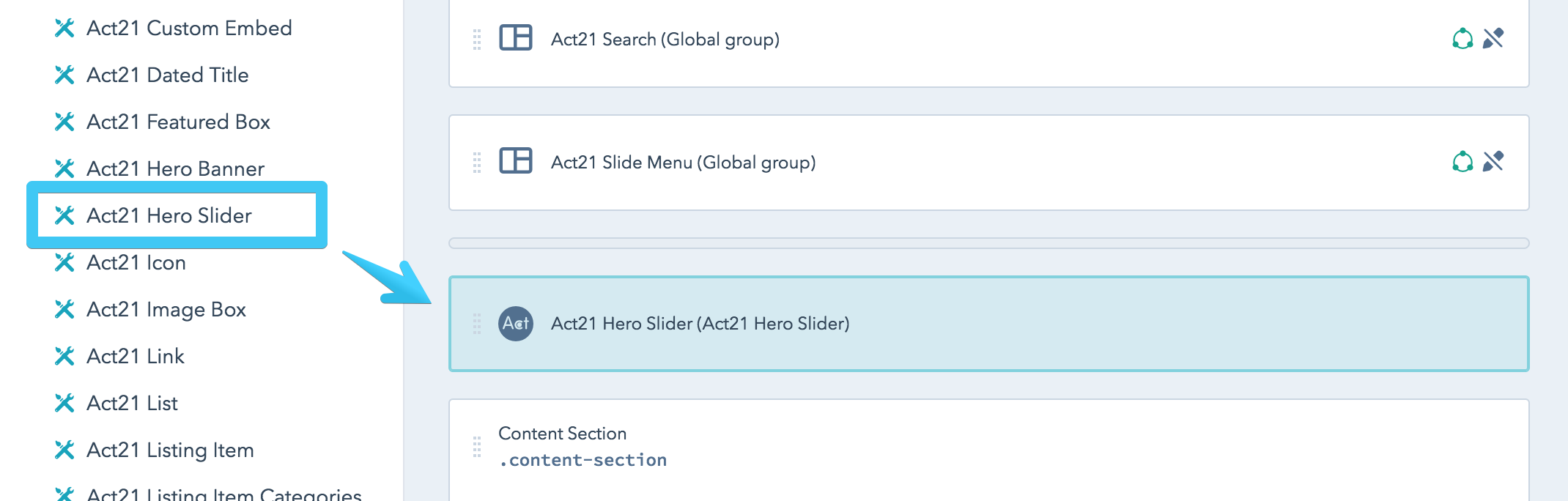
Hero Slider
This is the Act21 Hero Slider custom module:

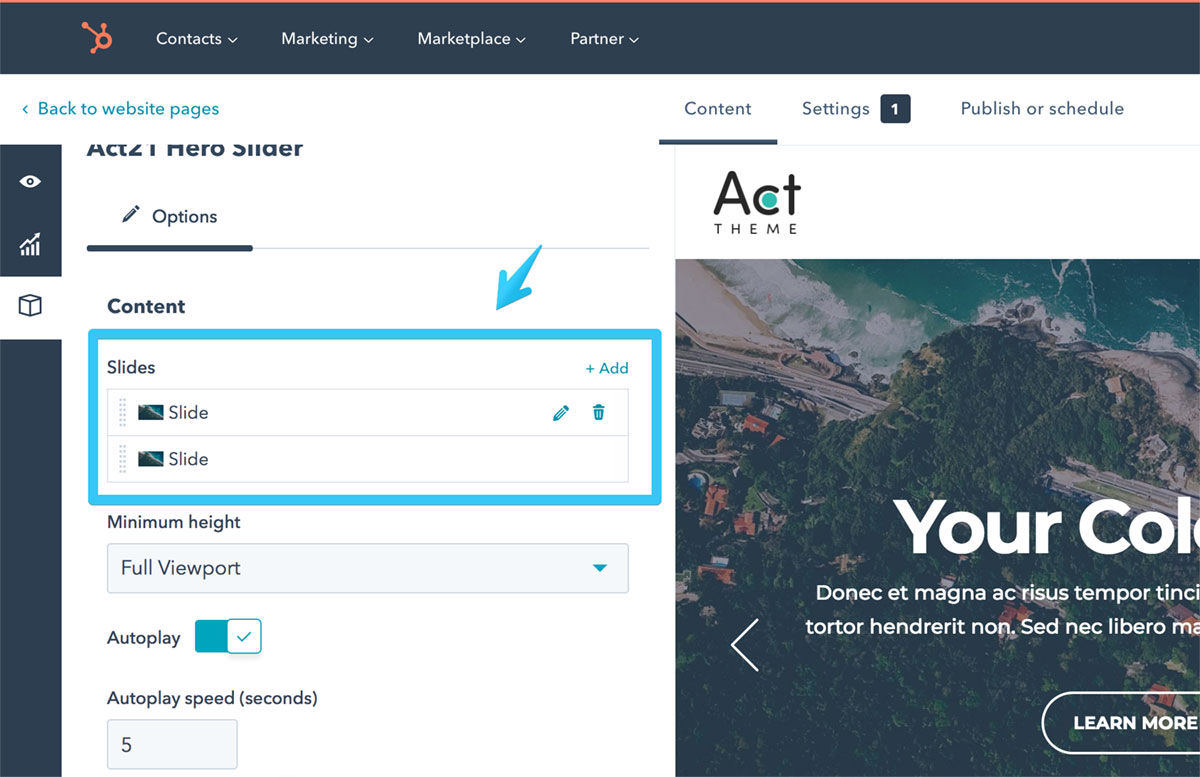
Module Options
Slides
Edit, add, remove or reorder slides:
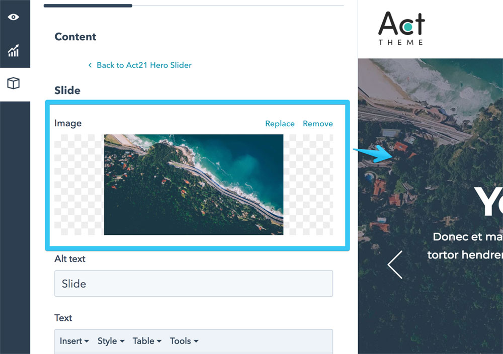
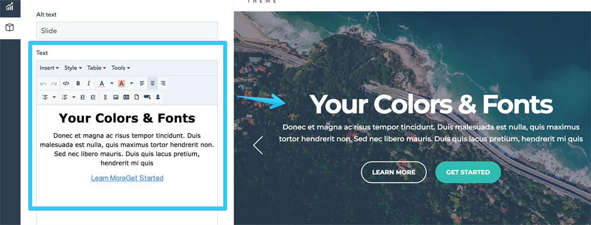
Each slide has these options:
Image
Text
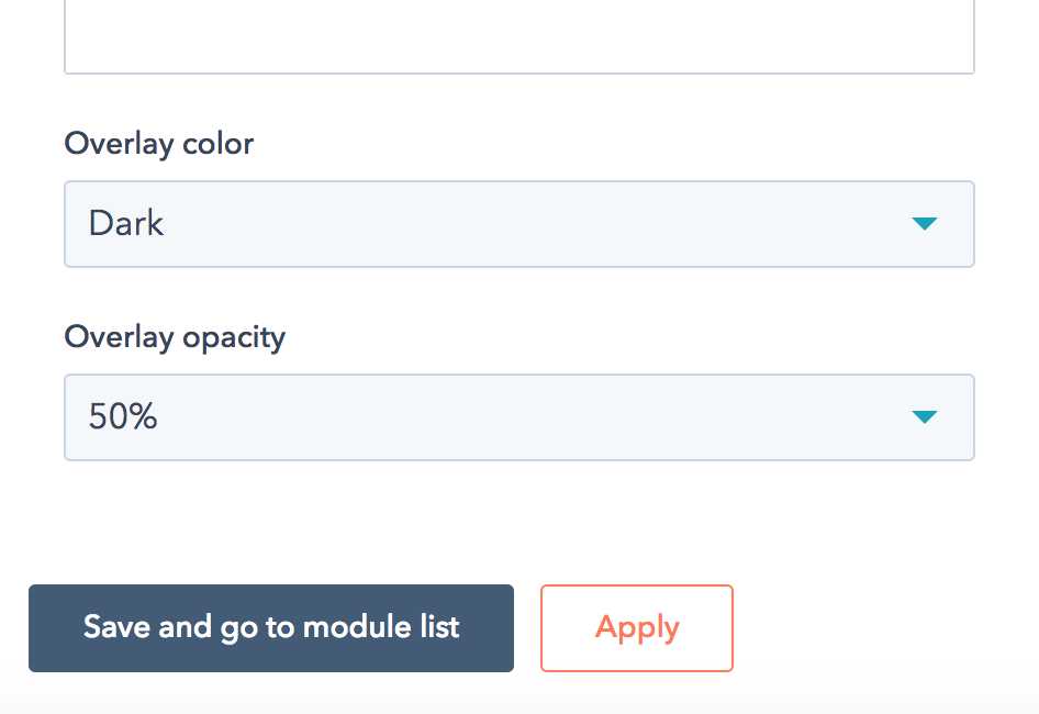
Overlay color and opacity
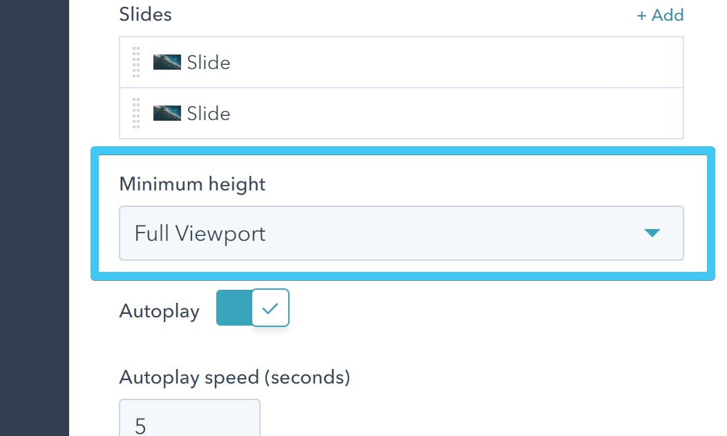
Minimum height
This specifies how tall your Hero Slider should be.
If you choose Natural, no minimum height is specified, so the height of your Hero Slider is determined by its slides.

Full Viewport will make your Hero Slider at least as tall as the viewport (browser window). It will exceed that height if your content is taller. This option is useful on pages with Header Overlap, when the Hero Slider is the first content section.

Full Viewport Minus Header will make your Hero Slider at least as tall as the viewport (browser window), minus the header height. It will exceed this minimum height if your content is taller. This option is useful on pages with normal header (not Header Overlap), when the Hero Slider is the first content section.

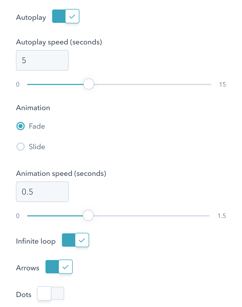
Slider adjustments
Adjust the slider functionality the way you want using the options:
White content
Check this box if you want the content inside your Hero Slider to be white.

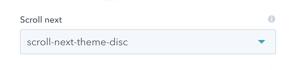
Scroll next
Adds an arrow at the bottom of your Hero Slider that, when clicked, will scroll your page to the next Content Section. If it doesn't exist, the arrow will not appear.
Custom Class
Use this box if you want to add a custom class to your Hero Slider module.
For more sliders visit this page.