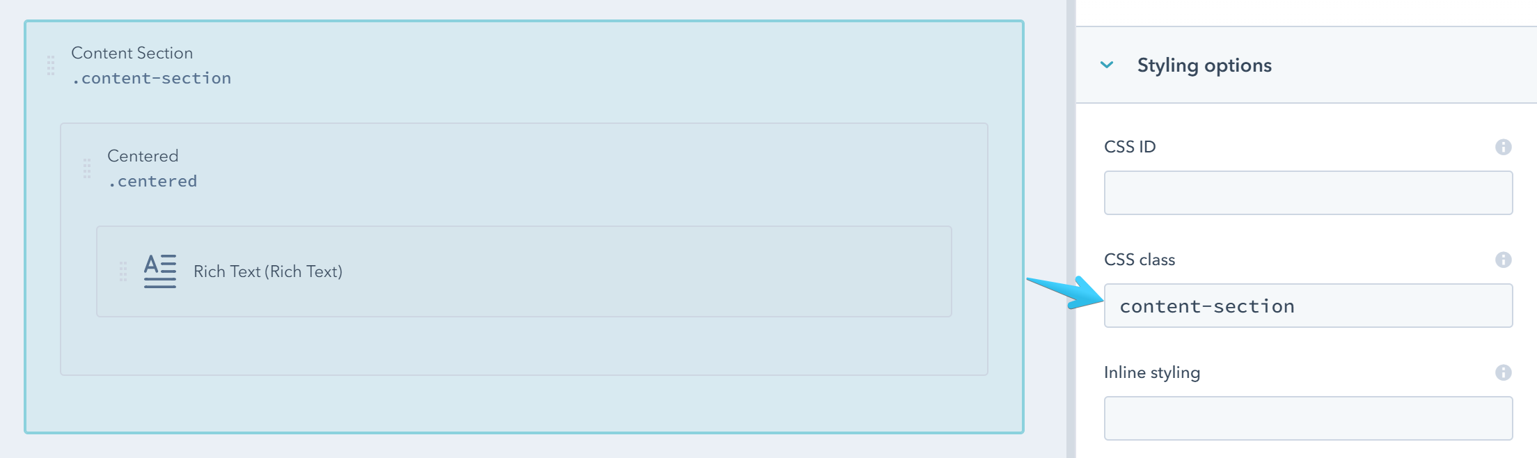
Content Section
Along with the Centered wrapper this is the most common component in Act2. It is basically a container with a pre-defined vertical space and some special properties. You will mostly use this to split your page vertically in full-width sections.
This can be a group with the content-section class:
Watch this video to see how easy is to add Content Sections with your custom layout:
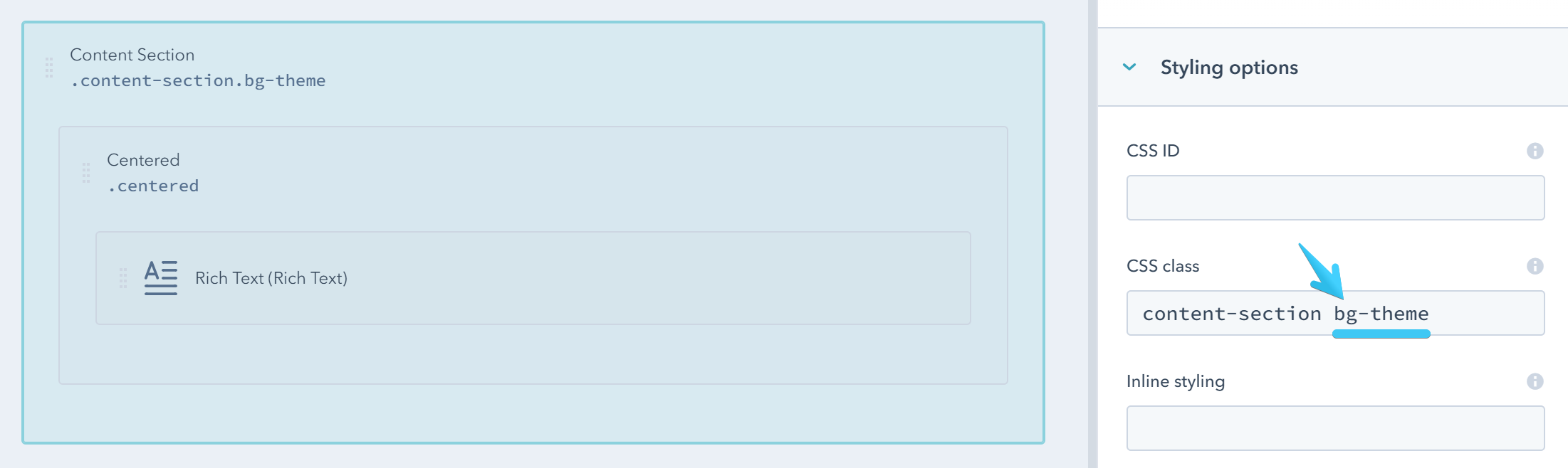
Pre-Defined Background Color
There are a few pre-defined CSS classes that you can use to add a background color to your Content Section that's consistent with your theme:
| CSS Class | Sample (with the default colors) |
|---|---|
| bg-light | |
| bg-dark | |
| bg-theme | |
| bg-white |
Example:
Gradient Background
You can also add one of these classes for a beautiful gradient background.
| CSS Class | Sample |
|---|---|
| bg-g1 | |
| bg-g2 | |
| bg-g3 | |
| bg-g4 | |
| bg-g5 | |
| bg-g6 | |
| bg-g7 | |
| bg-g8 | |
| bg-g9 | |
| bg-g10 | |
| bg-g11 | |
| bg-g12 |
Custom Background Color
For a custom background color you can easily add an inline style. Example:
background-color: #bbe3b5;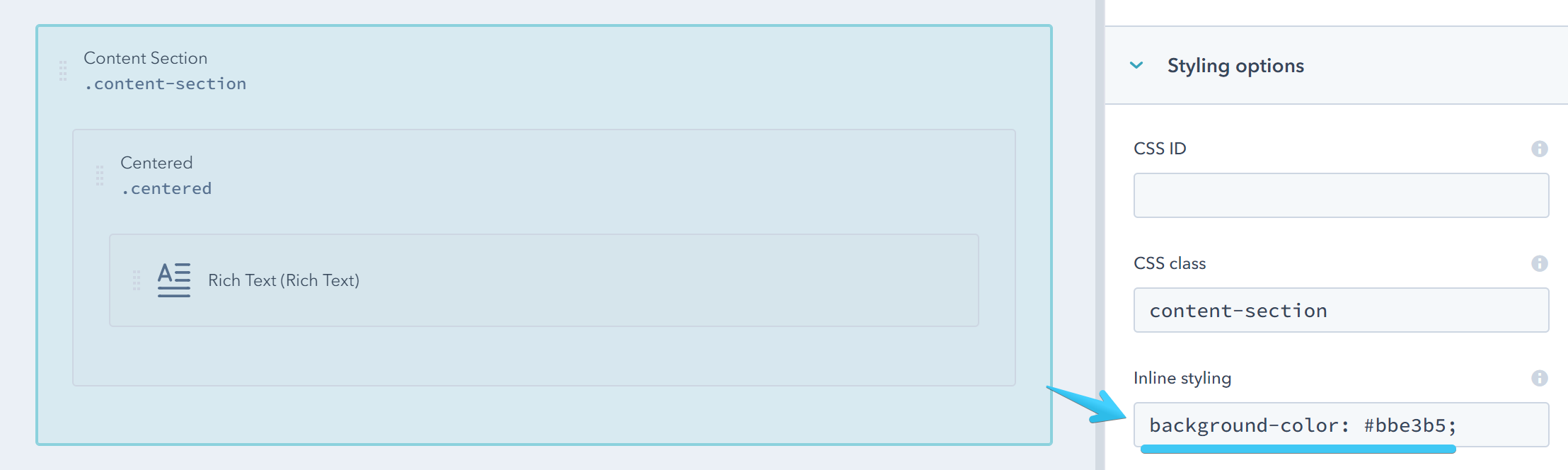
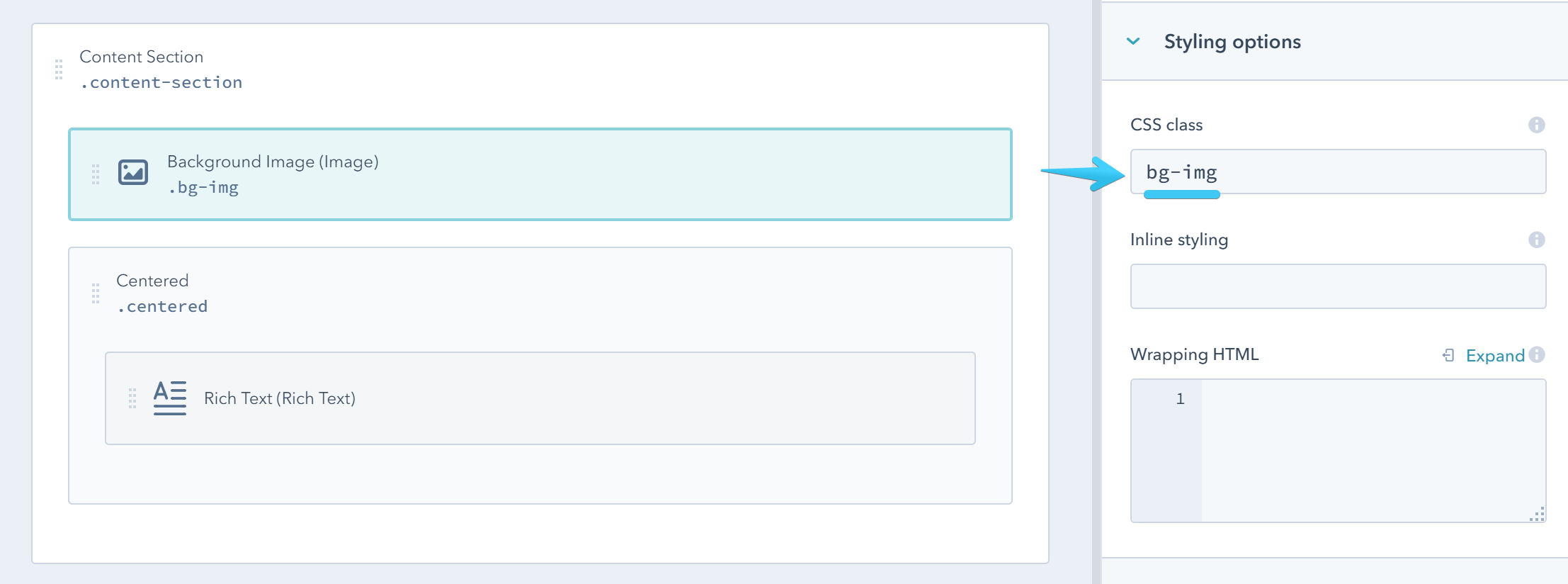
Background Image
To set a background image on your section add an Image module at the top of your Content Section with the bg-img class:
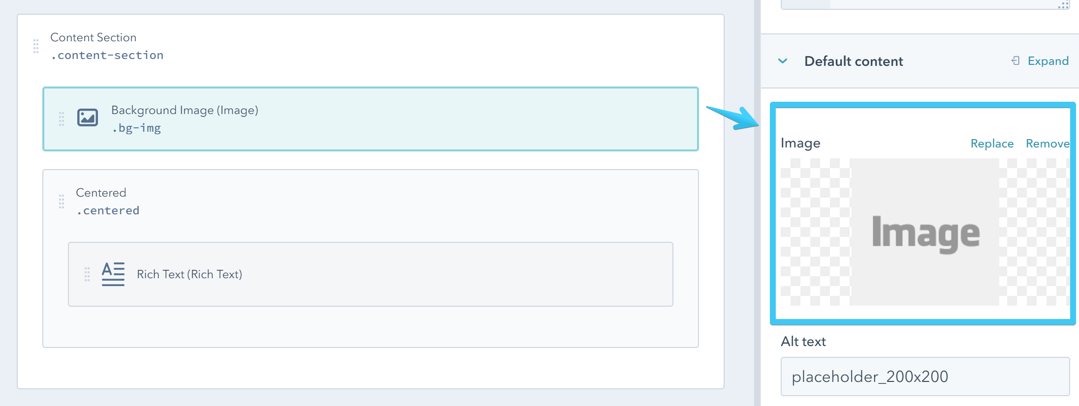
Then you can choose your background image:
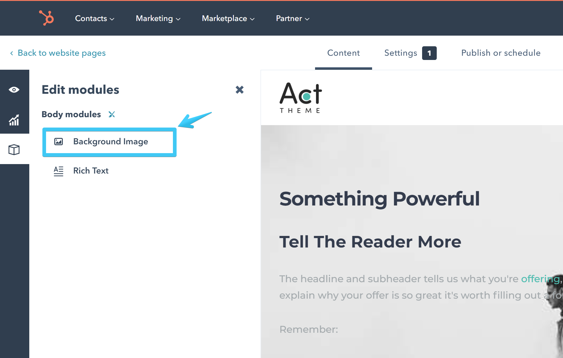
Because it's applied on the background, this module is not visible in the page editor, so you would need to find it in the modules sidebar on the left to change the default image - a good reason to choose a recognizable name for your module:
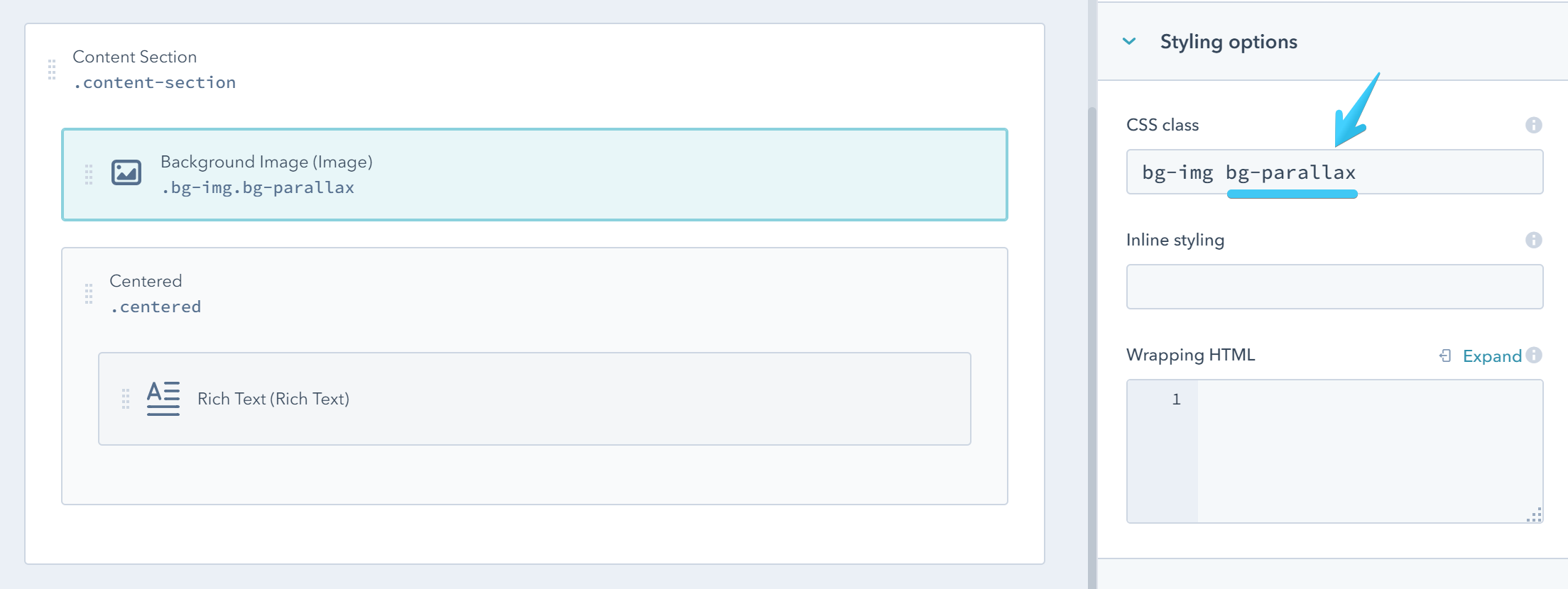
Parallax Background
For a parallax effect add the bg-parallax class to your image module described above.
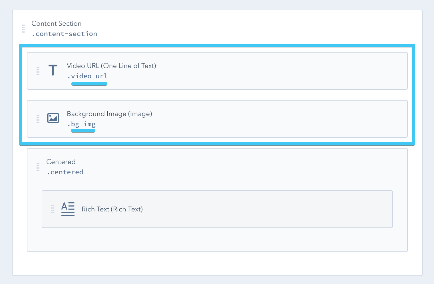
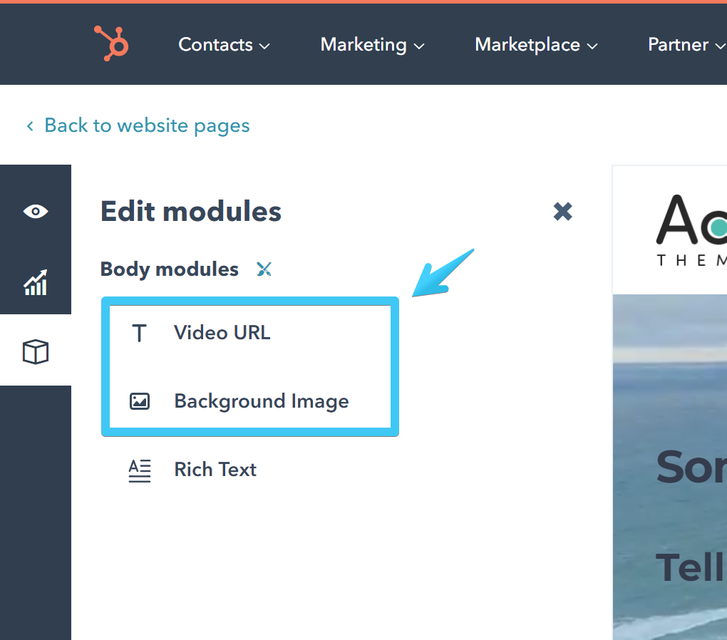
Video Background
To set a video background on your section add a One Line of Text module with the video-url class and an Image module with the bg-img class at the top of your Content Section:
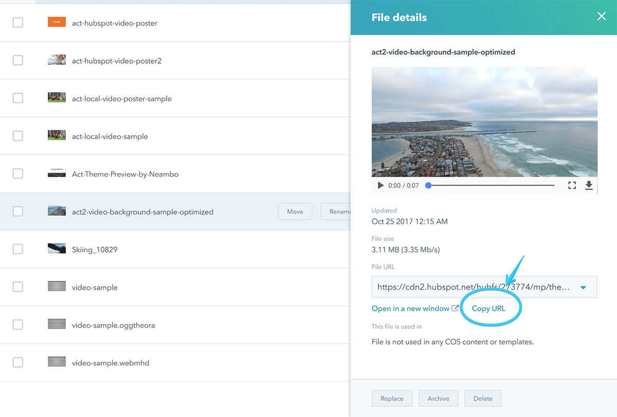
Now you can go to File Manager and upload your video. It must be MP4 format and we recommend a file smaller than 5MB.
Copy the file URL and add it to your Video URL module:
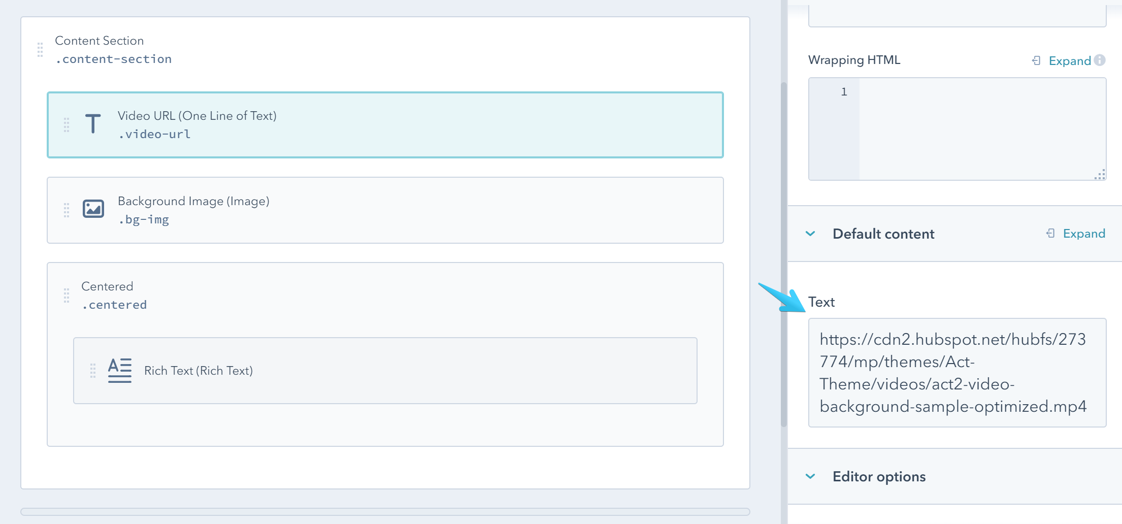
You will also need an image with the first frame of your video to show until your video starts playing and on older browsers that don't allow or support playing videos in the background.
You need to add this image on the Background Image module we previously described.
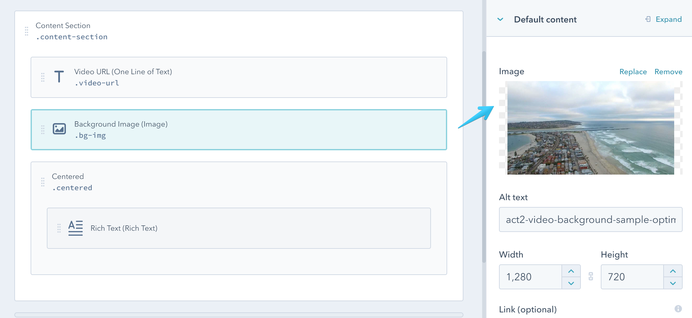
Because they are applied on the background, these modules are not visible in the page editor, so you would need to find them in the modules sidebar on the left to change the default image and video URL - a good reason to choose recognizable names for your modules:
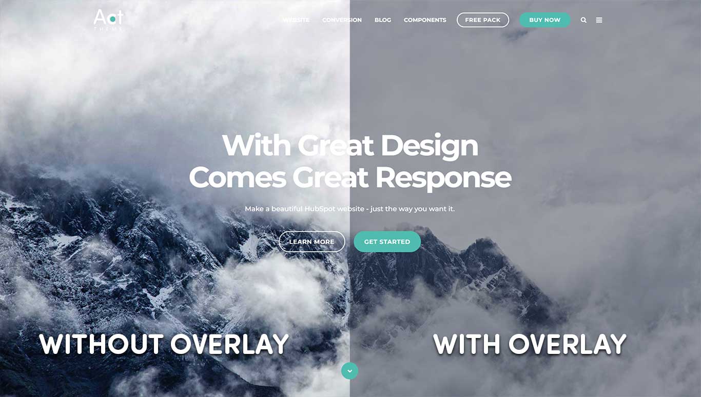
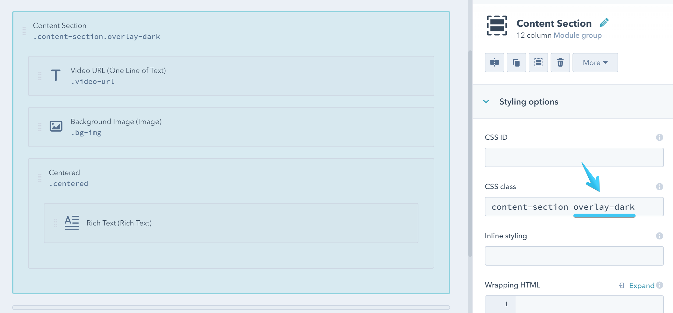
Transparent Overlay
Sometimes you would want to add a transparent overlay to your Content Section, especially if you set a background image or video background, so your text can be a bit more visible.
For that you would need to add two more classes to your Content Section group:
1. Overlay color
Which specifies the color of your overlay:
These are all the available options:
| CSS Class | Sample (with the default theme colors) |
|---|---|
| overlay-dark | |
| overlay-theme | |
| overlay-light | |
| overlay-white | |
| overlay-g1 | |
| overlay-g2 | |
| overlay-g3 | |
| overlay-g4 | |
| overlay-g5 | |
| overlay-g6 | |
| overlay-g7 | |
| overlay-g8 | |
| overlay-g9 | |
| overlay-g10 | |
| overlay-g11 | |
| overlay-g12 |
2. Overlay opacity
Which specifies the opacity of the overlay:
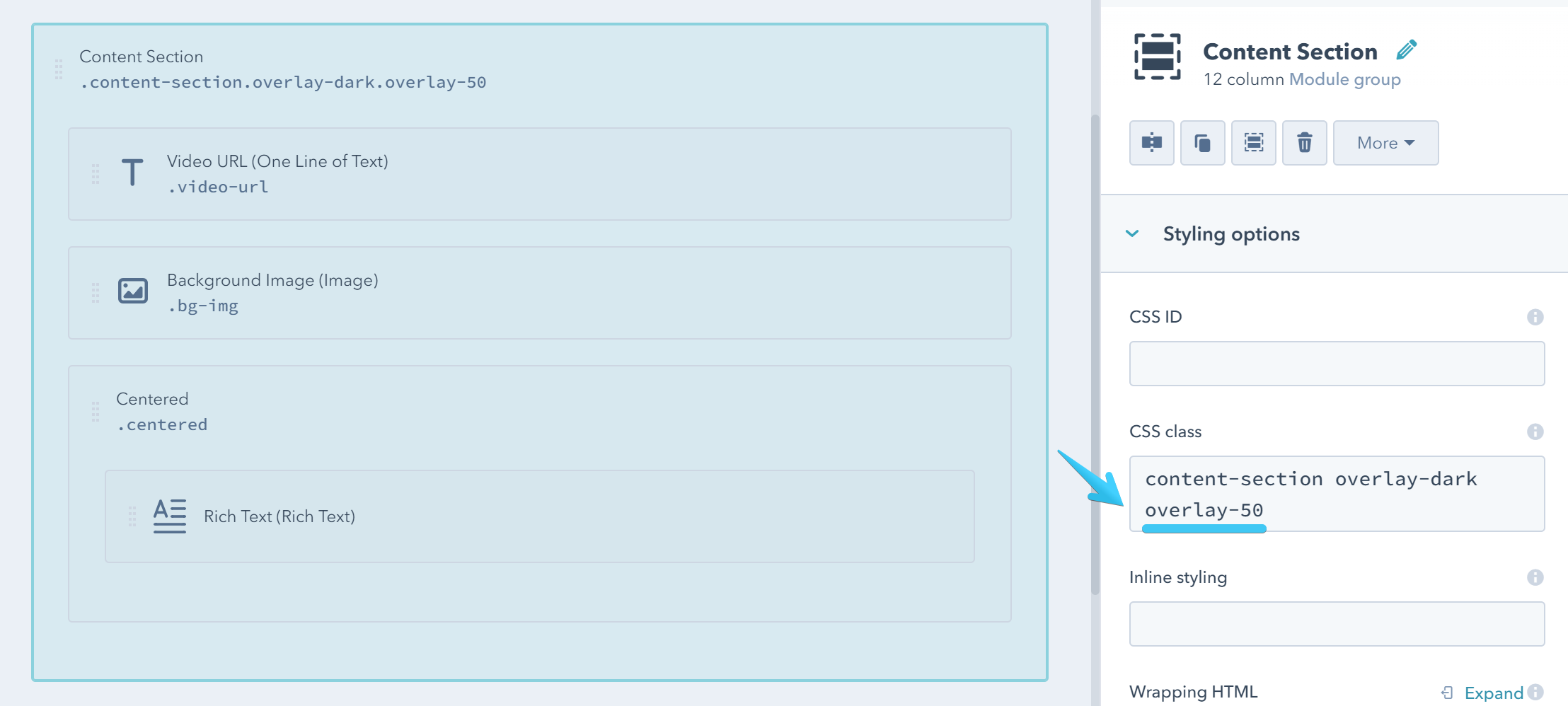
You would need to choose one of these:
| CSS Class | Description |
|---|---|
| overlay-0 | The overlay is fully transparent |
| overlay-10 | 10% opacity |
| overlay-20 | 20% opacity |
| overlay-30 | 30% opacity |
| overlay-40 | 40% opacity |
| overlay-50 | 50% opacity |
| overlay-60 | 60% opacity |
| overlay-70 | 70% opacity |
| overlay-80 | 80% opacity |
| overlay-90 | 90% opacity |
| overlay-95 | 95% opacity, the overlay is almost opaque |
| overlay-98 | 95% opacity, the overlay is almost opaque, background is barely visible |
| overlay-100 | The overlay is fully opaque |
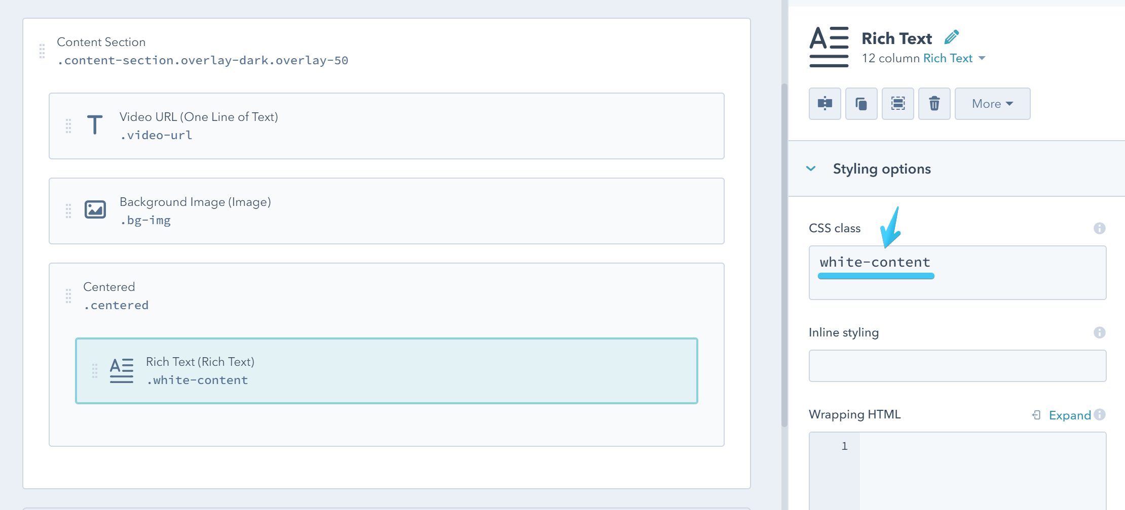
White Content
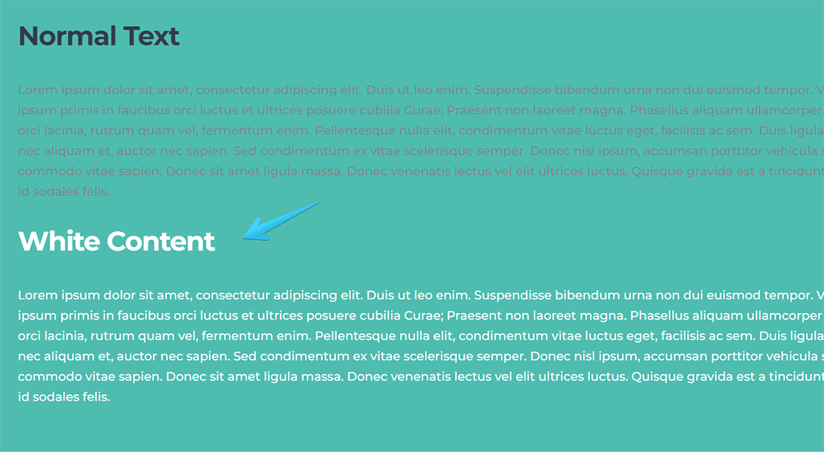
Add this class white-content to the groups or modules where you need white content. For example, on those sections with background images or videos.
Sometimes the best way is to apply this class individually to those modules or groups where you want the content to be white, instead of the entire section, because it may contain elements where white content is not necessary, like Card Boxes, Content Cards, etc.
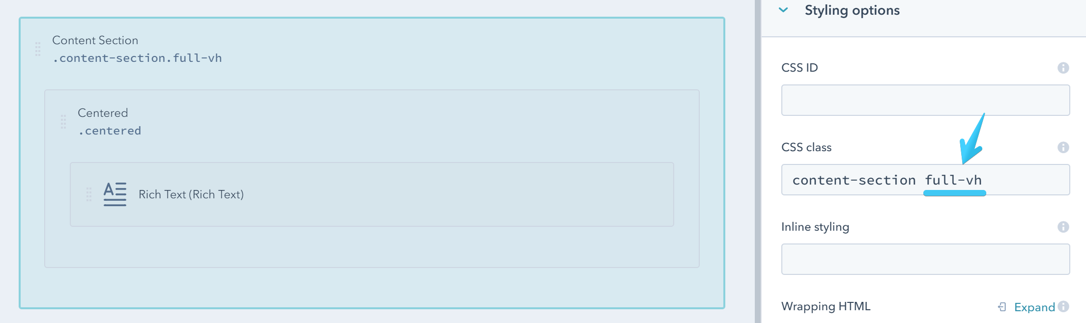
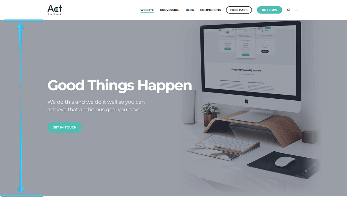
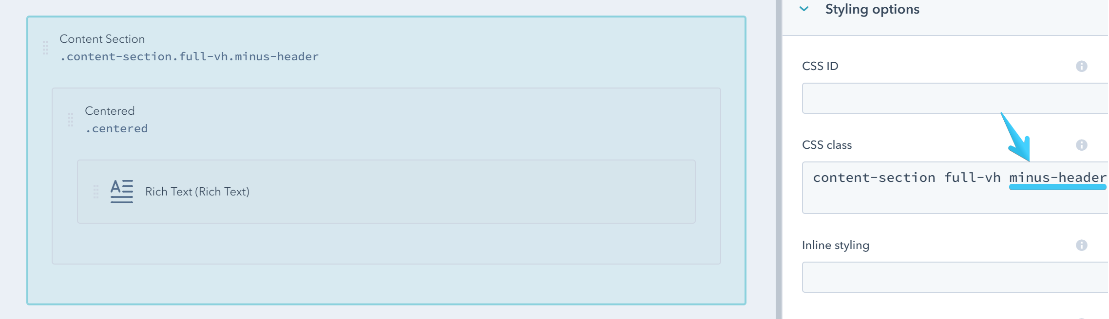
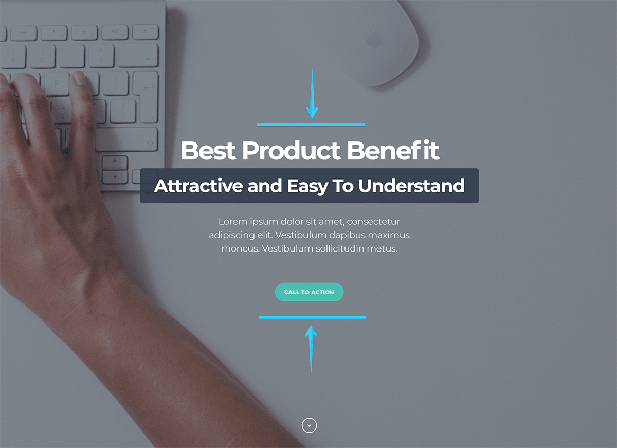
Full-Screen Section
Use this class full-vh to make your section at least as tall as the browser window.
You can also add this complementary class minus-header if you want to make it just as tall as the browser window, minus the height of the default static header:
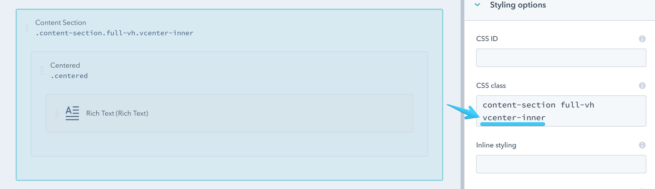
Vertically Center Content
In addition to the Full-Screen Section above, if you also want to vertically center the content inside your section please follow the steps:
Add this class vcenter-inner to your Content Section:
Then add the following code to the Wrapping HTML box:
<div class="vcenter-outer">
    {{ html }}
</div>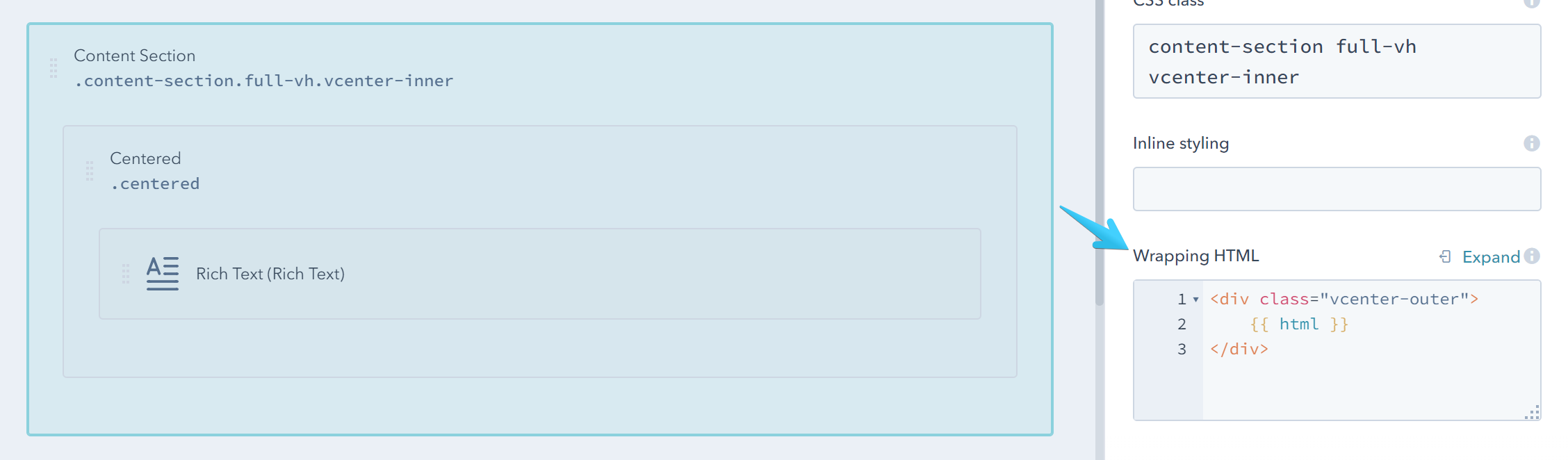
Important Notes:
This doesn't work with divided groups, because it will mess up with the grid system in HubSpot. If by design your Content Section where you want to vertically center the content is not full-width (that row has already been splitted) you can group it one more time such that it will become a full-width group (not divided) so you can apply the vcenter class and wrapper.
(FYI, we needed this elaborate method in order to support IE11, which doesn't play very well with CSS flexbox)
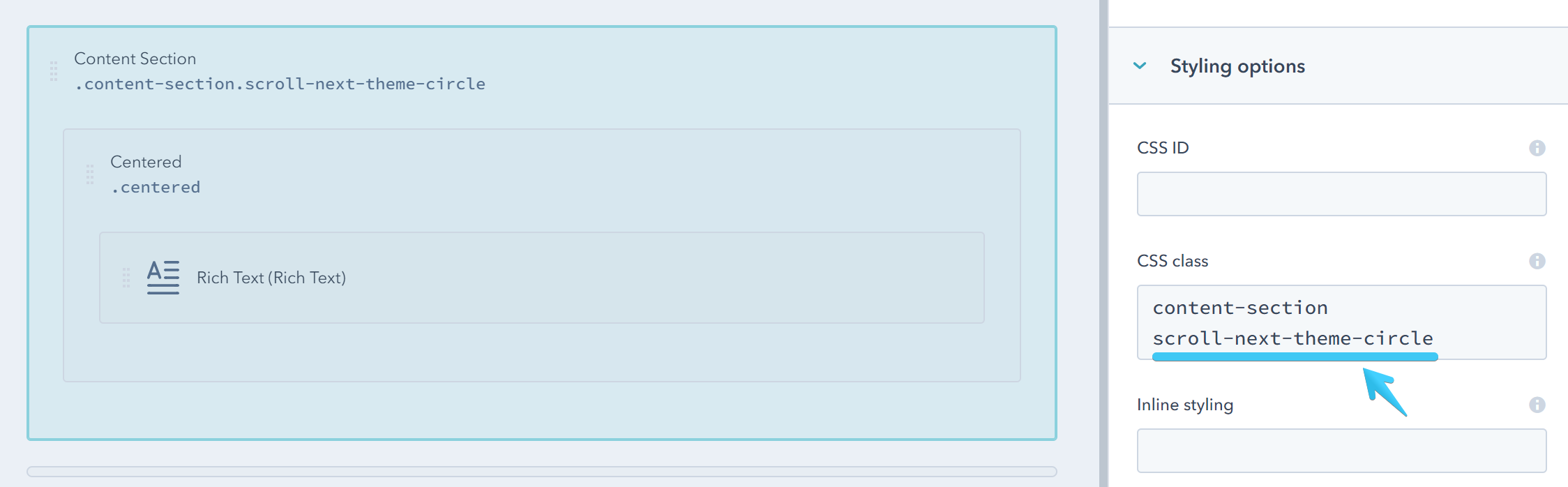
Scroll Next
Add one of the classes below to a Content Section to include an arrow that, when clicked, will scroll your page to the next Content Section. If it doesn't exist, the arrow will not appear.
| CSS Class | Sample |
|---|---|
| scroll-next-theme-dot |  |
| scroll-next-theme-circle |  |
| scroll-next-theme-disc |  |
| scroll-next-dark-dot | 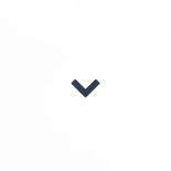 |
| scroll-next-dark-circle |  |
| scroll-next-dark-disc | 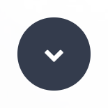 |
| scroll-next-white-dot |  |
| scroll-next-white-circle |  |
| scroll-next-white-disc |  |