Stack
HubSpot templates are built using a 12 column responsive-grid system.
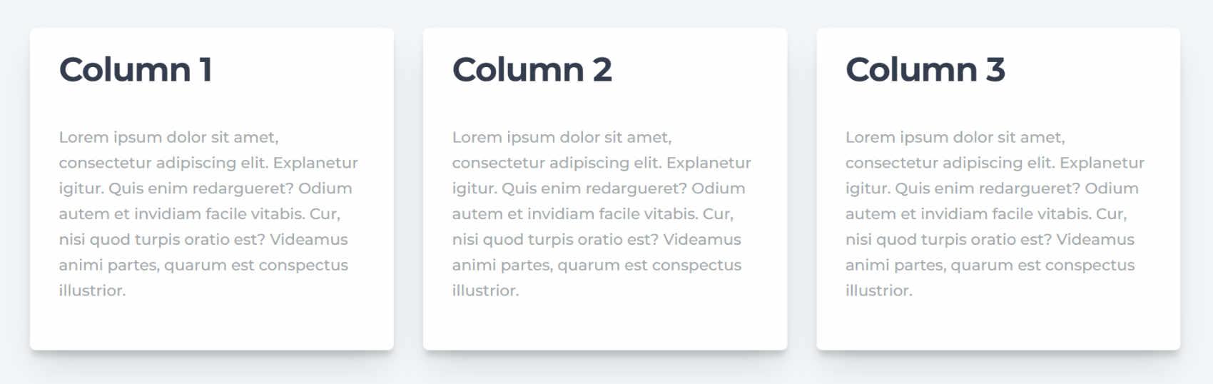
The columns automatically stack one after another on viewport (browser window) sizes smaller than 768px:
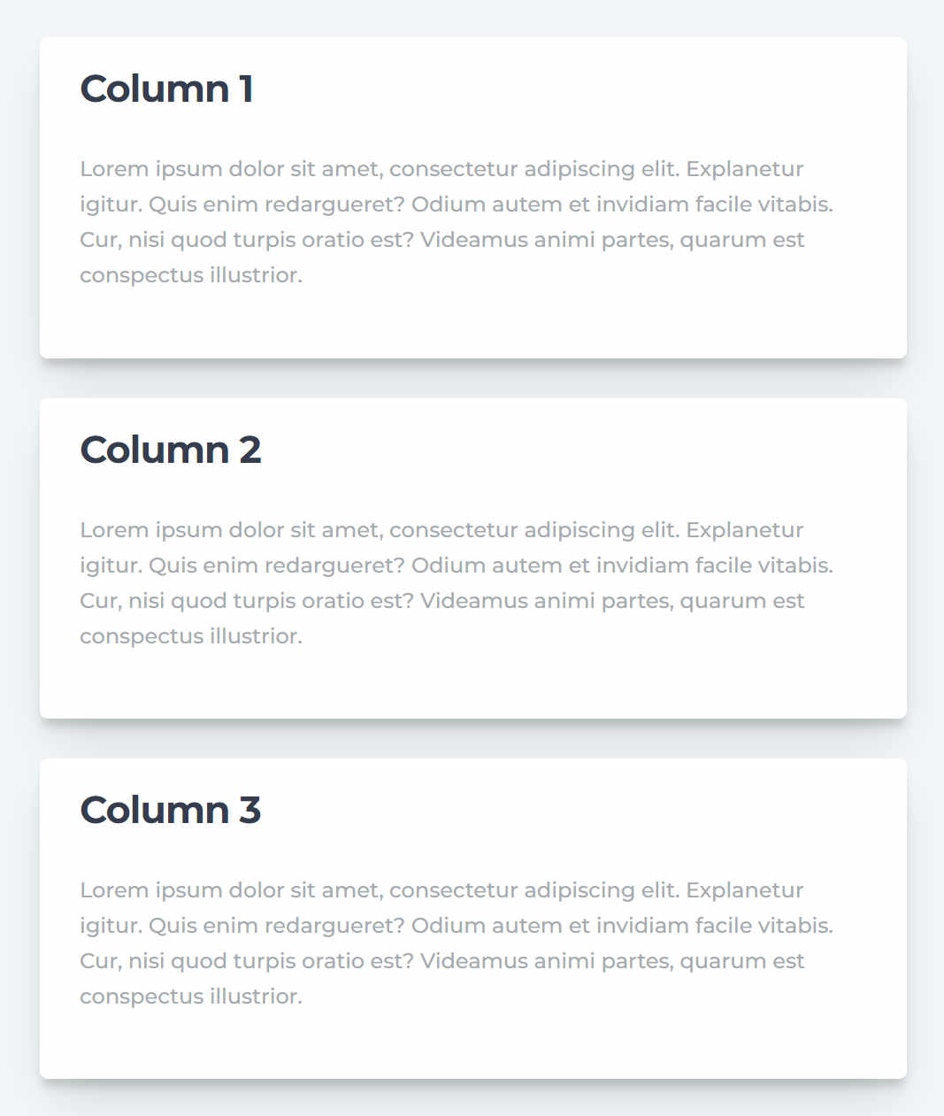
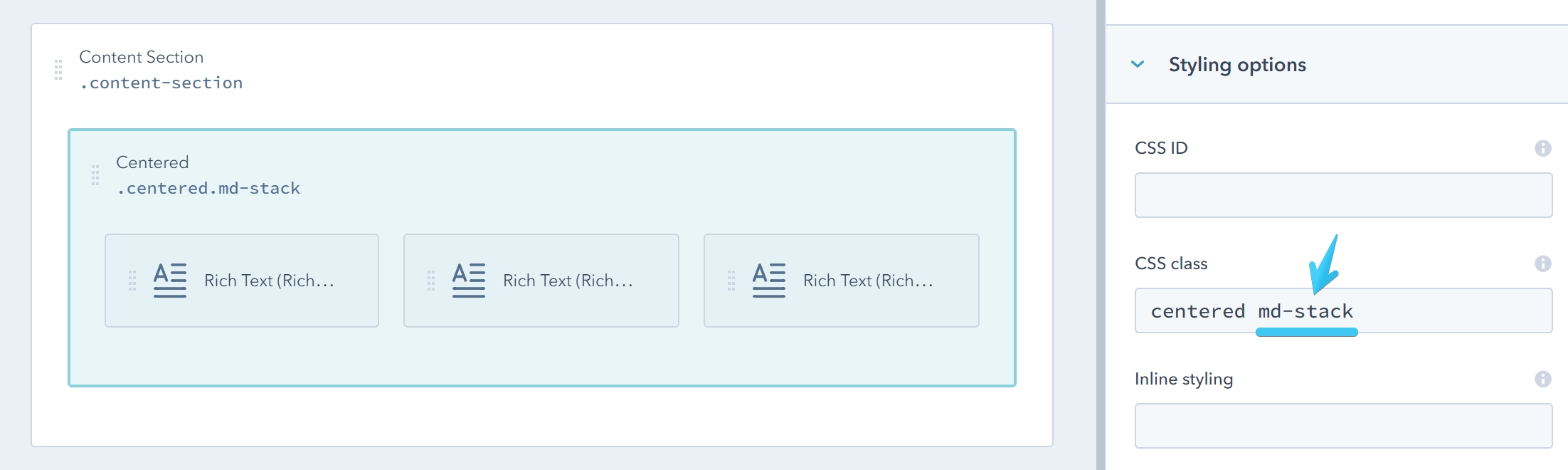
MD Stack
In Act2 you can change the default behavior and make the columns stack at larger viewport size. You can add the md-stack class to a group, and all its direct-child columns will stack on screens smaller than 1140px:
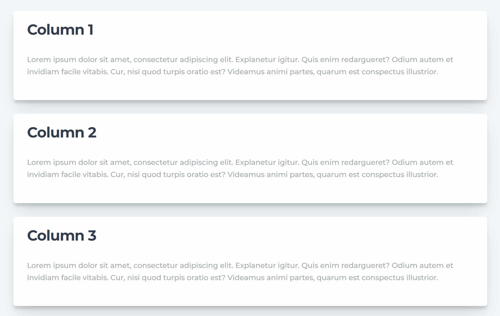
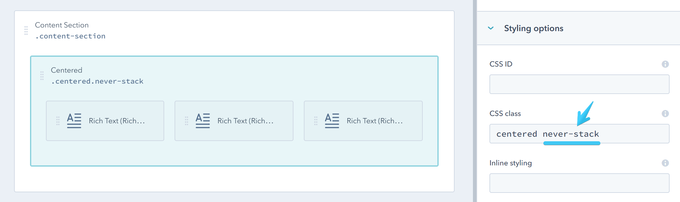
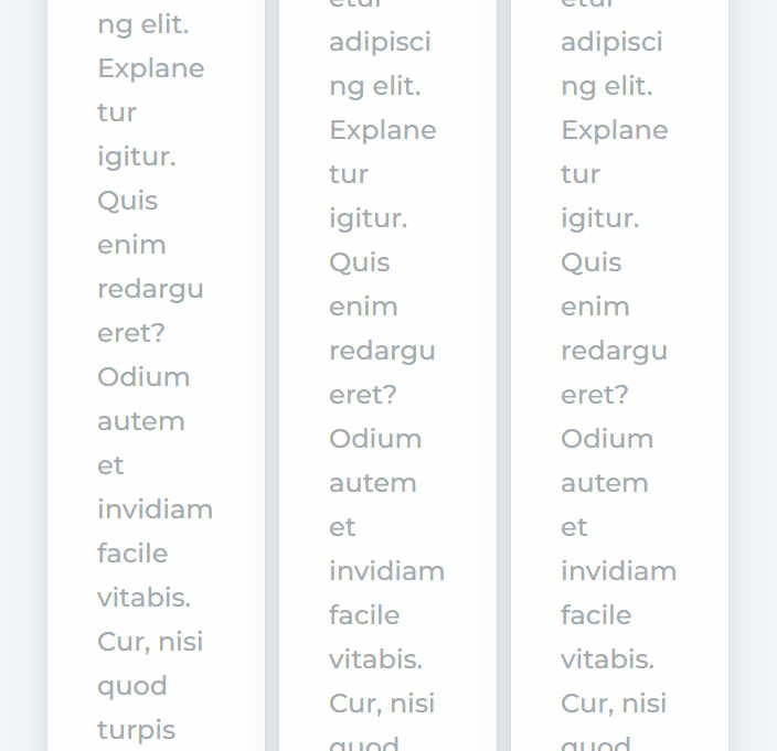
Never Stack
Alternatively, if you want the columns to stay that way, even on mobile, you can add this class: never-stack to their direct parent group:
For advanced users, the Never Stack component has the ability to rewrite the bootstrap grid spans on small or extra small screens, so the content can fit. Apply the classes below to your Never Stack direct child-columns (the combined span number must be 12):
| Small | Extra Small |
|---|---|
| ns-sm-span1 | ns-xs-span1 |
| ns-sm-span2 | ns-xs-span2 |
| ns-sm-span3 | ns-xs-span3 |
| ns-sm-span4 | ns-xs-span4 |
| ns-sm-span5 | ns-xs-span5 |
| ns-sm-span6 | ns-xs-span6 |
| ns-sm-span7 | ns-xs-span7 |
| ns-sm-span8 | ns-xs-span8 |
| ns-sm-span9 | ns-xs-span9 |
| ns-sm-span10 | ns-xs-span10 |
| ns-sm-span11 | ns-xs-span11 |
| ns-sm-span12 | ns-xs-span12 |