Centered
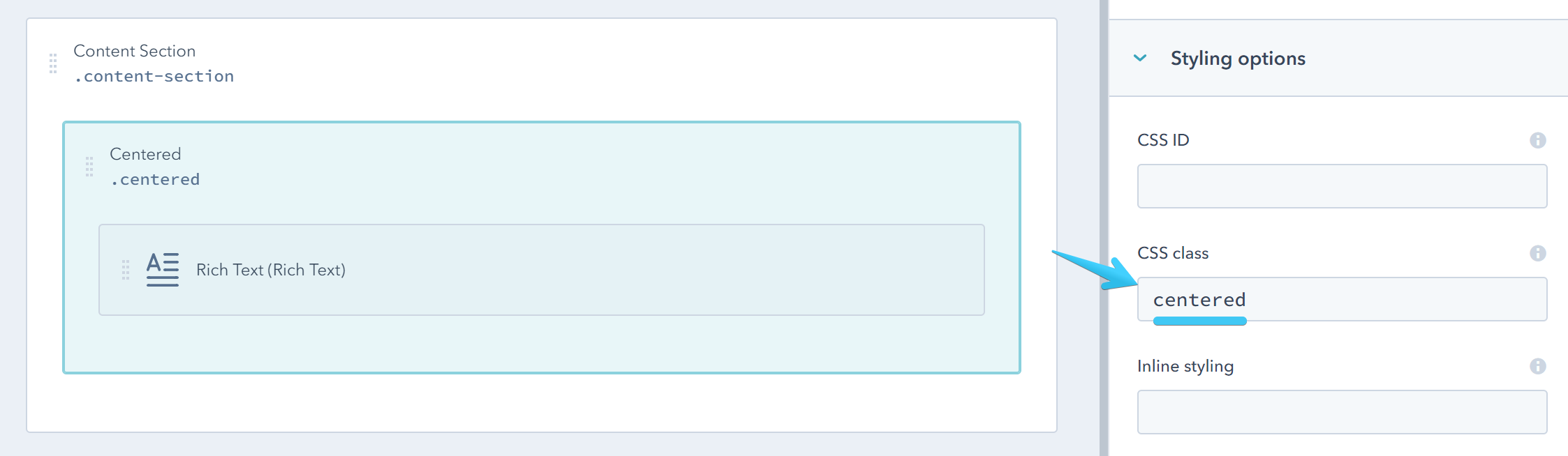
Add the centered class to a full-width (not splitted) group or module to center it in the page:
Here is a quick video to demostrate how this works:
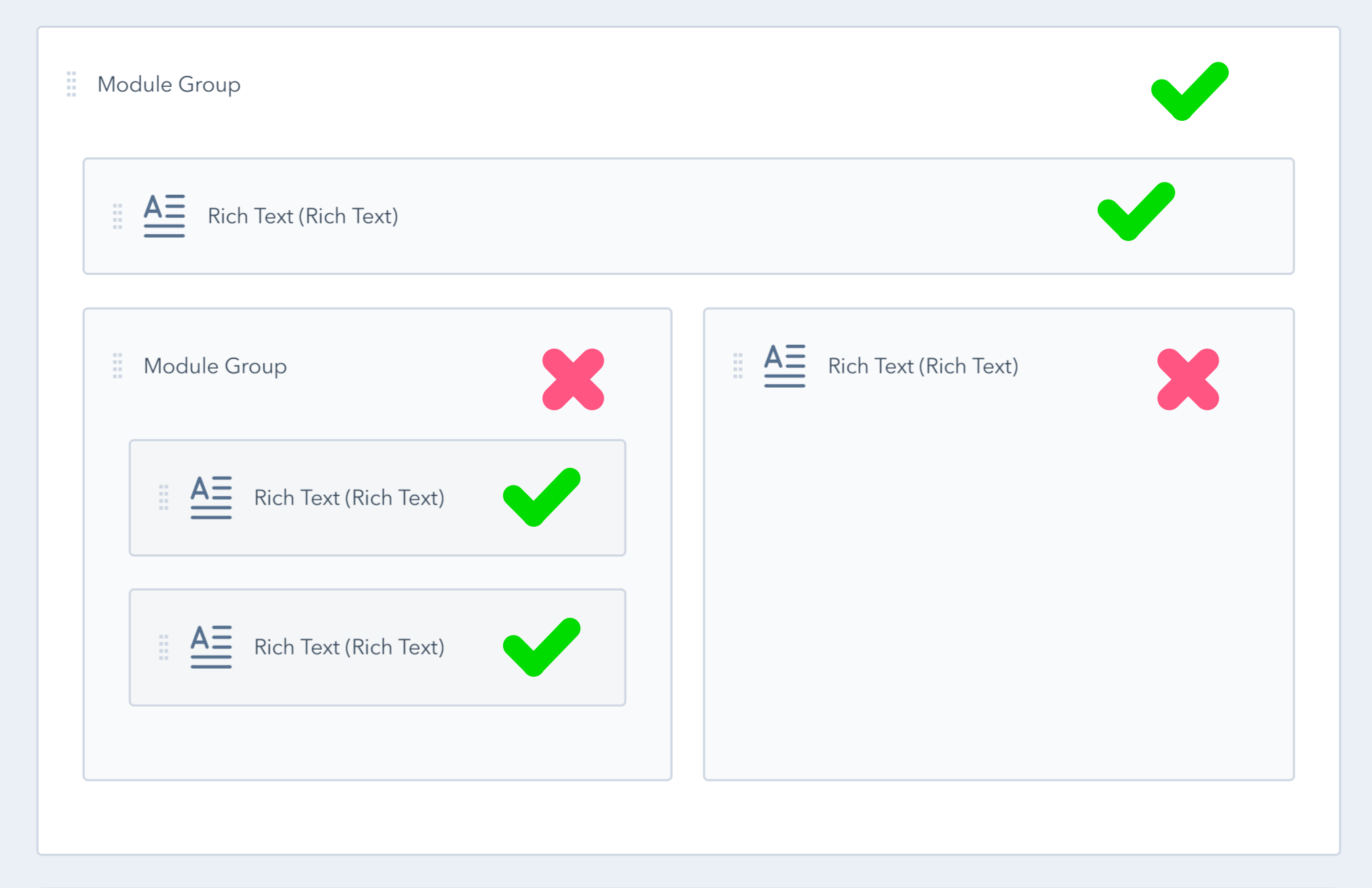
In the following figure the modules/groups marked with an x are divided and cannot be used as Centered elements:
By default, the centered wrapper has 30px padding left and 30px padding right for good looking screen edges, which is excluded from nested centered wrappers (a centered wrapper inside another) so the padding is not cumulative unless you add some.
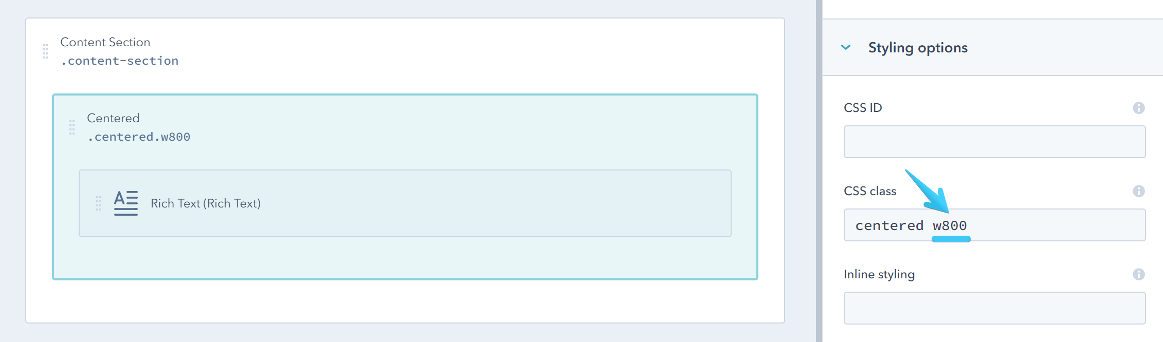
Along with the centered class you can also use the helper classes to specify a width for your content (expressed in pixels):
| w100 |
| w150 |
| w200 |
| w250 |
| w300 |
| w350 |
| w400 |
| w450 |
| w500 |
| w550 |
| w600 |
| w650 |
| w700 |
| w750 |
| w800 |
| w850 |
| w900 |
| w950 |
| w1000 |
| w1050 |
| w1100 |
| w1150 |
| w1200 |
| w1250 |
| w1300 |
| w1350 |
| w1400 |
| w1450 |
| w1500 |
| w1550 |
| w1600 |
| w1650 |
| w1700 |
| w1750 |
| w1800 |
| w1850 |
| w1900 |
| w1950 |
| w2000 |
Example:
And you can do that also depending on screen size. On medium-sized screens (viewport width lower than 1280px) you can add this prefix: md-. On small-sized screens (viewport width lower than 768px) you can add this prefix: sm-. On very small screens (viewport width lower than 480px) you can add this prefix: xs-
For example:
centered w1600 md-w900 sm-w500 xs-w250This will make your centered wrapper 1600px wide on large screens, 900px wide on medium sized screens, 500px wide on small screens and 250px wide on extra small screens.