Accordion
There are three custom modules in Act2 that you can use for your accordions:
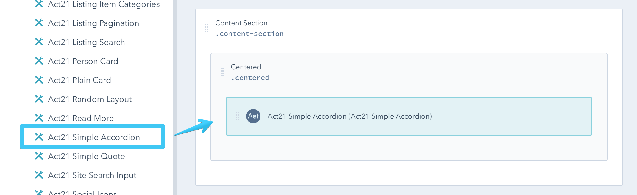
Act21 Simple Accordion
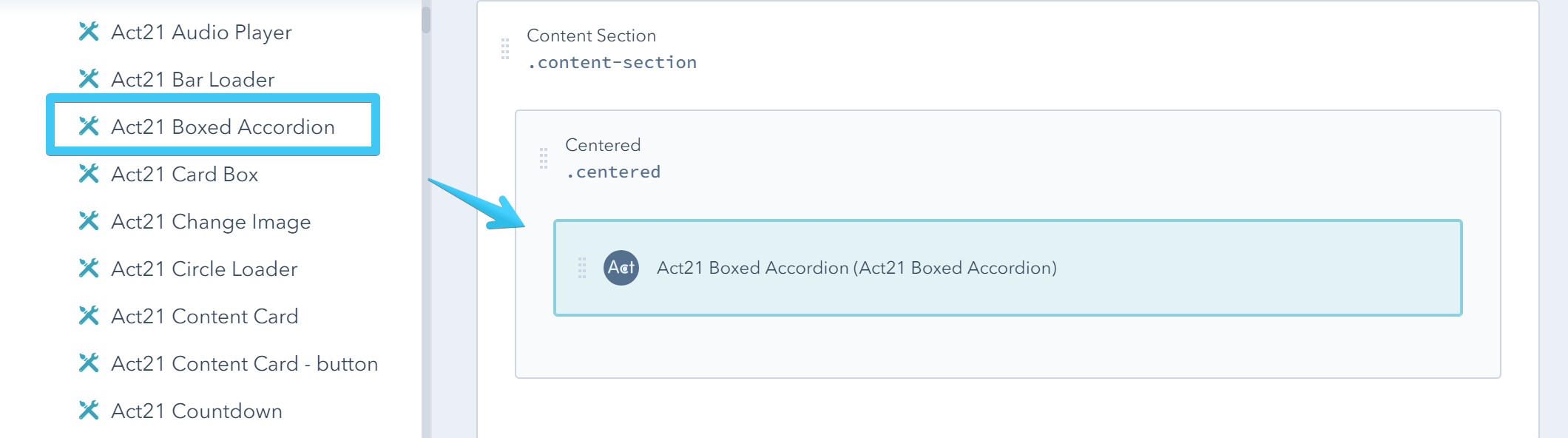
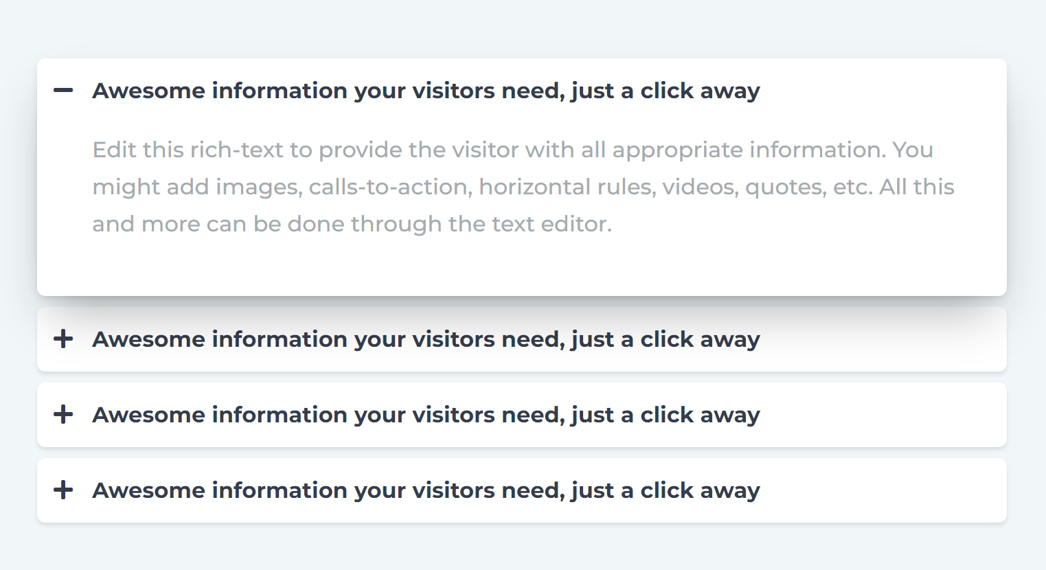
Act21 Boxed Accordion
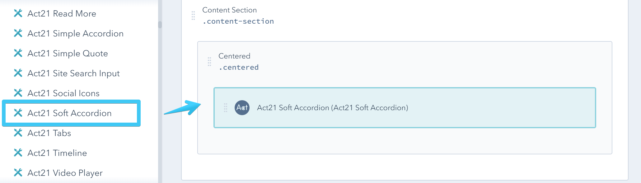
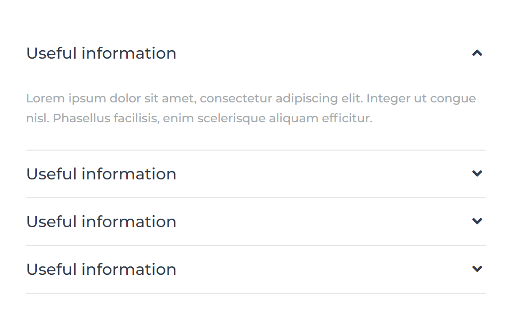
Act21 Soft Accordion
Modules options
All three modules have these options:
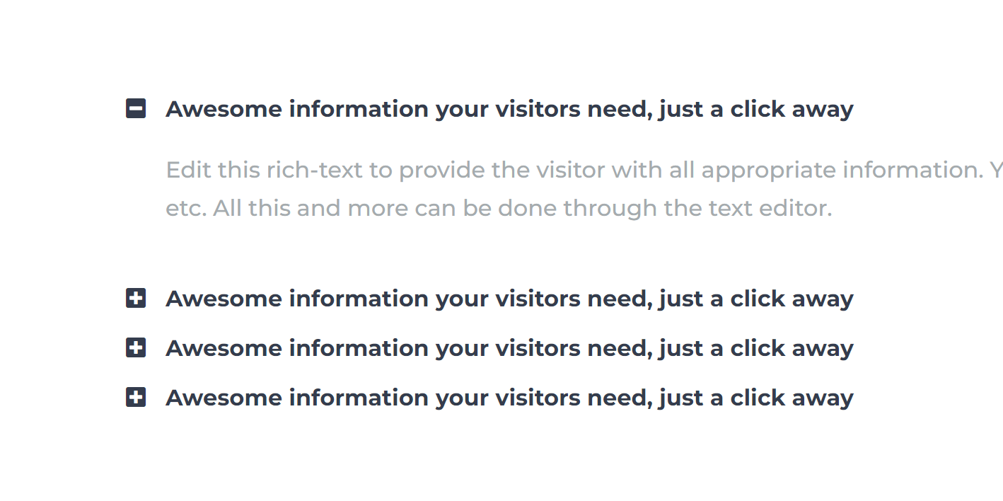
Accordion items
Edit, add, remove or reorder items:
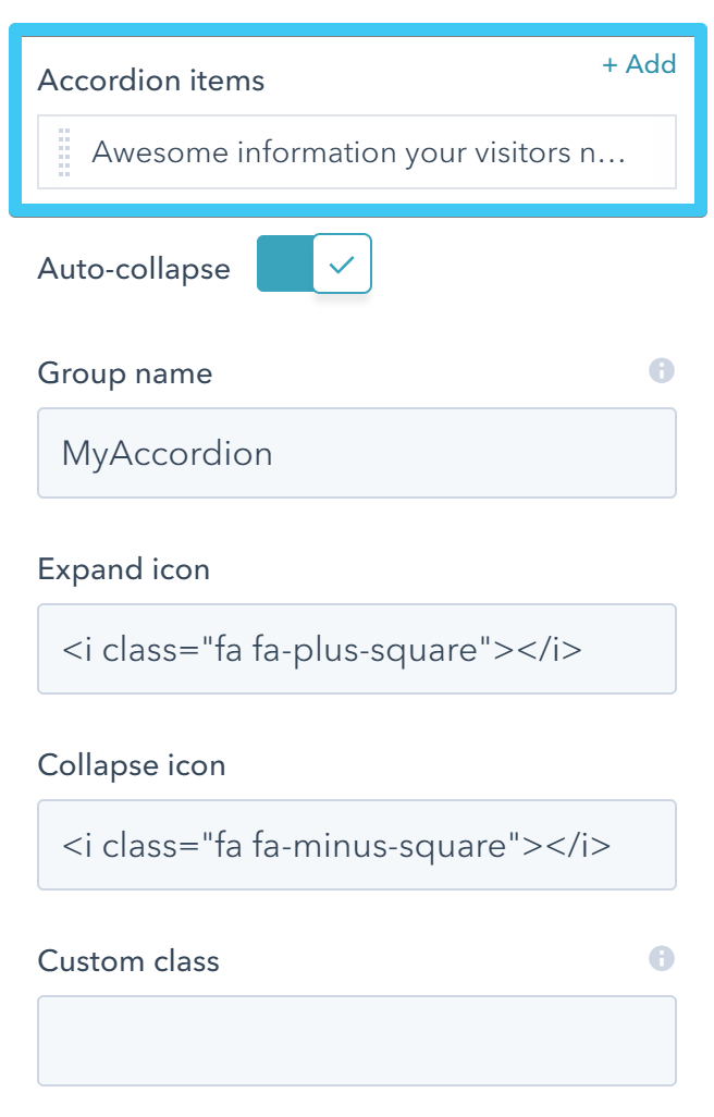
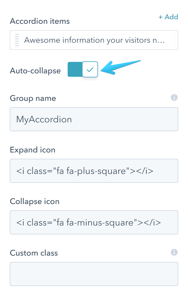
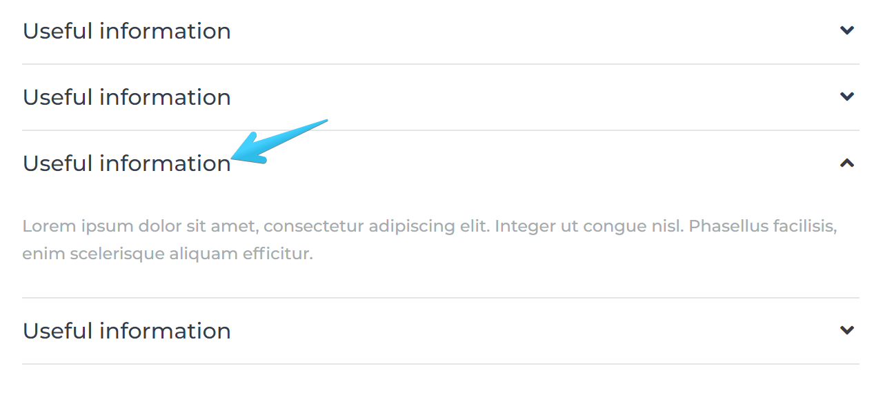
Auto-collapse
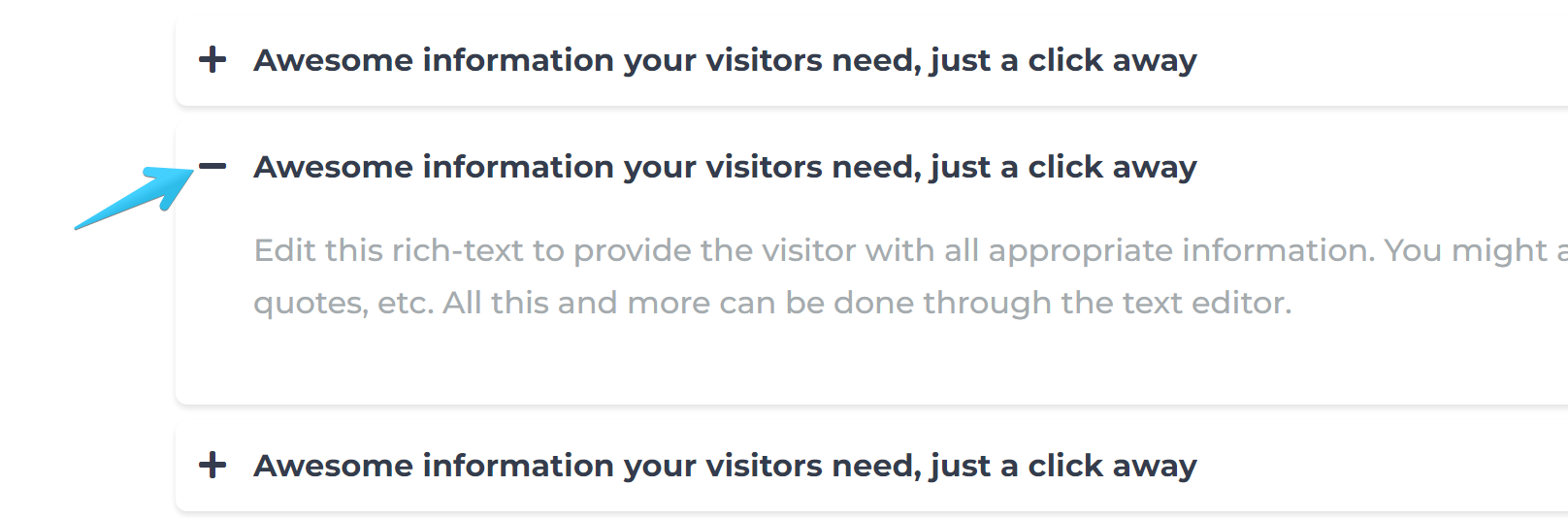
Expand one item at a time:
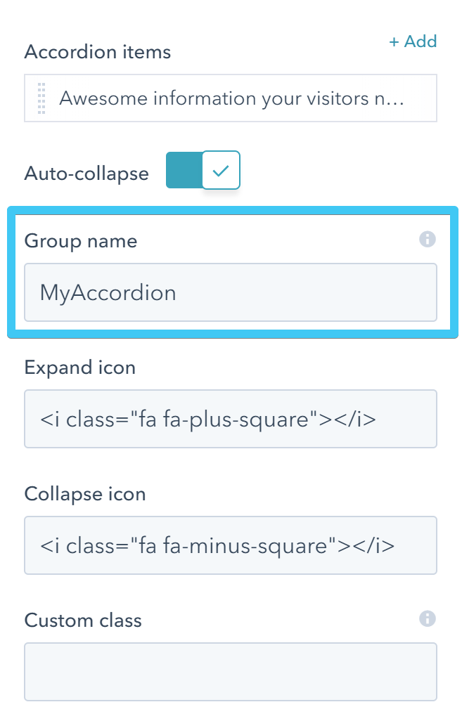
Group name
By adding the same accordion group name to multiple accordion modules you can link them, so when the user expands an item in that group, the others will collapse, whatever their position in the page. For the opposite behavior just use unique names for each accordion module.
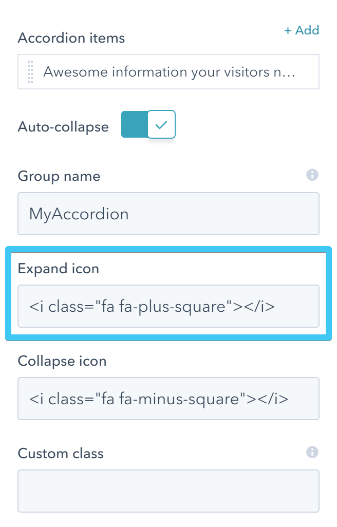
Expand icon
Replace the default Font Awesome icon that suggests to expand an item:
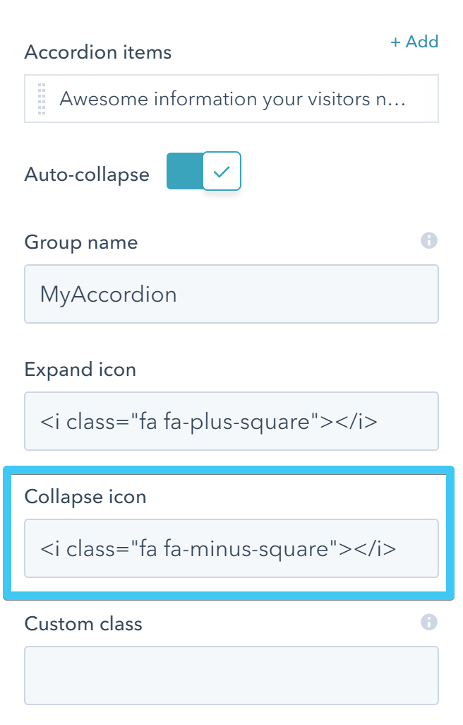
Collapse icon
Replace the default Font Awesome icon that suggests to collapse an item:
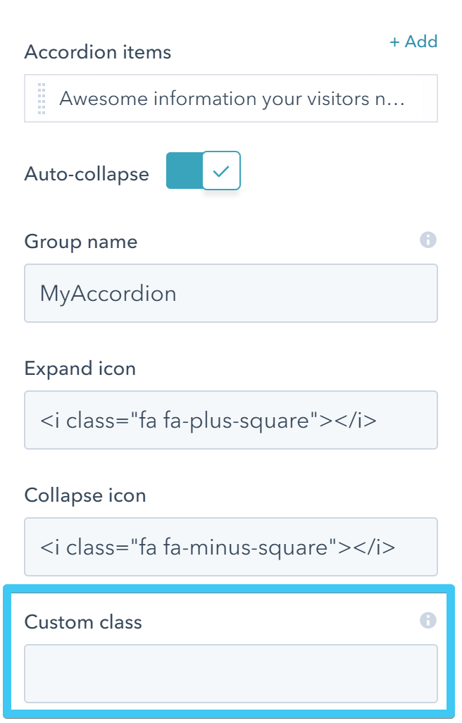
Custom class
Use this box if you want to add a custom class to your module at the page level.
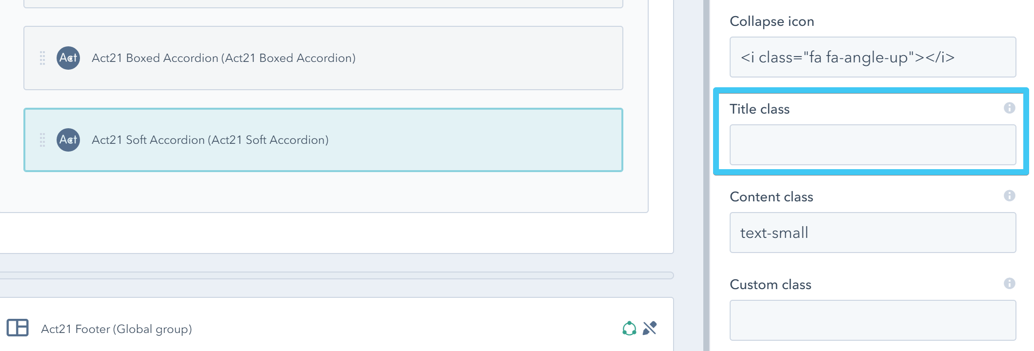
Additionally, Act21 Soft Accordion module has two more options:
Title class
A custom class that you can use to further style the accordion title.
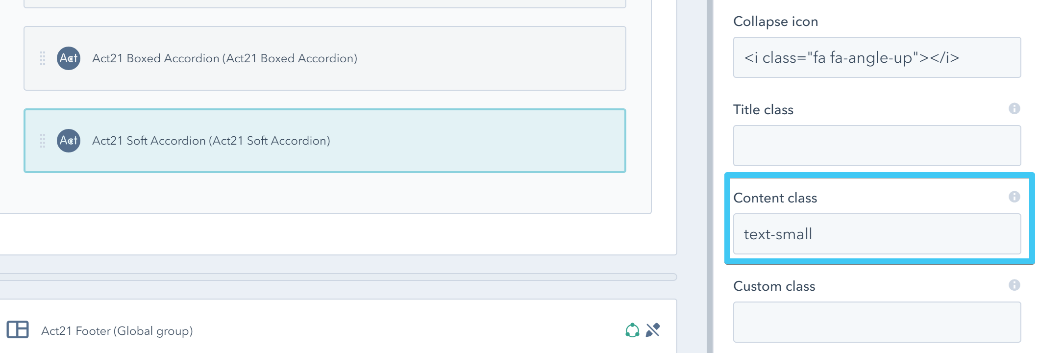
Content class
A custom class that you can use to further style the accordion content.
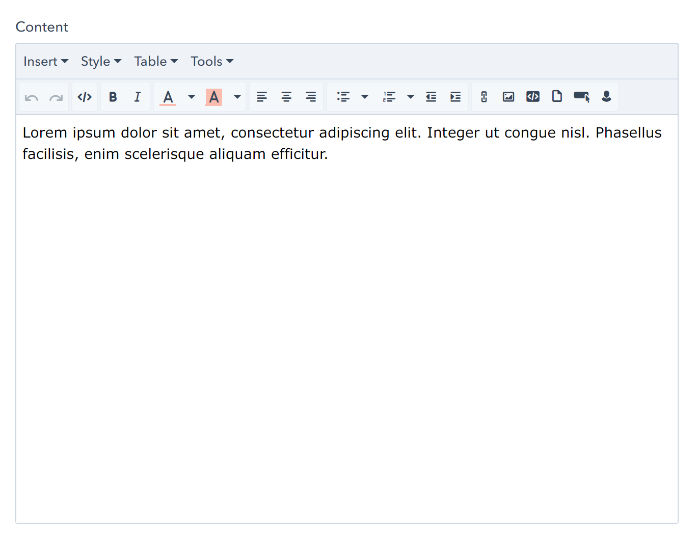
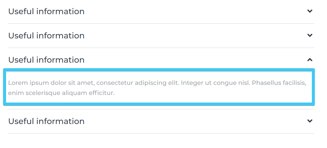
Each accordion item has these editable fields:
Title

Content
Expanded by default
Check this box to expand the item by default:

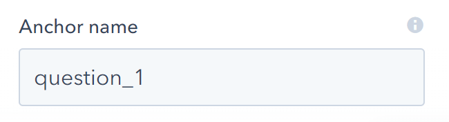
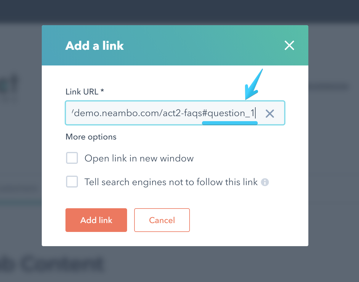
Anchor name
You can link from an external page to this accordion item. The item will expand and the page will scroll to its position. Anchor names should be unique per page. Please use only letters, numbers, _ and - characters: