Menus
Learn more about HubSpot's standard modules here
Menu Trees
Both Main Navigation and Sub-Menu in Act Theme are set with your default menu tree from Content Settings > Advanced Menus:
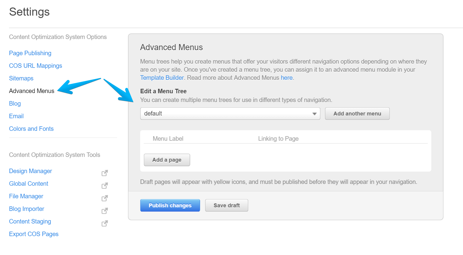
If you use another menu tree, please make sure to select it in your menu modules in Design Manager. You can find those modules in your Act Header and Act Sub-Menu global groups.
Learn how to change the Main Navigation's menu tree here. It is pretty similar for the Sub-Menu.
Note: Both Main Navigation and Sub-Menu should use the same menu tree in order to work as designed.
Styling
In Act Theme, all menus have a basic styling by default, but if you need to start clean and reset those styles, you can add this class menu-reset along with your custom one. This is a reset by overwriting, so it means you still need to use the same or over-qualified selectors, or just use !important in order to overwrite the existing styles. We suggest using the browser's inspect tool to see what styles are applied and where.
Flyout animation
Add the flyouts-fade class to obtain a fade-in animation and/or flyouts-slide for a slide-in effect. These animations occur only if the menu has flyouts enabled and the orientation is set to Vertical or Horizontal (as a third option, Vertical Flyouts orientation behaves like an "accordion", so these classes won't affect any animations there. Read more about the menu orientation below).
Menu orientation
There are five types of menus that can be obtained in Act Theme, by enabling/disabling flyouts and choosing the menu orientation:
1. Horizontal Orientation + Flyouts Enabled
A standard horizontal menu with drop-downs. The Main Navigation in Act Theme uses this configuration by default.
2. Horizontal Orientation + Flyouts Disabled
A navigation having columns, dictated by the main parent items. May be used for footer sitemaps. Maximum menu levels recommended: 2.
3. Vertical Orientation + Flyouts Enabled
A vertical menu with right flyout sub-navigation. Recommended to be used in left sidebars/columns.
4. Vertical Flyouts Orientation + Flyouts Enabled
A vertical menu having an "accordion" behavior. That means the parent menu level is expanded when hovering over it, making the direct child level visible.
Notes:
- "Vertical Flyouts" orientation should not be confused with the simple "Vertical" orientation.
- "Vertical Flyouts" orientation does not appear on Simple Menu modules, but on Advanced Menu modules only.
5. Vertical Orientation + Flyouts Disabled (same behavior for Vertical Flyouts Orientation + Flyouts Disabled)
A vertical menu with the direct child levels visible only when the visitor navigates to that page in the menu, the parent page, or a sibling page in that menu branch. The Sub-Menu in Act Theme uses this configuration by default.