How do columns stack one below the other on mobile
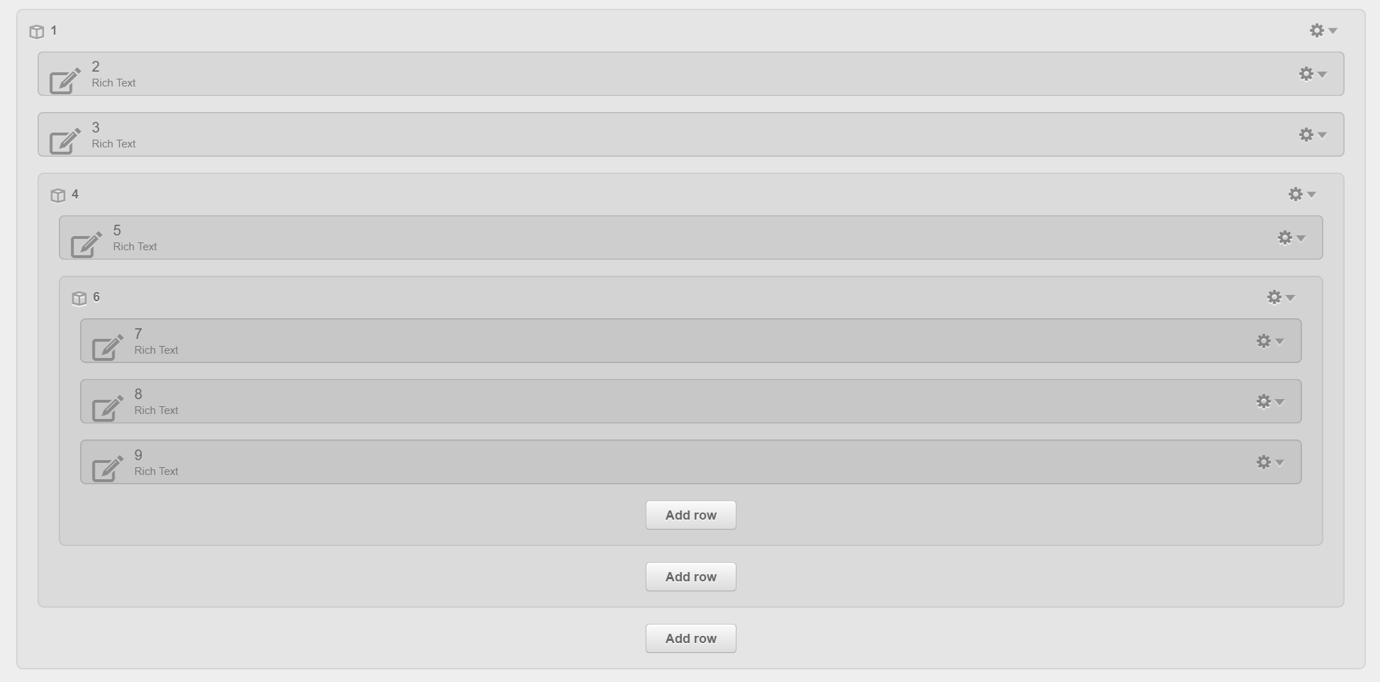
In HubSpot, the columns on the left side in a row are always above those on the right on mobile. For example, these groups and modules:
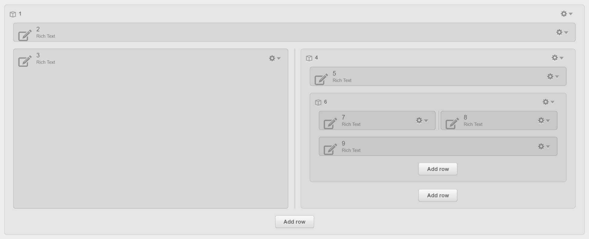
will stack this way on mobile:
How to swap two columns
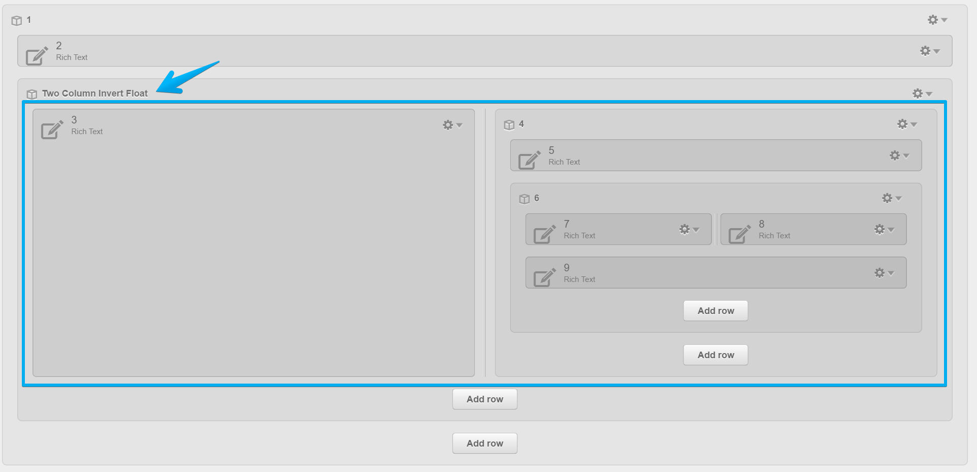
In Act Theme however, you can swap two columns, so they can stack in your desired order on mobile. Please note this doesn't work with three or more columns, only two:
You just need to group your two columns:
Then, add this class to the new group:
two-column-invert-float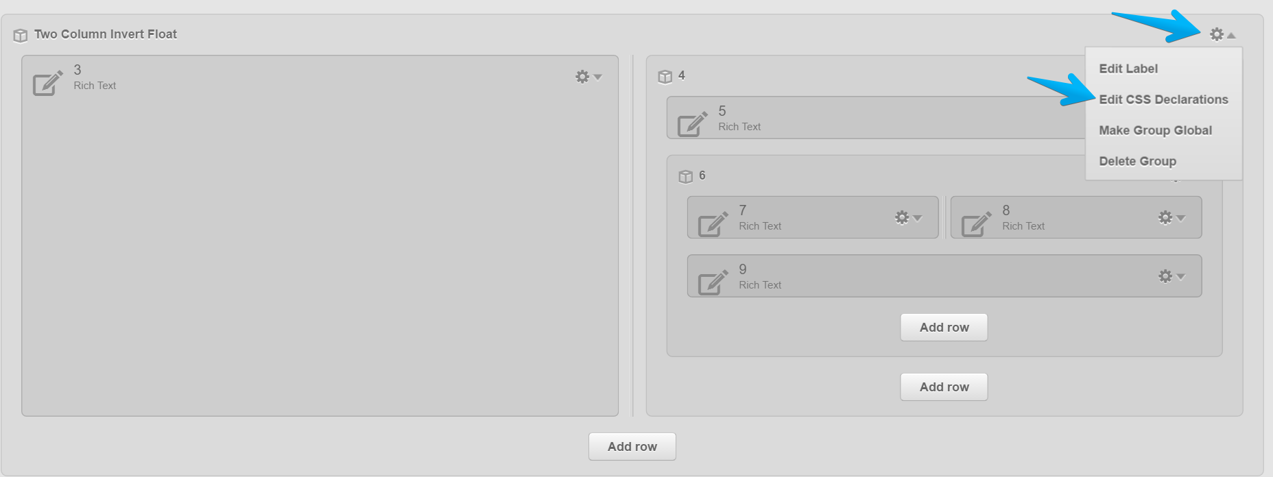
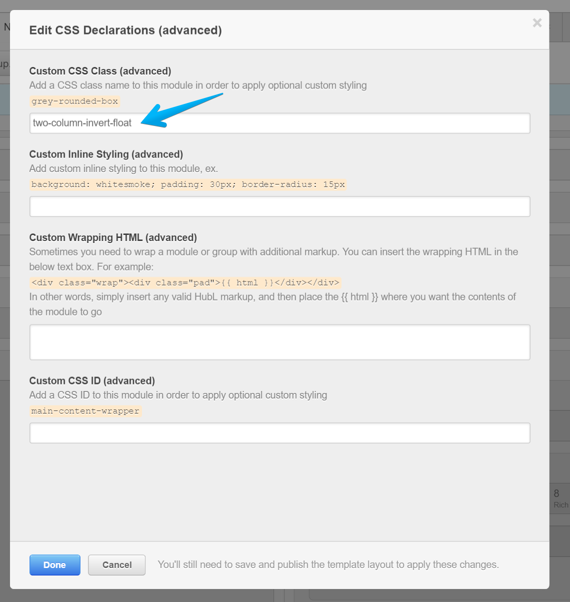
Click Done and Publish your changes.
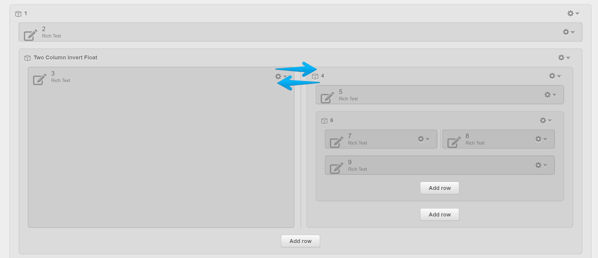
This way, your left column (as seen in Design Manager) will actually float to the right, and the right column will float to the left:
But, they will keep the natural flow on mobile:
Note: If your columns have some left/right padding, you can use helper classes to adjust or remove that.