Call-to-Action Buttons
Update: This step is now optional, just in case you need to use the buttons elsewhere or want them to keep the color in some preview screens, where the CSS stylesheet cannot be included. If present, Act-Theme.css will overwrite these styles.
VIDEO: How to setup your Act Theme Call-to-Action styles
After following the instructions in the video above, you can clone your button and obtain the rest of the designs, by applying the CSS classes from the table below.
Making regular links look like buttons
You can also use simple links <a> with the CSS classes from the table below, in order to make them look like buttons, in Rich Text, Custom HTML or HubL modules.
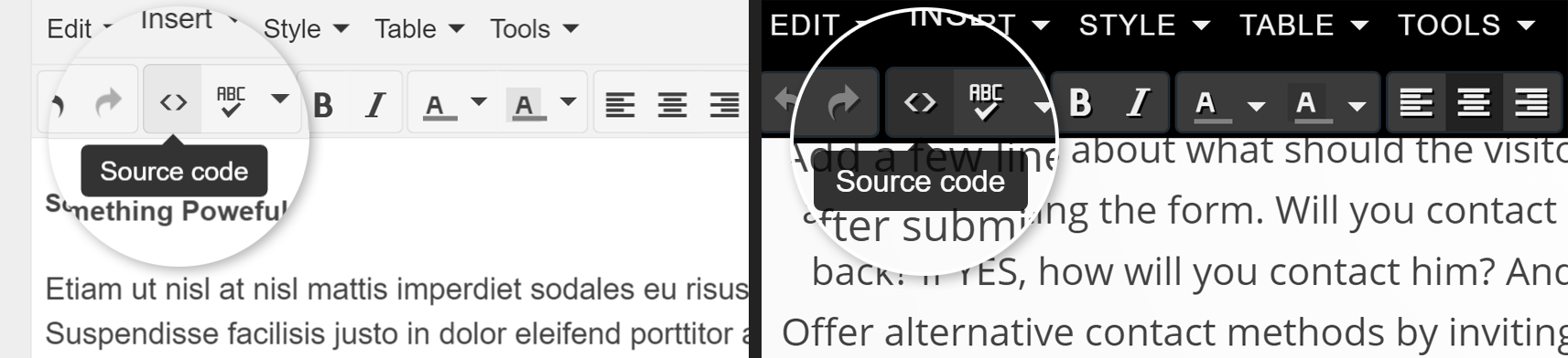
Here are the step-by-step instructions on how to add classes to your links in Rich Text modules:
Open the source code panel by clicking this button:
Find for your anchor's source code, which looks similar to this:
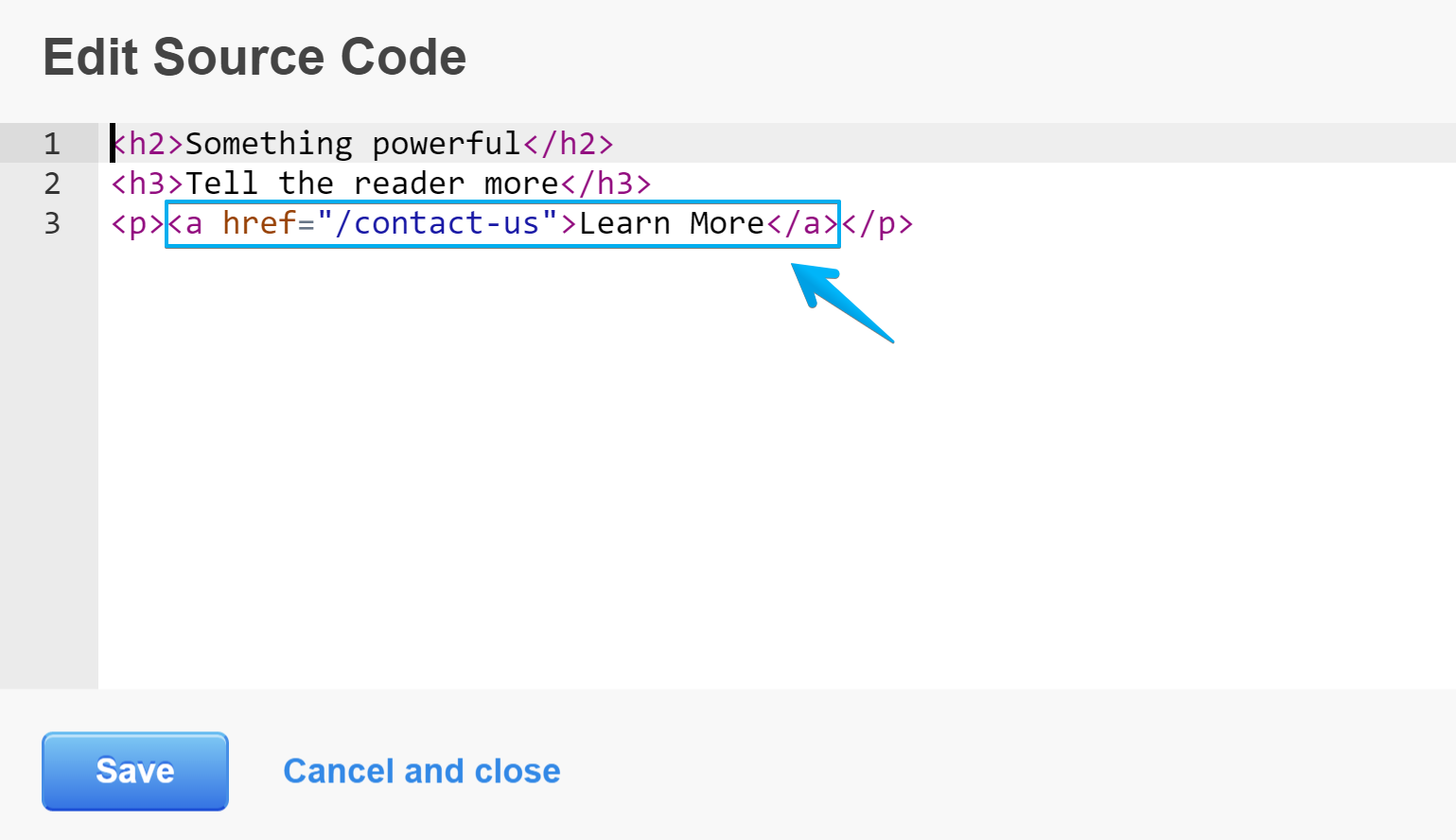
Then, right after the opening <a add a white space and the class attribute class="default-button", then a white space again, like here:
<a class="default-button" href="/contact-us">Learn More</a>Button classes
Here are all Call-to-Action button classes in Act Theme:
| Button | CSS Class | Anchor Code |
|---|---|---|
| Learn More | ||
| Learn More | ||
| Learn More | ||
| Learn More | ||
| Learn More | ||
| Learn More | ||
| Learn More | ||
| Learn More | ||
| Learn More | ||
| Learn More | ||
| Learn More | ||
| Learn More | ||
| Learn More | ||
| Learn More |
Button spacing
If you need to add some spacing around the buttons you can use the has-margin class. Example:
<a class="default-button has-margin" href="/contact">Contact</a>This is especially useful when you need to center pairs of buttons (like those on the homepage). You just need to add the has-margin class to both buttons, but please make sure there are no white spaces between, before or after them, as the has-margin class will take care of the spacing.
Multiple theme configuration
If you have multiple Act Theme configurations in your HubSpot account (two or more Act Theme styles with different colors), and want to add buttons from one configuration to a page having another color scheme, you can use an unique additional class for each set. This will prevent CTA styles conflict and overwriting.
For example, one set like this:
.config1.default-button.large.negative {}And another one like this:
.config2.default-button.large-negative {}You will just need to change the Call-to-Action Style Code generated by the Customization Tool and prepend that unique class to each selector. Example:
.config1.default-button {
    display: inline-block;
    max-width: 100%;
    padding: 15px 25px;
    background: #ffc91a;
    color: #222222 !important;
    font-family: "Open Sans", "Helvetica Neue", Helvetica, Arial, sans-serif;
    font-size: 14px;
    line-height: 1.43;
    font-weight: 600;
    text-transform: uppercase;
    text-align: center;
    text-decoration: none !important;
    text-shadow: none;
    letter-spacing: 0.05em;
    cursor: pointer;
    -webkit-transition: all 0.2s ease;
    transition: all 0.2s ease;
}

.config1.primary-button.has-margin,
.config1.default-button.has-margin {
    margin: 10px;
}

.config1.default-button.headlines-color {
    background: #666666;
    color: #fff !important;
}
...
Then, paste your new code in the HubSpot CTA builder and use the classes like this:
config1 default-button large negative